

ColossalComponents

Rounded Controls for VCL Projects
- Active · last change 10-5-2026
- ★ 1 on GitHub
README
Colossal Controls
A collection of custom VCL components for Delphi.
Components are registered on the Colossal Controls tab of the Tool Palette.
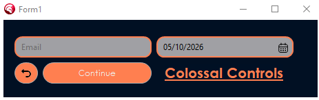
Components
TRoundEdit
An edit box with rounded corners. The frame is drawn with GDI+ using anti-aliasing, so the corners are smooth instead of jagged (which is what you get when clipping a window with SetWindowRgn).
TRoundEdit is a TCustomControl that paints the rounded frame and hosts a borderless TEdit inside it. The inner edit's height is set from the real font height and centered vertically, so the text stays aligned at any font size.
Features
- Anti-aliased rounded corners (GDI+)
- Configurable corner radius, border width, and colors
- Different border color when the edit has focus
- Text is vertically centered and follows font changes
- Transparent corners (opt-in with
Transparent = True): the control paints what is behind it, so it looks right over any parent or sibling. By default the corners are filled with the parent's color - Cannot be used as a parent for other components (
csAcceptsControlsremoved) - Double buffered, no flicker
Published properties
| Property | Type | Default | Description |
|---|---|---|---|
Text |
string | Text of the inner edit | |
Radius |
Integer | 10 |
Corner radius in pixels |
BorderWidth |
Integer | 1 |
Border thickness in pixels (0 = no border) |
BorderColor |
TColor | $00C0C0C0 |
Border color when not focused |
FocusColor |
TColor | $00D77800 |
Border color when the edit has focus |
FillColor |
TColor | clWhite |
Background color of the box and inner edit |
Padding |
Integer | 8 |
Space between the border and the text |
Transparent |
Boolean | False |
True = paint what is behind the control (parent + siblings below) so the corners blend with it. False = fill with the parent's color only |
Font |
TFont | Font of the text |
Standard properties such as Align, Anchors, Margins, TabOrder, PopupMenu, Visible, and Enabled are also published.
Published events
OnChange, OnClick, OnDblClick, OnEnter, OnExit, OnKeyDown, OnKeyPress, OnKeyUp, OnMouseDown, OnMouseMove, OnMouseUp, OnMouseEnter, OnMouseLeave, and OnContextPopup.
The focus, keyboard, and most of the mouse activity happen inside the inner edit, so its events are forwarded to the ones above (mouse coordinates are translated to the TRoundEdit). OnMouseEnter / OnMouseLeave fire once for the whole control, not each time the cursor moves between the frame and the inner edit. If a PopupMenu is assigned, it replaces the default edit context menu.
Accessing the inner edit
The inner TEdit is exposed through the public Edit property, for anything not published directly:
RoundEdit1.OnChange := MyChangeHandler;
RoundEdit1.Edit.PasswordChar := '*';
RoundEdit1.Edit.NumbersOnly := True;
Use the events of the
TRoundEdititself. Assigning an event directly onEdit(e.g.Edit.OnChange) replaces the forwarding handler, and the correspondingTRoundEditevent stops firing.
TRoundButton
A button with rounded corners, drawn with GDI+ using anti-aliasing, in the same visual style as TRoundEdit.
Unlike TRoundEdit, it does not host another control: TRoundButton is a self-painted TCustomControl, so the frame, the state colors, and the caption are all drawn by the component itself.
Features
- Anti-aliased rounded corners (GDI+), same geometry as
TRoundEdit - Visual states: normal, hover, pressed, and disabled, each with its own color
- Accent border (
FocusColor) on hover, pressed, keyboard focus, and for the active default button - Keyboard support:
Spaceto press,Enterfor theDefaultbutton,Escfor theCancelbutton - Accelerator keys through
&in the caption (e.g.&Save) ModalResultsupport, likeTButton- Glyph support through an image list (
Images/ImageIndex), placed left, right, above, below, or centered relative to the caption; drawn grayed out when the button is disabled - Transparent corners (opt-in with
Transparent = True): the control paints what is behind it, so it looks right over any parent or sibling. By default the corners are filled with the parent's color - Cannot be used as a parent for other components (
csAcceptsControlsremoved) - Double buffered, no flicker
Published properties
| Property | Type | Default | Description |
|---|---|---|---|
Caption |
string | Button text (& marks the accelerator key) |
|
Radius |
Integer | 10 |
Corner radius in pixels (0 = square corners) |
BorderWidth |
Integer | 1 |
Border thickness in pixels (0 = no border) |
BorderColor |
TColor | $00ADADAD |
Border color in the normal and disabled states |
FocusColor |
TColor | $00D77800 |
Border color on hover, pressed, focus, and default |
FillColor |
TColor | $00E1E1E1 |
Background color in the normal state |
HoverColor |
TColor | $00FBF1E5 |
Background color while the mouse is over the button |
PressedColor |
TColor | $00F7E4CC |
Background color while pressed |
DisabledColor |
TColor | $00CCCCCC |
Background color when Enabled is False |
Default |
Boolean | False |
Enter clicks this button |
Cancel |
Boolean | False |
Esc clicks this button |
ModalResult |
TModalResult | mrNone |
Result set on the parent form when clicked |
Images |
TCustomImageList | Image list holding the glyph (works with TVirtualImageList) |
|
ImageIndex |
TImageIndex | -1 |
Glyph to show (-1 = no glyph) |
ImageAlignment |
TImageAlignment | iaLeft |
Glyph position relative to the caption: iaLeft, iaRight, iaTop, iaBottom, iaCenter |
Spacing |
Integer | 8 |
Space between the glyph and the caption in pixels |
Transparent |
Boolean | False |
True = paint what is behind the button (parent + siblings below) so the corners blend with it. False = fill with the parent's color only |
Font |
TFont | Font of the caption |
Standard properties such as Align, Anchors, Margins, TabOrder, TabStop, Hint, PopupMenu, Visible, and Enabled, plus the usual click, mouse, and keyboard events (OnClick, OnMouseEnter, OnKeyDown, ...), are also published.
TRoundDateTimePicker
A date/time picker with rounded corners that behaves like the standard TDateTimePicker: an edit where the date is typed directly, plus a button that opens a calendar to pick from. Drawn with GDI+, in the same visual style as the other components.
Typing a date
The value is edited field by field (day, month, year, ...), like the standard picker:
- Type digits: they fill the current field and move on to the next one when it is complete (typing
05102026gives05/10/2026). - A separator key (
/.-:or space) moves to the next field, so a date can be typed as it reads:5/10/2026. Left/Right(or a click) select a field,Up/Downand the mouse wheel change it,Home/Endjump to the first / last field.Ctrl+Vpastes a full date/time (parsed with the system format),Ctrl+Ccopies the text.MinDate/MaxDateare enforced when a field is completed or the control loses focus.
Calendar drop-down
Click the calendar button, or press F4 / Alt+Down. Inside the calendar, the arrows move the date, PageUp / PageDown change the month (Ctrl = year), Home / End go to the first / last day of the month, Enter selects, and Esc closes it. Clicking a day, or any other control, also closes it. The calendar takes its colors, font, and corner radius from the picker.
Published properties
| Property | Type | Default | Description |
|---|---|---|---|
DateTime |
TDateTime | now | Current value (date and time) |
Kind |
TRoundDateTimeKind | rdkDate |
rdkDate, rdkTime, or rdkDateTime (rdkTime has no calendar button) |
Format |
string | Custom display format. Empty = default of Kind (system short date for dates, HH:mm for times) |
|
MinDate |
TDateTime | 0 |
Lowest allowed value (0 = no limit) |
MaxDate |
TDateTime | 0 |
Highest allowed value (0 = no limit; a date without time allows the whole day) |
Radius |
Integer | 10 |
Corner radius in pixels |
BorderWidth |
Integer | 1 |
Border thickness in pixels (0 = no border) |
Padding |
Integer | 8 |
Space between the border and the text |
BorderColor |
TColor | $00ADADAD |
Border color when not focused |
FocusColor |
TColor | $00D77800 |
Border color when focused, and the color of the selected field and of the calendar's selected day |
FillColor |
TColor | clWhite |
Background color |
HoverColor |
TColor | $00F0F0F0 |
Background of the calendar button on hover |
SelectedTextColor |
TColor | clWhite |
Text color of the selected field |
FirstDayOfWeek |
TRoundWeekDay | from locale | First column of the calendar |
ShowToday |
Boolean | True |
Show the "Today" footer in the calendar |
TodayCaption |
string | Today |
Text of the "Today" footer (e.g. Hoje) |
Transparent |
Boolean | False |
See Transparency |
Font |
TFont | Font of the text and of the calendar |
At runtime, Date and Time give the date part and the time part of DateTime, and DroppedDown, DropDown, and CloseUp control the calendar.
Published events
OnChange, OnDropDown, OnCloseUp, plus the standard OnClick, OnDblClick, OnEnter, OnExit, OnKeyDown, OnKeyPress, OnKeyUp, OnMouseDown, OnMouseMove, OnMouseUp, OnMouseEnter, OnMouseLeave, and OnContextPopup.
Display format
The Format string uses these tokens (case-sensitive; M is the month and m the minute). Any other character is shown as is, and text between single quotes is a literal.
| Token | Meaning |
|---|---|
d, dd |
Day of the month (5, 05) |
ddd, dddd |
Day name, short / long (read-only) |
M, MM |
Month number (3, 03) |
MMM, MMMM |
Month name, short / long |
yy, yyyy |
Year (2 / 4 digits) |
H, HH |
Hour, 24-hour clock |
h, hh |
Hour, 12-hour clock (use with tt) |
m, mm |
Minute |
s, ss |
Second |
tt |
AM / PM |
RoundDateTimePicker1.Kind := rdkDateTime;
RoundDateTimePicker1.Format := 'dd/MM/yyyy HH:mm';
RoundDateTimePicker1.MinDate := EncodeDate(2026, 1, 1);
RoundDateTimePicker1.OnChange := DateChanged;
TRoundCalendar
The month calendar used by the picker's drop-down, also available as a standalone control. Rounded and anti-aliased (GDI+), it shows one month at a time with previous / next month buttons, the selected day, today's date, and an optional "Today" footer.
Click a day to select it (OnSelect; OnChange fires whenever Date changes, including from the keyboard). Keyboard: arrows move the date, PageUp / PageDown change the month (Ctrl = year), Home / End go to the first / last day, Enter selects.
The layout is compact and scales with the font: header, weekday row, footer, and cells are all sized from the font height, so the calendar follows font and DPI changes. The default size is 160 x 192. Call FitToFont to resize the control to a comfortable size for its current font (the picker does this for its drop-down); you can also size it freely, and the grid fills the available space.
| Property | Type | Default | Description |
|---|---|---|---|
Date |
TDate | today | Selected date |
MinDate / MaxDate |
TDate | 0 |
Selectable range (0 = no limit); days outside it are dimmed and cannot be selected |
FirstDayOfWeek |
TRoundWeekDay | from locale | First column of the grid |
ShowToday |
Boolean | True |
Show the "Today" footer |
TodayCaption |
string | Today |
Text of the footer |
Radius |
Integer | 12 |
Corner radius of the calendar |
DayRadius |
Integer | 6 |
Corner radius of the day cells and buttons |
BorderWidth |
Integer | 1 |
Border thickness |
BorderColor |
TColor | $00C0C0C0 |
Border color |
FillColor |
TColor | clWhite |
Background color |
SelectedColor |
TColor | $00D77800 |
Background of the selected day, and the "Today" text |
SelectedTextColor |
TColor | clWhite |
Text color of the selected day |
HoverColor |
TColor | $00F0F0F0 |
Background of the hovered day / button |
TodayColor |
TColor | $00D77800 |
Ring around today's date |
MutedColor |
TColor | $00A0A0A0 |
Weekday names, days of other months, disabled days |
Transparent |
Boolean | False |
See Transparency |
Requirements
- Delphi 13 (RAD Studio 37.0)
- VCL, Windows (the package currently targets Win32)
Installation
- Open
ColossalControls.dprojin the IDE. - In the Project Manager, right-click
ColossalControls.bpland choose Build, then Install. - The IDE should report that
TRoundEdit,TRoundButton,TRoundCalendar, andTRoundDateTimePickerwere registered. The package appears in Component > Install Packages as Colossal Controls. - Open a VCL form. The components are on the Colossal Controls tab of the Tool Palette.
To use the components in your own projects, add the src folder of this repository to the IDE's library path (Tools > Options > Language > Delphi > Library > Library path), or add the units (uRoundEdit.pas, uRoundButton.pas, uRoundCalendar.pas, uRoundDateTimePicker.pas, and the shared uColossalDraw.pas) to your project.
Usage
Drop a TRoundEdit on a form and adjust its properties in the Object Inspector, or create it in code:
uses
  uRoundEdit;

procedure TForm1.FormCreate(Sender: TObject);
var
  Edt: TRoundEdit;
begin
  Edt := TRoundEdit.Create(Self);
  Edt.Parent := Self;
  Edt.SetBounds(20, 20, 250, 36);
  Edt.Radius := 12;
  Edt.FocusColor := clHighlight;
  Edt.Text := 'Hello';
end;
A rounded button, created in code:
uses
  uRoundButton;

procedure TForm1.FormCreate(Sender: TObject);
var
  Btn: TRoundButton;
begin
  Btn := TRoundButton.Create(Self);
  Btn.Parent := Self;
  Btn.SetBounds(20, 70, 120, 36);
  Btn.Caption := '&Save';
  Btn.Images := ImageList1;
  Btn.ImageIndex := 0;
  Btn.ImageAlignment := iaLeft;
  Btn.Default := True;
  Btn.ModalResult := mrOk;
  Btn.OnClick := SaveClick;
end;
Transparency
Every component has a Transparent property, which is off by default (False).
Transparent = False(default): the area outside the rounded corners is filled with the parent's color (Parent.Brush.Color). This is the cheapest option to paint, and it looks right when the control sits directly on a parent with a solid color.Transparent = True: the control paints what is really behind it (the parent's background plus any sibling controls below it in the Z-order) before drawing the rounded shape, so the corners blend with the background. Use it when a control has a different parent or color behind it than its own parent's color, for example a control placed on a form that overlaps a panel, or a parent with a background image or gradient.
Turning transparency on is more costly to paint, because the background is captured again every time the control repaints (including on hover, press, and focus changes). Leave it off unless you actually see the wrong color in the corners.
// A button on the form that overlaps a panel of a different color
RoundButton2.Transparent := True;
Project structure
ColossalComponents/
????????? ColossalControls.dpk     Package source
????????? ColossalControls.dproj   Package project
????????? LICENSE                  MIT License
????????? src/
???   ????????? uColossalDraw.pas    Shared drawing helpers (GDI+ colors and shapes, transparent background)
???   ????????? uRoundEdit.pas       TRoundEdit component
???   ????????? uRoundButton.pas     TRoundButton component
???   ????????? uRoundCalendar.pas   TRoundCalendar component
???   ????????? uRoundDateTimePicker.pas  TRoundDateTimePicker component
????????? bin/                     Compiled output (DCU)
Known limitations
- By default (
Transparent = False) the corners are filled with the parent'sBrush.Color, so a control that overlaps a sibling (e.g. a panel) or sits on a parent with a background image or gradient shows solid-colored corners. SetTransparent = Truein those cases. - With
Transparent = Truethe background behind the control is captured each time it paints. If what is behind it changes without the control being repainted (e.g. a sibling below it is recolored or moved at runtime), callInvalidateon the control. This also costs a bit more per paint. - Only controls that are below the control in the Z-order are part of its background when
Transparent = True. TRoundEdithas no special visual style for the disabled state yet (TRoundButtondoes).TRoundButton's caption is single-line, and the glyph has no separate hover/pressed images.- The calendar drop-down of
TRoundDateTimePickeris a child of the form (not a separate window), so it cannot extend outside the form's client area. It opens above the picker when there is no room below, but a picker placed in a form that is smaller than the calendar will show it clipped. TRoundDateTimePickeredits a single value: there is no empty / "no date" state, and theddd/ddddday-name tokens are display-only.- Only Win32 is built by the package at the moment.
License
Released under the MIT License.