

opcb-object-pascal-component-builder

OPCB – Object Pascal Component Builder A library for fluent creation and configuration of components in Delphi and Lazarus. Enables expressive, hierarchical, and reusable runtime UI construction. Developed by Fabiano Arndt. Copyright © 2025 Fabiano Arndt
- Active · last change 10-30-2026
- ★ 33 on GitHub
README
OPCB – Object Pascal Component Builder
Versão em português: veja README_PT.md
🚀 Instantiate and configure Delphi and Lazarus components in a fluent, expressive, and reusable way — entirely at runtime, with no .dfm/.lfm required.
OPCB (Object Pascal Component Builder) is a library for Delphi and Lazarus that lets you build and configure visual components in code, with a fluent, chainable, and readable API. It targets a case the design-time form designer doesn't cover well: UI whose shape is only known at runtime — driven by data, by a schema, by user choices, or by anything else the designer can't see in advance.
Table of Contents
- Documentation & Articles
- Benefits
- Usage Examples
- Features Demonstrated
- Examples Gallery
- Tested
- Requirements
- Installation
- License
📖 Documentation
docs
📖 Articles
articles
✨ Benefits
- 🔹 Fluent API – Configure properties and events in a chained way.
- 🔹 Less repetitive code.
- 🔹 Hierarchical organization – Facilitates creation of nested layouts.
- 🔹 Automatic grid support – Add controls in cells with
RowSpanandColSpan. - 🔹 Three builders, one API style –
TControlCreatorfor visual controls,TComponentCreatorfor non-visual components (dialogs, timers, datasets...),TMenuCreatorfor menu trees. - 🔹 RTTI-based property/event assignment – Set arbitrary properties (
WithProp) and events (WithEvent) by name, even on component classes the library doesn't know about ahead of time. - 🔹 Compatible with VCL, LCL, and FMX.
- 🔹 Extensively tested – see Tested below.
🚀 Usage Examples
Simple control creation:
uses
  OPCB;

procedure TForm1.FormCreate(Sender: TObject);
var
  Creator: TControlCreator;
begin
  Creator := TControlCreator.Create;
  try
    Creator
      .SetOwnerAndParent(Self, Self)
      .SetSpace(5, 5)
      .SetTopLeft(10, 10)
      .SetDirection(cpdVertical)
      .Add(TControlBuilder.Create(TLabel).WithCaption('Nome'))
      .Add(TControlBuilder.Create(TEdit, 'edit_name').WithWidth(250).WithCaption(''))
      .IncTop(15)
      .Add(TControlBuilder.Create(TLabel).WithCaption('Idade'))
      .Add(TControlBuilder.Create(TNumberBox).WithWidth(50))
      .IncTop(20)
      .SetDirection(cpdHorizontal)
      .Add(TControlBuilder.Create(TButton, 'button_enviar').WithCaption('Enviar'))
      .Add(TControlBuilder.Create(TButton, 'button_cancelar').WithCaption('Cancelar'))
      .AlignControlsRight(['button_enviar', 'button_cancelar'], ['edit_name'])
    ;
  finally
    Creator.Free;
  end;
end;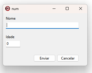
Nested control creation:
uses
  OPCB;

procedure TForm1.FormCreate(Sender: TObject);
var
  Creator: TControlCreator;
begin
  Creator := TControlCreator.Create;
  try
    Creator
      .SetOwnerAndParent(Self, Self)
      .SetTopLeft(10, 10)
      .SetSpace(5, 5)
      .SubLevel(TControlBuilder.Create(TGroupBox).WithCaption('Opções').WithWidthAndHeight(250, 250))
        .SetDirection(cpdVertical)
        .SetTopLeft(20, 20)
        .Add(TControlBuilder.Create(TCheckBox).WithCaption('Opção 1'))
        .Add(TControlBuilder.Create(TCheckBox).WithCaption('Opção 2'))
        .Add(TControlBuilder.Create(TCheckBox).WithCaption('Opção 3'))
        .Add(TControlBuilder.Create(TCheckBox).WithCaption('Opção 4'))
        .Add(TControlBuilder.Create(TCheckBox).WithCaption('Opção 5'))
        .Add(TControlBuilder.Create(TCheckBox).WithCaption('Opção 6'))
      .SuperLevel
      .SubLevel(TControlBuilder.Create(TPanel).WithWidthAndHeight(250, 250))
        .SetDirection(cpdVertical)
        .SetTopLeft(20, 20)
        .Add(TControlBuilder.Create(TLabel).WithCaption('Informação 1'))
        .Add(TControlBuilder.Create(TLabel).WithCaption('Informação 2'))
        .Add(TControlBuilder.Create(TLabel).WithCaption('Informação 3'))
        .Add(TControlBuilder.Create(TLabel).WithCaption('Informação 4'))
        .Add(TControlBuilder.Create(TLabel).WithCaption('Informação 5'))
        .Add(TControlBuilder.Create(TLabel).WithCaption('Informação 6'))
        .IncTop(50)
        .Add(TControlBuilder.Create(TButton).WithCaption('Copiar'))
      .SuperLevel
    ;
  finally
    Creator.Free;
  end;
end;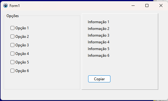
Grid Mode:
uses
  OPCB;

procedure TForm1.FormCreate(Sender: TObject);
var
  Creator: TControlCreator;
begin
  Creator := TControlCreator.Create;
  try
    Creator
      .SetOwnerAndParent(Self, Self)
      .SetTopLeft(20, 20)
      .SetSpace(5, 5)
      .SetDirection(cpdVertical)
      .GridInit(4, 6)
        .GridSetCellWidthAndHeight(70, 70)
        .GridSetColWidth(0, 200)
        .GridSetRowHeight(1, 150)
        .Add(TControlBuilder.Create(TPanel).WithCaption('1'))
        .Add(TControlBuilder.Create(TPanel).WithCaption('2'))
        .SubLevel(TControlBuilder.Create(TPanel).WithCaption('3'))
          .Add(TControlBuilder.Create(TButton).WithCaption('B1'))
          .Add(TControlBuilder.Create(TButton).WithCaption('B2'))
        .SuperLevel
        .Add(TControlBuilder.Create(TPanel).WithCaption('4'))
        .Add(TControlBuilder.Create(TPanel).WithCaption('5'))
        .SetDirection(cpdHorizontal)
        .GridColSpan(2)
        .GridRowSpan(2)
        .Add(TControlBuilder.Create(TPanel).WithCaption('6'))
        .Add(TControlBuilder.Create(TPanel).WithCaption('7'))
        .Add(TControlBuilder.Create(TPanel).WithCaption('8'))
        .Add(TControlBuilder.Create(TPanel).WithCaption('9'))
        .Add(TControlBuilder.Create(TPanel).WithCaption('10'))
        .Add(TControlBuilder.Create(TPanel).WithCaption('11'))
        .GridSkipCell
        .Add(TControlBuilder.Create(TPanel).WithCaption('12'))
        .Add(TControlBuilder.Create(TPanel).WithCaption('13'))
        .GridRowSpan(2)
        .Add(TControlBuilder.Create(TPanel).WithCaption('14'))
        .Add(TControlBuilder.Create(TPanel).WithCaption('15'))
        .Add(TControlBuilder.Create(TPanel).WithCaption('16'))
        .Add(TControlBuilder.Create(TPanel).WithCaption('17'))
        .Add(TControlBuilder.Create(TPanel).WithCaption('18'))
        .Add(TControlBuilder.Create(TPanel).WithCaption('19'))
      .GridFinish
    ;
  finally
    Creator.Free;
  end;
end;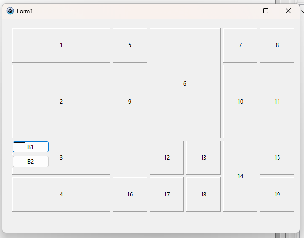
🚀 Example: Building a Virtual Keyboard
The example below demonstrates how to build a complete virtual keyboard using the library.
procedure TForm1.FormCreate(Sender: TObject);
var
  Creator: TControlCreator;
begin
  Creator := TControlCreator.Create;
  try
    Creator
      .SetOwnerAndParent(Self, Self)
      .SetSpace(2, 2)
      .SetTopLeft(20, 20)
      .SubLevel(TControlBuilder.Create(TPanel))
        .SetTopLeft(10, 10)
        .GridInit(4, 10)
          .GridSetCellWidthAndHeight(80, 80)
          .GridSetRowOffset(1, 22)
          .GridSetRowOffset(2, 65)
          .External(procedure (ACreator: TControlCreator)
            const KeyRows: array[0..1] of string = ('QWERTYUIOPASDFGHJKL', 'ZXCVBNM');
            var Key: Char;
            begin
              for Key in KeyRows[0] do
                ACreator.Add(TControlBuilder.Create(TSpeedButton).WithCaption(Key));
              ACreator.Break;
              for Key in KeyRows[1] do
                ACreator.Add(TControlBuilder.Create(TSpeedButton).WithCaption(Key));
              ACreator.Break;
              ACreator.GridSkipCells(2);
              ACreator.GridColSpan(5);
              ACreator.Add(TControlBuilder.Create(TSpeedButton).WithCaption('[ SPACE ]'));
            end
          )
        .GridFinish
        .IncLeft(20)
        .GridInit(4, 3)
          .GridSetCellWidthAndHeight(80, 80)
          .External(procedure(ACreator: TControlCreator)
            const Keys = '789456123';
            var Key: Char;
            begin
              for Key in Keys do
                ACreator.Add(TControlBuilder.Create(TSpeedButton).WithCaption(Key));
              ACreator.GridColSpan(2);
              ACreator.Add(TControlBuilder.Create(TSpeedButton).WithCaption('0'));
              ACreator.Add(TControlBuilder.Create(TSpeedButton).WithCaption(','));
            end
          )
        .GridFinish
        .RecalcParentSize(10, 10)
      .SuperLevel
    ;
  finally
    Creator.Free;
  end;
end;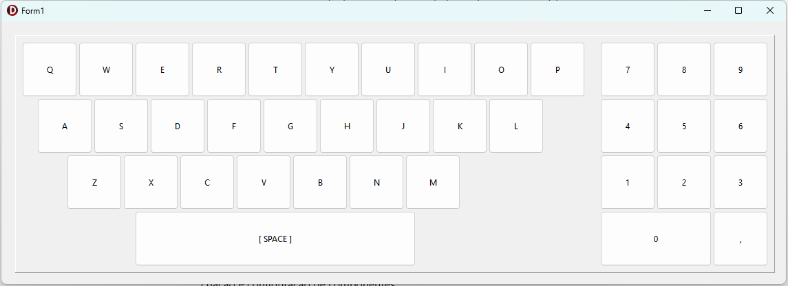
🔑 Features Demonstrated
- Fluent control creation
.SetOwnerAndParent(Self, Self)defines owner and parent..SetSpace(2, 2)/.SetTopLeft(20, 20)control spacing and initial position.
- Hierarchy of levels
.SubLevel(...)opens a new construction scope (e.g. aTPanel)..SuperLevelreturns to the previous level.
- Grid layouts
.GridInit(Rows, Cols)starts a grid..GridSetCellWidthAndHeight(W, H)defines the cell dimensions..GridSetRowOffset(Row, Offset)applies offset in specific rows.
- Dynamic control insertion
.External(procedure(ACreator: TControlCreator) ...)allows batch creation of controls such as keys from arrays/strings.
- Grid positioning control
.Break→ line/column break (direction-dependent — see docs before relying on it for a plain "next line down";.BreakLine/.BreakColumnare the unconditional versions)..GridSkipCells(N)→ skips cells..GridColSpan(N)→ merges columns (e.g. SPACE key).
- Automatic container adjustment
.RecalcParentSize(PaddingX, PaddingY)automatically resizes the parent container.
🎹 Result
The example creates:
- A QWERTY keyboard with two letter rows and an expanded [ SPACE ] key.
- A numeric keyboard with digits
0–9and a comma. - Both organized within a
TPanelthat automatically adjusts to its content.
🧪 Examples Gallery
Beyond the snippets above, the examples/Builders folder has full, runnable projects — one subfolder per platform (Lazarus, VCL, FMX, plus a couple of cross-compiler VCL-Lazarus ones). Each is a standalone Delphi/Lazarus project you can open and run directly.
| Platform | Example | What it demonstrates |
|---|---|---|
| Lazarus | schema-driven-ui |
A single generator renders a data-driven field schema as either a 2-column grid or a 1-column stack, and reads values back by field name — UI whose shape only exists at runtime. |
| Lazarus | book-search |
Open Library book-search screen with query box, pagination, progress bar, and dynamically generated book cards. |
| Lazarus | sqlite |
SQLite-backed app: login screen, main menu/status bar, and a dynamically opened tabbed Users CRUD form. |
| Lazarus | virtual-keyboard |
On-screen virtual keyboard (QWERTY + numeric keypad) built from custom-styled speed buttons in a grid. |
| Lazarus | grid-mode |
Grid layout mode with column/row spans and skipped cells, arranging 18 panels/buttons irregularly. |
| Lazarus | dialogs |
Modal builder-dialogs: state list, masked phone, color picker, spin edit, string grid, trackbar, dual-listbox mover, and a searchable in-memory-dataset DB grid. |
| Lazarus | exemplo-menus |
Main menu and popup menu tree (File/Edit/Search) built via TMenuCreator. |
| Lazarus | custom-helper-for-builders |
How to write your own class helper methods (e.g. WithFontSize, WithVisible) for the library's builder classes. |
| VCL | exemplo-populator-tela-login |
Full login screen (fields, checkbox, button, footer) built and aligned entirely via the builder. |
| VCL | virtual-keyboard |
On-screen virtual keyboard (QWERTY + numeric keypad) with nested grids, row offsets and spans. |
| VCL | dialogs |
Modal builder-dialogs: masked phone, color picker, calendar view, string grid, trackbar, dual-listbox mover, and a searchable ClientDataSet DB grid. |
| VCL | grid-autoexpand |
Grid layout mode (GridInit/GridFinish) with a minimal 2×2 example. |
| VCL | exemplo-menu |
Main menu and popup menu tree (File/Edit/Search) built via TMenuCreator. |
| VCL | exemplo-panelflow-card |
Adds avatar profile cards (image + name/contact labels) to a flow panel on demand, one click at a time. |
| VCL | exemplo-classes-personalizadas |
Building your own custom control class (a self-clicking button) with the builder, alongside regular controls. |
| VCL | custom-helper-for-builders |
How to write your own class helper methods for the library's builder classes. |
| VCL | no-dfm / no-dfm-2 |
Minimal forms built with no .dfm file at all — every control created in code. |
| VCL-Lazarus | no-dfm |
The same no-.dfm/.lfm idea, written once and compiled unmodified under both Delphi and Lazarus. |
| FMX | dialogs |
Modal builder-dialogs: password entry, a string-grid date picker, a trackbar picker, a state picker, and a dual-listbox mover. |
| FMX | exemplo-menu |
Main menu and popup menu tree (File/Edit/Search) built via TMenuCreator. |
| FMX | flow-card |
Adds avatar profile cards to a flow layout on demand, one click at a time. |
| FMX | CRUD1 |
Minimal TOPCBCreators layout demo (a small starting point, not a full CRUD screen despite the name). |
✅ Tested
OPCB ships with an extensive automated regression suite, run on every change against both compilers this library supports — because the two catch different classes of bugs (the Delphi/DUnitX suite, for instance, is the only one that reliably surfaces memory leaks via FastMM):
- 213 tests on the Lazarus/FPC suite (
tests/Lazarus/ControlBuilder), fpcunit. - 207 tests on the Delphi/VCL suite (
tests/Delphi/VCL), DUnitX. - 0 failures, 0 errors, 0 memory leaks on both, as of the last full run.
🧩 Requirements
- Delphi: a version with generics and interface support (10.x or newer recommended). Targets VCL and FMX.
- Lazarus / Free Pascal: FPC 3.2+ (the library relies on generics and advanced records). Targets the LCL.
🧩 Installation
🔹 Option 1 – Clone the repository
git clone https://github.com/fabianoallex/opcb-object-pascal-component-builder.git🔹 Option 2 – Manual download
Download the ZIP file from the GitHub repository and extract it to a folder of your choice.
💠 Delphi
- Open Delphi.
- Go to Tools ▸ Options ▸ Language ▸ Delphi Options ▸ Library.
- In the Library Path field, add the full path to the
srcfolder. Example:C:\opcb\src
💠 Lazarus
- Open Lazarus.
- Go to Project ▸ Project Options ▸ Compiler Options ▸ Paths.
- In Other unit files (-Fu), add the path to the
srcfolder. Example:C:\opcb\src
🧰 Done!
After that, the project's units will be available for use in your Delphi or Lazarus projects.
📄 License
OPCB is licensed under the Apache License, Version 2.0 — see LICENSE and NOTICE for the full text and attribution details.