

Delphi.FMX.UIOverlayLoader

Skia-based Delphi/FMX component, that provides a simple and flexible way to display a overlay loader in your application.
- Active · last change 9-10-2025
- ★ 8 on GitHub
README
FMX.UIOverlayLoader
Simple and customizable Delphi/FMX component for displaying a loading overlay. You can use it to prevent the user from interacting with the UI when making API calls or running any long-running asynchronous task. Everything is handled at runtime, so there's no need to add any extra views or components at design time.
✨Features
- Pure FMX & Skia: Built with 100% FMX code and rendered using the powerful components Skia4Delphi for high-quality, cross-platform graphics.
- Vector-Based Spinner: Uses SVG for the spinner icon instead of a bitmap image. This results in a smaller component footprint and perfectly crisp visuals on any screen resolution.
- Highly Customizable: Easily change the overlay's background color, opacity, spinner color, stroke color, corner radius, and more.
- Predefined & Custom Spinners: Includes several built-in spinner styles and allows you to load your own custom SVG spinner from a file.
- Runtime Implementation: No need to clutter your form design. The overlay is created and managed entirely through code.
- Customizable Animations: Control the spinner's animation style (e.g., Linear, Bounce, Elastic) and velocity.
- Z-Order Support: Properly handles display over native controls using the
ControlTypeproperty.
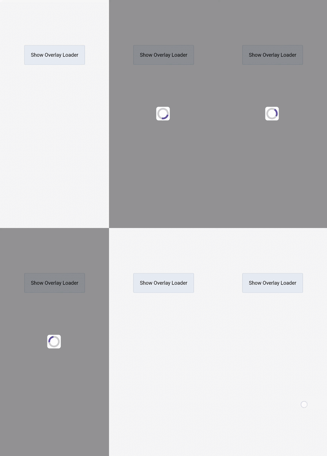
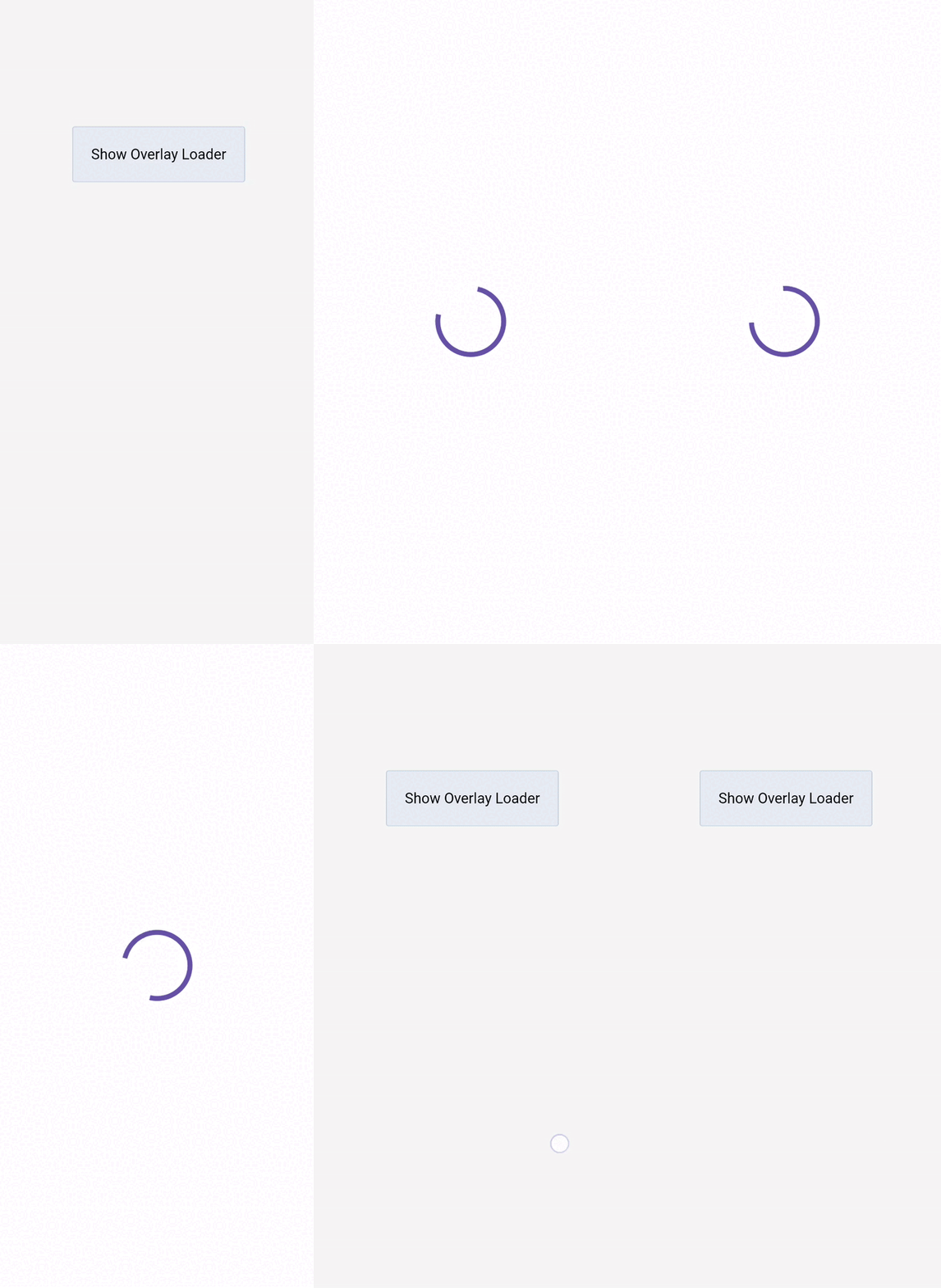
🚀Getting Started
Follow these steps to integrate TUIOverlayLoader into your FMX project.
Prerequisites
You must have the Skia4Delphi library installed in your RAD Studio environment.
Integration
- Add the
FMX.UIOverlayLoader.pasunit to your project's search path. - Include the unit in the
usesclause of the form where you want to display the OverlayLoader. - Declare a
TUIOverlayLoaderobject variable in your form's private section. - In your form's
OnCreateevent, create an instance of the loader. Remember to free it in theOnDestroyevent. - Use the
SetOverloadingFormmethod to specify which form the overlay should cover. This is mandatory and must be called beforeShow.
Basic Usage
Here is a minimal example of how to use the component.
uses
  FMX.UIOverlayLoader;

type
  TMyForm = class(TForm)
    ButtonShow: TButton;
    procedure ButtonShowClick(Sender: TObject);
    procedure FormCreate(Sender: TObject);
    procedure FormDestroy(Sender: TObject);
  private
    { Private declarations }
    FLoader: TUIOverlayLoader;
  public
    { Public declarations }
  end;

//...

procedure TMyForm.FormCreate(Sender: TObject);
begin
  FLoader := TUIOverlayLoader.Create(Self);
  FLoader.SetOverloadingForm(Self);
end;

procedure TMyForm.FormDestroy(Sender: TObject);
begin
  FLoader.Free;
end;

procedure TMyForm.ButtonShowClick(Sender: TObject);
begin
  // Show the loader
  FLoader.Show;

  // Simulate a long-running task
  TTask.Run(procedure
    begin
      Sleep(3000);
      TThread.Synchronize(nil, procedure
      begin
        FLoader.Hide;
      end);
    end);
end;
🎨Customization & Examples
You can customize almost every visual aspect of the loader at runtime.
Change Colors and Opacity
Adjust the background and spinner colors to match your application's theme.
procedure TMyForm.FormCreate(Sender: TObject);
begin
  FLoader := TUIOverlayLoader.Create(Self);
  FLoader.SetOverloadingForm(Self);

  // Customize the overlay background
  FLoader.BackgroundColor := TAlphaColors.Lightgoldenrodyellow;
  FLoader.BackgroundOpacity := 0.5;

  // Customize the spinner colors (using a predefined model)
  FLoader.SpinnerType := TSpinnerType.stModel1;
  FLoader.SpinnerColor := TAlphaColors.Steelblue; // Affects the 'fill' attribute in the SVG
  FLoader.SpinnerStrokeColor := TAlphaColors.Red; // Affects the 'stroke' attribute in the SVG
end;
Use a Custom Size
Set SpinnerSize to ssCustom to define a specific width and height for the spinner. Otherwise, it will use the predefined dimensions (e.g., ssSmall is 48x48).
procedure TMyForm.FormCreate(Sender: TObject);
begin
  FLoader := TUIOverlayLoader.Create(Self);
  FLoader.SetOverloadingForm(Self);

  FLoader.SpinnerSize := TSpinnerSize.ssCustom;
  FLoader.SpinnerWidth := 100;
  FLoader.SpinnerHeight := 100;
end;
Load a Custom SVG Spinner
Use the LoadFromFile method to replace the default spinner with your own SVG icon.
procedure TMyForm.FormCreate(Sender: TObject);
begin
  FLoader := TUIOverlayLoader.Create(Self);
  FLoader.SetOverloadingForm(Self);

  // This will automatically set SpinnerType to stCustom
  FLoader.LoadFromFile('\Path\To\Your\custom-spinner.svg');

  // You can still customize its color
  FLoader.SpinnerColor := TAlphaColors.Orange;
end;
Customize the Spinner's Background
You can add a background with rounded corners directly behind the spinner for better visibility.
procedure TMyForm.FormCreate(Sender: TObject);
begin
  FLoader := TUIOverlayLoader.Create(Self);
  FLoader.SetOverloadingForm(Self);

  FLoader.SpinnerBackgroundColor := TAlphaColors.White;
  FLoader.SpinnerBackgroundOpacity := 0.8;
  FLoader.SpinnerBackgroundRadius := 16; // Corner radius
end;
Adjust Animation
Change the animation's interpolation type and duration (velocity).
procedure TMyForm.FormCreate(Sender: TObject);
begin
  FLoader := TUIOverlayLoader.Create(Self);
  FLoader.SetOverloadingForm(Self);

  // Make the animation faster (lower duration = faster)
  FLoader.SpinnerVelocity := 0.5; // 0.5 seconds per 360-degree rotation

  // Change the animation curve
  FLoader.SpinnerMotion := TSpinnerMotion.Bounce;
end;
📚API Reference
Properties
| Property | Type | Description |
|---|---|---|
| BackgroundColor | TAlphaColor |
Sets the color of the full-screen overlay background. |
| BackgroundOpacity | Single |
Sets the opacity of the overlay background (0.0 to 1.0). |
| SpinnerColor | TAlphaColor |
Sets the primary color of the SVG spinner by replacing its fill attribute. |
| SpinnerStrokeColor | TAlphaColor |
Sets the stroke color of the SVG spinner by replacing its stroke attribute. |
| SpinnerOpacity | Single |
Sets the opacity of the spinner icon (0.0 to 1.0). |
| SpinnerType | TSpinnerType |
Sets the spinner style. Options are stModel1, stModel2, or stCustom. Loading a file automatically sets this to stCustom. |
| SpinnerSize | TSpinnerSize |
Sets a predefined size for the spinner (ssSmall=48, ssMedium=64, ssBig=128). Use ssCustom to set width/height manually. |
| SpinnerWidth | Single |
Sets the spinner's width. Only has an effect if SpinnerSize is ssCustom. |
| SpinnerHeight | Single |
Sets the spinner's height. Only has an effect if SpinnerSize is ssCustom. |
| SpinnerBackgroundColor | TAlphaColor |
Sets the color of the small background rectangle directly behind the spinner. |
| SpinnerBackgroundOpacity | Single |
Sets the opacity of the spinner's background rectangle. |
| SpinnerBackgroundRadius | Single |
Sets the corner radius for the spinner's background rectangle. |
| SpinnerVelocity | Single |
The duration (in seconds) of one full 360-degree rotation. A smaller value means a faster spinner. Default is 0.9. |
| SpinnerMotion | TSpinnerMotion |
The type of animation interpolation (e.g., Linear, Cubic, Bounce, Elastic). |
| ControlType | TControlType |
Determines rendering mode. Use Platform to ensure the Loader is correctly displayed on top of native controls, resolving Z-order issues. |
Methods
| Method | Description |
|---|---|
| Show; | Displays the overlay on the form specified with SetOverloadingForm. Does nothing if the overlay is already visible or if the target form has not been set. |
| Hide; | Hides the overlay. |
| SetOverloadingForm(AParent); | Sets the parent control (usually a TForm) that the overlay will cover. Must be called before Show. |
| LoadFromFile(AFileSVGName); | Loads a custom SVG file to be used as the spinner. This automatically sets the SpinnerType to stCustom. |
| IsShowing: Boolean; | Returns True if the overlay is currently visible, False otherwise. |