

CssStyledControls

Lazarus CSS styled controls
- Active · last change 11-1-2026
- ★ 9 on GitHub
README
CssStyledControls
A set of visual controls for Lazarus / Free Pascal (LCL) that are fully stylable with CSS and support HTML formatting for their text content.
The library brings a modern, web-like approach to desktop GUI development: instead of tweaking dozens of properties by hand, you describe the look of every control in a single CSS file — complete with selectors, pseudo-classes, cascading, specificity, CSS variants (themes), gradients, box shadows, and inline styles. A built-in TCssProxy component can even push the same theme onto standard LCL controls (TForm, TButton, TEdit, TLabel, TPanel).
[!WARNING] Work in progress. The library is under active development. Some controls may not yet be fully functional, and parts of this documentation may be incomplete or out of date. APIs and behavior can change without notice.
[!WARNING] Compatibility note. The library and demo were developed and tested only in Unleashed Pascal and Lazarus stable. Functionality in other versions of FreePascal / Lazarus is not guaranteed.
Table of Contents
- Features
- Screenshots
- Installation
- Quick Start
- Demo Project
- Included Controls
- CSS Overview
- General CSS Properties
- Per-Control CSS Properties
- SVG Image Lists (TCssSvgImgList)
- Menus (TCssMainMenu, TCssPopupMenu)
- Tabs (TCssTabControl, TCssPageControl)
- Tree Icons (TCssVirtualStringTree)
- Progress Bars (TCssProgressBar)
- Themes (Light and Dark)
- HTML Formatting
- Link Handling
- Tooltips with CSS and HTML
- Message Dialogs (CssMessageDialogs)
- Style Provider API
- Proxy Styling for Standard LCL Controls
- High DPI Support
- Native Form Title Bar (Windows)
- Design-Time Support
- Example Theme
- License
Features
- Full CSS styling — every control reads its appearance from CSS rules: background, gradients, borders, per-corner radii, padding, fonts, colors, alignment, opacity, text shadows, box shadows, cursors, and more.
- CSS selectors — match by class name,
CssTag,CssID,CssClass, pseudo-classes and combinators. - Pseudo-classes —
:hover,:active,:focus,:focus-visible,:enabled,:disabled,:checked,:unchecked,:default,:cancel. - Cascading and specificity — later rules and more specific rules win, exactly like in the browser.
- Themes / variants — a single CSS file can contain several
@variant <name> { ... }blocks (e.g.lightanddark), switchable at runtime throughTCssStyleProvider. - Gradients —
linear-gradient(...)andradial-gradient(...)with angles (deg,grad,rad,turn,to …) and color stops. - Box shadows —
box-shadow: <dx> <dy> <blur> <spread> <color>on any control. - Per-corner radii —
border-radiusaccepts 1–4 values (TL TR BR BL). - HTML text rendering —
HtmlModerenders captions, list items, menu items, tree cells, and hints as HTML with inline styles, lists, headings, code blocks, links, etc. - Clickable links —
<a href="...">inside HTML content raisesOnLinkClick, changes the cursor, and supportsa,a:hover,a:activeCSS rules. - CSS-styled tooltips — tooltips can be styled with the
::hintselector and rendered as HTML. - Windows 11-style switches — set
checkbox-style: toggle/radio-style: toggleon a checkbox / radio button (or on atoggleclass) to render them as pill switches with an animated thumb. A third synonym,custom, reuses the same toggle renderer but tunes the thumb inset independently throughtoggle-thumb-inset. - SVG check / radio icons —
TCssCheckBox,TCssRadioButton,TCssCheckGroup, andTCssRadioGroupaccept aTCssSvgImgListand draw per-state icons for every combination of checked / hovered / focused / disabled. When a dedicated disabled icon is not provided, the enabled artwork is desaturated and re-tinted to match the CSS:disabledtext colour, exactly likeTCssBitBtn. - Tree icons from SVG —
TCssVirtualStringTreeaccepts aTCssSvgImgListand requests a per-cell icon throughOnGetImageIndex, with DPI-aware sizing, per-theme variants, and automaticcurrentColortinting. - Nested child styling — composite controls (
TCssComboBox,TCssCheckGroup,TCssRadioGroup,TCssListBox,TCssVirtualStringTree, tabs) expose*CssClass/*CssStyleproperties so you can style their internal children too. - Focus-within — a parent (
TCssPanel,TCssGroupBox,TCssCheckGroup,TCssRadioGroup,TCssComboBox,TCssTabControl,TCssPageControl) can highlight its border while a child has focus (focus-within: true). - Standard LCL styling —
TCssProxyreads the active CSS variant and appliesbackground,color,font-*, andtext-alignto plain LCLTButton,TEdit,TLabel,TPanel, and forms. - Anti-aliased rendering — rounded boxes, circles, triangles, check marks, and focus rings are drawn with sub-pixel coverage and cached bitmaps. SVG icons from
TCssSvgImgListare rendered at up to 4× the requested size and box-filtered down with premultiplied alpha, so small icons keep clean diagonal edges. - Animated progress bars —
TCssProgressBarsupports horizontal and vertical orientation, a determinate mode with smooth (eased) transitions whenPositionchanges, an indeterminate pulse mode (pbMarquee) whose amplitude tracks the currentPosition, three semantic states (normal / error / paused) selectable through CSS colors, and an optional percentage text that automatically switches its color depending on whether it currently sits over the fill or over the track. - CSS-styled message dialogs — the
CssMessageDialogsunit replacesShowMessage,MessageDlg,MessageBox,InputBox,InputQuery, andPasswordBoxwith dialogs built entirely fromTCssStyledControldescendants, skinned by the same theme and honouring HTML text. Dialog messages may carry clickable<a href="…">links, handled through a global or per-dialog callback, and the icon shown next to the message can be taken from a sharedTCssSvgImgListinstead of the built-in shapes. - No external dependencies — pure LCL, works on Windows, Linux, and macOS.
Screenshots
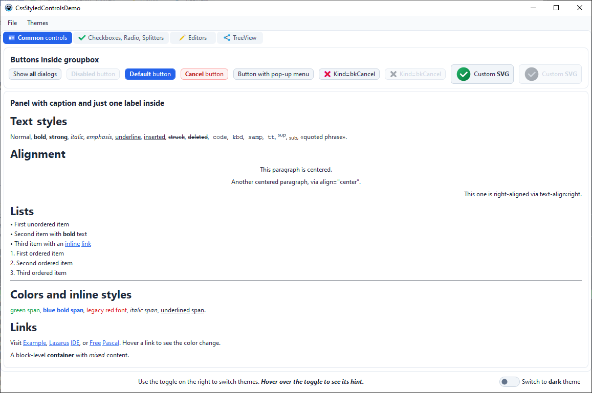
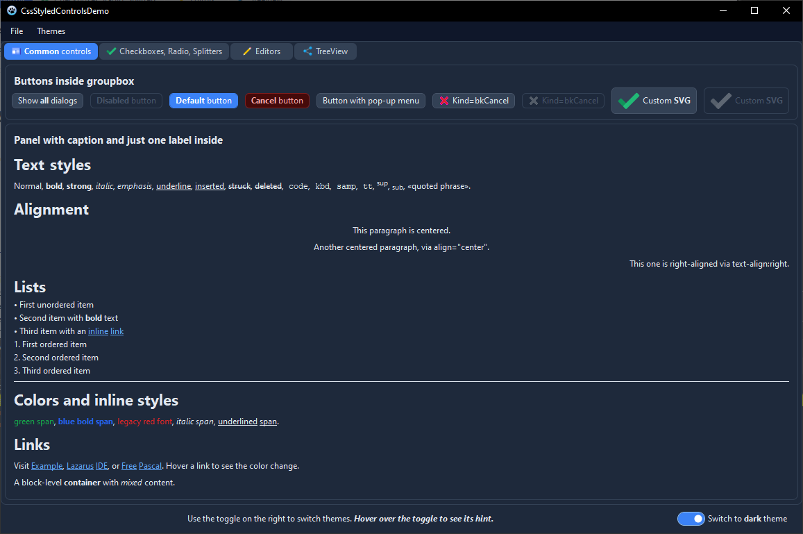
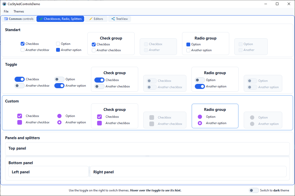
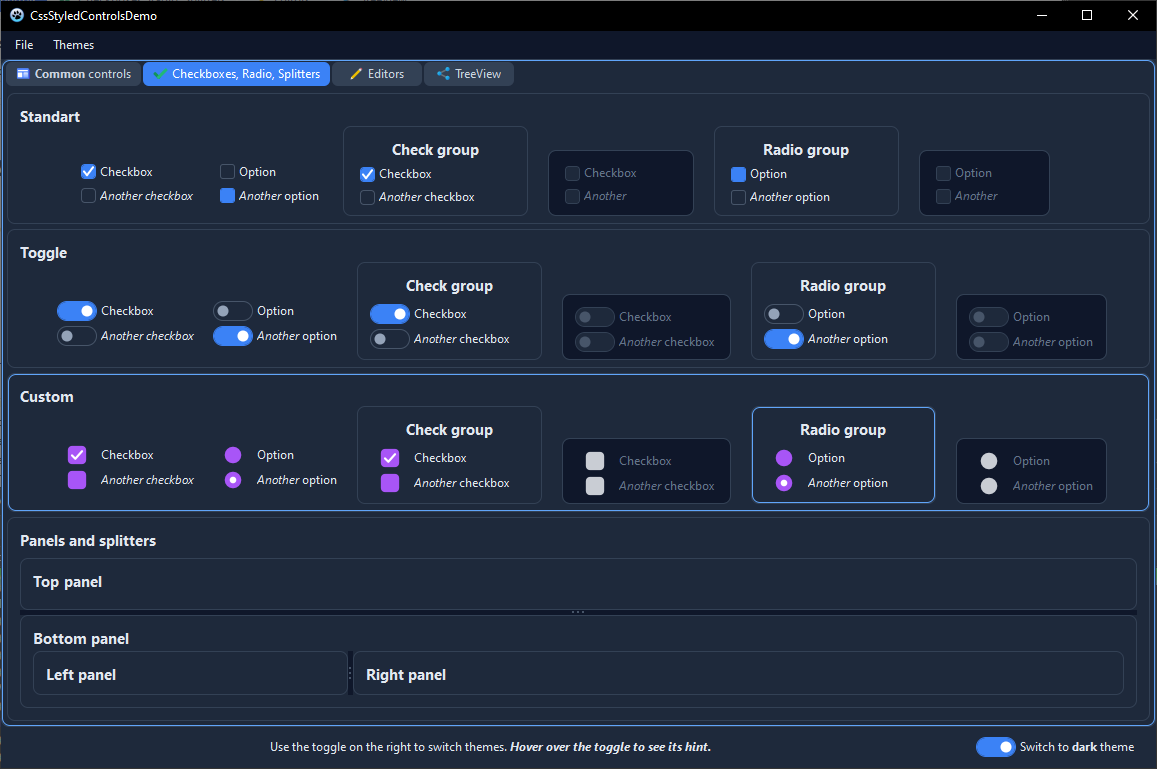
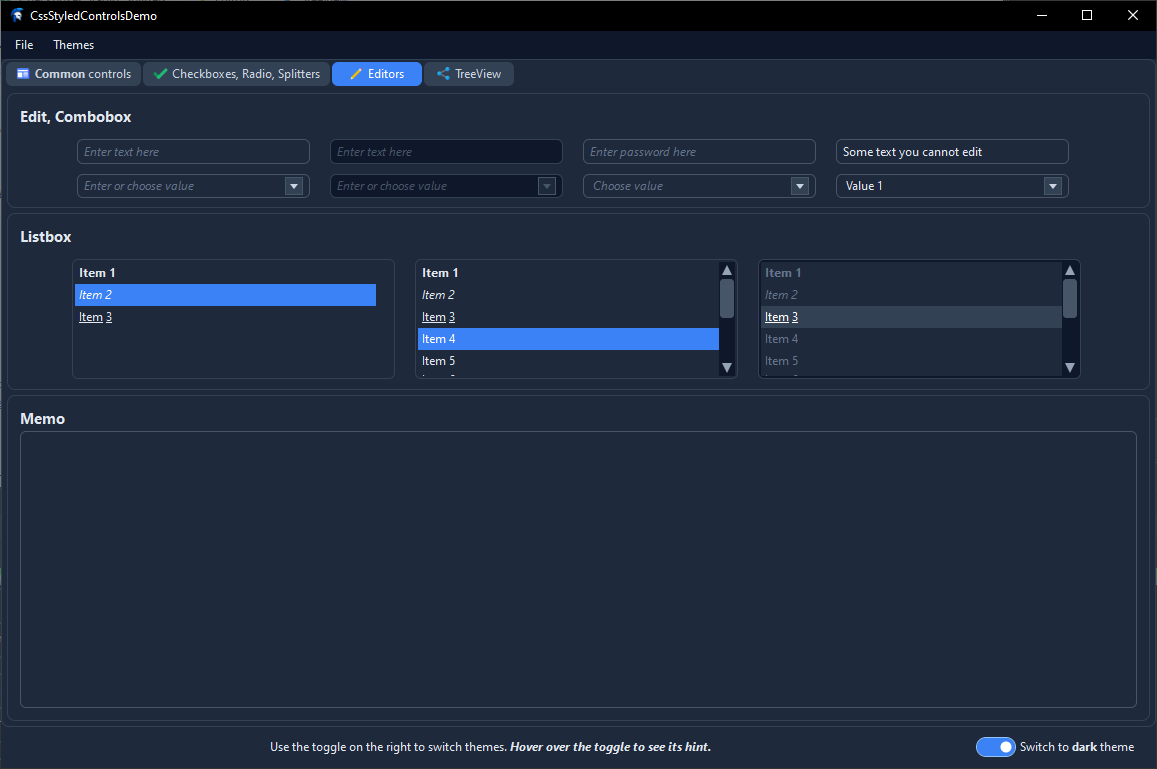
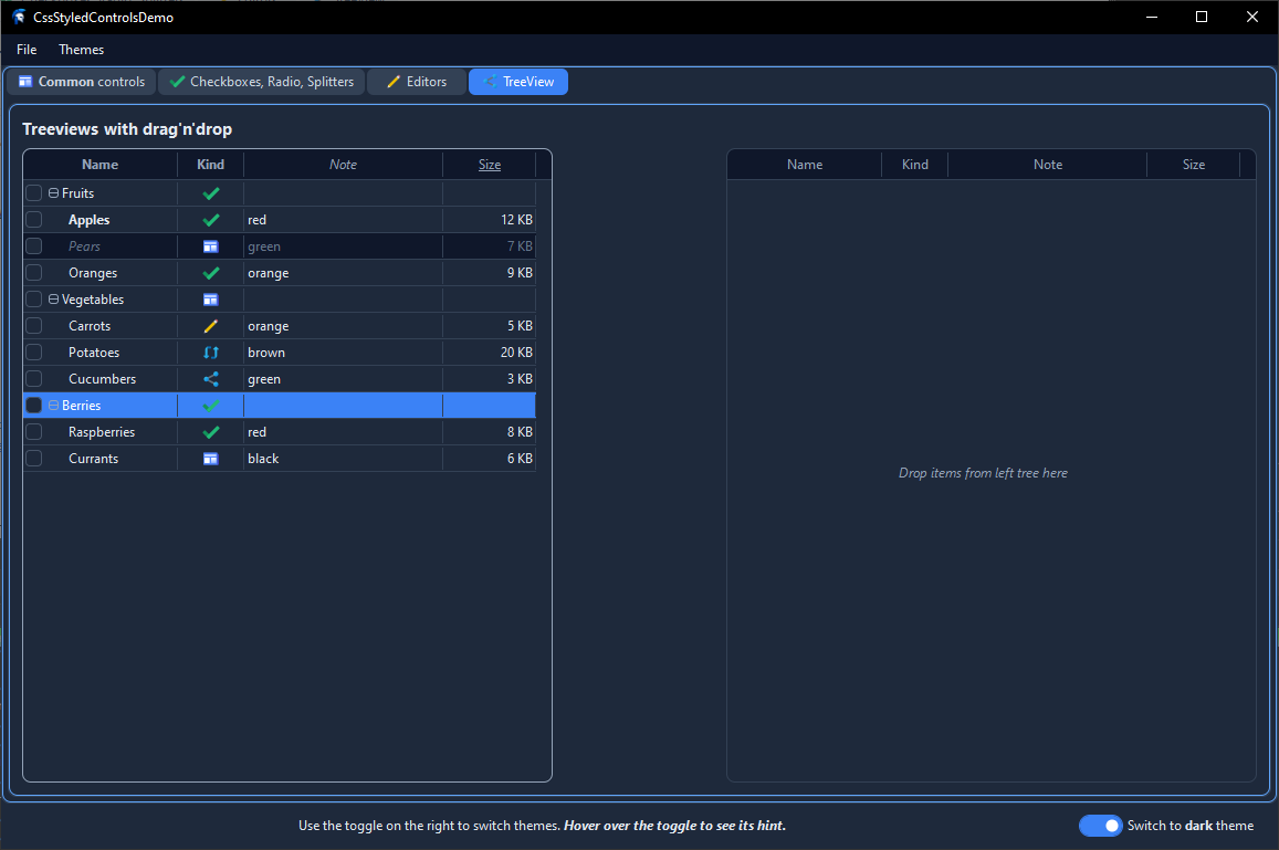
Each tab of the demo project is shown in both variants of the bundled
ModernTheme.css — light and dark. In every pair the two screenshots
come from the same running form, switched at runtime by the toggle in the
status bar; only the active @variant changes.
Common controls
Buttons, TCssBitBtns with built-in and custom SVG glyphs, an HTML label,
and a TCssPopupMenu.
| Light | Dark |
|---|---|
 |
 |
Checkboxes, Radio, Splitters
Standard checkboxes and radio buttons, Windows 11-style switches
(.toggle and .custom), check / radio groups with focus-within,
per-state SVG icons on every control and every group item, and a set
of panels separated by splitters.
| Light | Dark |
|---|---|
 |
 |
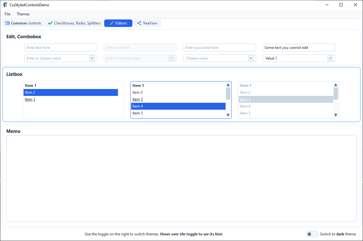
Editors
TCssEdit (plain, disabled, password, read-only), TCssComboBox in
all four supported states, TCssListBox, and TCssMemo.
| Light | Dark |
|---|---|
 |
 |
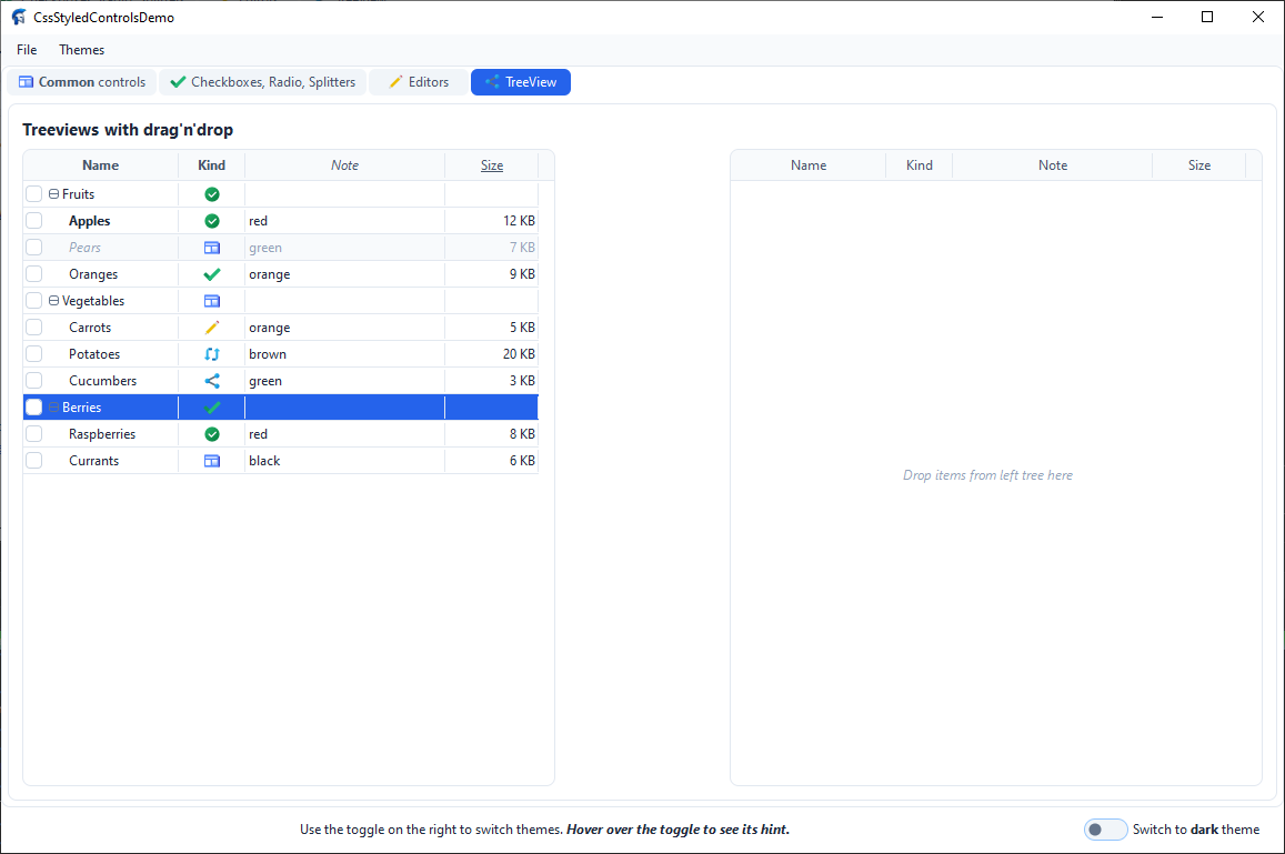
TreeView
Two TCssVirtualStringTrees with columns, per-cell SVG icons, checkboxes,
inline editing, and drag & drop between the trees.
| Light | Dark |
|---|---|
 |
 |
Message dialogs
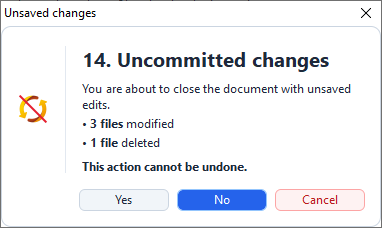
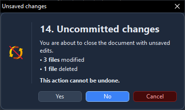
Dialogs built by TCssMessageDialogs inherit the same TCssStyleProvider as the rest of the form, so switching the theme restyles them together with the main window — no per-dialog configuration is needed. The pair below shows the same confirmation dialog in both variants; two more dialog examples appear in the Message Dialogs section below.
| Light | Dark |
|---|---|
 |
 |
Progress bar
Determinate and indeterminate TCssProgressBars in both orientations,
with ShowText on and off, and one bar per semantic state — normal,
error, paused — so the three fill colors from the active theme are
visible side by side.
| Light | Dark |
|---|---|
ListView
Report view with columns, SVG icons, checkboxes, sorting and inline
editing, plus list, small-icon and icon views. The report view shows the
focus rectangle around the current cell (ShowItemFocusRect), and the
lower views use spatial arrow-key navigation between their visual columns.
| Light | Dark |
|---|---|
Installation
-
Clone the repository:
git clone https://github.com/avavdoshin/CssStyledControls.git -
Open the runtime package
Packages/CssStyledControls.lpkin Lazarus (Package → Open Package File…). -
Click Compile, then Use → Install.
-
Open the design-time package
Packages/CssStyledControlsDesign.lpkand install it too. It adds:- a multi-line CSS editor for
TCssStyleProvider.CssText, - a file picker for
TCssStyleProvider.FileName, - a component editor with an
Edit CSS…verb onTCssStyleProvider, - a page editor (
New Page,Delete Page,Next Page,Previous Page) onTCssPageControl, - a visual menu designer for
TCssMainMenu/TCssPopupMenu, - a Columns Editor for
TCssVirtualStringTree.Columns, - a shortcut picker (with ~150 common shortcuts) for
TCssMenuItem.Shortcut.
- a multi-line CSS editor for
-
The component palette gets a new tab
CSSStyledControls:TCssStyleProvider,TCssProxy,TCssButton,TCssBitBtn,TCssCheckBox,TCssCheckGroup,TCssComboBox,TCssEdit,TCssGroupBox,TCssLabel,TCssListBox,TCssMemo,TCssMainMenu,TCssPopupMenu,TCssPanel,TCssProgressBar,TCssRadioButton,TCssRadioGroup,TCssScrollBar,TCssSplitter,TCssVirtualStringTree,TCssPageControl,TCssTabControl,TCssTabSheet.TCssMenuItemis not shown on the palette: it is created and edited only through the visual menu designer.
Quick Start
-
Drop a
TCssStyleProvideronto a form (or a data module). -
Fill its
CssTextproperty (or setFileNameto a.cssfile), for example:TCssButton { background-color: #2563EB; color: #FFFFFF; border: 1px solid #2563EB; border-radius: 6px; padding: 6px 14px; text-align: center; vertical-align: middle; } TCssButton:hover { background-color: #1D4ED8; } TCssButton:active { background-color: #1E40AF; } TCssButton:disabled { background-color: #F1F5F9; color: #94A3B8; border-color: #E2E8F0; } -
Drop a
TCssButton(or any otherTCss*control) onto the same form and assign itsStyleProviderproperty to the provider created in step 1. Every control that references the provider is automatically restyled whenever the CSS text changes. -
(Optional) Set
HtmlMode := Trueon a control and use HTML in itsCaption:<b>Save</b> <span style="color:#f00">now</span> -
(Optional) For a light/dark theme, wrap your rules in
@variantblocks:@variant light { TCssButton { background-color: #F1F5F9; color: #1E293B; } } @variant dark { TCssButton { background-color: #334155; color: #E2E8F0; } }and toggle it in code:
CssStyleProvider1.DefaultStyleName := 'dark'; -
(Optional) For a button with an icon, use
TCssBitBtn:CssBitBtn1.Kind := bkOK; // built-in "OK" icon + label CssBitBtn1.Layout := ... // set through CSS insteadTCssBitBtn { glyph-layout: left; glyph-spacing: 6px; glyph-margin: auto; }
Demo Project
A ready-to-run demonstration lives in the Demo folder:
Demo/CssStyledControlsDemo.lpr
Demo/Unit1.pas
Demo/Unit1.lfmOpen CssStyledControlsDemo.lpi in Lazarus and press F9. The demo is
wired so that almost everything is driven by CSS and by events — Pascal
code is only used where a demo cannot avoid it (populating the tree,
switching the theme, copying nodes on cross-tree drops).
All application-wide configuration is performed once in the .lpr
file, right after Application.CreateForm and before
Application.Run:
Application.Initialize;
Application.CreateForm(TForm1, Form1);
TCssFormDarkTitle.EnableAutoAttach(Form1.CssStyleProvider1);
CssMessageDlgSetStyleProvider(Form1.CssStyleProvider1);
CssMessageDlgSetHtmlMode(True);
CssMessageDlgSetOnLinkClick(@Form1.OnLinkClick);
CssMessageDlgSetIconSource(Form1.CssSvgImgList1);
Application.Run;Keeping these calls in the .lpr — rather than in FormCreate —
guarantees they are already active on the very first frame, before any
form has had a chance to open. The main form itself only contains the
event handlers that are genuinely form-local: FormCreate for
populating the tree, CssCheckBox1Click for the theme toggle,
CssLabel2LinkClick and OnLinkClick for the link demo, and the
tree's own editing and drag-and-drop events.
The form is organised as a TCssPageControl with six tabs, plus a
bottom status panel and a top menu bar. All dialogs shown during the
demo are produced by the TCssMessageDialogs unit, so they are styled
by the same TCssStyleProvider that skins the main form — there is no
native LCL dialog anywhere on screen.
Page 1 — Common controls
-
A
TCssPageControlwhose tab strip is decorated with SVG icons. The page itself carries the icon (CssTabSheet1.ImageIndex = 1), so the tab automatically displays the second entry of the sharedCssSvgImgList1(icons8-news). The icon follows the tab text color in every state — plain, hovered, active — and switches to thedarkvariant of that entry together with the CSS theme. -
A
TCssGroupBoxcontaining severalTCssButtons (enabled, disabled, default, cancel, and one with aTCssPopupMenu). -
The first button in that group (
CssButton1, the one labelled Show all dialogs) opens a step-by-step demonstration of theTCssMessageDialogsunit. Its hint reads "Click to see all CssMessageDlg functions"; the handler walks through fourteen consecutive dialogs, one per click, closing each one to see the next:- Inline formatting (
,,<u>,<s>,<code>). - Inline colors via
and the legacy. - Headings
<h1>..<h3>with the icon centred against the first line of text. - Paragraphs, automatic word wrapping and explicit `
`.
- Ordered and unordered lists.
- Preformatted code in
<pre>, preserving spaces and#10. combined withandalign="right".- Subscript, superscript and
<q>inline quotes. - Hyperlink styling for
<a href="...">.
- A confirmation dialog mixing a heading, a list and a colored
warning paragraph, with
mbNoas the safe default. - A long wrapped HTML paragraph with mixed inline runs.
- A release-notes style combination ending with a centred `` and an italic footer.
- An HTML prompt rendered through
CssInputBox, showing that the same parser drives the input-dialog caption as well. - A confirmation dialog that mirrors #10 but uses a custom SVG
icon through
CssMessageDlgIcon. The icon comes from index 22 of the sharedCssSvgImgList1— theicons8-not-syncedartwork — and is drawn in place of the built-in warning triangle. This demonstrates that an arbitrary entry of the icon list can be shown in a dialog without redefining the global source.
Every dialog in this sequence is built from the same styled controls as the rest of the library: a
TCssPanelbackdrop withborder-radius, aTCssMessageIcon, aTCssLabelwithHtmlMode, a one-pixel divider, andTCssButtons that inherit:defaultand:cancelfrom the theme. Dialog #14 additionally exercises the per-call SVG override (CssMessageDlgIcon(..., 22, ...)), which needs the application-wide icon source to be configured once — the demo does this inFormCreatewithCssMessageDlgSetIconSource(CssSvgImgList1).When the theme is switched from light to dark, the whole sequence is restyled automatically — no per-dialog configuration is required. Icons from the shared list are re-rasterised with the new
currentColor, and any entry that defines adarkvariant is swapped to that variant together with the rest of the dialog.HTML mode is turned on for the duration of the sequence with
CssMessageDlgSetHtmlMode(True)and turned off in afinallyblock, so the rest of the application keeps interpreting<and>as ordinary characters. - Inline formatting (
-
Four
TCssBitBtncontrols next to those buttons, covering every glyph source the control supports:Kind = bkCancelwith a custom caption (UseKindCaption = False) — a built-in vector icon paired with a user-supplied label.- the same
Kind = bkCancel, butEnabled = False— the same glyph is rendered in its muted disabled variant, in tone with the disabled caption. - a custom SVG glyph (
SvgImages = CssSvgImgList1,ImageIndex = 0) — a 32×32 vector icon rasterised at the current DPI and drawn next to an HTML caption (Custom SVG,HtmlMode = True). - the same SVG glyph with
Enabled = False— the rasteriser desaturates the RGBA image in place (transparent pixels stay transparent, anti-aliased edges are preserved) and re-tints it to match the disabled text color, so no box appears behind the icon.
-
A non-visual
TCssSvgImgList(CssSvgImgList1) holding the SVG sources for the whole demo. It is configured at32 × 32design-time size withScaled = True, so every icon is always rendered at the current DPI, and ships with seven 48×48 general-purpose icons, sixteen 24×24 state icons for the checkbox and radio demos, and one additional message-dialog icon:General icons (indices 0–5, used by buttons, tabs, menus, and trees):
icons8-ok— a gradient circle with a white checkmark. This entry has per-theme variants: its baseSvgis the light artwork, and itsVariantslist carries an alternativedarkbody with a muted green gradient.icons8-news— a blue newspaper-style icon, used by the tab strip.icons8-edit— a pencil-on-paper icon, used byMenuItem1in the popup menu.icons8-done,icons8-refresh,icons8-share— additional entries used by the two trees on the TreeView tab.
Checkbox state icons (indices 6–13, used by the Custom panel on the Checkboxes, Radio, Splitters tab):
check_unchecked— plain rounded square.check_checked— square with a white checkmark.check_unchecked_hover/check_checked_hover— same two shapes in the darker hover tint.check_unchecked_focused/check_checked_focused— same two shapes wrapped in the focus ring.check_unchecked_disabled/check_checked_disabled— muted grey variants for the:disabledstate.
Radio state icons (indices 14–21, used by the same Custom panel):
radio_unchecked,radio_checked,radio_unchecked_hover,radio_checked_hover,radio_unchecked_focus,radio_checked_focus,radio_unchecked_disabled,radio_checked_disabled— the eight circle-based counterparts of the checkbox set, keeping the same state coverage (normal, hover, focus, disabled).
The state icons are all pure-
fillSVG (nostroke) with integer coordinates, so they rasterise cleanly at every DPI without the smearing that thin strokes would produce at 22-pixel sizes.Message-dialog icon (index 22, used by scenario #14 on Page 1):
icons8-not-synced— a red "no sync" glyph exported from Illustrator. The file wraps two full-canvas background rectangles in<g>groups markedstyle="display:none;". The SVG parser skips those hidden subtrees together with their children, so the rasterised output contains only the visibleLayer_3and shows clean transparency on the dialog backdrop. This entry doubles as a live demonstration of the parser's hidden-group handling.
-
A
TCssPopupMenu(CssPopupMenu1) whose icons are sourced once at the menu level:CssPopupMenu1.SvgImages := CssSvgImgList1. Every item can then simply set its ownImageIndex—MenuItem1uses2(icons8-edit), andMenuItem2leaves it at-1, so the icon column is not reserved when no item in the menu has an icon. -
A
TCssPanelwith aTCssLabelwhoseCaptionis HTML demonstrating every supported tag: headings, bold / italic / underline / strike / code / kbd / samp / tt / sup / sub /<q>, alignment via bothalign="…"andstyle="text-align:…", ordered and unordered lists, inline colors, legacy ``, spans, and clickable<a>links.
Page 2 — Checkboxes, Radio, Splitters
The tab is organised as four TCssPanels stacked top-to-bottom, each
demonstrating one visual style, followed by a fifth panel that shows
the splitters.
- Standart panel — plain
TCssCheckBox/TCssRadioButtonwith the default box-and-check-mark renderer, and aTCssCheckGroup/TCssRadioGrouppair with the same style. Two more groups (CssCheckGroup3,CssRadioGroup3) are disabled and carry no caption, demonstrating how:disabledpropagates to the children. - Toggle panel — the same six controls, but every one has
CssClass = 'toggle'(standalone) orCheckBoxCssClass/RadioCssClass = 'toggle'(groups). This is the Windows 11-style pill switch, driven by the.togglerules in the theme. The disabled groups at the right show the muted palette in that style as well. - Custom panel — the visual counterpart of Toggle, but every
control draws its glyph from
CssSvgImgList1instead of the built-in renderer. The standalone checkboxes (CssCheckBox6,CssCheckBox7) and the checkbox groups (CssCheckGroup5,CssCheckGroup6) use indices 6–13; the standalone radios (CssRadioButton5,CssRadioButton6) and the radio groups (CssRadioGroup5,CssRadioGroup6) use indices 14–21. Every control wires all eight image indexes —ImageIndex,ImageIndexChecked,ImageIndexHover,ImageIndexCheckedHover,ImageIndexFocused,ImageIndexCheckedFocused,ImageIndexDisabled,ImageIndexCheckedDisabled— so hovering, focusing, and disabling each swap the glyph through the SVG list. The two disabled groups on the right use the same*Disabledindexes, so their artwork is muted without any per-control desaturation code. - Panels and splitters panel — one horizontal splitter between a
Top panel and a Bottom panel, and one vertical splitter between
a Left panel and a Right panel. The panels demonstrate
focus-within: trueand the hover border transition.
Because the Custom panel is driven entirely by TCssSvgImgList and
CSS classes, switching the active CSS variant from Light to Dark
also swaps the checkbox / radio glyphs to their per-theme variants when
the corresponding SVG entries define them — no Pascal code runs during
the switch.
Page 3 — Editors
- Four
TCssEditcontrols: normal, disabled, password (PasswordChar = '*',MaxLength = 10), and read-only (Captionpreset, all editing disabled). Every one uses theplaceholder-color/placeholder-font-styledeclarations from CSS to render a muted italic placeholder. - Four
TCssComboBoxcontrols covering both combo styles:ccsDropDown— editable, HTML items,Placeholder = 'Enter or choose value'.ccsDropDown(disabled) — same, with the muted palette from:disabled.ccsDropDownList— selection-only, ten items,Placeholder = 'Choose value'.ccsDropDownList(ReadOnly = True) — same, but the dropdown cannot be opened and the arrow keys do not change the selection.
- Three
TCssListBoxcontrols: a short list, a long list with a custom scrollbar (.listbox-scrollbar), and a disabled list with a pre-selected item to show the disabled selection colors. - A
TCssMemowithssAutoBothscrollbars and.memo-scrollbarstyling, filling the rest of the tab.
Page 4 — TreeView
- Two
TCssVirtualStringTrees (LeftTreeandRightTree) configured identically, so that any node can be dropped from one into the other. Each tree has:- four columns — Name, Kind, Note, Size — with HTML headers
(
Name,Note,<u>Size</u>), per-column alignment (CellHAlign = thaCenteron Kind,thaRighton Size), andLastColumnStretch = Trueso the Size column fills the remaining width. - per-cell SVG icons in the Kind column, sourced from
CssSvgImgList1throughOnGetImageIndex. The event returnsD^.Kindfor column 1 and-1for the others, so the icon column is reserved only where icons actually exist. - checkboxes (
ShowCheckboxes = True) with the.css-tree-checkbox .checkboxclass inherited from the baseTCssCheckBox. - inline editing (
AllowEditing = True).OnEditingblocks column 3 (Size) so the numeric column stays read-only;OnNewTextwrites the typed value back to the correct field based onColumn, and appliesPlainTextToHtmlonly to column 0. - drag & drop (
AllowDrag = True,AllowDrop = True). Dropping a node (or a multi-selection) onto another tree creates a full copy of the subtree in the target and deletes the original from the source, preservingcvsChecked,cvsExpanded, andcvsDisabledstates.OnDragOverNodesprevents dropping on a disabled node, and rejects dragging disabled nodes at all. - a placeholder shown when the tree is empty
(
Drop items from left tree here/…from right tree here).
- four columns — Name, Kind, Note, Size — with HTML headers
(
- The left tree is populated in
FormCreatewith three root groups (Fruits, Vegetables, Berries) and a mixture of HTML captions, notes, icon indexes, and sizes. One node (Pears) is disabled to demonstrate the muted palette for:disabledrows.
Page 5 — Bars
- Horizontal determinate panel — six
TCssProgressBars at 10%…60%, covering the three semantic states (pbsNormal,pbsPaused,pbsError) in both their enabled and disabled palettes. TheirHintnames the state, so hovering is enough to identify each bar. - Horizontal marquee panel — the same six state/disabled
combinations with
Style = pbMarquee, showing the animated indeterminate pulse whose amplitude followsPosition. - Vertical marquee panel — six vertical bars
(
Orientation = pbVertical) with the same state coverage. - Interactive panel — a smooth determinate bar, a marquee bar and
a bar with smooth transitions turned off, driven by the Increase /
Decrease buttons (
CssButton6/CssButton7). The buttons clamp the position between 0 and 100 and update all three bars at once, so the difference between eased and immediate updates is visible. - Vertical determinate panel — vertical bars at 10%, 50% and 100%, plus a 100% marquee bar and the paused/error variants at full position.
Page 6 — ListView
-
CssListView1demonstrates the report view (ViewStyle = lvsReport) with fourteen items and five columns: Name (300 px), Kind (110 px, centred), Note (360 px), Size (90 px, right-aligned) and Modified (220 px). It enablesCheckboxes,GridLines,HotTrack,RowSelect,MultiSelect,HideSelection = FalseandAutoSort = True. Every row carries an SVG icon fromCssSvgImgList1throughItem.ImageIndex; the icons are rasterised at 16×16 (SmallImages,SmallImageWidth/Height). -
Sorting — clicking the Kind header toggles ascending / descending order and paints the
sort-marker-colorarrow in the header. No Pascal sorting code is involved;AutoSortuses the control's built-in comparison. -
Inline editing — double-clicking a row starts the editor on column 0 (Name). The editor is styled by
.listview-edit; pressing Enter commits the text andOnEdited(CssListView1Edited) copies the new caption to the matching item in the other three views, which hold independent item objects. -
Keyboard navigation — Up/Down move the selection between rows, while Left/Right move the focused cell between columns without changing the selected row.
ShowItemFocusRect = Truedraws the dotted focus rectangle around the current cell, and clicking a cell also updates the focused column. -
HTML text —
CssListView1.HtmlMode = True, so the column headers and the Note cells render HTML: bold, italic, underline, and inline colors are visible in the report list. Sorting andAutoSizeColumnuse the plain text without the tags. -
Other view styles — three read-only
TCssListViews on the lower half of the page use the same data:CssListView2—lvsListwith a single 160 px column;CssListView3—lvsSmallIconwith 16×16 artwork;CssListView4—lvsIconwith 40×40 artwork (LargeImages,LargeImageWidth/Height).
Keyboard navigation in these views follows the visible layout: Up/Down move inside the current visual column and Left/Right move to the same row of the adjacent column, falling back to that column's last item when the row does not exist.
-
The embedded scrollbars use
.listview-scrollbar, and the inline editor uses.listview-edit. Both the embedded demo stylesheet andThemes/ModernTheme.cssdefine the light and dark variants ofTCssListView, so switching the theme restyles the header, rows, selection, grid lines, check marks and scrollbars without any code.
Status bar and menu
- A
TCssCheckBoxstyled as a Windows 11 switch (.toggleclass) that switches the whole application between the light and dark variants by settingCssStyleProvider1.DefaultStyleName. ItsHintis itself written in HTML —<h6>, `` and<li>render through the CSS-styled hint window. - A
TCssMainMenuwith File and Themes dropdowns. Switch theme (MenuItem5) toggles the same switch as the status bar, and the File menu carries a separator to show howmenu-separator-colorandmenu-separator-heightare applied. - A
TCssProxythat applies the same theme to the plainTForm.
The relevant demo handlers are tiny:
procedure TForm1.CssCheckBox1Click(Sender : TObject);
begin
if CssCheckBox1.Checked then
CssStyleProvider1.DefaultStyleName := 'Dark'
else
CssStyleProvider1.DefaultStyleName := 'Light';
end;
procedure TForm1.CssLabel2LinkClick(Sender : TObject;
const AHref, AText : UnicodeString);
begin
CssMessageBox('Link clicked',
'Href=' + AHref + ' , Text=' + AText,
MB_YESNOCANCEL or MB_ICONINFORMATION);
end;
procedure TForm1.LeftTreeNewText(Sender : TObject; Node : TCssVirtualNode;
Column : Integer; const NewText : string);
var
D: PNodeData;
Tree: TCssVirtualStringTree;
begin
if not Assigned(Node.Data) then Exit;
D := PNodeData(Node.Data);
Tree := TCssVirtualStringTree(Sender);
case Column of
0: D^.Caption := Tree.PlainTextToHtml(NewText);
2: D^.Note := Tree.PlainTextToHtml(NewText);
3: D^.Size := StrToIntDef(Trim(NewText), D^.Size);
end;
end;
procedure TForm1.LeftTreeDropNodesEx(Sender : TObject;
SourceTree : TCssVirtualStringTree; Nodes : TList;
TargetNode : TCssVirtualNode);
begin
// Cross-tree drop: copy every node into the target, then delete the
// originals from the source. Same-tree drops fall back to the built-in
// MoveNodes.
end;Note the second handler: clicking an <a> inside the HTML label now
opens a CssMessageBox from TCssMessageDialogs, so even the
"reference to a link" popup is skinned by the same theme and inherits
the MB_ICONINFORMATION glyph from the CSS-aware dialog engine. The
Dialogs unit is still present in the uses clause, but only for the
mrYes / mrNo / mrCancel result constants — none of the standard
ShowMessage / MessageDlg / MessageBox functions are called from
the demo.
The dialog engine used by Page 1's Show all dialogs button is
configured once, in the .lpr file, right after the main form is
created:
Application.Initialize;
Application.CreateForm(TForm1, Form1);
TCssFormDarkTitle.EnableAutoAttach(Form1.CssStyleProvider1);
CssMessageDlgSetStyleProvider(Form1.CssStyleProvider1);
CssMessageDlgSetHtmlMode(True);
CssMessageDlgSetOnLinkClick(@Form1.OnLinkClick);
CssMessageDlgSetIconSource(Form1.CssSvgImgList1);
Application.Run;Four of these calls configure the dialog engine for the whole application at once:
CssMessageDlgSetStyleProviderbinds the sameTCssStyleProviderthe main form uses, so a dialog is skinned by the same theme.CssMessageDlgSetHtmlModeturns on the HTML parser for the message text and for the input prompt.CssMessageDlgSetOnLinkClickinstallsTForm1.OnLinkClickas the global handler for<a href="...">links, so a click in any dialog is routed through the same method as a click in the on-form label.CssMessageDlgSetIconSourceregisters the sharedCssSvgImgList1as the source for the dialog icons. This is what makesCssMessageDlgIcon('...', ..., 22, ...)in scenario #14 show theicons8-not-syncedartwork; without it, the call would silently fall back to the built-in shapes.
TCssFormDarkTitle.EnableAutoAttach is a separate concern — it makes
every form that becomes visible follow the same CSS theme on its native
Windows title bar. See Native Form Title Bar
above.
Switching the toggle changes the CSS theme and every SVG icon at the
same time — the tab-strip icon, both TCssBitBtn glyphs, the popup menu
item icon, and every cell icon in both trees all move to their dark
variants in one step, without a single line of code in the form.
Included Controls
| Control | Description |
|---|---|
TCssStyledControl |
Base class of all CSS-styled controls. Contains the CSS engine, the HTML parser, and the AA renderer. |
TCssStyleProvider |
Non-visual component that holds CSS text and pushes it to controls. |
TCssSvgImgList |
Non-visual component that stores images in native SVG format, optionally with per-theme variants (dark, light, …), and renders them on demand with HiDPI and anti-aliasing. Drop-in replacement for TImageList when vector icons are preferred. |
TCssProxy |
Non-visual component that applies the active CSS variant to plain LCL controls (TForm, TButton, TEdit, TLabel, TPanel). |
TCssButton |
Push button with Default, Cancel, ModalResult, and :default / :cancel pseudo-classes. |
TCssBitBtn |
Button with a glyph (icon) next to the caption. Supports standard TBitBtn.Kind icons, custom bitmaps (Glyph + NumGlyphs), TImageList, TCssSvgImgList, per-state image indexes (ImageIndexDisabled / Pressed / Focused), HiDPI-aware rendering, and CSS-driven icon layout. |
TCssCheckBox |
Tri-state check box with an optional Windows 11-style switch appearance. |
TCssCheckGroup |
Group of check boxes laid out in columns, with per-item state. |
TCssRadioButton |
Radio button with an optional Windows 11-style switch appearance. |
TCssRadioGroup |
Group of radio buttons laid out in columns. |
TCssComboBox |
Dropdown combo box (ccsDropDown, ccsDropDownList). |
TCssEdit |
Single-line editor with selection, clipboard, undo, placeholder styles. |
TCssMemo |
Multi-line editor with word-wrap, scrollbars, selection, clipboard, colored caret and placeholder. |
TCssLabel |
Label with FocusControl, ShowAccelChar, Transparent. |
TCssListBox |
List box with multi-select, hover, per-item colors, custom scrollbar. |
TCssListView |
List view with report / list / small icon / icon styles, columns, sub-items, checkboxes, SVG images, sorting, inline editing, multi-select, and custom scrollbars. |
TCssPanel |
Container panel with focus-within support. |
TCssProgressBar |
Progress bar with horizontal / vertical orientation, a determinate mode with eased position transitions, an indeterminate pulse mode, and three semantic states (normal / error / paused). |
TCssGroupBox |
Group box with caption on the border and focus-within support. |
TCssScrollBar |
Custom scrollbar (can be drawn standalone or inside another control). |
TCssSplitter |
Splitter with grip, live/ghost preview, and adjacent-control highlighting. |
TCssMainMenu |
Menu bar with dropdowns. |
TCssPopupMenu |
Popup menu component (non-visual) with Popup / AutoPopup. |
TCssMenuItem |
Single menu item. Hidden from the palette; edited by the visual menu designer. |
TCssTabControl |
Tab strip without pages, with optional overflow scroll buttons. |
TCssPageControl |
Tab control with pages (TCssTabSheet). |
TCssTabSheet |
A single page of a TCssPageControl. |
TCssVirtualStringTree |
Virtual tree view with columns, checkboxes, SVG cell icons, editing, sorting, drag & drop, per-cell alignment, lazy loading, and incremental search. |
| --- |
CSS Overview
Where the CSS Lives
There are three ways to give a control its CSS rules, applied in this order (later sources override earlier ones):
TCssStyleProvider— the recommended way for an application-wide theme. Assign the provider to a control'sStyleProviderproperty.StyleName— selects a specific variant inside the provider. If empty, the provider'sDefaultStyleNameis used.CssStyle— inline declarations applied after everything else. Equivalent to the HTMLstyle="..."attribute.
Additionally, CssTag, CssID, and CssClass define how the control is matched by selectors.
Selectors
A selector is a chain of simple selectors. The engine parses the last simple selector in the chain (descendant/child combinators are accepted but only the rightmost part is matched, like in simplified CSS).
Supported simple selector components:
| Syntax | Matches |
|---|---|
* |
Any control. |
Name |
The control's class name (TCssButton), CssTag, 'control', or 'TCssStyledControl'. |
#id |
CssID. |
.class |
One of the classes in CssClass (space-separated list, several allowed). |
:pseudo |
A pseudo-class (see below). |
a, a:hover, a:active |
Rules for HTML links inside HtmlMode text. |
::hint |
Rules for the control's tooltip. |
Example:
TCssButton { /* by class name */ }
button.primary { /* by tag + class */ }
#saveButton { /* by id */ }
TCssButton:hover { /* pseudo-class */ }
a { /* html link */ }
a:hover { /* hovered link */ }
::hint { /* tooltip */ }
.toggle { /* class selector */ }Pseudo-Classes
| Pseudo-class | Active when… |
|---|---|
:hover |
The mouse is over the control. |
:active |
The left mouse button is pressed on the control. |
:focus |
The control has focus. |
:focus-visible |
Same as :focus. |
:enabled |
Enabled = True. |
:disabled |
Enabled = False. |
:checked |
Checked = True. |
:unchecked |
Checked = False. |
:default |
(TCssButton only) Default = True. |
:cancel |
(TCssButton only) Cancel = True. |
Specificity and Cascade
Rules are sorted by a simplified specificity tuple, then by source order:
- A — number of
#idparts (0or1). - B — number of
.classand:pseudoparts. - C —
1if a type/tag name was present, else0.
If everything is equal, rules that appear later in the CSS text win. Inline styles (CssStyle) are applied last of all.
Themes (Variants)
A single CSS text may contain several named variants. Each variant starts with a marker:
@variant light
{
TCssButton { background-color: #2563EB; color: #FFFFFF; }
}
@variant dark
{
TCssButton { background-color: #3B82F6; color: #FFFFFF; }
}The alternative bracket syntax is also accepted:
[light]
TCssButton { /* ... */ }
[dark]
TCssButton { /* ... */ }Everything between one @variant marker and the next belongs to that variant. Rules placed before the first marker belong to DefaultStyleName.
At runtime, choose the theme by setting the provider's DefaultStyleName or a control's StyleName:
CssStyleProvider1.DefaultStyleName := 'dark';
// or per control:
CssButton1.StyleName := 'dark';A file without any @variant marker is treated as a single variant named by DefaultStyleName ('default' by default).
General CSS Properties
These declarations are understood by every TCssStyledControl descendant.
Background
| Property | Example | Notes |
|---|---|---|
background |
background: #fff; |
Shorthand; picks the first color token, or a gradient if the value is *-gradient(...). |
background-color |
background-color: transparent; |
transparent means "do not fill". |
background-image |
background-image: linear-gradient(…) |
Supports linear-gradient(...) and radial-gradient(...). |
Gradients
TCssPanel {
background-image: linear-gradient(180deg, #2563EB 0%, #1E40AF 100%);
}
TCssPanel.radial {
background-image: radial-gradient(#FFFFFF 0%, #CBD5E1 100%);
}Supported angle units: deg, grad, rad, turn, and the to <side> / to <corner> keywords. Color stops accept % positions; missing positions are interpolated automatically.
Text
| Property | Values | Notes |
|---|---|---|
color |
CSS color | Text color. |
text-align |
left | center | right |
Horizontal alignment of caption/text. |
vertical-align |
top | middle / center | bottom |
Vertical alignment. |
text-shadow |
1px 1px #000 / none |
<dx> <dy> [color]. |
font |
italic bold 12pt 'Segoe UI' |
Shorthand; the first recognized size wins. |
font-family |
'Segoe UI', Arial, sans-serif |
First family found on the system wins; keyword families are resolved. |
font-size |
12pt | 14px | medium | large … |
pt is converted to px. |
font-weight |
normal | bold | 100…900 |
600 and above ⇒ bold. |
font-style |
normal | italic | oblique |
Generic families serif, sans-serif, monospace, cursive, fantasy, and system-ui are mapped to real fonts on the current system.
Border
| Property | Example | Notes |
|---|---|---|
border |
1px solid #ccc |
Shorthand for width / style / color. |
border-width |
1px, 2px, thin, medium, thick |
|
border-color |
#cccccc |
|
border-style |
none | solid | dotted | dashed |
|
border-radius |
6px | 6px 4px | 6px 4px 2px | 6px 4px 2px 0 |
1–4 values, CSS shorthand (TL TR BR BL). |
Spacing
| Property | Notes |
|---|---|
padding |
1–4 values, CSS shorthand. |
padding-top, padding-right, padding-bottom, padding-left |
Individual sides. |
Interaction and Effects
| Property | Values | Notes |
|---|---|---|
cursor |
pointer, text, wait, move, not-allowed, no-drop, help, crosshair, progress, e-resize, w-resize, n-resize, s-resize, ne-resize, sw-resize, nw-resize, se-resize, col-resize, row-resize, default, … |
Maps to LCL cursor constants. |
opacity |
0.0 … 1.0 (or 50%) |
Blends the control's colors with its parent color. |
focus-color |
CSS color | Color of the focus rectangle. |
focus-within |
true | false |
(Composite controls) highlight the parent while a child has focus. |
box-shadow |
2px 2px 4px 1px rgba(0,0,0,.25) |
<dx> <dy> [blur] [spread] [color]. Supports inset (parsed and ignored). |
Colors
The following formats are accepted anywhere a color is expected:
#RGB,#RGBA,#RRGGBB,#RRGGBBAArgb(r, g, b),rgba(r, g, b, a)with values0..255or0..100%- Named colors:
black,white,red,green,blue,yellow,orange,purple,gray/grey,silver,maroon,olive,lime,aqua/cyan,teal,navy,fuchsia/magenta,pink,brown,gold,khaki,beige,ivory,snow,tomato,coral,salmon,darkgray,lightgray,dimgray,whitesmoke transparent
Lengths
Lengths accept px, pt (converted to px at 96 DPI), unit-less numbers (treated as px), and the keywords thin (1), medium (2), thick (4).
Per-Control CSS Properties
Each control adds its own set of declarations on top of the general ones. All of them are reset by ResetStyle and can be overridden via :hover, :active, :focus, :disabled, :checked, etc.
TCssButton
No extra properties. Use the standard pseudo-classes plus :default and :cancel.
Additional Pascal properties: Default, Cancel, ModalResult.
TCssButton:default { background-color: #2563EB; color: #FFFFFF; }
TCssButton:cancel { background-color: #FEF2F2; color: #B91C1C; }TCssBitBtn — Button with Glyph
TCssBitBtn is a descendant of TCssButton that adds a bitmap glyph next to the caption, in the spirit of the classic TBitBtn. Because it inherits from TCssButton, every TCssButton rule in your CSS still applies — the bit button only adds three extra glyph-* properties and the ability to source an icon.
Glyph Source Priority
The control can draw a glyph from four sources, in this order (highest priority first):
Kind≠bkCustom— a built-in vector icon, plus a standard caption.SvgImages+ImageIndex— an image from aTCssSvgImgList. The SVG is rasterised on demand, at the current DPI, with anti-aliasing, and tinted with the effective text color from CSS.Images+ImageIndex— an image from aTImageList.Glyph— a user-suppliedTBitmap, optionally split into 1–4 states viaNumGlyphs.
As soon as a source yields a valid image index, the next sources in the list are ignored. When no glyph is available at all, TCssBitBtn behaves exactly like a plain TCssButton.
Pascal Properties
| Property | Type | Default | Notes |
|---|---|---|---|
Kind |
TCssBitBtnKind |
bkCustom |
One of: bkCustom, bkOK, bkCancel, bkHelp, bkYes, bkNo, bkClose, bkAbort, bkRetry, bkIgnore, bkAll. |
Glyph |
TBitmap |
empty | User bitmap. Assigning a non-empty bitmap resets Kind to bkCustom. |
NumGlyphs |
Integer |
1 |
1–4: how many sub-images the Glyph bitmap is split into, stacked vertically. Ignored for SvgImages, Images and Kind. |
Images |
TCustomImageList |
nil |
Source of the glyph when Kind = bkCustom and no SvgImages is set. |
SvgImages |
TCssSvgImgList |
nil |
Preferred source of the glyph when Kind = bkCustom. Takes priority over Images. See SVG Image Lists. |
ImageIndex |
Integer |
-1 |
Index for the normal state, inside SvgImages or Images. -1 disables this source. |
ImageIndexDisabled |
Integer |
-1 |
Index for the disabled state. -1 means "fall back to ImageIndex". See below. |
ImageIndexPressed |
Integer |
-1 |
Index for the pressed (:active) state. -1 means "fall back to ImageIndex". |
ImageIndexFocused |
Integer |
-1 |
Index for the focused state. -1 means "fall back to ImageIndex". |
Transparent |
Boolean |
True |
Whether Glyph uses transparency. |
GlyphScaled |
Boolean |
False |
If True, Glyph and Images are stretched by the current DPI factor. The SvgImages and Kind sources are always DPI-scaled. |
UseKindCaption |
Boolean |
True |
If True, changing Kind overwrites Caption with the standard label. If False, your own caption is preserved. Automatically set to False the first time you assign a caption that does not match the current Kind's default. |
GlyphLayout |
TCssButtonLayout |
blGlyphLeft |
Read-only. Reflects the effective value parsed from CSS. |
GlyphSpacing |
Integer |
— | Read-only. Effective spacing in device pixels. |
GlyphMargin |
Integer |
— | Read-only. Effective margin in device pixels, or -1 for "use CSS padding". |
Per-State Image Indexes
For the SvgImages and Images sources, ImageIndex selects the glyph for the normal state, and the three extra properties override it for the specific states:
| State | Index used |
|---|---|
| Normal | ImageIndex |
Enabled = False |
ImageIndexDisabled, if >= 0; otherwise ImageIndex |
Pressed (:active) |
ImageIndexPressed, if >= 0; otherwise ImageIndex |
| Focused | ImageIndexFocused, if >= 0; otherwise ImageIndex |
Only one state applies per paint. The lookup order matches the glyph state machine: disabled → pressed → focused → normal, so a disabled button always uses ImageIndexDisabled even if it is also focused or pressed.
If a dedicated disabled image is provided via ImageIndexDisabled, that image is used as is — the automatic muted-tint treatment described below is skipped. This is the recommended way to ship hand-crafted disabled artwork.
NumGlyphs and Glyph States
When a user Glyph is assigned, NumGlyphs tells the control how the source bitmap is split. States are selected automatically:
NumGlyphs |
State 0 (normal) | State 1 (disabled) | State 2 (pressed) | State 3 (focused) |
|---|---|---|---|---|
| 1 | ✓ | — | — | — |
| 2 | ✓ | ✓ | — | — |
| 3 | ✓ | ✓ | ✓ | — |
| 4 | ✓ | ✓ | ✓ | ✓ |
For Kind icons, SvgImages and Images, NumGlyphs is ignored: those sources supply a single glyph per state, and the disabled variant is generated internally if no explicit ImageIndexDisabled is set (see below).
Disabled State
When Enabled = False:
- If the glyph source is
Kind, the control regenerates the vector icon in a muted palette: the icon is fully desaturated, its contrast is compressed toward mid-gray, and the result is blended with the effective:disabledtext color taken from CSS. The disabled icon therefore visually matches the disabled caption in both light and dark themes, without extra configuration. - If the source is
SvgImagesandImageIndexDisabledis set, that index is used as is — SVG still honours the current:disabledtext color, because the rasteriser paintscurrentColorfrom CSS. - If the source is
SvgImagesandImageIndexDisabledis not set, the alpha-aware desaturation is applied directly to the RGBA raster. Transparent pixels stay transparent, so the disabled icon has no visible box behind it. The AA edges of the icon survive too. - If the source is a user
GlyphwithNumGlyphs ≥ 2, state 1 is used as is — the user already provided a dedicated disabled bitmap, no automatic desaturation is applied. - If the source is
GlyphwithNumGlyphs = 1or anImagesglyph, the bitmap is desaturated on the fly and cached. The same muted tint as above is applied.
Both enabled and disabled variants are cached, so switching Enabled back and forth is free.
CSS Properties
Three additional declarations control the icon's presentation. All three are DPI-aware.
| Property | Values | Notes |
|---|---|---|
glyph-layout |
left | right | top | bottom |
Position of the icon relative to the caption. Default: left. |
glyph-spacing |
any CSS length (4px, 0.3em, thin) |
Gap between the icon and the caption. Scaled by the DPI factor. Default: 4px. |
glyph-margin |
CSS length, or auto / none |
Offset of the icon+caption group from the content edge. auto uses the CSS padding. |
glyph-margin: auto is a special keyword: the control picks the smallest side of the current CSS padding as the margin. This keeps the button visually consistent when only padding is set on TCssButton.
Because TCssBitBtn inherits from TCssButton, every TCssButton rule applies to it as well. The three glyph-* properties are simply added on top, and can be overridden per theme.
Example
TCssBitBtn {
  glyph-layout: left;
  glyph-spacing: 6px;
  glyph-margin: auto;
}
/* Top-aligned glyphs for toolbar-style buttons. */
TCssBitBtn.toolbar {
glyph-layout: top;
glyph-spacing: 2px;
text-align: center;
}// SVG icon that recolors itself with the current CSS text color.
// On :disabled the raster is auto-tinted, on :active it is reused
// unless a dedicated pressed icon is provided.
CssBitBtn1.SvgImages := CssSvgImgList1;
CssBitBtn1.ImageIndex := CssSvgImgList1.IndexOf('save');
CssBitBtn1.ImageIndexPressed := CssSvgImgList1.IndexOf('save_pressed');
CssBitBtn1.Caption := 'Save';
CssBitBtn1.UseKindCaption := False;
// Built-in icon with a custom caption.
CssBitBtn2.Kind := bkOK;
CssBitBtn2.Caption := 'Save';
CssBitBtn2.UseKindCaption := False;
// Bitmap glyph with 4 states (normal / disabled / pressed / down).
CssBitBtn3.Glyph.LoadFromFile('icon_states.png');
CssBitBtn3.NumGlyphs := 4;
CssBitBtn3.GlyphScaled := True;
// Glyph from a classic image list.
CssBitBtn4.Images := ImageList1;
CssBitBtn4.ImageIndex := 3;Notes and Caveats
- Assigning a non-empty
Glyph(via the Object Inspector or in code) resetsKindtobkCustom, mirroringTBitBtn. - Setting a custom
CaptionwhenUseKindCaption = Trueautomatically flips it toFalse— the currentKind's label will no longer overwrite yours. SetUseKindCaption := Trueagain to restore the standard label. - The
Kindglyphs are drawn with the anti-aliased primitives of the base engine, so their edges are smooth at every DPI. They never use the system font, so no font substitution or missing-glyph issues occur. SvgImagesis preferred overImages. To force the classicTImageListfor a specific button, just leaveSvgImagesunset on that button (the property is per-control).- The SVG icon is always rendered at the current DPI, because
TCssSvgImgListbakesScreen.PixelsPerInch / 96into its own effective size. SettingGlyphScaledadditionally multiplies the size, which is useful only when the same icon must be enlarged on purpose. - All glyph bitmaps are cached per state and per DPI factor.
ChangeScaleregenerates them automatically when the form moves to a monitor with a different scale. - When the source is
SvgImages, the rendered glyph is kept as apf32bitbitmap with a real alpha channel, and it is composited per-pixel onto the canvas. This is the only way the anti-aliased edges of the SVG survive on all LCL widgetsets — theTBitmap.TransparentColor-based path used forImagesandGlyphwould drop the alpha of the edges and produce a jagged outline. - In the designer, changing
Kindrepaints the control immediately, without waiting for the next focus event.
TCssCheckBox
CSS Properties
| Property | Notes |
|---|---|
checkbox-background |
Fill color of the box. |
checkbox-border-color |
Border color of the box. |
checkbox-border-width |
Border width of the box. |
checkbox-radius |
Corner radius of the box. |
check-color |
Color of the check mark. |
checkbox-style |
toggle / switch turns the box into a pill switch; custom is a synonym with an independently tunable thumb inset. |
toggle-width |
Width of the switch track (default 40 px). |
toggle-height |
Height of the switch track (default 20 px). |
toggle-thumb-inset |
Gap between the thumb and the track edge, per side (default 4 px). Clamped to [0, toggle-height/2 - 1]. Used by both toggle and custom. |
toggle-thumb-color |
Thumb color of the switch (defaults to check-color). |
TCssCheckBox.toggle {
  checkbox-style: toggle;
  toggle-width: 40px;
  toggle-height: 20px;
  toggle-thumb-inset: 4px;
  checkbox-background: #F1F5F9;
  toggle-thumb-color: #64748B;
}
TCssCheckBox.toggle:checked {
  checkbox-background: #2563EB;
  toggle-thumb-color: #FFFFFF;
}

/* `custom` looks identical to `toggle` unless you override its values —
   which is exactly the point: it lets a theme tune the thumb inset
   for one switch style without affecting the other. */
TCssCheckBox.custom {
  checkbox-style: custom;
  toggle-width: 48px;
  toggle-height: 24px;
  toggle-thumb-inset: 3px;
  checkbox-background: #F1F5F9;
  toggle-thumb-color: #64748B;
}
Pascal Properties
| Property | Type | Default | Notes |
|---|---|---|---|
Checked |
Boolean |
False |
Convenience wrapper over State. |
State |
TCheckBoxState |
cbUnchecked |
Tri-state value. |
AllowGrayed |
Boolean |
False |
Enables cbGrayed. |
ToggleStyle |
Boolean |
— | Read-only. True when the effective CSS checkbox-style is toggle / switch / custom. |
SvgImages |
TCssSvgImgList |
nil |
Per-state SVG source. |
ImageIndex |
Integer |
-1 |
Unchecked, normal. |
ImageIndexChecked |
Integer |
-1 |
Checked / grayed, normal. |
ImageIndexHover |
Integer |
-1 |
Unchecked, hover. |
ImageIndexCheckedHover |
Integer |
-1 |
Checked, hover. |
ImageIndexFocused |
Integer |
-1 |
Unchecked, focused. |
ImageIndexCheckedFocused |
Integer |
-1 |
Checked, focused. |
ImageIndexDisabled |
Integer |
-1 |
Unchecked, disabled. When -1, the control auto-generates a muted variant of ImageIndex. |
ImageIndexCheckedDisabled |
Integer |
-1 |
Checked, disabled. When -1, auto-generates from ImageIndexChecked. |
Per-State SVG Icons
TCssCheckBox can draw its glyph from a TCssSvgImgList instead of the built-in box / switch renderer. As soon as any state resolves to a valid index, the SVG is used for that state; the built-in renderer is skipped. The lookup order matches the CSS state machine — disabled → checked-hover → checked → hover → base — with an extra focus layer between hover and base:
| State | Index used |
|---|---|
| Unchecked, normal | ImageIndex |
| Unchecked, hover | ImageIndexHover, else ImageIndex |
| Unchecked, focus | ImageIndexFocused, else ImageIndex |
| Unchecked, disabled | ImageIndexDisabled, else auto-tinted ImageIndex |
| Checked / grayed, normal | ImageIndexChecked |
| Checked / grayed, hover | ImageIndexCheckedHover, else ImageIndexChecked |
| Checked / grayed, focus | ImageIndexCheckedFocused, else ImageIndexChecked |
| Checked / grayed, disabled | ImageIndexCheckedDisabled, else auto-tinted ImageIndexChecked |
The auto-tinted fallback is the same algorithm used by TCssBitBtn: the enabled artwork is desaturated, its contrast is compressed toward mid-gray, and the result is blended with the effective :disabled text colour from CSS. Transparent pixels stay transparent and the anti-aliased edges survive, so no box appears behind the icon.
CssCheckBox1.SvgImages                 := CssSvgImgList1;
CssCheckBox1.ImageIndex                := 0;   // unchecked
CssCheckBox1.ImageIndexChecked         := 1;
CssCheckBox1.ImageIndexHover           := 2;
CssCheckBox1.ImageIndexCheckedHover    := 3;
CssCheckBox1.ImageIndexFocused         := 4;
CssCheckBox1.ImageIndexCheckedFocused  := 7;
CssCheckBox1.ImageIndexDisabled        := 6;
CssCheckBox1.ImageIndexCheckedDisabled := 5;
TCssRadioButton
CSS Properties
| Property | Notes |
|---|---|
radio-background |
Fill color of the circle. |
radio-border-color |
Border color of the circle. |
radio-border-width |
Border width of the circle. |
radio-radius |
Corner radius (when < half of the box). |
dot-color |
Color of the inner dot. |
radio-style |
toggle / switch turns the radio into a pill switch; custom is a synonym with an independently tunable thumb inset. |
toggle-width |
Width of the switch track (default 40 px). |
toggle-height |
Height of the switch track (default 20 px). |
toggle-thumb-inset |
Gap between the thumb and the track edge, per side (default 4 px). |
toggle-thumb-color |
Thumb color of the switch (defaults to dot-color). |
Pascal Properties
| Property | Type | Default | Notes |
|---|---|---|---|
Checked |
Boolean |
False |
|
ToggleStyle |
Boolean |
— | Read-only. True when the effective CSS radio-style is toggle / switch / custom. |
SvgImages |
TCssSvgImgList |
nil |
Per-state SVG source. |
ImageIndex |
Integer |
-1 |
Unchecked, normal. |
ImageIndexChecked |
Integer |
-1 |
Checked, normal. |
ImageIndexHover |
Integer |
-1 |
Unchecked, hover. |
ImageIndexCheckedHover |
Integer |
-1 |
Checked, hover. |
ImageIndexFocused |
Integer |
-1 |
Unchecked, focused. |
ImageIndexCheckedFocused |
Integer |
-1 |
Checked, focused. |
ImageIndexDisabled |
Integer |
-1 |
Unchecked, disabled. -1 falls back to auto-tinted ImageIndex. |
ImageIndexCheckedDisabled |
Integer |
-1 |
Checked, disabled. -1 falls back to auto-tinted ImageIndexChecked. |
Per-State SVG Icons
Identical to TCssCheckBox, with Checked (a Boolean) replacing TCheckBoxState in the lookup:
| State | Index used |
|---|---|
| Unchecked, normal | ImageIndex |
| Unchecked, hover | ImageIndexHover, else ImageIndex |
| Unchecked, focus | ImageIndexFocused, else ImageIndex |
| Unchecked, disabled | ImageIndexDisabled, else auto-tinted ImageIndex |
| Checked, normal | ImageIndexChecked |
| Checked, hover | ImageIndexCheckedHover, else ImageIndexChecked |
| Checked, focus | ImageIndexCheckedFocused, else ImageIndexChecked |
| Checked, disabled | ImageIndexCheckedDisabled, else auto-tinted ImageIndexChecked |
CssRadioButton1.SvgImages                 := CssSvgImgList1;
CssRadioButton1.ImageIndex                := 0;
CssRadioButton1.ImageIndexChecked         := 1;
CssRadioButton1.ImageIndexHover           := 2;
CssRadioButton1.ImageIndexCheckedHover    := 3;
CssRadioButton1.ImageIndexFocused         := 4;
CssRadioButton1.ImageIndexCheckedFocused  := 5;
CssRadioButton1.ImageIndexDisabled        := 6;
CssRadioButton1.ImageIndexCheckedDisabled := 7;
TCssCheckGroup / TCssRadioGroup
Both are subclasses of TCssGroupCaptionControl, so they support Caption with CaptionMode (gcmInside, gcmOnBorder) and CaptionBackgroundColor, plus focus-within: true.
They expose CheckBoxCssClass / CheckBoxCssStyle (resp. RadioCssClass / RadioCssStyle) so their children are styled by a separate CSS rule:
TCssCheckGroup  { /* ... */ }
.checkbox       { /* applied to the child checkboxes */ }
.toggle         { /* switch appearance for the children */ }
.custom         { /* switch appearance with a different thumb inset */ }
Per-Item SVG Icons
Both groups can push a shared set of SVG icons down to every child control, and let individual children override the unchecked / normal icon:
| Property | Type | Default | Notes |
|---|---|---|---|
SvgImages |
TCssSvgImgList |
nil |
Per-state SVG source for every child. |
ItemImageIndexes |
TStringList |
— | One line per item; each line is the unchecked base index for that item. Empty / -1 falls back to the group-level ImageIndex. |
ImageIndex |
Integer |
-1 |
Fallback unchecked index for items not covered by ItemImageIndexes. |
ImageIndexChecked |
Integer |
-1 |
Checked index, shared by every child. |
ImageIndexHover |
Integer |
-1 |
Unchecked hover index, shared. |
ImageIndexCheckedHover |
Integer |
-1 |
Checked hover index, shared. |
ImageIndexFocused |
Integer |
-1 |
Unchecked focus index, shared. |
ImageIndexCheckedFocused |
Integer |
-1 |
Checked focus index, shared. |
ImageIndexDisabled |
Integer |
-1 |
Unchecked disabled index. -1 lets each child auto-tint its own unchecked index. |
ImageIndexCheckedDisabled |
Integer |
-1 |
Checked disabled index. -1 lets each child auto-tint. |
The group owns SvgImages, so it is enough to assign the list and the shared indexes once — every child receives them through ApplyImagesToChild in both RebuildItems and UpdateChildStyles.
Priority for the unchecked base index:
ItemImageIndexes[Index], when it parses to a value>= 0.ImageIndexof the group, otherwise.-1— the child falls back to whatever it has locally (typically-1).
CssCheckGroup1.SvgImages                 := CssSvgImgList1;
CssCheckGroup1.ImageIndex                := 0;   // fallback for all items
CssCheckGroup1.ImageIndexChecked         := 1;
CssCheckGroup1.ImageIndexHover           := 2;
CssCheckGroup1.ImageIndexCheckedHover    := 3;
CssCheckGroup1.ImageIndexFocused         := 4;
CssCheckGroup1.ImageIndexCheckedFocused  := 7;
CssCheckGroup1.ImageIndexDisabled        := 6;
CssCheckGroup1.ImageIndexCheckedDisabled := 5;

// Per-item unchecked icons — item 1 and 2 use different artwork:
CssCheckGroup1.ItemImageIndexes.Clear;
CssCheckGroup1.ItemImageIndexes.Add('');       // item 0: falls back to ImageIndex = 0
CssCheckGroup1.ItemImageIndexes.Add('10');     // item 1: custom unchecked index
CssCheckGroup1.ItemImageIndexes.Add('11');     // item 2: custom unchecked index
TCssRadioGroup exposes the same properties under the RadioButtons[Index] accessor (equivalent to CheckBoxes[Index] on TCssCheckGroup).
The group-level CheckBoxCssClass / RadioCssClass ('toggle', 'custom', …) still applies on top of the per-item SVG icons: a child rendered as a switch uses the switch track, and the SVG is drawn over it when its index resolves. In practice you pick one — SVG icons or the built-in renderer — for a given group.
TCssComboBox
TCssComboBox is a dropdown combo box that supports two modes: ccsDropDown (with an embedded editable field) and ccsDropDownList (selection only). It reads its appearance from CSS and exposes child‑control styling for the embedded editor, the popup list box, and the scrollbar.
CSS Properties
Dropdown button
| Property | Notes |
|---|---|
combo-button-background |
Fill of the dropdown button. Defaults to the control’s background-color, or clBtnFace if that is not set. |
combo-button-hover-background |
Fill of the dropdown button on hover. Defaults to rgb(230,235,240). |
combo-button-active-background |
Fill of the dropdown button while pressed. Defaults to rgb(210,220,230). |
combo-button-arrow-color |
Color of the dropdown triangle. Defaults to the control’s text color. |
combo-button-radius |
Corner radius of the dropdown button. Defaults to 0. |
combo-button-border-color |
Border color of the dropdown button. When omitted, no border is drawn. |
Placeholder
These properties affect the placeholder of the combo box itself. In ccsDropDownList the placeholder is drawn by the combo box. In ccsDropDown the placeholder is passed to the embedded TCssEdit and is styled through that editor’s CSS (EditCssClass / EditCssStyle).
| Property | Notes |
|---|---|
placeholder-color |
Placeholder text color. Defaults to rgb(150,150,150). |
placeholder-align |
left | center | right. Defaults to left. |
placeholder-font-weight |
normal | bold | bolder. |
placeholder-font-style |
normal | italic | oblique. |
placeholder-text-decoration |
underline, line-through, none. |
Pascal Properties
| Property | Type | Default | Notes |
|---|---|---|---|
Items |
TStrings |
— | The list of items. |
ItemIndex |
Integer |
-1 |
Index of the selected item. |
Text |
string |
— | In ccsDropDown: the text of the embedded editor. In ccsDropDownList: the text of the selected item. |
SelText |
string |
— | Read‑only. Returns the display text of the selected item. |
ComboStyle |
TCssComboStyle |
ccsDropDown |
ccsDropDown or ccsDropDownList. |
ReadOnly |
Boolean |
False |
In ccsDropDown it is forwarded to TCssEdit.ReadOnly. In ccsDropDownList it disables opening the dropdown and prevents changing the selected item with the keyboard. |
DropDownCount |
Integer |
8 |
Maximum number of visible rows in the dropdown. Minimum 1. |
ItemHeight |
Integer |
18 |
Height of a list row. Minimum 10. |
Placeholder |
string |
'' |
Placeholder text. |
Child Controls CSS
| Property | Default | Notes |
|---|---|---|
EditCssClass |
'combobox-edit' |
CSS class of the embedded editor. |
EditCssStyle |
'background-color: transparent; border: 0px solid transparent; padding: 0px;' |
Inline style of the embedded editor. |
ListBoxCssClass |
'combobox-list' |
CSS class of the dropdown list box. |
ListBoxCssStyle |
'' |
Inline style of the dropdown list box. |
ScrollBarCssClass |
'combobox-scrollbar' |
CSS class of the dropdown scrollbar. |
ScrollBarCssStyle |
'' |
Inline style of the dropdown scrollbar. |
ItemHeight is passed to the internal TCssListBox as the item-height CSS declaration. You can override it per list box by adding item-height to ListBoxCssStyle — declarations in ListBoxCssStyle are appended after the base value, so they take precedence.
Events
| Event | Notes |
|---|---|
OnDropDown |
Fired before the dropdown is shown. |
OnCloseUp |
Fired after the dropdown is closed. |
OnChange |
Fired when the editor text or the selected item changes. |
OnSelect |
Fired when ItemIndex changes. |
Behavior Notes
- In
ccsDropDownan internalTCssEditis created. The user can type into it, and the text is matched against the items to updateItemIndex. - In
ccsDropDownListthere is no editor.Textreturns the display text of the selected item, andPlaceholderis drawn by the combo box itself whenItemIndex < 0and the control is not focused. HtmlModeaffects the items in the dropdown (TCssListBox). The embedded editor always hasHtmlMode := False, and the closed state shows plain text.- When
ReadOnly = TrueandComboStyle = ccsDropDownList, the dropdown cannot be opened, the up/down keys do not change the selection, and the cursor becomescrDefault. - The width of the dropdown button is derived from the content height and is clamped between
12and22scaled pixels. - The dropdown list is displayed in a borderless popup form. Its background color is taken from the list box CSS or from the control’s own
background-color.
Example
TCssComboBox {
  combo-button-background:        #F8FAFC;
  combo-button-hover-background:  #E2E8F0;
  combo-button-active-background: #CBD5E1;
  combo-button-arrow-color:       #0F172A;
  combo-button-radius:            4px;
  combo-button-border-color:      #CBD5E1;

  placeholder-color:              #94A3B8;
  placeholder-align:              left;
  placeholder-font-style:         italic;
  placeholder-text-decoration:    underline;
}CssComboBox1.ComboStyle := ccsDropDownList;
CssComboBox1.ReadOnly := True;
CssComboBox1.DropDownCount := 10;
CssComboBox1.ItemHeight := 22;
CssComboBox1.Placeholder := 'Select...';
CssComboBox1.EditCssClass := 'combobox-edit';
CssComboBox1.ListBoxCssClass := 'combobox-list';
CssComboBox1.ScrollBarCssClass := 'combobox-scrollbar';TCssEdit
| Property | Notes |
|---|---|
placeholder-color |
Color of the placeholder text. |
placeholder-align |
left | center | right. |
placeholder-font-weight |
normal / bold / numeric. |
placeholder-font-style |
normal / italic / oblique. |
placeholder-text-decoration |
underline, line-through, none. |
TCssMemo
| Property | Notes |
|---|---|
selection-background |
Background of the selection. |
selection-color |
Text color of the selection. |
caret-color |
Caret color. |
placeholder-color |
Color of the placeholder text. |
placeholder-align |
left | center | right. |
placeholder-vertical-align |
top | middle / center | bottom. |
placeholder-font-weight |
normal / bold / numeric. |
placeholder-font-style |
normal / italic / oblique. |
placeholder-text-decoration |
underline, line-through, none. |
TCssListBox
| Property | Notes |
|---|---|
item-background |
Default item background. |
item-color |
Default item text color. |
item-hover-background |
Item background on hover. |
item-hover-color |
Item text color on hover. |
item-selected-background |
Selected item background. |
item-selected-color |
Selected item text color. |
item-height |
Row height. |
Plus ScrollBarCssClass / ScrollBarCssStyle for the embedded scrollbar, and the Pascal properties ScrollBarWidth, MouseWheelLines, AlwaysReserveScrollBar.
TCssListView
TCssListView is a CSS-styled replacement for TListView. It supports the
same four view styles and the usual item / column model.
var
  Item: TCssListItem;
begin
  CssListView1.ViewStyle := lvsReport;
  CssListView1.Columns.AddItem('Name', 200);
  CssListView1.Columns.AddItem('Size', 90).Alignment := taRightJustify;
  CssListView1.Columns.AddItem('Modified', 140);

  CssListView1.Items.BeginUpdate;
  try
    Item := CssListView1.Items.AddItem('Report.pdf');
    Item.SubItems.Add('1.2 MB');
    Item.SubItems.Add('2026-10-29');
    Item.ImageIndex := 0;
    Item.Checked := True;
  finally
    CssListView1.Items.EndUpdate;
  end;
end;
Key properties:
| Property | Notes |
|---|---|
ViewStyle |
lvsReport (default), lvsList, lvsSmallIcon, lvsIcon. |
Columns |
Collection of TCssListColumn (Caption, Width, MinWidth, Alignment, Visible, AutoSize, ImageIndex). Column 0 shows Item.Caption, column n shows Item.SubItems[n - 1]. |
Items |
Collection of TCssListItem (Caption, SubItems, ImageIndex, StateIndex, OverlayIndex, Checked, Indent, Data, Selected). |
MultiSelect, RowSelect |
Selection behaviour. Ctrl and Shift are honoured, SelectAll / ClearSelection are available in code. |
Checkboxes |
Draws a checkbox in column 0 (or before the icon in icon views). |
ShowColumnHeaders, GridLines, HotTrack, HideSelection |
Report / interaction options. |
ReadOnly |
When False, F2 or a double click opens the inline editor. Set ReadOnly := True to disable editing. |
HtmlMode |
Renders item captions, subitems, and column headers as HTML (,, <u>, colors, spans). Sorting, incremental search, and AutoSizeColumn use the plain text with tags stripped. |
SmallImages, LargeImages, StateImages |
TCssSvgImgList instances. Small images are used in report / list / small-icon modes, large images in icon mode. |
SortType, SortColumn, SortDirection, AutoSort |
Built-in sorting. AutoSort sorts when a column header is clicked. AlphaSort and CustomSort are also available. |
ItemIndex, FocusedColumn, SelCount, Selected, TopItem, VisibleRowCount |
Runtime selection and scrolling information. In report mode FocusedColumn is the cell that receives the keyboard focus. |
Keyboard navigation is spatial and matches the visible item layout:
- Up/Down move within the current visual column of items.
- Left/Right move to the same row in the adjacent visual column. If that row does not exist there, the last item of the target column is selected.
- In
lvsReport, Left/Right move the focused header column instead; setShowItemFocusRect := Trueto draw the focus rectangle around the current cell.
Events: OnSelectItem, OnItemChecked, OnItemActivate, OnColumnClick,
OnCompare, OnInsert, OnDeletion, OnEditing, OnEdited, OnDrawItem,
and OnChange.
CSS Properties
| Property | Notes |
|---|---|
header-background |
Column header background. |
header-color |
Column header text color. |
header-hover-background |
Header background under the mouse when HotTrack is enabled. |
header-height |
Header height in pixels. |
header-padding |
Horizontal header text padding. |
sort-marker-color |
Color of the sort arrow. |
item-background |
Default row / item background. |
item-color |
Default item text color. |
item-hover-background, item-hover-color |
Hover colors. |
item-selected-background, item-selected-color |
Selected item colors. |
selection-background, selection-color |
Fallback selection colors when the item-specific values are not set. |
hover-background |
Fallback hover background. |
grid-color, line-color |
Grid and separator colors. |
item-height, row-height |
Row height. |
item-padding, column-padding |
Horizontal padding inside cells. |
scrollbar-size |
Thickness of the embedded scrollbars. |
check-color |
Check mark color. |
placeholder, placeholder-color |
Text shown when the list is empty. |
disabled-background, disabled-color |
Colors used when Enabled = False. |
The embedded scrollbars use ScrollBarCssClass (default
listview-scrollbar), the inline editor uses EditCssClass (default
listview-edit), and the checkboxes use CheckBoxCssClass (default
listview-checkbox checkbox). ScrollBarCssStyle, CheckBoxCssStyle, and
CheckBoxInlineCss can be used for per-instance overrides.
TCssProgressBar
TCssProgressBar is a CSS-styled replacement for TProgressBar. It supports
both orientations, determinate and indeterminate modes, semantic states, and
an optional percentage text — all skinned by the same theme as the rest of
the library.
CSS Properties
| Property | Notes |
|---|---|
progress-color |
Fill color of the bar in the normal state. |
progress-error-color |
Fill color when State = pbsError. |
progress-paused-color |
Fill color when State = pbsPaused. |
progress-text-color |
Color of the percentage text drawn over the fill. When omitted, the control auto-picks black or white based on the luminance of the fill, so the digits stay readable on both light and dark fills. |
progress-radius |
Corner radius of the fill. When omitted, the fill inherits the control's border-radius minus border-width minus padding, so it always tucks neatly inside the track. |
Everything else — the track itself — is styled by the ordinary general
properties (background-color, border, border-radius, padding,
font-*, color).
Pascal Properties
| Property | Type | Default | Notes |
|---|---|---|---|
Min |
Integer |
0 |
Lower bound of the range. |
Max |
Integer |
100 |
Upper bound. |
Position |
Integer |
0 |
Current value, clamped to [Min..Max]. In pbMarquee mode this value is still the target amplitude of the pulse. |
Step |
Integer |
10 |
Increment used by StepIt. |
Orientation |
TCssProgressBarOrientation |
pbHorizontal |
pbHorizontal or pbVertical. In vertical mode the bar fills from the bottom up, and ShowText renders the percentage rotated 90° CCW. |
State |
TCssProgressBarState |
pbsNormal |
pbsNormal, pbsError, pbsPaused. Switches the fill color between the corresponding CSS properties. |
Style |
TCssProgressBarStyle |
pbContinuous |
pbContinuous (determinate) or pbMarquee (indeterminate). |
ShowText |
Boolean |
False |
Draws the current percentage as text on top of the bar. The text is shown in both modes; in pbMarquee it displays the target Position, not the moving pulse. |
Smooth |
Boolean |
True |
Animates Position changes over ~250 ms with an ease-out curve instead of jumping. Disable for instant updates. |
MarqueeInterval |
Integer |
30 |
Half-period of the pulse in milliseconds (min. 5). |
DisplayFraction |
Double |
— | Read-only. The fraction (0..1) that is currently drawn, including any in-flight animation. |
Methods
| Method | Notes |
|---|---|
StepIt |
Advances Position by Step. |
StepBy(ADelta) |
Advances Position by an arbitrary value. |
Behavior
- Determinate mode (
pbContinuous). AssigningPositiontriggers a smooth transition from the previous displayed value to the new one (unlessSmooth = False), so aStepItloop reads as a continuously moving bar rather than a series of jumps. - Indeterminate mode (
pbMarquee). The fill is animated as a pulse: it grows from zero up to the fraction given byPositionand back. This makes the bar a useful indicator for long-running operations where the total is unknown but the current stage is meaningful — the amplitude always reflects the caller's latestPosition, while the motion itself signals that the process is alive. ChangingPositionin this mode smoothly retargets the amplitude rather than restarting the pulse. - Text color. When
ShowTextis enabled, the digits are drawn twice, once incolorclipped to the track region and once inprogress-text-colorclipped to the fill region. That is why the same text remains readable whether it sits over the pale track, over the colored fill, or straddles the boundary. Ifprogress-text-coloris not set, the control derives it from the fill luminance (black on light fills, white on dark ones). - Vertical orientation.
pbVerticalfills from the bottom up. The percentage text is rendered as a small rotated bitmap, so it works identically on every widgetset — including GTK2, whereFont.Orientationis a no-op. - Design-time. Animations are intentionally disabled while
csDesigningis set, so dropping aTCssProgressBaron a form does not cause a timer to fire inside the IDE.
Example
TCssProgressBar {
  background-color: #F1F5F9;
  color:            #1E293B;
  border:           1px solid #E2E8F0;
  border-radius:    8px;
  padding:          2px;

  progress-color:        #2563EB;
  progress-text-color:   #FFFFFF;
  progress-error-color:  #DC2626;
  progress-paused-color: #F59E0B;
}// Determinate progress with smooth animation.
CssProgressBar1.Min := 0;
CssProgressBar1.Max := 200;
CssProgressBar1.Position := 37;
CssProgressBar1.ShowText := True;
// Vertical, with the percentage rotated 90° CCW.
CssProgressBar2.Orientation := pbVertical;
CssProgressBar2.Position := 60;
CssProgressBar2.ShowText := True;
// Indeterminate: pulses from zero up to the current Position and back.
CssProgressBar3.Style := pbMarquee;
CssProgressBar3.Position := 75;
CssProgressBar3.ShowText := True;
// Semantic states override the fill color.
CssProgressBar4.State := pbsError;
CssProgressBar4.State := pbsPaused;TCssScrollBar
| Property | Notes |
|---|---|
scrolltrack-background |
Track (groove) background. |
thumb-background |
Thumb fill. |
thumb-hover-background |
Thumb fill on hover. |
thumb-active-background |
Thumb fill while dragging. |
thumb-border-color |
Thumb border. |
thumb-radius |
Thumb corner radius. |
arrow-color |
Arrow color. |
TCssSplitter
| Property | Notes |
|---|---|
grip-color |
Color of the grip dots. |
grip-count |
Number of dots (integer, e.g. 3). |
grip-size |
Size of a dot in px. |
grip-spacing |
Gap between dots in px. |
Additional Pascal properties: AutoSnap, SnapThreshold, HighlightAdjacentControls, ResizeStyle (crsUpdate / crsLine).
Menus (TCssMainMenu, TCssPopupMenu, TCssMenuBase)
| Property | Notes |
|---|---|
menu-background |
Background of the dropdown. |
menu-border-color |
Border of the dropdown. |
menu-item-height |
Height of an item. |
menu-text-color |
Text color of items. |
menu-hover-background |
Item background on hover. |
menu-hover-text-color |
Item text color on hover. |
menu-disabled-text-color |
Text color of disabled items. |
menu-separator-color |
Separator color. |
menu-separator-height |
Height of a separator. |
menu-separator-width |
Width of a separator. |
menu-shortcut-color |
Shortcut text color. |
TCssMainMenu additionally supports:
| Property | Notes |
|---|---|
menubar-background |
Background of the menu bar itself. |
Tabs (TCssTabControl, TCssPageControl)
| Property | Notes |
|---|---|
tab-background |
Background of an inactive tab. |
tab-hover-background |
Background of a hovered tab. |
tab-active-background |
Background of the active tab. |
tab-text-color |
Text color of inactive tabs. |
tab-active-text-color |
Text color of the active tab. |
tab-border-color |
Tab border. |
tab-radius |
Tab corner radius. |
tab-spacing |
Gap between tabs. |
tab-padding |
Horizontal padding inside a tab (used with auto-size). |
tab-auto-size |
true / false / 1 / 0. |
tab-max-width |
Maximum width for auto-sized tabs (0 = unlimited). |
tab-cursor |
Cursor over an inactive tab. |
tab-scroll-button-background |
Fill of the overflow scroll buttons. |
tab-scroll-button-hover-background |
Hover fill of the scroll buttons. |
tab-scroll-button-active-background |
Pressed fill of the scroll buttons. |
tab-scroll-button-disabled-background |
Disabled fill of the scroll buttons. |
tab-scroll-arrow-color |
Arrow color of the scroll buttons. |
tab-scroll-arrow-disabled-color |
Disabled arrow color of the scroll buttons. |
tab-scroll-button-radius |
Corner radius of the scroll buttons. |
tab-scroll-button-size |
Size of a single scroll button (0 = auto). |
cursor is applied to the content area (over the active tab and empty space).
TCssVirtualStringTree
| Property | Notes |
|---|---|
header-background |
Header fill. |
header-color |
Header text color. |
header-hover-background |
Header cell hover fill. |
selection-background |
Selected row fill. |
selection-color |
Selected row text. |
hover-background |
Hovered row fill. |
line-color |
Grid / separator color. |
button-color |
Expand/collapse button color. |
checkbox-background |
Passed to the internal checkbox helpers. |
checkbox-border-color |
Idem. |
checkbox-border-width |
Idem. |
checkbox-radius |
Idem. |
check-color |
Idem. |
drop-target-background |
Highlight of the drop target row. |
sort-marker-color |
Sort arrow color. |
disabled-background |
Background of a disabled row. |
disabled-color |
Text color of a disabled row. |
header-height |
Header height in px. |
row-height, item-height |
Row height in px. |
indent |
Indent per tree level in px. |
scrollbar-size |
Size of the internal scrollbars in px. |
header-text-align, header-align |
left | center | right. |
header-vertical-align, header-valign |
top | middle | bottom. |
cell-text-align, row-text-align, node-text-align |
left | center | right. |
cell-vertical-align, row-vertical-align, node-vertical-align |
top | middle | bottom. |
placeholder-color |
Color of the empty-tree placeholder. |
placeholder-align |
left | center | right. |
placeholder-vertical-align |
top | middle | bottom. |
placeholder-font-weight |
normal / bold / numeric. |
placeholder-font-style |
normal / italic / oblique. |
placeholder-text-decoration |
underline, line-through, none. |
html-mode |
true / false — enables HTML in cells. |
Cell icons are not styled through CSS. They are configured through the Pascal properties Images, ShowImages, ImageSize, ImageSpacing, ImageVariant, and the OnGetImageIndex event — see Tree Icons.
Child controls also expose CheckBoxCssClass / CheckBoxCssStyle and EditStyleName for the inline editor.
SVG Image Lists (TCssSvgImgList)
TCssSvgImgList is a non-visual component that plays the same role as TImageList, but stores its pictures as native SVG text. Each image is rasterised on demand, at the size and DPI the caller asks for, using the same anti-aliased primitives that TCssStyledControl uses for its own artwork.
Because SVG is vector-based, a single entry can serve as a 16×16 toolbar icon, a 32×32 button glyph and a 64×64 HiDPI preview without any extra work. TCssSvgImgList is the recommended source for TCssBitBtn, TCssMenuItem and TCssTabControl glyphs when your icons are already shipped as SVG (Illustrator, Inkscape, Figma, Iconify, Material Symbols, and so on).
Why not just use TImageList?
- Crisp at any DPI.
TImageListships fixed-size bitmaps; on a 200 % monitor they either look tiny or blurry.TCssSvgImgListrenders the vector source at the exact device pixel size. - One asset, many sizes. No need to author a separate PNG for every DPI bucket.
currentColorsupport. SVG paths that usefill="currentColor"are painted with the effective CSS text color of the consumer (TCssBitBtn,TCssMenuItemandTCssTabControlpass the resolved color automatically). One icon can be a blue "info" bubble in the light theme and a pale yellow one in the dark theme, without two separate files.- Per-theme variants. A single entry can carry different SVG bodies for
dark,light,high-contrast(or any other variant name), and the consumer picks the right one based on the currently active CSS theme. - Smaller
.lfmfiles. SVG text compresses better than raw RGBA bitmaps, especially for line-art icons.
Where It Is Used
TCssBitBtn.SvgImages— see TCssBitBtn.TCssMenuItem.SvgImages/TCssMenuBase.SvgImages— see Menus.TCssTabControl.SvgImages/TCssPageControl.SvgImages— see Tabs.TCssVirtualStringTree.Images+OnGetImageIndex— see Tree Icons.- Anywhere in your own code that needs a
TBitmapfrom an SVG:TCssSvgImgList.GetBitmap,GetBitmapByName,DrawToCanvas. TCssSvgImgList.AssignToImageList— one-shot migration path: rasterise every SVG entry into a standardTImageList(for legacy controls that still require one). The alpha channel is preserved through a generated mask, so the resulting images keep their transparency.
Supported SVG Subset
The built-in rasteriser is deliberately small but covers what icon sets actually use:
- Elements:
svg,g,path,rect,circle,ellipse,line,polyline,polygon,text,tspan. - Path commands:
M m L l H h V v C c S s Q q T t A a Z z. - Transforms:
translate,scale,rotate,skewX,skewY,matrix. - Style:
fill,fill-opacity,fill-rule,stroke,stroke-opacity,stroke-width,stroke-linecap,stroke-linejoin,stroke-miterlimit,opacity,color(currentColor),style="...",display,visibility. - Gradients:
linearGradient,radialGradient, includinggradientUnits,gradientTransformandspreadMethod. Gradients declared as direct children of<svg>are supported too, not only inside<defs>. - Stops: both
style="stop-color:...;stop-opacity:..."and the presentation attributesstop-color/stop-opacityare honoured, so output from Illustrator, Inkscape and Figma is parsed correctly out of the box. - View box:
viewBox+preserveAspectRatio(meet/slice, alignment keywords,none).
Hidden subtrees — elements with display:none or visibility:hidden — are skipped together with their children, so the background rectangles that Illustrator and Inkscape wrap in a hidden <g> never appear in the rasterised output.
Not supported: filters, <use> / <defs> references (other than gradients), <textPath>, CSS animations, embedded fonts. If your icons rely on any of these, pre-render them to PNG or simplify them in the SVG editor.
Menus (TCssMainMenu, TCssPopupMenu)
TCssMainMenu, TCssPopupMenu and their items support icons sourced from a TCssSvgImgList. Icons can be attached both per-item and per-menu, and follow the same theme / variant rules as the rest of the library.
Where the Icon Comes From
Each TCssMenuItem has an SvgImages property, and so does the owning menu (TCssMenuBase.SvgImages). The resolution order at paint time is:
- Item-level
SvgImages, when set on the specific item — this is the per-item override. - Menu-level
SvgImages, when the item does not set its own. - Otherwise the item has no icon.
This means a single SvgImages := CssSvgImgList1 on the menu covers every item; individual items only need their ImageIndex set. When a specific item must use a different source list, set its own SvgImages and it wins for that item.
TCssMenuItem.ImageIndex selects the entry inside the effective source list. -1 (the default) disables the icon for that item.
Menu-wide Presentation
The menu itself controls how the icons are drawn, via three CSS properties on TCssMenuBase:
| Property | Values | Notes |
|---|---|---|
menu-icon-layout |
left | right |
Horizontal position of the icon relative to the caption. Default: left. |
menu-icon-size |
CSS length | Icon size in device pixels. When omitted, the icon follows the height of the text on the menu canvas. |
TCssPopupMenu {
  menu-icon-layout: left;
  menu-icon-size:   16px;   /* optional; if omitted, tracks text height */
}
menu-icon-size is DPI-aware: it is scaled by the same factor as the rest of the CSS lengths. When it is not set, the icon follows TextHeight('Mg') on the menu canvas, capped by menu-item-height, so it stays in proportion with the font.
Item-Level CSS (for the icon)
Per-item overrides are not exposed through CSS — they are per-component and per-item. Use the Object Inspector or code:
MenuItem1.SvgImages  := CssSvgImgList1;
MenuItem1.ImageIndex := CssSvgImgList1.IndexOf('save');

MenuItem2.SvgImages  := CssSvgImgList1;
MenuItem2.ImageIndex := CssSvgImgList1.IndexOf('open');
Layout Rules
- When at least one visible item in a popup has an icon, a column is reserved for it in every row so captions stay aligned. When no item has an icon, the column is not reserved at all.
- The check-mark column is reserved only when at least one item is
Checked; when nothing is checked, the space is not wasted. - The shortcut text and the submenu arrow remain pinned to the right edge. The caption gets exactly the space that is left between the reserved left columns and the reserved right columns.
- The right-side slot of the item is resolved right-to-left in this order:
[pad] [arrow] [shortcut] [right icon when menu-icon-layout=right] [caption]. This is what makes the layout stable under bold HTML text. - The menu's own
Paintuses the exact same right-margin computation as its measuring pass, so bold HTML captions never wrap to a second line and never get clipped vertically. - Top-level items of
TCssMainMenusupport icons too, with the same resolution rules and the samemenu-icon-layout/menu-icon-sizeCSS properties.
Example
TCssPopupMenu {
  menu-background:          #FFFFFF;
  menu-border-color:        #E2E8F0;
  menu-item-height:         26px;
  menu-hover-background:    #2563EB;
  menu-hover-text-color:    #FFFFFF;

  menu-icon-layout:         left;
  menu-icon-size:           16px;

  menu-separator-color:     #E2E8F0;
  menu-shortcut-color:      #94A3B8;
}CssPopupMenu1.SvgImages := CssSvgImgList1;
MenuItem1.Caption := 'Save';
MenuItem1.ImageIndex := CssSvgImgList1.IndexOf('save');
MenuItem2.Caption := 'Open';
MenuItem2.ImageIndex := CssSvgImgList1.IndexOf('open');Switching CssStyleProvider1.DefaultStyleName from Light to Dark immediately swaps every menu icon to its dark variant, if the corresponding item defines one.
Tabs (TCssTabControl, TCssPageControl)
Both TCssTabControl and its descendant TCssPageControl support per-tab icons sourced from a TCssSvgImgList.
How to Attach Icons
TCssTabControluses a parallel list of image indexes,TabImageIndexes. Line N of that string list corresponds to tab N; each line is either a number (an index intoSvgImages) or-1/ empty for "no icon".TCssPageControluses theImageIndexproperty of eachTCssTabSheet. Because pages and tabs are linked one-to-one,TabImageIndexesis derived automatically from the pages — the value ofTabImageIndexesis ignored when the control has pages.
// TCssTabControl — no pages, indexes in a parallel list:
CssTabControl1.SvgImages := CssSvgImgList1;
CssTabControl1.Tabs.Add('Save');
CssTabControl1.Tabs.Add('Load');
CssTabControl1.Tabs.Add('Settings');
CssTabControl1.TabImageIndexes.Add('0');
CssTabControl1.TabImageIndexes.Add('1');
CssTabControl1.TabImageIndexes.Add('2');// TCssPageControl — one ImageIndex per page:
CssPageControl1.SvgImages := CssSvgImgList1;
CssPageControl1.Pages[0].ImageIndex := 0;
CssPageControl1.Pages[1].ImageIndex := 1;Presentation
Two CSS properties on TCssTabControl / TCssPageControl control the icon layout:
| Property | Values | Notes |
|---|---|---|
tab-icon-layout |
left | right |
Horizontal position of the icon relative to the caption. Default: left. |
tab-icon-size |
CSS length | Icon size in device pixels. When omitted, the icon follows the height of the tab text, capped by the tab height. |
TCssPageControl {
  tab-icon-layout: left;
  tab-icon-size:   14px;   /* optional; if omitted, tracks text height */
}
tab-icon-size is DPI-aware. When it is not set, the effective icon size is TextHeight('Mg') on the tab canvas, clamped to TabHeight - 6 and to a minimum of 8 px, so it always fits inside the tab.
Layout Rules
- The icon + caption group is centred inside the tab, whether or not the tab has an icon.
- When the tab has an icon, the caption is left-aligned inside the remaining space, so the group stays visually balanced.
GetTabWidthreserves the same icon column width thatPaintuses, so tab widths and icon positions stay in sync. Bold HTML captions are measured against the same width that is later given to them at paint time — nothing gets clipped.TCssPageControl.GetTabImageIndexreads the index from the correspondingTCssTabSheet, so hiding a page viaTabVisibleautomatically hides its icon together with the tab.
Example
TCssTabControl,
TCssPageControl {
  tab-background:             transparent;
  tab-hover-background:       #F1F5F9;
  tab-active-background:      #EFF6FF;

  tab-text-color:             #64748B;
  tab-active-text-color:      #1D4ED8;

  tab-icon-layout:            left;
  tab-icon-size:              14px;

  tab-scroll-button-background:            #F1F5F9;
  tab-scroll-button-hover-background:      #E2E8F0;
  tab-scroll-button-active-background:     #CBD5E1;
  tab-scroll-button-disabled-background:   #F8FAFC;
  tab-scroll-arrow-color:                  #475569;
  tab-scroll-arrow-disabled-color:         #CBD5E1;
}
The icon color follows the tab text color for the current state — tab-text-color for inactive / hovered tabs, tab-active-text-color for the active tab. When the CSS theme changes, the icons are re-rasterised with the new color and the new variant.
Tree Icons (TCssVirtualStringTree)
TCssVirtualStringTree can draw an SVG icon in any cell, sourced from a TCssSvgImgList. Icons are requested per-cell through an event, so the same tree can mix different icon sources, show per-row state icons (folder / file, expanded / collapsed, checked / unchecked), or return -1 to leave a cell icon-free.
How to Attach Icons
Assign a TCssSvgImgList to the tree's Images property and handle OnGetImageIndex:
CssTree1.Images     := CssSvgImgList1;
CssTree1.ShowImages := True;
CssTree1.ImageSize  := 0;    // 0 = follow text height, like menu-icon-size / tab-icon-size

procedure TForm1.CssTree1GetImageIndex(Sender: TObject;
  Node: TCssVirtualNode; Column: Integer; var ImageIndex: Integer);
begin
  if Column = 0 then
    ImageIndex := CssSvgImgList1.IndexOf(NodeFolderOrFile(Node))
  else
    ImageIndex := -1;       // no icons in other columns
end;
The event fires once per cell on every paint, so it is also a convenient place to compute state-dependent icons. For example, return the index of folder-open for expanded folders and of folder for collapsed ones.
Pascal Properties
| Property | Type | Default | Notes |
|---|---|---|---|
Images |
TCssSvgImgList |
nil |
Source of the per-cell icons. No icons are drawn when unset. |
ShowImages |
Boolean |
True |
Master switch. When False, OnGetImageIndex is not called and the icon slot is not reserved. |
ImageSize |
Integer |
0 |
Icon size in design-time pixels; 0 means "follow the current font", like menu-icon-size / tab-icon-size. |
ImageSpacing |
Integer |
4 |
Gap between the icon and the cell text, in design-time pixels. |
ImageVariant |
string |
'' |
SVG variant name passed to TCssSvgImgList.GetBitmap. When empty, the variant is derived from the tree's StyleName / StyleProvider.DefaultStyleName, so theme switches propagate automatically. |
OnGetImageIndex |
TCssGetImageIndexEvent |
nil |
Called for every visible cell; return the index inside Images, or -1 for "no icon". |
Sizing and DPI
- When
ImageSize = 0, the icon follows the same rule as the menu and tab icons: the effective size isCanvas.TextHeight('Mg')on the tree canvas (with the CSS font already applied), capped by the "native" size of theTCssSvgImgListentry (GetEffectiveWidth/GetEffectiveHeight), and clamped toFItemHeight - ScalePx(2). This keeps the icon visually in proportion with the cell text and prevents tiny SVG assets from being blown up. - When
ImageSize > 0, that value is scaled by the tree's DPI factor (ScalePx). This mirrorsmenu-icon-sizeandtab-icon-size. TCssSvgImgListitself is DPI-aware, so SVG artwork is rasterised at the exact device pixel size — sharp at 100 %, 125 %, 150 %, 200 % and higher.
Layout Rules
- The icon is placed between the leading decorations and the caption: after the expand/collapse button and the checkbox column on the first column, or at the cell's left edge on subsequent columns.
- The icon is vertically centred in the row (
(FItemHeight - iconHeight) div 2). - The cell text is shifted to the right by
iconWidth + ImageSpacingso the caption never overlaps the icon. - The tree reserves space for the icon only in rows that actually request one via
OnGetImageIndex. Rows withImageIndex = -1keep the caption aligned to the same left edge they would have without icons — icons are not forced into a fixed column the way they are in a menu. AutoSizeColumnsaccounts for the icon width of the first cell when computing the column size, so calling it after loading a dataset with icons gives correct widths.
Theming and Disabled State
currentColortinting. The icon is rasterised with the effective text color of the cell asACurrentColor, so SVG paths written asfill="currentColor"follow the row's text color — the:hovercolor on a hovered row, theselection-coloron a selected row, and thedisabled-coloron a disabled row.- Per-theme variants. If the SVG entry carries a
darkvariant (see Themes / Variants underTCssSvgImgList), it is picked automatically when the CSS theme changes — as long asImageVariantis left empty. SettingImageVariantexplicitly overrides this and forces a fixed variant. - Disabled rows.
IsNodeDisabledalready paints the row indisabled-color; the icon picks up the same color and becomes visually muted without any extra code.
Example — Folder / File Icons with State
procedure TForm1.TreeGetImageIndex(Sender: TObject;
  Node: TCssVirtualNode; Column: Integer; var ImageIndex: Integer);
begin
  if Column <> 0 then
  begin
    ImageIndex := -1;
    Exit;
  end;

  if cvsHasChildren in Node.States then
  begin
    if cvsExpanded in Node.States then
      ImageIndex := CssSvgImgList1.IndexOf('folder-open')
    else
      ImageIndex := CssSvgImgList1.IndexOf('folder');
  end
  else
    ImageIndex := CssSvgImgList1.IndexOf('file');
end;/* Nothing tree-specific is required: the icon follows the CSS text color
of the row. Selection and disabled colors are picked up automatically. */
TCssVirtualStringTree {
selection-color: #FFFFFF;
disabled-color: #94A3B8;
}Switching CssStyleProvider1.DefaultStyleName from light to dark changes the icon tint immediately, and — if the SVG entry has a dark variant — swaps the artwork as well, together with the rest of the tree.
Notes and Caveats
- The tree does not own the
TCssSvgImgList: freeing the list while it is still assigned toImagesis safe (the tree is notified viaFreeNotificationand clears the reference), but icons disappear once the list is gone. - Icon indexes are validated on every paint: an index that is
< 0or>= Images.Countis treated as "no icon". - Disabled nodes never draw a hover or selected background, so the icon tint naturally follows
disabled-coloronly. There is no per-node icon override — useOnGetImageIndexto return different indexes forcvsDisablednodes if you want a dedicated "disabled" artwork.
Themes / Variants
Every item can carry multiple SVG bodies — one per theme. Variants are stored as VariantName=Svg text pairs inside the item's Variants string list, and are looked up case-insensitively, so dark in the list will match Dark coming from TCssStyleProvider.DefaultStyleName.
Resolution rules:
- The item first tries the exact variant name it was asked for.
- If that variant is not defined on the item — or its body is empty — the item falls back to the base
Svgproperty. - If the caller does not pass a variant name at all, the base
Svgis used.
The variant name is passed in by the consumer:
TCssBitBtn,TCssMenuItem,TCssTabControlpassStyleName(if set) orStyleProvider.DefaultStyleNameof the owning control, so switching the theme switches the icons together with the rest of the UI.- Standalone users can pass it explicitly:
CssSvgImgList1.GetBitmap(0, 32, 32, clBlack, 'dark'). - If there is no CSS at all, the fallback is
TCssSvgImgList.DefaultVariant(empty by default).
Pascal API
| Member | Description |
|---|---|
Items |
Collection of TCssSvgImgListItem (Name, Svg, Variants). |
Count |
Number of items (read-only). |
Width, Height |
Design-time size of a single cell, in pixels (default 16 × 16). |
Scaled |
If True (default), Width and Height are multiplied by Screen.PixelsPerInch / 96. |
DefaultVariant |
Fallback variant name used by parameterless GetBitmap / DrawToCanvas. |
AddSvg(Name, Svg) |
Appends an item and returns its index. |
AddSvgFromFile(Name, FileName) |
Appends an item, loading SVG text from a file. |
Delete(Index), Clear |
Removes one item / all items. |
IndexOf(Name) |
Case-insensitive lookup by Name, or -1. |
GetSvg(Index) / GetSvg(Name) |
Returns the base SVG text. |
SetSvg(Index, Value) |
Replaces the base SVG text of an item. |
GetParseError(Index) |
Returns the error string if the last parse failed, or an empty string. |
GetEffectiveWidth / GetEffectiveHeight |
Width / height after applying Scaled. |
GetVariantNames |
Returns a sorted, de-duplicated list of every variant name used by any item. Caller owns the list. |
HasVariant(Name) |
True when at least one item defines the given variant. |
GetBitmap(Index, W, H, CurrentColor) |
Rasterises with the list's DefaultVariant. Caller owns the bitmap. |
GetBitmap(Index, W, H, CurrentColor, Variant) |
Same, with an explicit variant. |
GetBitmapByName(Name, W, H, CurrentColor [, Variant]) |
Same, looked up by Name. |
DrawToCanvas(Canvas, Index, X, Y [, W, H, CurrentColor]) |
Rasterises at the effective size (or an explicit one) and blits to the canvas. |
AssignToImageList(ImageList, CurrentColor) |
Rasterises every entry into a standard TImageList, generating the transparency mask. |
SaveToStream / LoadFromStream |
Batch serialisation of all items. |
SaveToFile / LoadFromFile |
Same, from a file on disk. |
TCssSvgImgListItem
| Property | Notes |
|---|---|
Name |
Logical name. Used by IndexOf, GetBitmapByName, and shown in the visual editor. |
Svg |
Base SVG text of the image — used when no variant matches. |
Variants |
TStrings in VariantName=SVG text format. Assign or edit through the visual editor. |
Image |
Read-only. Returns the parsed TSvgImage for the base Svg (lazily created). |
Example — Using It From Code
// Load an icon at design time (see "Design-Time Support" below)
// or from code:
CssSvgImgList1.AddSvgFromFile('check',  'icons/check.svg');
CssSvgImgList1.AddSvgFromFile('cancel', 'icons/cancel.svg');

// Attach it to a button:
CssBitBtn1.SvgImages  := CssSvgImgList1;
CssBitBtn1.ImageIndex := CssSvgImgList1.IndexOf('check');

// Or rasterise manually — the caller owns the returned bitmap:
Bmp := CssSvgImgList1.GetBitmap(CssSvgImgList1.IndexOf('check'), 64, 64, clGreen);
try
  Image1.Picture.Assign(Bmp);
finally
  Bmp.Free;
end;
Example — Recolouring with currentColor
Use currentColor inside the SVG wherever a design tool would normally hard-code a palette color:
<svg viewBox="0 0 16 16">
  <path fill="currentColor" d="M8 1.5a6.5 6.5 0 1 0 0 13 6.5 6.5 0 0 0 0-13z"/>
</svg>
The icon then follows the effective CSS text color of the consumer. TCssBitBtn passes GetEffectiveTextColor, TCssMenuItem and TCssTabControl pass the menu / tab text color, so the same SVG becomes green on a normal button, muted grey on a :disabled button, and white on a dark theme — all without a single extra file.
Example — Per-Theme Variants
CssSvgImgList1.Items[0].Name := 'check';
CssSvgImgList1.Items[0].Svg  := '...light-theme SVG...';
CssSvgImgList1.Items[0].Variants.Values['dark'] := '...dark-theme SVG...';
Then just switch the CSS theme on the provider:
CssStyleProvider1.DefaultStyleName := 'dark';Every consumer that points to this list (TCssBitBtn, TCssMenuItem, TCssTabControl) will pick the dark variant of check automatically.
Performance Notes
- The rasteriser flattens Bézier and arc segments into polygons once, then runs the anti-aliased coverage pass over them. Everything is done in memory; there is no disk cache.
TCssSvgImgListkeeps an internal LRU cache of already-rasterised bitmaps keyed by(index, width, height, currentColor, variant, serial). The cache is invalidated whenever an item'sSvgorVariantschange, a new item is added, orWidth/Height/Scaled/DefaultVariantchange.- For icon sets of a few dozen entries the cost is negligible. If you ship thousands of SVGs, load them on demand rather than all at once.
TCssBitBtnkeeps its own small per-state cache of the scaled glyph, so re-painting a button does not re-rasterise the SVG on every frame. The cache is keyed on the resolved variant too, so switching the theme only re-rasterises once.
Notes and Caveats
- The SVG parser is not an XML validator. If it fails,
Image.Erroris non-empty and the rasteriser returns a blank bitmap. CallGetParseError(Index)if you need to surface the reason. - The rasteriser produces a
pf32bitbitmap with a real per-pixel alpha channel — noTransparentColorchroma-keying anywhere, so semi-transparent strokes and antialiased edges blend correctly on any background. - Small icons (16–64 px) are rendered at up to 4× the requested size and box-filtered down with premultiplied alpha. The extra cost is paid once per
(image, size, colour, variant)tuple and cached; repeated draws reuse the cached bitmap. Icons larger than 256 px are rasterised at their native size. - The
Variantslookup is case-insensitive, which matters becauseTCssStyleProvider.DefaultStyleNameis often capitalised (Dark,Light) while authors type variant names in lowercase.
Themes (Light and Dark)
The library ships with a ready-made theme, Themes/ModernTheme.css, which contains both variants and covers every control. Load it into a TCssStyleProvider:
CssStyleProvider1.LoadFromFile('ModernTheme.css');
CssStyleProvider1.DefaultStyleName := 'light';   // or 'dark'
The @variant markers partition the file:
@variant light
{
  .standart-form { background-color: #ffffff; color: #000000; }
  .standart-btn  { background: #eeeeee; font-weight: bold; }
  .standart-edit { background: #f9f9f9; text-align: left; }
}

/* Global rules shared by both variants */
*       { font-family: 'Segoe UI', sans-serif; font-size: 10pt; color: #1E293B; }
::hint  { /* ... */ }
a       { /* ... */ }
TCssButton { /* ... */ }
/* ... all other controls ... */

@variant dark
{
  .standart-form { background-color: #1E293B; color: #ffffff; }
  .standart-btn  { background: #333333; color: #cccccc; }
  .standart-edit { background: #222222; color: #ffffff; }
}

/* The same set of rules again, overriding the light palette */
*       { color: #E2E8F0; background-color: #1E293B; }
/* ... */
Switching the whole application between variants is one line:
procedure TForm1.SetDarkTheme;
begin
  CssStyleProvider1.DefaultStyleName := 'dark';
end;
All controls that reference the provider (and any TCssProxy on the form) are restyled automatically.
HTML Formatting
Every TCssStyledControl supports HTML rendering. Enable it with:
CssLabel1.HtmlMode := True;
CssLabel1.Caption  := '<b>Hello</b>, <i>world</i>!';
HtmlMode affects the rendering of Caption in:
TCssButton,TCssCheckBox,TCssRadioButton,TCssLabel,TCssPanel,TCssGroupBoxTCssEdit(placeholder only),TCssMemo(placeholder only)TCssComboBox(list items)TCssListBox(items)TCssCheckGroup,TCssRadioGroup(item captions)TCssMainMenu,TCssPopupMenu(item captions)TCssTabControl/TCssPageControl(tab captions)TCssVirtualStringTree(cell text, whenOnGetTextreturns HTML)TCssStyledHintWindow(tooltips, ifHintHtmlModeisTrue)
Supported Tags
| Tag | Effect |
|---|---|
<h1> … <h6> |
Heading (bold, larger font). |
,, <section>, <article>, <header>, <footer> |
Block element. |
| `` | Centered block. |
<pre>, <xmp> |
Preformatted monospace block (line breaks preserved). |
| `` | Horizontal rule. |
| ` | |
| ` | Line break. |
<q> |
Adds « and » around the text. |
, |
Bold. |
, |
Italic. |
<u>, <ins> |
Underline. |
<del>, <s>, <strike> |
Strike-through. |
<code>, ``, <samp>, <tt> |
Monospace font. |
| `` | Superscript. |
| `` | Subscript. |
| `` | Text color. |
| `` | Inline style (see below). |
<ul>, <ol>, <li> |
Bullet / numbered list. |
<a href="..."> |
Link (see below). |
Supported Inline Styles
Only a small subset of CSS is supported inside style="...":
colorfont-weightfont-styletext-decoration
Block Attributes
align="left|center|right"on,,<h1>…<h6>, ``.style="text-align: ..."on the same elements.
Entities
The parser decodes: , <, >, ", ', &.
Measuring
All controls measure HTML using the same parser, so AutoSize and layout are correct. Use MeasureHtmlTextSize if you need to know the size programmatically.
Use HtmlToPlainText to strip HTML from a string:
Plain := CssLabel1.HtmlToPlainText('<b>Hello</b> <i>world</i>'); // "Hello world"Link Handling
HTML text can contain links:
CssLabel1.HtmlMode := True;
CssLabel1.Caption  := 'Visit <a href="https://example.com">our site</a>.';

CssLabel1.OnLinkClick := @LabelLinkClick;

procedure TForm1.LabelLinkClick(Sender: TObject; const AHref, AText: string);
begin
  ShellExecute(0, 'open', PChar(AHref), nil, nil, SW_SHOWNORMAL);
end;
Links are highlighted according to the a, a:hover, a:active rules:
a        { color: #2563EB; text-decoration: underline; cursor: pointer; }
a:hover  { color: #1D4ED8; }
a:active { color: #1E40AF; }
The cursor automatically becomes crHandPoint (or whatever the CSS cursor says) when the mouse is over a link.
You can also query the link at a point programmatically:
var Href, Text: string;
if CssLabel1.TryGetLinkAt(Point(X, Y), Href, Text) then
  Memo1.Lines.Add(Href + ' -> ' + Text);

CssLabel1.ClickLinkAtPoint(Point(X, Y));
Tooltips with CSS and HTML
Set ShowHint := True, Hint := '...' and (optionally) HintHtmlMode := True. Then style the hint with the ::hint selector:
::hint {
  background-color: #F8FAFC;
  color: #0F172A;
  border: 1px solid #94A3B8;
  border-radius: 6px;
  padding: 6px 10px;
  font-size: 9pt;
  text-align: left;
  vertical-align: top;
}
If HintHtmlMode is True, the hint text is rendered as HTML; otherwise it is plain text.
The hint is drawn by an internal TCssStyledHintWindow that uses the same CSS engine, so all general properties (background, border, radius, padding, font, shadow) are supported.
Message Dialogs (CssMessageDialogs)
The CssMessageDialogs unit provides CSS-styled replacements for the standard dialog functions from Dialogs.pas. Instead of the native LCL dialogs, it opens a TCssMessageForm — a plain TForm used only as a container — whose entire visible content is built from TCssStyledControl descendants:
- a
TCssPanelbackdrop that draws the dialog background, border and rounded corners from CSS; - a
TCssMessageIconthat renders the standard information / warning / error / question icon using the anti-aliased primitives of the base engine (no bitmap assets), or — when an icon index is supplied — a vector icon taken from a sharedTCssSvgImgList; - a
TCssLabelfor the message text, optionally rendered as HTML; - an optional
TCssEditfor text and password input; - an optional one-pixel
TCssPaneldivider between the icon and the message; TCssButtoninstances for the action buttons, inheriting:defaultand:cancelpseudo-classes fromTCssButton.
Because a TForm is not a TCssStyledControl, its Color property is kept in sync with the active CSS theme through a TCssProxy attached to the form. The backdrop panel uses the same .msgdialog class name as the form proxy, so both resolve to the same declaration and blend cleanly at the rounded corners.
Screenshots
Three representative dialogs, each shown in both the light and the dark variant of the bundled theme. Every element visible inside the dialog — the backdrop, the icon column, the divider, the HTML label, the input edit, and the action buttons — is a TCssStyledControl and is skinned by the same TCssStyleProvider that skins the rest of the application.
Confirmation dialog — mixed HTML, custom SVG icon
A warning dialog that combines a heading, an unordered list, and a colored paragraph. The icon is taken from the application-wide TCssSvgImgList through CssMessageDlgIcon(..., 22, ...).
| Light | Dark |
|---|---|
Information dialog — release-notes layout
A pure-HTML dialog with headings, bold / italic / underline / strikeout fragments, inline colors, code fragments, ordered and unordered lists, a horizontal rule, and a centered footer. No SVG icon is used here — the built-in anti-aliased information glyph is drawn from the base engine.
| Light | Dark |
|---|---|
Input dialog — HTML prompt with an embedded TCssEdit
An input dialog built through CssInputBox. The prompt itself is HTML (and a colored), and the embedded TCssEdit uses the ordinary TCssEdit styling of the active theme.
| Light | Dark |
|---|---|
Function Mapping
Standard (Dialogs.pas) |
CSS replacement |
|---|---|
ShowMessage |
CssShowMessage |
ShowMessageFmt |
CssShowMessageFmt |
MessageDlg |
CssMessageDlg / CssMessageDlgIcon |
MessageDlgPos |
CssMessageDlgPos / CssMessageDlgPosIcon |
MessageBox |
CssMessageBox / CssMessageBoxIcon |
InputBox |
CssInputBox |
InputQuery |
CssInputQuery |
PasswordBox |
CssPasswordBox |
The *Icon variants take an extra AIconIndex argument that selects an
entry inside the application-wide icon source; see
Custom SVG Icons below.
The Css prefix avoids a name clash with the Dialogs unit. If you prefer the original names, alias them in a one-line wrapper unit.
Quick Start
- Add
CssMessageDialogsto theusesclause of the unit where you show dialogs. - (Optional) Place a
TCssStyleProvideron your main form and load a theme into it. Every dialog will find that provider automatically, because it is looked up by walking the active form's components. - Call any of the functions:
CssShowMessage('Operation completed.');
CssMessageDlg('Save changes?', mtConfirmation, [mbYes, mbNo, mbCancel], 0);
If there is no provider on the active form and no global provider has been set, the dialog still opens and uses system default colours.
Two optional global setters configure behaviour that applies to every
subsequent dialog. Call them once, typically in the application's
.lpr file right after the main form is created — see the demo for
the exact ordering — or, if you prefer, in the main form's
FormCreate:
// Handle clicks on <a href="..."> links inside dialog messages.
CssMessageDlgSetOnLinkClick(@HandleDialogLink);

// Use a shared SVG list for dialog icons.
CssMessageDlgSetIconSource(CssSvgImgList1);
Pass nil to either setter to clear the setting. See
Link Handling and Custom SVG Icons
below for the full API.
Function Overloads
CssMessageDlg and CssMessageDlgPos come in four overloads each, and CssMessageBox in two:
// 1. No caption, automatic default button
CssMessageDlg('Message', mtInformation, [mbOK], 0);

// 2. Explicit default button, no caption
CssMessageDlg('Message', mtInformation, [mbYes, mbNo], 0, mbNo);

// 3. Explicit caption, automatic default button
CssMessageDlg('Message', mtWarning, [mbRetry, mbCancel], 0, 'Network error');

// 4. Explicit caption and default button
CssMessageDlg('Delete permanently?', mtError, [mbYes, mbNo, mbCancel], 0,
              'Confirmation', mbCancel);
CssMessageDlgPos takes the same four combinations plus a screen position:
CssMessageDlgPos('Message', mtInformation, [mbOK], 0, 200, 150);
CssMessageDlgPos('Message', mtInformation, [mbOK], 0, 200, 150, 'Title');
CssMessageDlgPos('Message', mtInformation, [mbOK], 0, 200, 150, mbCancel);
CssMessageDlgPos('Message', mtInformation, [mbOK], 0, 200, 150, 'Title', mbCancel);
CssMessageBox accepts either the WinAPI flag set alone, or the flag set plus an explicit TMsgDlgBtn that overrides MB_DEFBUTTONn:
CssMessageBox('Caption', 'Message', MB_OK or MB_ICONINFORMATION);
CssMessageBox('Caption', 'Overwrite?', MB_YESNOCANCEL or MB_ICONWARNING, mbCancel);CssInputBox, CssInputQuery, and CssPasswordBox keep the standard signatures:
S  := CssInputBox('Name', 'Enter display name:', 'Anonymous');
Ok := CssInputQuery('Path', 'Export directory:', S);
S  := CssPasswordBox('Auth', 'Password:');
Custom SVG Icons
By default a dialog draws one of the four built-in icons — information,
warning, error, or question — using the anti-aliased primitives of the
base engine. To show your own artwork instead, point the dialog engine
at a TCssSvgImgList and pick an entry by index.
The icon source is application-wide: set it once, and every dialog that is asked to display an SVG icon uses the same list. The index is a per-call argument, so different dialogs can show different pictures without duplicating the source.
// Once, at application startup.
CssMessageDlgSetIconSource(CssSvgImgList1);

// Later — every dialog that wants an SVG icon passes its own index:
CssMessageDlgIcon(
  'The file was <b>saved</b>.',
  mtInformation, [mbOK], 0,
  5);                                    // 5 = index inside CssSvgImgList1
The index is passed after all existing optional parameters, which
keeps FPC's overload resolution unambiguous: Integer and TMsgDlgBtn
are numerically compatible, and putting the index last is what lets the
new signatures coexist with the old ones.
API
| Function | Notes |
|---|---|
CssMessageDlgIcon |
Four overloads, mirroring CssMessageDlg. |
CssMessageDlgPosIcon |
Four overloads, mirroring CssMessageDlgPos. |
CssMessageBoxIcon |
Two overloads, mirroring CssMessageBox. |
// Minimal form: just an icon index.
CssMessageDlgIcon('Message', mtInformation, [mbOK], 0, 5);

// Index + default button.
CssMessageDlgIcon('Save?', mtConfirmation, [mbYes, mbNo], 0, 7, mbNo);

// Index + caption.
CssMessageDlgIcon('Message', mtInformation, [mbOK], 0, 5, 'Update');

// Full form.
CssMessageDlgIcon('Delete?', mtError, [mbYes, mbNo, mbCancel], 0,
                  12, 'Confirmation', mbCancel);

// Positioned variant.
CssMessageDlgPosIcon('Message', mtInformation, [mbOK], 0,
                     200, 150, 5);

// WinAPI-style variant.
CssMessageBoxIcon('Caption', 'Overwrite?',
                  MB_YESNOCANCEL or MB_ICONWARNING, 3, mbCancel);
Behaviour
- A valid index replaces the built-in shape. When
0 <= AIconIndex < Source.Count, the SVG is drawn inside the icon column and the icon column is reserved even formtCustomdialogs that would otherwise be icon-less. - An invalid index or a
nilsource falls back silently.AIconIndex = -1(the default in allCssMessageDlg*wrappers) and an out-of-range index both mean "use the built-in shape". - The icon follows the active theme. The variant name passed to
TCssSvgImgList.GetBitmapis the dialog'sStyleName, which is itself derived from the provider'sDefaultStyleName. If the SVG entry defines adarkvariant, switching the CSS theme switches the dialog icon too, without any extra code. currentColorworks. The rasteriser is passedGetEffectiveTextColor, so SVG paths written asfill="currentColor"follow the dialog'scolordeclaration from.msgdialog.- Transparency is preserved. The rendered glyph is a
pf32bitbitmap with a real per-pixel alpha channel; it is composited per-pixel onto the dialog backdrop. Anti-aliased edges and semi-transparent artwork blend correctly against both the light and the dark variant of the theme. - The icon background is painted by the dialog.
TCssMessageIcondoes not call the base class'sPaint; instead it fills its client rectangle with the backdrop's styled background color and then draws the SVG on top. This is what removes the grey block that a naiveinherited Paintwould leave around the icon on themed panels.
Per-Dialog Override
CssMessageDlgSetIconSource changes the source for every subsequent
dialog. To use a different source — or no source at all — for a single
dialog, use TCssMessageForm.CreateMessageDialog directly:
var
  Dlg: TCssMessageForm;
begin
  Dlg := TCssMessageForm.CreateMessageDialog(
    Application.MainForm, mtInformation,
    'Choose an option.', [mbOK], mbOK,
    False, False, '',
    'Title',
    nil,              // OnLinkClick: nil = use the global handler
    7);               // AIconIndex
  try
    Dlg.ShowModal;
  finally
    Dlg.Free;
  end;
end;
Link Handling
When CssMessageDlgSetHtmlMode(True) is active, a dialog message may
contain <a href="..."> links. Links are rendered with the CSS rules
for a, a:hover, and a:active, and clicking one raises a callback
with the href and the plain-text body of the link.
Two ways to install the handler:
- Globally, once at application startup, for every dialog:
CssMessageDlgSetOnLinkClick(@HandleDialogLink);

procedure TForm1.HandleDialogLink(Sender: TObject;
  const AHref, AText: string);
begin
  if AHref = 'help' then
    OpenHelp(AText)
  else
    ShellExecute(0, 'open', PChar(AHref), nil, nil, SW_SHOWNORMAL);
end;
The same four CssMessageDlgSet* calls can equally well be placed in
the application's .lpr file, right after
Application.CreateForm(TForm1, Form1); — that is where the bundled
demo puts them, so the configuration is already active before the main
form is first shown.
-
Per dialog, when you construct a
TCssMessageFormyourself:Dlg := TCssMessageForm.CreateMessageDialog( Application.MainForm, mtInformation, 'Read the <a href="https://example.com">documentation</a>.', [mbOK], mbOK, False, False, '', 'Welcome', @HandleDialogLink); // per-dialog handlerThe same handler can also be set after construction:
Dlg.OnLinkClick := @HandleDialogLink;
If both a per-dialog handler and a global handler are present, the per-dialog one wins. If neither is set, links are still drawn with the correct style and still change the cursor, but clicking them does nothing.
Callback signature
type
  TCssLinkClickEvent = procedure(Sender: TObject;
    const AHref, AText: AnsiString) of object;
The Sender passed to the callback is the TCssMessageForm itself,
not the internal TCssLabel. This is deliberate: the dialog is the
public object the caller interacts with, and it stays valid as long as
the dialog is open.
Caveats
- Avoid opening another
CssMessageDlg-based dialog from inside the link-click handler if the global handler is set. Doing so would recurse: the new dialog would use the same global handler, and a click on a link in it would open yet another dialog. Open the target withShellExecute,OpenDocument, or your own navigation logic instead. - Turning HTML mode off (
CssMessageDlgSetHtmlMode(False)) also disables link rendering, because the<a>tags are no longer parsed.
Caption Handling
If the caption is empty, Application.Title is used — this matches the LCL behaviour of the standard MessageDlg. CssShowMessage and CssShowMessageFmt always use this default caption.
Default Button Selection
When a TMsgDlgBtn value is passed explicitly, it becomes the default only if that button is actually present in the Buttons set. Otherwise the default is auto-picked by the same priority order used by LCL:
OK > Yes > YesToAll > No > NoToAll > Retry > Abort > Ignore > All > CloseThe default button is rendered through TCssButton:default, the cancel-like button through TCssButton:cancel. The Escape key activates the first Cancel-like button found, and Return activates the default button.
Provider Resolution
The style provider for a dialog is resolved in this order:
- The first
TCssStyleProviderfound on the currently active form, or onApplication.MainFormif there is no active form. - The provider set globally with
CssMessageDlgSetStyleProvider. - No provider — controls fall back to system default colours.
// App-wide fallback, used when the owning form has no provider of its own.
CssMessageDlgSetStyleProvider(CssStyleProvider1);
CssMessageDlgSetStyleProvider(CssStyleProvider1, 'dark');   // with a style name
CssMessageDlgSetStyleProvider(nil);                          // reset
HTML Mode
HTML rendering of the message text is off by default, so < and > inside normal strings are treated as ordinary characters. Enable it globally:
CssMessageDlgSetHtmlMode(True);
try
  CssShowMessage('<b>Success!</b><br>The file has been saved.');
  CssMessageDlg('<h3>Summary</h3><ul>' +
                '<li>3 files updated</li>' +
                '<li>1 file deleted</li>' +
                '</ul>',
                mtInformation, [mbOK], 0, 'Results');
finally
  CssMessageDlgSetHtmlMode(False);
end;
When HTML mode is off, #13#10, #13, and #10 in the message produce line breaks, and long lines wrap automatically to the dialog width. When HTML mode is on, use for a line break and ... for a paragraph — #13#10 is treated as a space, as in HTML.
The same flag controls HTML rendering in the prompt of CssInputQuery / CssInputBox / CssPasswordBox.
CSS Styling
The dialog is skinned by a single .msgdialog rule (applied to both the form proxy and the backdrop panel), plus its helper rules for the divider and the icon:
.msgdialog {
  background-color: #FFFFFF;
  color: #1E293B;
  border: 1px solid #CBD5E1;
  border-radius: 10px;
  padding: 0px;
  focus-within: false;
}
.msgdialog:hover,
.msgdialog:focus { border-color: #CBD5E1; }

/* One-pixel divider between the icon column and the message text. */
.msgdialog-divider {
  background-color: #E2E8F0;
  border: none;
  border-radius: 0px;
  padding: 0px;
  focus-within: false;
}
.msgdialog-divider:hover,
.msgdialog-divider:focus { border: none; }

/* Icon canvas: transparent, no border, no padding. */
TCssMessageIcon {
  background-color: transparent;
  border: none;
  border-radius: 0px;
  padding: 0px;
}
Everything else — buttons, input edit, label, and any SVG icon — is
styled by the ordinary TCssButton, TCssEdit, and TCssLabel rules
of the active theme. This means a TCssMessageForm inherits the same
look as the rest of the application: no separate dialog theme to
maintain.
An SVG icon is rasterised with currentColor bound to the dialog's
color, so SVG artwork that uses fill="currentColor" follows the
theme in the same way the built-in shapes do. In dark mode the icon
becomes light, and vice versa.
.msgdialog deliberately sets focus-within: false to suppress the base TCssPanel focus ring; the dialog is not a composite widget that needs a group highlight.
Layout
The dialog lays itself out in a single column:
????????????????????????????????????????????????????????????????????????????????????????????????????????????????????????????????????????????????
??? [PadPx]                                      ???
??? [PadPx][icon][PadPx][div][PadPx][text ...][PadPx]
???                                              ???
???                    [input edit]              ???
???                                              ???
???                     [btn][btn][btn]          ???
??? [PadPx]                                      ???
????????????????????????????????????????????????????????????????????????????????????????????????????????????????????????????????????????????????- The icon is vertically centred against the whole message block.
- For single-line messages, the icon and the text share a vertical centre, so the row reads as one unit.
- For multi-line messages, the text anchors to the top and the icon floats in the middle of the block, matching the behaviour of the standard Windows
MessageBox. - The divider (when present) is centred within the same block, with a small top and bottom inset so it does not touch the panel edges.
- Buttons are right-aligned; their width, height and gap are DPI-scaled.
DPI
Every metric — padding, spacing, icon size, edit height, button size and gap — is scaled through the standard ScaleDpi helper, so the dialog looks correct at 100 %, 125 %, 150 %, 200 % and higher.
Full Example
uses
  ..., CssMessageDialogs;

procedure TForm1.RunDialogDemos;
var
  R: Integer;
  S: string;
  Ok: Boolean;
begin
  // Plain message.
  CssShowMessage('A simple information box.');

  // Formatted message.
  CssShowMessageFmt('File "%s" not found in "%s".',
                    ['settings.ini', 'C:\ProgramData']);

  // Confirmation, default button = No.
  R := CssMessageDlg('Save changes?',
    mtConfirmation, [mbYes, mbNo, mbCancel], 0, mbNo);

  // Destructive action, caption and safe default.
  R := CssMessageDlgPos('Delete permanently?',
    mtError, [mbYes, mbNo, mbCancel], 0, 300, 200,
    'Confirmation', mbCancel);

  // WinAPI-style.
  R := CssMessageBox('Caption', 'Overwrite the existing file?',
    MB_YESNOCANCEL or MB_ICONWARNING, mbCancel);

  // Input.
  S  := CssInputBox('Name', 'Enter display name:', 'Anonymous');
  Ok := CssInputQuery('Path', 'Choose an export directory:', S);
  S  := CssPasswordBox('Auth', 'Enter administrator password:');

  // Custom SVG icon — index 5 inside the global source.
  CssMessageDlgIcon('The file was saved.', mtInformation, [mbOK], 0, 5);

  // SVG icon with a caption.
  CssMessageDlgIcon('Delete this entry?', mtConfirmation,
                    [mbYes, mbNo], 0, 12, 'Confirmation');

  // HTML link with the global handler installed above.
  CssMessageDlg(
    'See the <a href="https://example.com/release-notes">release notes</a> ' +
    'for details.',
    mtInformation, [mbOK], 0);
end;

procedure TForm1.FormCreate(Sender: TObject);
begin
  CssMessageDlgSetHtmlMode(True);
  CssMessageDlgSetStyleProvider(CssStyleProvider1);
  CssMessageDlgSetOnLinkClick(@HandleDialogLink);
  CssMessageDlgSetIconSource(CssSvgImgList1);
end;

procedure TForm1.HandleDialogLink(Sender: TObject;
  const AHref, AText: string);
begin
  ShellExecute(0, 'open', PChar(AHref), nil, nil, SW_SHOWNORMAL);
end;
Design Notes
- The dialog window is a plain
TFormused only as a container. Every visible element is aTCssStyledControl. TCssMessageIcondeliberately does not callinherited Paint. The base class fills the control withGetParentBackgroundColor, which silently falls back toclBtnFacewhen a CSS lookup fails at paint time; on a themed backdrop that produces an ugly grey block around the icon. Instead, the dialog passes the backdrop's styled background to the icon throughSetExternalBackgroundColor, and the icon fills its own client area with that color before compositing the SVG.- The per-dialog handler for links is stored on the form and forwarded to the internal label via a small adapter method, so external code never sees the internal
TCssLabel. This keeps the public API stable if the label is ever replaced by another renderer. - The form's
Coloris synchronised with the CSS theme through aTCssProxyattached to the form, using the same.msgdialogselector as the backdrop panel. The two never diverge, so rounded corners never show a mismatched corner pixel. - Icons are drawn with the AA primitives (
DrawAntiAliasedCircle,DrawAntiAliasedTriangle) from the base engine — no external images, no bitmap assets, no missing-glyph issues. - HTML mode, the style provider, and the input password mask are global state. Call
CssMessageDlgSetHtmlModeandCssMessageDlgSetStyleProvideronce at application startup, not per dialog. - Because the dialog is modal and blocks the calling thread, it behaves exactly like the standard
MessageDlg: code after the call runs once the user has pressed a button.
Style Provider API
TCssStyleProvider is a non-visual component that holds the CSS text and notifies all registered controls when it changes.
Key Properties
| Property | Description |
|---|---|
CssText |
Full CSS text (may contain @variant blocks). |
FileName |
Path to a .css file — loaded automatically on assignment. |
DefaultStyleName |
Variant used by controls whose StyleName is empty. |
StyleCount |
Number of loaded variants (read-only). |
StyleNames[Index] |
Name of a variant (read-only). |
CssByName[Name] |
Get/set the CSS text of a single variant. |
OnChange |
Fired after the provider's content changes. |
Key Methods
CssStyleProvider1.Clear;
CssStyleProvider1.AddOrUpdateStyle('light', 'TCssButton { ... }');
CssStyleProvider1.RemoveStyle('dark');
CssStyleProvider1.HasStyle('light');                  // Boolean
CssStyleProvider1.GetCss('light');                    // string
CssStyleProvider1.SetCss('light', '...');
CssStyleProvider1.GetCssForControl('');               // effective CSS for the default variant
CssStyleProvider1.LoadFromFile('theme.css');
CssStyleProvider1.LoadFromStrings(Memo1.Lines);
CssStyleProvider1.LoadFromCss('TCssButton { ... }');
CssStyleProvider1.SaveToFile('theme.css');
CssStyleProvider1.RegisterControl(CssButton1);
CssStyleProvider1.UnRegisterControl(CssButton1);
Switching Themes at Runtime
procedure TForm1.SetDarkTheme;
begin
  CssStyleProvider1.DefaultStyleName := 'dark';
end;

procedure TForm1.SetLightTheme;
begin
  CssStyleProvider1.DefaultStyleName := 'light';
end;
All controls that reference the provider are restyled automatically.
Proxy Styling for Standard LCL Controls
TCssProxy is a non-visual component that reads the currently active CSS variant from a TCssStyleProvider and applies a curated set of declarations to plain LCL controls — the ones that do not descend from TCssStyledControl.
How It Works
For each component owned by the same form, TCssProxy picks a CSS class by component type:
| Component type | Property | Default class |
|---|---|---|
TCustomForm |
FormStyleName |
.standart-form |
TCustomButton |
ButtonStyleName |
.standart-btn |
TCustomEdit |
EditStyleName |
.standart-edit |
TCustomLabel |
LabelStyleName |
— (unset) |
TCustomPanel |
PanelStyleName |
— (unset) |
| anything else | DefaultStyleName |
— (unset) |
For the matched class, TCssProxy extracts the rule body from the active variant (or from the provider's fallback) and applies:
background/background-color→Color(and turns offTransparentif present),color→Font.Color,font-family→Font.Name(viaResolveFontFamily),font-size→Font.Size,font-weight→Font.Style + [fsBold](or-),font-style→Font.Style + [fsItalic](or-),text-align→Alignment.
Everything else in the rule is ignored.
Typical Use
Drop a TCssStyleProvider and a TCssProxy onto the form, wire them up, and configure the class names in the Object Inspector:
CssProxy1.ThemeProvider    := CssStyleProvider1;
CssProxy1.FormStyleName    := 'standart-form';
CssProxy1.ButtonStyleName  := 'standart-btn';
CssProxy1.EditStyleName    := 'standart-edit';
CssProxy1.LabelStyleName   := 'standart-label';
CssProxy1.PanelStyleName   := 'standart-panel';
Then in CSS:
.standart-form { background-color: #ffffff; color: #000000; }
.standart-btn  { background: #eeeeee; font-weight: bold; }
.standart-edit { background: #f9f9f9; text-align: left; }
Whenever the active variant changes, TCssProxy re-applies its rules. The application of styles is deferred via Application.QueueAsyncCall to avoid doing layout work while the provider is still updating.
High DPI Support
The library is High DPI aware. All pixel values that come from CSS are rescaled automatically when the DPI of the monitor changes, so the same theme looks equally sharp at 100 %, 125 %, 150 %, 200 % and higher.
What is scaled
- All length values parsed from CSS:
padding,border-width,border-radius,box-shadowoffsets/blur/spread,text-shadowoffsets,font-sizewhen given inpx,toggle-width/toggle-height,checkbox-radius/radio-radius,grip-size/grip-spacing,tab-spacing/tab-padding/tab-scroll-button-size,item-height/row-height/header-height,scrollbar-size/thumb-radius,indent, etc. - Hard-coded UI metrics inside the controls: check mark thickness, drop-down arrow size, splitter grip dots, menu separators and item paddings, tab strip margins, scroll-button arrows, tree expand/collapse buttons, cell text insets, placeholder insets, and so on.
What is not scaled
- Every
TCssSvgImgListentry is rasterised at the current DPI, so SVG icons are always sharp at 100 %, 125 %, 150 %, 200 % and higher.TCssSvgImgList.Scaled(defaultTrue) controls whether the design-time cell size is multiplied by the DPI factor — leave it atTruefor the same behaviour as the rest of the library.TCssBitBtn,TCssMenuItemandTCssTabControladditionally treat icon sizes as DPI-aware lengths (seemenu-icon-size,tab-icon-size) and re-rasterise onChangeScale. - Colors, fonts by name,
font-weight,font-style,text-decoration,text-align,vertical-align,cursor,opacity,box-shadowcolor and all other non-length values — they are device-independent by nature. - Sizes and positions of controls that are managed by LCL itself
(
Align,Anchors,Constraints,Width/Heightset in the Object Inspector). Those are already scaled by the LCL layout engine whenApplication.Scaled := Trueis set (the default for new projects). Font.Sizein points — LCL scales it internally; the library leaves it untouched.
How it works
- Each
TCssStyledControlkeeps an internalScaleFactorderived fromFont.PixelsPerInch(falling back toScreen.PixelsPerInch, then to 96). At 96 DPI the factor is 1.0; at 144 DPI it is 1.5; and so on. - When the LCL calls
ChangeScaleon the control (which happens when the form is moved to a monitor with a different DPI, or whenApplication.Scaledis toggled), the control refreshes itsScaleFactorand re-applies the effective CSS. No action is required from application code. - The native Windows title bar managed by
TCssFormDarkTitlealso follows the theme on DPI change; on Linux and macOS it is a no-op.
What you need to do in your application
Nothing, as long as the project follows the standard LCL conventions:
Application.Scaled := True;— this is already the case in the demo project (CssStyledControlsDemo.lpr) and in any new Lazarus project created with the default settings.- Provide High DPI manifests for Windows, if you want crisp non-client areas. The Lazarus IDE has a Project → Project Options → Application → Use manifest resource option; selecting the standard DPI-aware manifest is enough. The library itself does not ship a manifest.
If you need the current scale factor in your own code, use:
var
  S: Double;
begin
  S := CssButton1.ScaleFactor;   // 1.0 at 96 DPI, 1.5 at 144 DPI, 2.0 at 192 DPI
end;
Manual scaling helper
Descendants and helper classes that live outside the TCssStyledControl
hierarchy (for example, the popup window used by TCssMainMenu and
TCssPopupMenu) can convert a design-time pixel value to device pixels
through the menu they belong to:
Scaled := FMenu.ScaleForDpi(8); // 8 design-time pixels -> device pixelsScaleForDpi is a public method on every TCssStyledControl; internally
it multiplies its argument by the control's current ScaleFactor.
Native Form Title Bar (Windows)
CssFormDarkTitle.pas (shipped with the library) can drive the native
Windows 10/11 title bar of a TForm so that it follows the active CSS
variant. On Linux and macOS every method is a safe no-op, so the unit
compiles and links without any Windows-specific dependencies on those
platforms, and calling it unconditionally is fine.
Quick Start
The simplest way is to turn on automatic attachment once, after the main form has been created:
uses
  ..., CssFormDarkTitle;

// In the .lpr file:
Application.Initialize;
Application.CreateForm(TForm1, Form1);

// Every form that becomes visible from now on — including forms
// created later — will follow the active CSS variant.
TCssFormDarkTitle.EnableAutoAttach(Form1.CssStyleProvider1);

Application.Run;
After that, switching the theme in code —
CssStyleProvider1.DefaultStyleName := 'dark';— automatically repaints the native title bar of every attached form.
Attaching a Single Form
If you only want a specific form to follow the theme, use AttachForm:
TCssFormDarkTitle.AttachForm(Form1, CssStyleProvider1);AttachForm is idempotent: calling it twice on the same form is safe.
Attaching Every Existing Form
If you prefer explicit control over which forms are attached — and you
do not want new forms to be picked up automatically — use
AttachAllForms:
Application.CreateForm(TForm1, Form1);
Application.CreateForm(TForm2, Form2);
Application.CreateForm(TForm3, Form3);

TCssFormDarkTitle.AttachAllForms(Form1.CssStyleProvider1);
Companion methods:
TCssFormDarkTitle.RefreshAllForms;
TCssFormDarkTitle.DetachAllForms;
AttachAllForms does not subscribe to newly created forms. If a form
is created after this call, attach it explicitly with AttachForm,
or switch to EnableAutoAttach instead.
Automatic Attachment
EnableAutoAttach installs a handler on Screen.AddHandlerFormVisibleChanged,
so every form in the application is attached the first time it
becomes visible:
TCssFormDarkTitle.EnableAutoAttach(CssStyleProvider1);Notes:
- Forms that already exist are attached immediately.
- Forms created later are attached when they are first shown.
- Calling
EnableAutoAttachagain replaces the previous provider. DisableAutoAttachstops the automatic behavior; forms that are already attached remain attached. CallDetachAllFormsafterwards if you also want to detach them.IsAutoAttachEnabledreturnsTruewhile automatic attachment is active.
Custom Variant Names
By default, any variant whose name contains dark (case-insensitive)
is treated as a dark theme. If your variants are named differently,
pass an explicit list:
TCssFormDarkTitle.AttachForm(Form1, CssStyleProvider1, ['night', 'black']);
TCssFormDarkTitle.AttachAllForms(CssStyleProvider1, ['night', 'black']);
TCssFormDarkTitle.EnableAutoAttach(CssStyleProvider1, ['night', 'black']);
Applying the System Preference
To match the current OS preference at startup (dark or light title bar based on the user's Windows settings):
[...]