

Turbopower Visual PlanIt: what changed
Revision 1 to 2. Removed lines have a minus sign; added lines have a plus sign.
| Old | New | Line | |
|---|---|---|---|
| 1 | 1 | ## About | |
| 2 | 2 | ||
| 3 | 3 | Visual PlanIt is a set of synchronized, data-aware components for adding time, task, & contact management capabilities to applications. Get that Outlook look & feel without the hassle. | |
| 4 | 4 | ||
| 5 | 5 | This component was designed for cross-platform applications. | |
| 6 | 6 | ||
| 7 | 7 | ### Screenshot | |
| 8 | 8 | ||
| 9 | 9 | 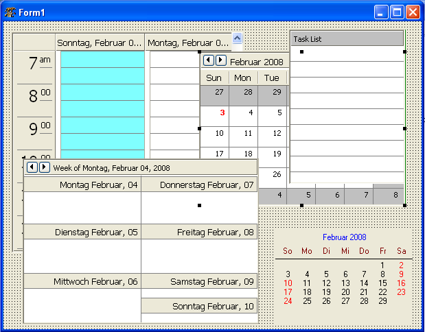 | |
| 10 | 10 | ||
| 11 | 11 | ### Author | |
| 12 | 12 | ||
| 13 | 13 | Author: Turbo Power Software | |
| 14 | 14 | ||
| 15 | 15 | LCL Port: Christian Ulrich and Werner Pamler | |
| 16 | 16 | ||
| 17 | 17 | ### License | |
| 18 | 18 | ||
| 19 | 19 | [Mozilla Public Licence 1.1](http://opensource.org/licenses/mozilla1.1.php) | |
| 20 | 20 | ||
| 21 | 21 | ### Download | |
| 22 | 22 | ||
| 23 | 23 | - Version 1.010: <https://sourceforge.net/projects/lazarus-ccr/files/tvplanit/tvplanit-1.0.10.zip/download> | |
| 24 | 24 | - Version 1.08: <https://sourceforge.net/projects/lazarus-ccr/files/tvplanit/tvplanit-1.08.zip/download> | |
| 25 | 25 | - Version 1.06: <https://sourceforge.net/projects/lazarus-ccr/files/tvplanit/tvplanit-1.06.zip/download> | |
| 26 | 26 | - Version 1.04: <https://sourceforge.net/projects/lazarus-ccr/files/tvplanit/tvplanit-1.04.zip/download> | |
| 27 | 27 | ||
| 28 | 28 | ### SVN | |
| 29 | 29 | ||
| 30 | 30 | You can checkout the actual source from <https://lazarus-ccr.svn.sourceforge.net/svnroot/lazarus-ccr/components/tvplanit> | |
| 31 | 31 | ||
| 32 | 32 | The commandline to do this is | |
| 33 | 33 | ||
| 34 | - | ||
| 34 | + | ```text | |
| 35 | + | svn co https://lazarus-ccr.svn.sourceforge.net/svnroot/lazarus-ccr/components/tvplanit | |
| 36 | + | ``` | |
| 35 | 37 | ||
| 36 | 38 | ### Change Log: New features | |
| 37 | 39 | ||
| 38 | 40 | - Feb 02, 2008 - Initial port (version 1.03) | |
| 39 | 41 | - Aug 01, 2016 - (Almost) complete port (version 1.04) | |
| 40 | 42 | - Nov 28, 2016 - Drag and drop, mORMot datastore, new fields, holiday support, designtime and runtime packages (version 1.06) | |
| 41 | 43 | - May 2018 - Adapt to Laz1.8+ high DPI support, json datastore. | |
| 42 | 44 | - May 04, 2018 - NavBar component editor (version 1.0.10) | |
| 43 | 45 | - June 21, 2018 - New properties for VpDayView and VpContactButtons, import from vCard and iCal files (version 1.2.0) | |
| 44 | 46 | - Jan 18, 2023 - Use category colors in week and month views. Simplify unlimited recurring events. Add context menu item to go to any date. Preview form for vCard and iCal import. Add new control: TVpGanttView. New icons by Roland Hahn (version 1.8.0) | |
| 45 | 47 | - Feb 10, 2023 - Bugfix for VpCalendar (version 1.8.1) | |
| 46 | 48 | ||
| 47 | 49 | - Current | |
| 48 | 50 | ||
| 49 | 51 | ### Incompatible changes | |
| 50 | 52 | ||
| 51 | 53 | - Version 1.0.4 does not compile with Delphi any more. | |
| 52 | 54 | - Starting with v1.0.11, the VpDayView events `OnDVBeforeDrawEvent` and `OnDVAfterDrawEvent` have an additional parameter `GutterRect`. This was done in order to allow custom painting of the event/gutter background. | |
| 53 | 55 | - Starting with v1.0.11, the events `OnOwnerEditEvent` of `TVpDayView`/`TVpWeekView`/`TVpMonthView`, `OnOwnerEditContact` of `TVpContactGrid`, and `OnOwnerEditTask` of `TVpTaskList` have a new parameter `IsNewEvent`, `IsNewContact`, and `IsNewTask` to indicate the custom editor whether a new event/contact/task is to be edited. | |
| 54 | 56 | ||
| 55 | 57 | ### Bug reporting / Feature request | |
| 56 | 58 | ||
| 57 | 59 | Bug reports and feature requests should be sent to the Lazarus/Free Pascal Bug Tracker; please specify the "Lazarus-CCR" project: <http://bugs.freepascal.org/> | |
| 58 | 60 | ||
| 59 | 61 | ### Dependencies / System Requirements | |
| 60 | 62 | ||
| 61 | 63 | - FPC 2.6.4 or newer | |
| 62 | 64 | - Lazarus 1.4.4 or newer | |
| 63 | 65 | - These versions were available at the time of writing this update. It is not excluded that the package can be used with older versions as well. | |
| 64 | 66 | ||
| 65 | 67 | ### Installation | |
| 66 | 68 | ||
| 67 | 69 | - Create a directory for the components, such as *lazarus\components\tvplanit* | |
| 68 | 70 | - In this directory, unzip the files from the zip file, or execute the svn commandline from above. | |
| 69 | 71 | - Open lazarus | |
| 70 | 72 | - In the release verison 1.04 the library has designtime and runtime code in the same package. Open the package *laz_visualplanit.lpk* from the folder *source* with *Package/Open file (-lpk)* and click **Compile**. Click **Use \> Install** if you want to install the components into the IDE. | |
| 71 | 73 | - Beginning with version 1.06 the library will be split into designtime and runtime packages | |
| 72 | 74 | - Open the runtime package *laz_visualplanit.lpk* from the library root folder with *Package/Open package file (.lpk)* and click **Compile** to compile it. | |
| 73 | 75 | - Open the designtime package *laz_visualplanit_design.lpk* from the same folder, click **Use \> Install**. | |
| 74 | 76 | - If you need the Zeos datastore repeat with package *laz_visualplanit_zeos.lpk* (and *laz_visualplanit_zeos_design.lpk*) from folder *source/addons/zeos*. Make sure that the [[Zeos tutorial|Zeos components]] are installed. | |
| 75 | 77 | ||
| 76 | 78 | ### Documentation | |
| 77 | 79 | ||
| 78 | 80 | If you need a full documentation of the the VisualPlanIt suite get TurboPower's original 300-page pdf file from the official SourceForge site of the Delphi version (https://sourceforge.net/projects/tpvplanit/files/tpvplanit_docs/). | |
| 79 | 81 | ||
| 80 | 82 | ## Using the planner components | |
| 81 | 83 | ||
| 82 | 84 | ### Getting started | |
| 83 | 85 | ||
| 84 | 86 | 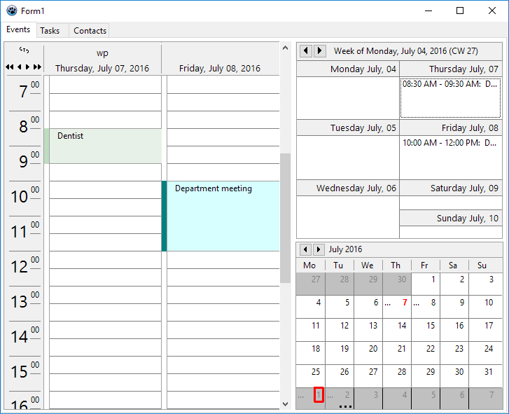 | |
| 85 | 87 | ||
| 86 | 88 | #### A simple project | |
| 87 | 89 | ||
| 88 | 90 | Here is a quick tutorial for your first steps with the VisualPlanIt components. | |
| 89 | 91 | ||
| 90 | 92 | - Create a new application. Save it into its own folder. | |
| 91 | 93 | - Add a TPageControl with three sheets. Name them *"Events"*, *"Tasks"*, and *"Contacts"*. | |
| 92 | 94 | - In the component palette seek for the tab *Visual PlanIt*. | |
| 93 | 95 | - Pick `TVpDayView` and add it to the *"Events"* sheet of PageControl. This is a day calendar and displays events (appointments, meetings, etc) for the entire day with a resolution as defined by its so-called `Granularity`. | |
| 94 | 96 | - If you are used to times in the 24-hour format switch `TimeFormat` to `tf24Hours`. | |
| 95 | 97 | - If the calendar is sufficiently wide you may want to change `NumDays` to - say - 2 to see two days at once. | |
| 96 | 98 | - Give the components a more modern look by setting `DrawingStyle` to `dsFlat`. | |
| 97 | 99 | - Similarly you can add a `TVpWeekView` (a week calendar) and/or a `TVpMonthView` (a month calendar) to the "Events" sheet. They give an overview of the same events, but with less resolution. Text ellipsis ("...") are shown if the event text cannot be fully displayed. | |
| 98 | 100 | - Now add a `TVpTaskList` to the *"Tasks"* sheet of the PageControl. It is a listing of to-do items along with their due dates. Overdue tasks are written in red. Completed tasks are striked out. Note that `DisplayOptions.ShowCompleted` or `.ShowAll` must be checked in order to see completed tasks. | |
| 99 | 101 | - Finally add a `TVpContactGrid` to sheet *"Contacts"* of the PageControl. | |
| 100 | 102 | - Again, you may want to use `DrawingStyle` `dsFlat` for a more modern look. | |
| 101 | 103 | - Play with the properties to setup all these visual controls according to your preferences. The `TVpWeekView`, for example, has a property to define whether the week starts on Monday or Sunday (`WeekStartsOn`). | |
| 102 | 104 | ||
| 103 | 105 | - Two ingredient are missing: the **DataStore** and the **ControlLink**. | |
| 104 | 106 | - The **Datastore** is a component which stores the data to be displayed in the visual controls. The Visual PlanIt package contains a series of predefined datastores - see below. We select here a TVpIniDatastore or TVpXmlDatastore which store the data in an ini or xml file - these stores do not require a database like the other datastores. | |
| 105 | 107 | - In the property `Filename`, enter a name for the datastore file, e.g. *data.ini* or *data.xml*, respectively. Using a relative filename here means that the path will be relative to the location of the exe file of the program which is convenient for this tutorial. In a "real" application, however, an absolute path may be preferrable. And it may also be advantageous to enter the filename at runtime, e.g. in the FormCreate event handler. | |
| 106 | 108 | - If the filename is known at designtime you can set `AutoConnect` to true in order to open the datastore automatically when the program starts. If the filename is specified at runtime leave `AutoConnect` at `false` and set the datastore's `Connected` property to true. | |
| 107 | 109 | - The **ControlLink** automatically establishes a link between the datastore and the visual controls and makes sure that the controls get their data if needed and are synchronized. | |
| 108 | 110 | ||
| 109 | 111 | - Now it's time to run the program | |
| 110 | 112 | - How to **add data**? This is done by double-clicking on any of the controls that we added to open a specific built-in editor for convenient entering of the data needed. | |
| 111 | 113 | - At the first time, however, a dialog pops up saying that "no resources have been defined". A **resource** is everything which can be administrated by the VisualPlanIt tools, such as an employee, a meeting room, a library of books, etc. Enter the name of the resource. If your program will deal with various resources you can add a TVpResourceCombobox to select the resource needed for the program run. Make sure to use unique resource names because VisualPlanIt will throw a duplicate-resource exception otherwise. | |
| 112 | 114 | - When you restart the program the next time you will notice that the data are no longer visible. No reason to be alarmed - the data are still there, but the program just does not know which resource to open. Enter this code in the FormCreate event, after connecting to the datastore: | |
| 113 | 115 | ||
| 114 | 116 | ``` pascal | |
| 115 | 117 | procedure TForm1.FormCreate(Sender: TObject); | |
| 116 | 118 | begin | |
| 117 | 119 | // Use this code if the filename is not set in the Object Inspector... | |
| 118 | 120 | VpXmlDatastore1.FileName := name_of_the_datastore_file; | |
| 119 | 121 | // ... and the datastore is not autoconnected. | |
| 120 | 122 | VpXmlDatastore1.Connected := true; | |
| 121 | 123 | // This code selects the first resource (index 0) found in the datastore. | |
| 122 | 124 | if VpXmlDatastore1.Resources.Count > 0 then | |
| 123 | 125 | VpXmlDatastore1.Resource := VpXmlDatastore1.Resources.Items[0]; | |
| 124 | 126 | end; | |
| 125 | 127 | ``` | |
| 126 | 128 | ||
| 127 | 129 | #### Event categories | |
| 128 | 130 | ||
| 129 | 131 | 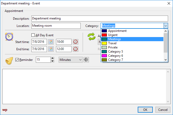 | |
| 130 | 132 | ||
| 131 | 133 | The event editor is used to enter or edit event details. You'll find here a combobox labeled "Category". The combobox items can be used to classify the events, like "Business", "Private", "Birthday" etc. The items, however, only have generic names, such as "Category 1", "Category 2", etc. You can select more descriptive names by visiting the datastore property `CategoryColorMap`. The field "Descriptions" defines the text to be displayed in the combobox. In order to be able to distinguish the categories in the DayView control you can also set up a background color and a bitmap here. The background colors can also be applied to the WeekView and MonthView controls when their `ApplyCategoryInfos` property is set to `true` (requires v1.7 at least). | |
| 132 | 134 | ||
| 133 | 135 | #### Playing an event sound | |
| 134 | 136 | ||
| 135 | 137 | The planner components are prepared to play a sound some pre-defined time ahead of the occurence of an event. For this to happen the "Reminder" checkbox must be checked in the event editor. | |
| 136 | 138 | ||
| 137 | 139 | There are several ways to set up the sound: | |
| 138 | 140 | ||
| 139 | 141 | - The datastore exposes a property `DefaultSound`. The sound file specified here will be played whenever an event with checked "Reminder" box happens. | |
| 140 | 142 | - Additionally, an individual sound file can be selected for each particular event by clicking at the loudspeaker icon next to the reminder interval. | |
| 141 | 143 | ||
| 142 | 144 | In Windows, the sounds are played automatically without further code because there universal sound utilities are embedded. In Linux, however, this is less standardized. But the datastore provides an event `OnPlaySound` where the correct sound playing command can be executed. The *fulldemo* project in the *examples* folder contains a unit which checks for the sound engines typically available in various systems; this unit is an adapted version of the **playsound component** by Gordon Bamber in the *Lazarus components and code repository* (https://sourceforge.net/p/lazarus-ccr/svn/HEAD/tree/components/playsoundpackage/). | |
| 143 | 145 | ||
| 144 | 146 | ### Datastores | |
| 145 | 147 | ||
| 146 | 148 | Datastores are responsible for persistent storage of event, task and contact data records. | |
| 147 | 149 | ||
| 148 | 150 | The ancestor of this hierachy of classes is `TVpCustomDatastore`. It implements the basic functionality and provides fundamental abstract methods, such as `LoadEvents`, `LoadTasks`, `LoadContacts`, `PostResources`, `PostEvents`, `PostTasks`, `PostContacts`. Its member class `Resources` (type: `TVpResources`) stores all resources in a list as `TVpResource` items. Such a resource item, in turn, contains other lists: `Schedule`, `Tasks`, and `Contacts` for all event, task and contact records. The currently selected resource can be accessed by the datastore's `Resource` or `ResourceID` properties (the latter is a unique numerical ID to identify the resource). | |
| 149 | 151 | ||
| 150 | 152 | `TVpCustomDBDatastore` inherited directly from `TVpCustomDatastore`. It is another (pseudo-) abstract class which provides the basic database functionality by means of four datasets, `ResourceTable`, `EventsTable`, `TasksTable`, and `ContactsTable`. Since datebases have very efficient methods of searching and filterung these datastores provide a property `DayBuffer` which defines a date range before and after the currently selected date for which records are loaded. | |
| 151 | 153 | ||
| 152 | 154 | #### TVpIniDatastore | |
| 153 | 155 | ||
| 154 | 156 | This is a simple file datastore which inherits from `TVpCustomDatastore`. It stores the data records in a simple **ini** file structure. The name of the ini file must be specified in the corresponding property. The file is loaded after the datastore has been created if the design-time property `AutoConnect` is true, or when the run-tim property `Connected` is switched to true. The file is saved automatically when `Connected` goes back to `false` - this happens before the datastore is destroyed. | |
| 155 | 157 | ||
| 156 | 158 | The demo project *examples/datastores/ini* is an example how the ini datastore can be used. | |
| 157 | 159 | ||
| 158 | 160 | #### TVpXmlDatastore | |
| 159 | 161 | ||
| 160 | 162 | This is another simple file datastore. It works similarly as the ini datastore except that the file is an **xml** file now. The datastore's tree of xml nodes can be inserted into any existing xml file, e.g. files written by `TXMLDataStorage`. For this purpose, the node must be specified to which the datastore's nodes will be attached (property `ParentNode`). | |
| 161 | 163 | ||
| 162 | 164 | Have a look at the demo project in *examples/datastores/xml* to see the xml datastore at work. | |
| 163 | 165 | ||
| 164 | 166 | #### TVpJsonDatastore | |
| 165 | 167 | ||
| 166 | 168 | Yet another simple file datastore inherited from `TVpCustomDatastore`. It takes the **json** file format to store the data records. Usage is demonstrated in the sample code in folder *examples/datastores/json*. | |
| 167 | 169 | ||
| 168 | 170 | #### TVpBufDSDatastore | |
| 169 | 171 | ||
| 170 | 172 | The following datastores inherit from `TVpCustomDBDatastore`. The first one, `TBufDSDataset`, uses simple `TBufDataset` tables for storage of the planner data. The four required files are named "Resources.db", "Events.db", "Contacts.db" and "Tasks.db", and are stored in the folder specified by the property `Directory`. If `AutoCreate` is true then the tables are created automatically when the program runs for the first time; otherwise the datastore method `CreateTables` must be called. | |
| 171 | 173 | ||
| 172 | 174 | Application of this datastore is demonstrated in *examples/datastores/bufdataset* and in *examples/fulldemo*. | |
| 173 | 175 | ||
| 174 | 176 | #### TVpSqlite3Datastore | |
| 175 | 177 | ||
| 176 | 178 | This datastore is a specialized storage for SQLite3 tables. It uses SQLDB components for this purpose. You must add a TSQLite3Connection and a TSQLTransaction to the form, link them together using the corresponding properties. Link the SQLite3Connection to the `Connection` of the datastore. The SQLQueries required are created automatically if the datastore's `AutoCreate` is true or after `CreateTables` is called. The database is stored in the file specified by the connection's `DatabaseName`. | |
| 177 | 179 | ||
| 178 | 180 | The project in *examples/datastores/sqlite3* demonstrates how the sqlite3 datastore can be used. | |
| 179 | 181 | ||
| 180 | 182 | #### TVpFirebirdDatastore | |
| 181 | 183 | ||
| 182 | 184 | A Firebird database provides the storage for `TVpFirebirdDatastore`. Again, SQLDB components are used here. To establish a connection to the database, a `TIBConnection` must be linked to the datastore's `Connection`. It must provide all information to connect to the database, such as database name, user name and password. In addition, a `TSQlTransaction` component is needed. The database should be created by the tools provided by Firebird or by third-party database administration tools. It is possible to do this also from the datastore, but this results in an exception. If the datastore's `AutoCreate` the required tables are created automatically when not found; alternatively call `CreateTables` for the datastore. | |
| 183 | 185 | ||
| 184 | 186 | Usage of the datastore is demonstrated in *examples/datastores/fb*. | |
| 185 | 187 | ||
| 186 | 188 | #### TVpZeosDatastore | |
| 187 | 189 | ||
| 188 | 190 | 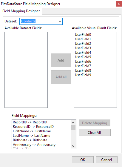 | |
| 189 | 191 | ||
| 190 | 192 | The `TVpZeosDatastore` works with the [[Zeos tutorial|ZEOS database components]]. Since they are not contained in the standard Lazarus distribution it is contained in a separate package, *laz_visualplanit_zeos*, which is found in the *source/addons/zeos* folder and must be installed after *laz_visualplanit*. | |
| 191 | 193 | ||
| 192 | 194 | A `TZConnection` is required to establishe a connection to the database. The tables are created internally, either automatically if `AutoCreate` is true, or manually by calling `CreateTable`. | |
| 193 | 195 | ||
| 194 | 196 | The demo project can be found in *examples/datastores/zeos*. | |
| 195 | 197 | ||
| 196 | 198 | #### TVpFlexDatastore | |
| 197 | 199 | ||
| 198 | 200 | In the database-aware datastores mentioned so far, the tables are created by the datastore. This makes sure that the fields are named in the way as expected by the datastore. If, on the other hand, tables are already existing or are provided by other applications it is very likely that field names will not be reckognized. `TVpFlexDatastore` can be a solution. Its name indicates that this is a very *flexible* datastore. In particular, it is possible to link to any database system if a TDataset-descendent is available. | |
| 199 | 201 | ||
| 200 | 202 | You must add four TDataset components to the form, each one corresponding to one of the Resources, Events, Contacts, and Tasks data, and link them to the `DataSsource` of the datastore via TDataSource components. Then double-click on the `TvVpFlexDatastore` to open the FieldMapper. This is a tool to assign the database fields to the internal fields of the datastore. For each database field that you want to include in the planner select the corresponding datastore field in the right list box. After clicking "Add" the pair of fields is shown in the "Field Mappings" listbox. | |
| 201 | 203 | ||
| 202 | 204 | There are two sample projects: | |
| 203 | 205 | ||
| 204 | 206 | - *examples/datastores/flex/access* demonstrates how an MS Access database can serve for storage using an ODBCConnection and other SQLDB components (there is also a *readme.txt* with step-by-step instructions). | |
| 205 | 207 | - *examples/datastores/flex/sqlite3* repeats the same with a SQLite3 database. | |
| 206 | 208 | ||
| 207 | 209 | #### Other datastores | |
| 208 | 210 | ||
| 209 | 211 | The following datastores from the original Delphi distribution are included in the source folder, but not added to the package because they require the BDE which is not available for Lazarus: | |
| 210 | 212 | ||
| 211 | 213 | - **TVpBDEDatastore** for database access by means of the Borland Database Engine (BDE) (unit *vpbdeds*) | |
| 212 | 214 | - **TVpAdvDatastore** for Advantage Database (unit *vpadvds*) | |
| 213 | 215 | - **TVpFF2Datastore** for FlashFiler 2 databases (unit *vpff2ds*) | |
| 214 | 216 | - **TVpDBISAMDatastore** for DBISAM database access (unit *vpdbisamds*) | |
| 215 | 217 | - **TVpSQLDatastore** (unit *vpsqlds*): This is a very general datastore for any sql database. An interfaced class to the TDataset-descendent must be provided, and there must be a class specifying the particular sql dialect. For application in Lazarus, some restructuring of BDE-related properties will be required. The package contains an example for BDE access. | |
| 216 | 218 | ||
| 217 | 219 | ### Holidays | |
| 218 | 220 | ||
| 219 | 221 | TvPlanIt has no ready-to-use support of holidays because this would involve a huge database covering all countries. Rather than that each datastore provides an event `OnHoliday` which queries the holiday name for the specified date; the holiday name is left empty when the day is not a holiday. The best way to apply this model is to calculate a list of the dates and names of all holidays for each year: | |
| 220 | 222 | ||
| 221 | 223 | ``` pascal | |
| 222 | 224 | uses | |
| 223 | 225 | fgl, DateUtils; | |
| 224 | 226 | ||
| 225 | 227 | type | |
| 226 | 228 | THolidayList = specialize TFPGMap<TDateTime, string>; | |
| 227 | 229 | ||
| 228 | 230 | var | |
| 229 | 231 | FHolidays: THolidayList = nil; // must be created and destroyed by the main form. | |
| 230 | 232 | ||
| 231 | 233 | { Calculates the date of some U.S. holidays for the specified year. } | |
| 232 | 234 | procedure TMainForm.CalcHolidays(AYear: Integer); | |
| 233 | 235 | ||
| 234 | 236 | // If a federal holiday falls on a Saturday the preceding Friday is a holiday. | |
| 235 | 237 | // If a federal holiday falls on a Sunday the following Monday is a holiday. | |
| 236 | 238 | // https://www.officeholidays.com/countries/usa/2022 | |
| 237 | 239 | function InLieuHoliday(ADate: TDateTime): TDateTime; | |
| 238 | 240 | var | |
| 239 | 241 | wd: Integer; | |
| 240 | 242 | begin | |
| 241 | 243 | wd := DayOfTheWeek(ADate); | |
| 242 | 244 | if wd = DaySaturday then | |
| 243 | 245 | Result := ADate - 1 | |
| 244 | 246 | else | |
| 245 | 247 | if wd = DaySunday then | |
| 246 | 248 | Result := ADate + 1 | |
| 247 | 249 | else | |
| 248 | 250 | Result := ADate; | |
| 249 | 251 | end; | |
| 250 | 252 | ||
| 251 | 253 | var | |
| 252 | 254 | d, d1: TDate; | |
| 253 | 255 | begin | |
| 254 | 256 | FHolidays.Clear; | |
| 255 | 257 | ||
| 256 | 258 | // New Year | |
| 257 | 259 | d := EncodeDate(AYear, 1, 1); | |
| 258 | 260 | FHolidays.Add(d, 'New Year'); | |
| 259 | 261 | d1 := InLieuHoliday(d); | |
| 260 | 262 | if d <> d1 then | |
| 261 | 263 | FHolidays.Add(d1, 'New Year (in lieu)'); | |
| 262 | 264 | ||
| 263 | 265 | // Easter & associated | |
| 264 | 266 | d := Easter(AYear); // Calculation of the Easter date is shown in the "Easter" example in the Lazarus installation. | |
| 265 | 267 | FHolidays.Add(d-2, 'Good Friday'); | |
| 266 | 268 | FHolidays.Add(d, 'Easter Sunday'); | |
| 267 | 269 | FHolidays.Add(d+49, 'Whitsunday'); | |
| 268 | 270 | ||
| 269 | 271 | // Independence day | |
| 270 | 272 | d := EncodeDate(AYear, 7, 4); | |
| 271 | 273 | FHolidays.Add(d, 'Independence Day'); | |
| 272 | 274 | d1 := InLieuHoliday(d); | |
| 273 | 275 | if d1 <> d then | |
| 274 | 276 | FHolidays.Add(d1, 'Independence Day (in lieu)'); | |
| 275 | 277 | ||
| 276 | 278 | // Labor Day (1st Monday in September) | |
| 277 | 279 | d := EncodeDayOfWeekInMonth(AYear, 9, 1, DayMonday); | |
| 278 | 280 | FHolidays.Add(d, 'Labor Day (U.S.)'); | |
| 279 | 281 | ||
| 280 | 282 | // Thanksgiving (4th Thursday in November) | |
| 281 | 283 | d := EncodeDayOfWeekInMonth(AYear, 11, 4, DayThursday); | |
| 282 | 284 | FHolidays.Add(d, 'Thanksgiving (U.S.)'); | |
| 283 | 285 | ||
| 284 | 286 | // Christmas | |
| 285 | 287 | d := EncodeDate(AYear, 12, 25); | |
| 286 | 288 | FHolidays.Add(d, 'Christmas Day'); | |
| 287 | 289 | d1 := InLieuHoliday(d); | |
| 288 | 290 | if d1 <> d then | |
| 289 | 291 | FHolidays.Add(d1, 'Christmas Day (in lieu)'); | |
| 290 | 292 | ||
| 291 | 293 | // Due to the off-days in the calendar, add also Christmas of the preceding | |
| 292 | 294 | // and New Year of the following years | |
| 293 | 295 | d := EncodeDate(AYear-1, 12, 25); // -1 --> previous year | |
| 294 | 296 | FHolidays.Add(d, 'Christmas Day'); | |
| 295 | 297 | d1 := InLieuHoliday(d); | |
| 296 | 298 | if d1 <> d then | |
| 297 | 299 | FHolidays.Add(d1, 'Christmas Day (in lieu)'); | |
| 298 | 300 | ||
| 299 | 301 | // New Year | |
| 300 | 302 | d := EncodeDate(AYear+1, 1, 1); // +1 --> following year | |
| 301 | 303 | FHolidays.Add(d, 'New Year'); | |
| 302 | 304 | d1 := InLieuHoliday(d); | |
| 303 | 305 | if d <> d1 then | |
| 304 | 306 | FHolidays.Add(d1, 'New Year (in lieu)'); | |
| 305 | 307 | end; | |
| 306 | 308 | ``` | |
| 307 | 309 | ||
| 308 | 310 | Since this code calculates the holidays for one year only the list must be updated when the year changes. This can be done in the OnDateChanged handler of the datastore; perform the calculation only when the year of the new date is different from the previously calculated year (`FHolidayYear: Integer`): | |
| 309 | 311 | ||
| 310 | 312 | ``` pascal | |
| 311 | 313 | procedure TMainForm.DateChangedHandler(Sender: TObject; ADate: TDateTime); | |
| 312 | 314 | var | |
| 313 | 315 | year: Integer; | |
| 314 | 316 | begin | |
| 315 | 317 | year := YearOf(ADate); | |
| 316 | 318 | if year <> FHolidayYear then | |
| 317 | 319 | begin | |
| 318 | 320 | CalcHolidays(year); | |
| 319 | 321 | FHolidayYear := year; | |
| 320 | 322 | end; | |
| 321 | 323 | end; | |
| 322 | 324 | ``` | |
| 323 | 325 | ||
| 324 | 326 | In the `OnHoliday` event, finally, the holiday name then can be found easily: | |
| 325 | 327 | ||
| 326 | 328 | ``` pascal | |
| 327 | 329 | procedure TMainForm.VpHoliday(Sender: TObject; ADate: TDateTime; | |
| 328 | 330 | var AHolidayName: String); | |
| 329 | 331 | var | |
| 330 | 332 | idx: Integer; | |
| 331 | 333 | begin | |
| 332 | 334 | if FHolidays.Find(ADate, idx) then | |
| 333 | 335 | AHolidayName := FHolidays.Data[idx];; | |
| 334 | 336 | end; | |
| 335 | 337 | ``` | |
| 336 | 338 | ||
| 337 | 339 | ### Overlaying events | |
| 338 | 340 | ||
| 339 | 341 | The DayView and WeekView components primarily display events of a single resource. It is possible, however, to switch into an **overlay mode** where other resources can be displayed within the same controls. This can be achieved by assigning a `TVResourceGroup` to the resource (property `Group`): | |
| 340 | 342 | ||
| 341 | 343 | ``` pascal | |
| 342 | 344 | type | |
| 343 | 345 | TVpOverlayPattern = (opSolid, opClear, opHorizontal, opVertical, opFDiagonal, opBDiagonal, opCross, opDiagCross); | |
| 344 | 346 | ||
| 345 | 347 | TVpOverlayDetail = (odResource, odEventDescription, odEventCategory); | |
| 346 | 348 | TVpOverlayDetails = set of TVpOverlayDetail; | |
| 347 | 349 | ||
| 348 | 350 | TVpResourceGroup = class | |
| 349 | 351 | //... | |
| 350 | 352 | property Caption: String; | |
| 351 | 353 | property Count: Integer; | |
| 352 | 354 | property Items[AIndex: Integer]: TVpResource; | |
| 353 | 355 | property Pattern: TVpOverlayPattern; | |
| 354 | 356 | property ResourceID: Integer; | |
| 355 | 357 | property ReadOnly: boolean read FReadOnly; | |
| 356 | 358 | property ShowDetails: TVpOverlayDetails; | |
| 357 | 359 | end; | |
| 358 | 360 | ``` | |
| 359 | 361 | ||
| 360 | 362 | The most convenient way to create a resource group is the `OverlayResources` method of a resource. It takes an array of the resource instances to be grouped as a parameter. When the array is empty an existing group is ungrouped. An optional `ACaption` parameter defines the name of the resource group. The following code snippet (taken from the FullDemo sample project) assumes that all resources which can be grouped with the currently active resource are listed in a `TCheckListBox` (named `lbOtherResources`) and is executed when one of the listbox entries is checked or unchecked: | |
| 361 | 363 | ||
| 362 | 364 | ``` pascal | |
| 363 | 365 | procedure TMainForm.lbOtherResourcesClickCheck(Sender: TObject); | |
| 364 | 366 | var | |
| 365 | 367 | i, n: Integer; | |
| 366 | 368 | resArray: TVpResourceArray; | |
| 367 | 369 | begin | |
| 368 | 370 | // Collect resources checked for overlaying in an array | |
| 369 | 371 | SetLength(resArray, lbOtherResources.Items.Count); | |
| 370 | 372 | n := 0; | |
| 371 | 373 | for i := 0 to lbOtherResources.Items.Count-1 do | |
| 372 | 374 | if lbOtherResources.Checked[i] then | |
| 373 | 375 | begin | |
| 374 | 376 | resArray[n] := TVpResource(lbOtherResources.Items.Objects[i]); | |
| 375 | 377 | inc(n); | |
| 376 | 378 | end; | |
| 377 | 379 | SetLength(resArray, n); | |
| 378 | 380 | ||
| 379 | 381 | // Overlay the checked resources to the currently active resource | |
| 380 | 382 | VpControlLink1.DataStore.Resource.OverlayResources(resArray); | |
| 381 | 383 | end; | |
| 382 | 384 | ``` | |
| 383 | 385 | ||
| 384 | 386 | Another way is to call the method `AddResourceGroup` of the datastore's `Resources` list. Here the IDs of the overlayed resources must be specified as an array in the first parameter of the procedure. The first id plays a special role: it refers to the resource to which the group is attached. If this resource is displayed in a Dayview or WeekView component then the events of the other specified ID(s) are overlayed within the same control. | |
| 385 | 387 | ||
| 386 | 388 | ``` pascal | |
| 387 | 389 | procedure TMainForm.CreateResourceGroup; | |
| 388 | 390 | const | |
| 389 | 391 | NAME_OF_GROUP = ''; // empty --> use resource descriptions instead | |
| 390 | 392 | PARENT_ID = 1; // ID of the resource which will display the entire group | |
| 391 | 393 | OVERLAYED_ID = 2; // ID of the resource to be overlayed in the view of the PARENT_ID resource. | |
| 392 | 394 | var | |
| 393 | 395 | datastore: TVpCustomDatastore; | |
| 394 | 396 | grp: TVpResourceGroup; | |
| 395 | 397 | begin | |
| 396 | 398 | datastore := VpControlLink1.Datastore; | |
| 397 | 399 | grp := datastore.Resources.AddResourceGroup([PARENT_ID, OVERLAYED_ID], NAME_OF_GROUP); | |
| 398 | 400 | grp.ReadOnly := true; | |
| 399 | 401 | grp.Pattern := opDiagCross; | |
| 400 | 402 | if datastore.Resource <> nil then | |
| 401 | 403 | datastore.Resource.Group := grp | |
| 402 | 404 | else | |
| 403 | 405 | datastore.Resource.Group := nil; | |
| 404 | 406 | datastore.RefreshEvents; | |
| 405 | 407 | end; | |
| 406 | 408 | ``` | |
| 407 | 409 | ||
| 408 | 410 | The level of detail visible to the user seeing overlayed events is controlled by the property `ShowDetails` of the resource group. By default, only the name of the overlayed resource is visible. If more details are to be exposed you can add the other elements of `TVpOverlayDetails`. The background of overlayed events in the dayview is hatched as specified by the `Pattern` property of the resource group if the event category is not excluded from the visible details; otherwise the event is drawn as specified by the property `HiddenCategories` of the Datastore. | |
| 409 | 411 | ||
| 410 | 412 | Editing, deleting, drag-and-drop of overlayed events is off by default, but can be allowed by setting the `ReadOnly` property of their resource group to false. | |
| 411 | 413 | ||
| 412 | 414 | In order to turn resource groups on and off the context menu of DayView and WeekView components is extended by a corresponding submenu. The submenu contains an item "none" meaning "no overlayed events" as well as an item for each resource group in which the currently selected resource is the parent. The caption of the menu items is defined by the (optional) second parameter of the `OverlayResources` and `AddResourceGroup` calls; if empty the group name is derived from the descriptions of the overlayed resources. | |
| 413 | 415 | ||
| 414 | 416 | ### Printing and print preview | |
| 415 | 417 | ||
| 416 | 418 | 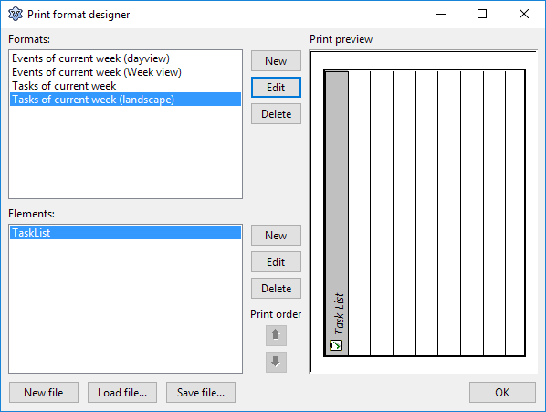 | |
| 417 | 419 | ||
| 418 | 420 | The VisualPlanIt package contains routines for printing the planner controls. Even a print preview is implemented. The printing process is defined by means of templates which are called "print formats" here. They can be created at designtime or by means of an xml file loaded at runtime, contain a list of the components to be printed. | |
| 419 | 421 | ||
| 420 | 422 | The heart of printing support is the TVpPrinter class - it is accessible by the `Printer` property of the `TVpControlLink`. It contains extra information needed for the printing process and contains a list of the available `PrintFormats`. | |
| 421 | 423 | ||
| 422 | 424 | In order to quickly access the print format designer double-click on the `TVpControlLink` component. Click on the upper "New" button to open the basic format editor. Here you can assign a reasonable name to the print format. Clicking on the lower "Edit" opens the "Element" editor - this is the tool to define the contents on the print print format, similar to a report designer, however less comfortable. In addition to the planner controls, DayView, WeekView, MonthView, TaskList and ContactGrid, the editor allows also to add additional text and shape objects to the format. Multiple elements can be contained within the same format. Position the elements by using the Top/Left/Width/Height specifications at the right. In addition, the entire format page can be rotated in 90° steps. | |
| 423 | 425 | ||
| 424 | 426 | A **print preview** can be generated by means of a `TVpPrintPreview` component. Assign the ControlLink of the form to the `ControlLink` and the `Printer` of the *Printers* units to the `Printer` property of the preview component. For printing to work correctly, you must have the package *Printer4Lazarus* in the requirements of the project; this can be done most easily by adding a standard `TPrintDialog` to the form which you will probably need anyway. Open the print preview by calling its `Execute` method. It should be mentioned that the print preview itself does not issue any printing commands. Therefore, extra printing code must be written if the user decides to initiate a print-out from the preview, something like this: | |
| 425 | 427 | ||
| 426 | 428 | ``` pascal | |
| 427 | 429 | if VpPrintPreviewDialog1.Execute then | |
| 428 | 430 | if PrintDialog1.Execute then begin | |
| 429 | 431 | Printer.BeginDoc; | |
| 430 | 432 | try | |
| 431 | 433 | VpPrintPreviewDialog1.ControlLink.Printer.Print( | |
| 432 | 434 | Printer, | |
| 433 | 435 | VpPrintPreviewDialog1.StartDate, | |
| 434 | 436 | VpPrintPreviewDialog1.EndDate | |
| 435 | 437 | ); | |
| 436 | 438 | finally | |
| 437 | 439 | Printer.EndDoc; | |
| 438 | 440 | end; | |
| 439 | 441 | end; | |
| 440 | 442 | ``` | |
| 441 | 443 | ||
| 442 | 444 | See the *fulldemo* project in the *examples* folder for a worked-out example. | |
| 443 | 445 | ||
| 444 | 446 | ### Localization | |
| 445 | 447 | ||
| 446 | 448 | All internal strings used by the VisualPlanIt package can be localized by means of the translation utilities available within Lazarus. The **translated po files** can be found in the folder *languages* of the distribution. Copy them to the language folder of your application, and translate them by calling | |
| 447 | 449 | ||
| 448 | 450 | ``` pascal | |
| 449 | 451 | uses | |
| 450 | 452 | translations; | |
| 451 | 453 | var | |
| 452 | 454 | langdir: String; // language folder of your application | |
| 453 | 455 | lang: String; // language abbreviation, e.g. "de" for German | |
| 454 | 456 | //... | |
| 455 | 457 | TranslateUnitResourceStrings('vpsr', langdir + 'vpsr.' + lang + 'po'); | |
| 456 | 458 | ``` | |
| 457 | 459 | ||
| 458 | 460 | > **Note:** Users are cordially invited to submit translations of the resource strings to their native language | |
| 459 | 461 | ||
| 460 | 462 | In addition to providing translated strings a variety of **date/time related properties** of the planner controls should be adapted: | |
| 461 | 463 | ||
| 462 | 464 | - Set `VpDateView.DateLabelFormat` to `DefaultFormatSettings.LongDateFormat`, dto. with `VpWeekView.DayHeadAttributes.DateFormat` and `VpWeekView.DateLabelFormat`. | |
| 463 | 465 | - Set `VpMonthView.DatelabelFormat` to the string `'mmmm yyyy'` which means "month in words + year". | |
| 464 | 466 | - Set `VpTaskView.DisplayOptions.DueDateFormat` to `DefaultFormatSettings.ShortDateformat`. | |
| 465 | 467 | - Determine the `TVpTimeFormat` of your system by calling `GetTimeFormat` (in Unit *vpmisc*). The result is either `tf12Hour` or `tf24Hour` and should be assigned to the `TimeFormat` properties of VpDayView, VpWeekView and VpMonthView. | |
| 466 | 468 | - Set the properties `WeekStartsOn` of VpMonthView and VpWeekView to the day code of the first day of a week (1 = Sunday, ..., 7 = Saturday). | |
| 467 | 469 | ||
| 468 | 470 | Finally, the `TVpControlLink` implements procedures for localizing **addresses** in the Contact Editor Dialog. For this purpose, the file *vplocalize.xml* accompanies the VisualPlanIt package. It contains rules for construction of addresses in the correct format varying from country to country. If this filename is assigned to the property `LocalizationFile` of the ControlLink then these rule are effective when the Contact Editor Dialog is created. Please note that this file is not translated by the po files. | |
| 469 | 471 | ||
| 470 | 472 | ### TVpDayView, TVpWeekView, and TVpMonthView reference | |
| 471 | 473 | ||
| 472 | 474 | These are the main visual components of the TvPlanIt library, they display the same information, but group it on different time-scales. | |
| 473 | 475 | ||
| 474 | 476 | #### Common | |
| 475 | 477 | ||
| 476 | 478 | ##### Properties | |
| 477 | 479 | ||
| 478 | 480 | - `AllowDragAndDrop: boolean`: Activates the feature that TvPlanIt events can be dragged to other time slots or other viewing controls. | |
| 479 | 481 | - `AllowInplaceEditing: boolean`: If enabled the `Description` of the selected TvPlanit event can be edited in-place by pressing the `F2` button. | |
| 480 | 482 | - `ApplyCategoryInfos: boolean` - when `true` the planner event category colors are applied when drawing the event. Note that this is property is not available in `TVpDayView` since this behaviour is activated automatically. | |
| 481 | 483 | - `DateLabelFormat: String`: Defines the format how dates are displayed by the control. Use the conventions established for the standard `FormatDateTime()` function. | |
| 482 | 484 | - `DragDropTransparent: Boolean`: Activates a semitransparent copy of the TvPlanIt event's area during a drag-and-drop operation. | |
| 483 | 485 | - `DrawingStyle: TVpDrawingStyle = (dsFlat, ds3d, dsNoBorder)`: Defines how the border of the control is drawn | |
| 484 | 486 | - `HeadAttributes: TVpHeadAttributs`: Contains `Color` and `Font` elements which determine how the headers of these table-like controls are painted. `TVpDayView` has also a `RowHeadAttributes` property for the row headers, with separate fonts for display of hours and minutes. | |
| 485 | 487 | - `HintMode: TVpHintMode = (hmPlannerHint, hmComponentHint)`: Defines the information displayed in the component hint window. If `hmPlannerHint` is selected the hint summarizes the information of the TvPlanIt event over which the mouse hovers. If `hmComponentHint` is selected the hint displays the string assigned to the `Hint` property of the control. | |
| 486 | 488 | - `LineColor: TColor`: This is the color of the grid lines. | |
| 487 | 489 | - `PopupMenu: TPopupMenu`: By default, returns the built-in popup menu of the component (allowing to access the individual menu items). An external popupmenu can be attached to replace the default menu. Attach an empty TPopupMenu if you want to turn off the built-in menu. | |
| 488 | 490 | - `ShowEventTime(s): Boolean`: If `true` the start and end times of the TvPlanIt events are added the the event description in the control (Note that this property is named in plural for `TVpDayView`, but in singular for the others). | |
| 489 | 491 | - `TimeFormat: TVpTimeFormat = (tf24Hour, tf12Hour)`: Determines whether event times are displayed in the 24-hour or 12-hour format. | |
| 490 | 492 | - `WeekStartsOn: TVpDayType = (dtSunday, dtMonday, dtTuesday, dtWednesday, dtThursday, dtFriday, dtSaturday)`: Identifies the first day of a week. Not available for `TVpDayView`. | |
| 491 | 493 | ||
| 492 | 494 | ##### Events | |
| 493 | 495 | ||
| 494 | 496 | Please be aware that the word "event" has two meanings in the following section: a Lazarus event or a TvPlanit event... | |
| 495 | 497 | ||
| 496 | 498 | - `AfterEnter`: Fires when the control is focused | |
| 497 | 499 | - `AfterExit`: Fires when the control loses focus | |
| 498 | 500 | - `AfterEdit`: Fires when editing of the TvPlanIt event description in the inplace editor is completed. Not available in `TVpMonthView`. | |
| 499 | 501 | - `BeforeEdit`: Fires when the inplace editor for editing of the TvPlanIt event description is invoked by pressing `F2`. Not available in `TVpMonthView`. | |
| 500 | 502 | - `OnAddEvent`: Fires when a new TvPlanIt event has been added by means of the event editor (opened after double-clicking on the event position in the control). | |
| 501 | 503 | - `OnDeletingEvent`: Fires before a TvPlanIt event is deleted and by-passes the default confirmation prompt. You can provide your own confirmation message. Note that you must set the argument `DoIt` to false if you want to inhibit deletion. | |
| 502 | 504 | - `OnHoliday`: The painting routine queries here whether the currently drawn day is a holiday. If yes, it is painted in a special color. | |
| 503 | 505 | - `OnModifyEvent`: Fires when an existing TvPlanIt event has been changed by means of the event editor (opened after double-clicking on the event position in the control). | |
| 504 | 506 | - `OnOwnerEditEvent`: Allows to by-pass the built-in event editor for definiting the specification of new or existing TvPlanIt events. | |
| 505 | 507 | ||
| 506 | 508 | #### TVpDayView only | |
| 507 | 509 | ||
| 508 | 510 | ##### Properties | |
| 509 | 511 | ||
| 510 | 512 | - `AllDayEventAttributes: TVpAllDayEventAttributes`: Defines how a TvPlanIt event is displayed which extends over the entire day. All-day events are displayed above the DayView's time-table. | |
| 511 | 513 | - `BackgroundColor: TColor`: Is the background color of the all-day event area | |
| 512 | 514 | - `EventBackgroundColor: TColor`: The background color of the event itself | |
| 513 | 515 | - `EventBorderColor: TColor`: The color of the event border | |
| 514 | 516 | - `Font: TFont`: The font used to display the event description. | |
| 515 | 517 | - `DefaultTopHour: TVpHours`: This enumeration of hours follows the schema `h_00`, `h_01` ... `h_23` and defines the hour at which the DayView's time-table starts by default. | |
| 516 | 518 | - `DotDotDotColor: TColor`: When a TvPlanIt event description is longer than the space reserved for it on the time-table, three dots are displayed in the color defined by this property. | |
| 517 | 519 | - `FixedDate: Boolean`: If `true` the VpDayView cannot be scrolled to another date by user interaction. | |
| 518 | 520 | - `Granularity: TVpGranularity = (gr05Min, gr06Min, gr10Min, gr15Min, gr20Min, gr30Min, gr60Min)`: Defines the time range covered by a time-table cell. | |
| 519 | 521 | - `GutterWidth: Integer`: The width of the highlighting bar at the left of the each TvPlanIt event cell. The gutter is drawn in the `Color` of the event's category. | |
| 520 | 522 | - `IconAttributes: TVpDayViewIconAttributes`: Defines which icons should be displayed in each event cell: | |
| 521 | 523 | - `ShowAlarmBitmap: boolean`: Displays a bitmap for those events for which an alarm rings. The bitmap can be selected either by the `AlarmBitmap` property or by the `AlarmImageIndex` in the datastore's imagelist, `Images`. | |
| 522 | 524 | - `ShowCategoryBitmap: boolean`: Displays the icon of the category assigned to the event in this cell | |
| 523 | 525 | - `ShowInPrint: boolean`: Main "switch" to turn icon display off (badly named...). Further control on icon display is possible by means of the `OnDrawIcons` event. | |
| 524 | 526 | - `ShowRecurringBitmap: boolean`: Displays a bitmap for recurring events. The bitmap can be selected either by the `RecurringBitmap` property or by the `RecurringImageIndex` in the datastore's imagelist, `Images`. | |
| 525 | 527 | - `IncludeWeekends: boolean`: Skips displaying weekend days in the control. | |
| 526 | 528 | - `NumDays: Integer`: Number of days displayed as columns in the control. | |
| 527 | 529 | - `RowHeight: Integer`: Height of the time table rows; automatic adjustment depending on `RowHeadAttributes.MinuteFont.Size` if `0` (default). | |
| 528 | 530 | - `RowLinesStep: Integer`: Determines the number of horizontal grid lines omitted. Normally (when `RowLinesStep` is 1) grid lines are drawn as set up by the `Granularity`. | |
| 529 | 531 | - `ShowNavButtons: Boolean`: Displays date navigation buttons in the upper left corner of the control | |
| 530 | 532 | - `ShowResourceName: Boolean`: Displays the name of the resource to which the current schedule belongs at the top of the time table. | |
| 531 | 533 | - `WrapStyle: TVpDVWrapStyle`: Determines how text longer than the line in the dayview is wrapped: | |
| 532 | 534 | - `wsNone`: no wrapping, the text is displayed in a single line and ends with an ellipsis (...) if it is too long. | |
| 533 | 535 | - `wsIconFlow`: the text is word-wrapped and flows around the icons (if any) displayed in the line. An ellipsis (...) is displayed if the text still is too long. | |
| 534 | 536 | - `wsNoFlow`: the text is word-wrapped and indented by the width of the icons (if any) displayed in the line. An ellipsis (...) is displayed if the text still is too long. | |
| 535 | 537 | ||
| 536 | 538 | ##### Events | |
| 537 | 539 | ||
| 538 | 540 | - `OnAfterDrawEvent`: Fires after each TvPlanIt event is painted. | |
| 539 | 541 | - `OnBeforeDrawEvent`: Fires before each TvPlanIt event is painted. | |
| 540 | 542 | - `OnDrawIcons`: Fires when a TvPlanIt event is drawn on the time-table and allows to hide specific icons. The icon types are classified by the enumeration `TVpDVIconTypes = (itAlarm, itRecurring, itCategory, itCustom)`. Icons to be drawn must be listed in the `Icons` set which is given as a parameter in addition to the event being painted. | |
| 541 | 543 | - `OwnerDrawCells`: Allows to override the built-in painting procedure of event cells. | |
| 542 | 544 | - `OwnerDrawColHeader`: Allows to override the built-in painting routine of the header of a time-table day column | |
| 543 | 545 | - `OwnerDrawRowHeader`: Allows to override the built-in painting routine of the header of a time slot row. | |
| 544 | 546 | ||
| 545 | 547 | #### TVpWeekView only | |
| 546 | 548 | ||
| 547 | 549 | ##### Properties | |
| 548 | 550 | ||
| 549 | 551 | - `AllDayEventAttributes: TVpAllDayEventAttributes`: Defines how a TvPlanIt event is displayed which extends over the entire day. | |
| 550 | 552 | - `BackgroundColor: TColor`: Is the background color of the all-day event area | |
| 551 | 553 | - `EventBackgroundColor: TColor`: The background color of the event itself | |
| 552 | 554 | - `EventBorderColor: TColor`: The color of the event border | |
| 553 | 555 | - `Font: TFont`: The font used to display the event description. | |
| 554 | 556 | - `EventFont: TFont`: Font used for painting the TvPlanIt event information in the weekly time-table. | |
| 555 | 557 | - `Layout: TVpWeekViewLayout = (wvlVertical, wvlHorizontal)`: Defines whether the VpWeekView puts the week days into its grid first horizontally or first vertically. | |
| 556 | 558 | - `WeekStartsOn: TVpDayType = (dtSunday, dtMonday, dtTuesday, dtWednesday, dtThursday, dtFriday, dtSaturday)`: Identifies the first day of a week. | |
| 557 | 559 | ||
| 558 | 560 | #### TVpMonthView only | |
| 559 | 561 | ||
| 560 | 562 | ##### Properties | |
| 561 | 563 | ||
| 562 | 564 | - `DayNameStyle: TVpMVDayNameStyle = (dsLong, dsShort, dsLetter)`: Determines which kind of day names are displayed in the header row of the month grid: full name ('Monday'), abbreviation ('Mo') or only first letter ('M'). | |
| 563 | 565 | - `DayNumberFont: TFont`: Font used to draw the day numbers. | |
| 564 | 566 | - `EventDayStyle: TFontStyles`: Font style used to highlight days with assigned TvPlanIt events. | |
| 565 | 567 | - `EventFont: TFont`: Font used when painting the TvPlanIt event information in the month grid. | |
| 566 | 568 | - `HolidayAttributes:TVpMvHolidayAttr`: Background color and font of calendar cells which correspond to holidays. | |
| 567 | 569 | - `KBNavigation: Boolean`: Allows to navigate the calendar using the arrow keys on the keyboard. | |
| 568 | 570 | - `OffDayColor: TColor`: Background color for the overflow days from the previous and next months | |
| 569 | 571 | - `OffDayFontColor: TColor`: Font color for the overflow days from the previous and next months | |
| 570 | 572 | - `RightClickChangeDate: Boolean`: Allows a right-click to change the selected date to the clicked cell. | |
| 571 | 573 | - `SelectedDayColor: TColor`: Color of the selected day number. | |
| 572 | 574 | - `ShowEvents: Boolean`: Allow to show/hide TvPlanIt event information in the calendar grid. | |
| 573 | 575 | - `TodayAttributes: TVpMvTodayAttr`: Background color and font of today's cell. | |
| 574 | 576 | - `WeekendAttributes: TVpMvWeekendAttr`: Background color and font of weekend cells. | |
| 575 | 577 | ||
| 576 | 578 | ##### Events | |
| 577 | 579 | ||
| 578 | 580 | - `OnEventClick`: Fires when a TvPlanIt event is clicked | |
| 579 | 581 | - `OnEventDblClick`: Fires when a TvPlanIt event is double-clicked. | |
| 580 | 582 | ||
| 581 | 583 | ## Using the navigation bar | |
| 582 | 584 | ||
| 583 | 585 | 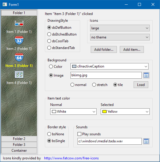 | |
| 584 | 586 | ||
| 585 | 587 | `TVpNavBar`, seen in the left of this screenshot of the *navbar* demo, is a navigation tool smiliar to the one known from Outlook. It consists of several **folders** represented by button-like controls and several **items** - these are the labelled icons in the large space between two buttons. The folder button - which can be drawn in several button- or tab-like styles - is always shown above the associated item area. Clicking on a folder divides the stack of folders in an upper and lower part, and displays the items assigned to this folder between the corresponding folder at the top and the next folder at the bottom. The index of the currently expanded folder is given by the property `ActiveFolder`, and the index of the clicked items within this folder is given by property `ActiveItem`. An event `OnItemClick` fires when an item is clicked, it has the index of the clicked item as a parameter. | |
| 586 | 588 | ||
| 587 | 589 | An **icon** can be assigned to each item. These images are collected in the image list assigned to the property `Images` of the navigation bar. The images normally should be 32x32 pixels. The property `IconSize` of each folder determines whether these images are displayed directly as "large images" or reduced by a factor 2 (16x16 pixels) as "small images". The down-scaling is done by the component.\ | |
| 588 | 590 | 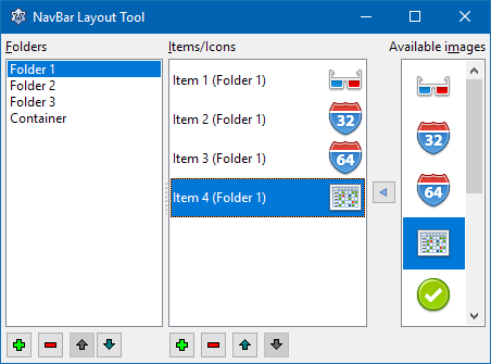 | |
| 589 | 591 | ||
| 590 | 592 | **Populating a TVpNavBar at designtime** is easy if the version of VisualPlanIt is at least 1.0.10 in which the component editor of the NavBar is functional. Just double-click on the component, or select "Layout Tool..." from the context menu of the component. This opens the component editor displayed here as a screenshot. It contains three listboxes: | |
| 591 | 593 | ||
| 592 | 594 | - The **left listbox** shows the **folders** found in the navigation bar. Click on the "+" button to add a new folder, "-" to delete the selected folder, or the "up"/"down" arrows to rearrange the folders. The properties of the selected folder are displayed in the object inspector: | |
| 593 | 595 | - Specify the `Caption` of the folder - this is the text to appear on the button/tab of the folder. | |
| 594 | 596 | - Leave `IconSize` at `isLarge` if you want to use large icons for this folder's items. In this case, icons and their captions will be centered, the caption will be below the icon and word-wrapped if the text is longer than the width of the NavBar. If you select `isSmall`, on the other hand, icons and captions are left aligned, and the (non-wrapped) captions are drawn at the right of the icons. `IconSize` can change from folder to folder. | |
| 595 | 597 | - Do not set the `FolderType` to `ftContainer` - this feature for adding arbitrary controls to the folder is not working in Lazarus at the time of this writing. | |
| 596 | 598 | - The **center listbox** shows the **items** assigned to the folder highlighted in the left list. Caption and icon of this item are displayed in each line. Again click on the "+", "-", or "up"/"down" buttons to add, delete or rearrange the items. And again, the properties of the selected item can be changed in the object inspector. Besides the `Caption` already mentioned for the folders, there is also a property `ImageIndex` which specifies the icon displayed for the item. The image index refers to the ImageList assigned to the property `Images` of the NavBar. | |
| 597 | 599 | - The **right listbox** contains all the **images** found in the ImageList. It is intended to simplify the assignment of icons to items: Select the item for which an icon is to be selected. pick the icon in the right image list and click on the arrow between the item and images listboxes. | |
| 598 | 600 | ||
| 599 | 601 | If the VisualPlanIt version is older than version 1.0.10, then getting folders and items into the NavBar is a bit more complicated because the component editor had not yet been ported/adapted to Lazarus. In this case, it is best to learn this task by means of the object inspector: | |
| 600 | 602 | ||
| 601 | 603 | - Add a TVpNavBar component to the form. | |
| 602 | 604 | - Add an imagelist with, ideally 32x32 images, and assign it to the `Images` property of the NavBar. | |
| 603 | 605 | - Click on the "..." button next to `FolderCollection` to open the collection editor for the folders. | |
| 604 | 606 | - Click "Add" to add a new folder. | |
| 605 | 607 | - Select the new folder in the collection editor, its properties appear in the object inspector and can be changed there. | |
| 606 | 608 | - In order to add items to the folder click on `ItemCollection`. This opens the collection editor for the items belonging to the current folder. | |
| 607 | 609 | - Again click "Add" to create a new item, and select it in the collection editor to enter its properties in the object inspector. | |
| 608 | 610 | ||
| 609 | 611 | ## Gadgets | |
| 610 | 612 | ||
| 611 | 613 | 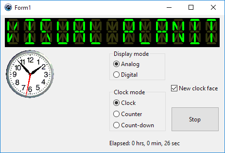 | |
| 612 | 614 | ||
| 613 | 615 | In addition to the planner components the Visual PlanIt package contains also two stand-alone gadgets: | |
| 614 | 616 | ||
| 615 | 617 | ### TVpLEDLabel | |
| 616 | 618 | ||
| 617 | 619 | This is a 14-segment LED display which can display any ASCII string. The string is defined by means of the property `Caption`, but the count of LED characters must be defined explicitly using the property `Columns` | |
| 618 | 620 | ||
| 619 | 621 | ### TVpClock | |
| 620 | 622 | ||
| 621 | 623 | This is a digital or analog clock - depending on the property `DisplayMode`. A variety of settings can be adjusted for each mode separately by using the properties in `AnalogOptions` and `DigitalOptions`. The properties are pretty much self-explanatory, except maybe the `DigitalOptions.MilitaryTime` which activates the 24-hour display if `true`, or the 12-hour am/pm mode if `false`. The `AnalogOptions.ClockFace` replaces the default-drawn clock face by a bitmap - see screenshot. | |
| 622 | 624 | ||
| 623 | 625 | With the property `ClockMode` the operation of the clock can be changed from standard clock to count-up or count-down timer, `cmClock`, `cmTimer`, `cmCountdownTimer`, respectively. | |
| 624 | 626 | ||
| 625 | 627 | The property `Active` starts the clock when set to `true`, or stops it when set to `false`. There is also a property `Hold` which temporarily pauses the clock when set to `true` and resumes it when set to `false`. Convenience methods `Start`, `Stop`, `Pause` and `Resume` have the same purpose. | |
| 626 | 628 | ||
| 627 | 629 | Property `TimeResolution` determines how often the display is updated (in milliseconds). | |
| 628 | 630 | ||
| 629 | 631 | --- | |
| 630 | 632 | *From the Free Pascal wiki, page "Turbopower Visual PlanIt", as it stood on 2023-07-22 after a change by Wp, out of the wiki's dump of 2024-05-26. Copyright stays with the author who wrote it, according to the old wiki's [[Licensing]] page. If you have concerns about this material, [message the admin](/wiki-contact).* |