

TComboBox: what changed
Revision 1 to 2. Removed lines have a minus sign; added lines have a plus sign.
| Old | New | Line | |
|---|---|---|---|
| 1 | 1 | A **TComboBox**  is a combination of an edit box and a (drop-down) list allowing one of several options to be chosen. | |
| 2 | 2 | ||
| 3 | 3 | # Usage | |
| 4 | 4 | ||
| 5 | 5 | To use a [[doc:lcl/stdctrls/tcombobox.html|TComboBox]] on a [[TForm|form]], you can simply select it on the *[[Standard tab]]* of the [[Component Palette]] and place it by clicking on the form. | |
| 6 | 6 | ||
| 7 | 7 | In the ComboBox, the stored [[String|strings]] are stored in the property *Items*, that is of type TStrings. Thus you can assign or remove strings in the ComboBox, as in a [[TStringList-TStrings Tutorial|TStringList]] or its parent [[TStringList-TStrings Tutorial|TStrings]]. | |
| 8 | 8 | ||
| 9 | 9 | Here are a few examples to use a combobox *ComboBox1* on a form *Form1*: | |
| 10 | 10 | ||
| 11 | 11 | ## Fill ComboBox | |
| 12 | 12 | ||
| 13 | 13 | ### By the Object Inspector | |
| 14 | 14 | ||
| 15 | 15 | - Select the ComboBox on your form with one click. | |
| 16 | 16 | - Go in the Object Inspector in the Properties tab on the property *Items*. | |
| 17 | 17 | - Click on the button with the three dots. The String Editor opens. | |
| 18 | 18 | - Enter your text and confirm your work with *OK*. | |
| 19 | 19 | ||
| 20 | 20 | ### By code when you create the form | |
| 21 | 21 | ||
| 22 | 22 | - Create the *OnCreate* event handler for the form, by clicking on your form, use the Object Inspector, the tab events, select the *OnCreate* event and click the button \[...\] or double click the button in the form. | |
| 23 | 23 | - In the source editor, you now insert the desired selection texts, for our example, you write as follows: | |
| 24 | 24 | ||
| 25 | 25 | ``` pascal | |
| 26 | 26 | procedure TForm1.FormCreate(Sender: TObject); | |
| 27 | 27 | begin | |
| 28 | 28 | ComboBox1.Items.Clear; //Delete all existing choices | |
| 29 | 29 | ComboBox1.Items.Add('Red'); //Add an choice | |
| 30 | 30 | ComboBox1.Items.Add('Green'); | |
| 31 | 31 | ComboBox1.Items.Add('Blue'); | |
| 32 | 32 | ComboBox1.Items.Add('Random Color'); | |
| 33 | 33 | end; | |
| 34 | 34 | ``` | |
| 35 | 35 | ||
| 36 | 36 | ## Make that something happens after the selection | |
| 37 | 37 | ||
| 38 | 38 | Like all components, even the TComboBox provides various [[Event order|events]], that are called when the user use the combobox. To respond to a change of the selection in the ComboBox, you can use the *OnChange* event: | |
| 39 | 39 | ||
| 40 | 40 | - Doubleclick the ComboBox on the form or choose the *OnChange* event in the Object Inspector and click on the button \[...\]. | |
| 41 | 41 | - The event handler is created, now you can insert your desired source, in our example we want to change the background color of the form: | |
| 42 | 42 | ||
| 43 | 43 | ``` pascal | |
| 44 | 44 | procedure TForm1.ComboBox1Change(Sender: TObject); | |
| 45 | 45 | begin | |
| 46 | 46 | case ComboBox1.ItemIndex of //what entry (which item) has currently been chosen | |
| 47 | 47 | 0: Color:=clRed; | |
| 48 | 48 | 1: Color:=clGreen; | |
| 49 | 49 | 2: Color:=clBlue; | |
| 50 | 50 | 3: Color:=Random($1000000); | |
| 51 | 51 | end; | |
| 52 | 52 | end; | |
| 53 | 53 | ``` | |
| 54 | 54 | ||
| 55 | 55 | - Start your application, the selection changes the background color of the form. | |
| 56 | 56 | ||
| 57 | 57 | ## Events | |
| 58 | 58 | ||
| 59 | 59 | The *OnGetItems* event is invoked when widgetset items list can be populated, so it is triggered when the button of the combo box is pressed. | |
| 60 | 60 | ||
| 61 | 61 | ## Owner drawn ComboBox | |
| 62 | 62 | ||
| 63 | 63 | In general, it is advantageous to let the ComboBox show in the [theme](http://en.wikipedia.org/wiki/Skin_%28computing%29) the user has chosen in his settings. In some cases (for example, to program a game with a colorful surface), you can deviate from this standard and draw it according to your own choice. This is how this works: | |
| 64 | 64 | ||
| 65 | 65 | > **Note:** **Parameters of ComboBoxDrawItem:**\ | |
| 66 | 66 | > \ | |
| 67 | 67 | > **Control:**\ | |
| 68 | 68 | > If multiple controls (e.g. multiple ComboBoxes) access this event handle, you know which control caused the event. In our example, instead of **`ComboBox1.Canvas.FillRect(ARect)`** you could also write **`TComboBox(Control).Canvas.FillRect(ARect)`**. However, you should still check in advance, whether it is a TComboBox: | |
| 69 | 69 | > | |
| 70 | 70 | > ``` pascal | |
| 71 | 71 | > if Control is TComboBox then | |
| 72 | 72 | > TComboBox(Control).Canvas.FillRect(ARect); | |
| 73 | 73 | > ``` | |
| 74 | 74 | > | |
| 75 | 75 | > **Index:** Specifies the item location, so you have access to the string **`<ComboBox>.Items[Index]`**.\ | |
| 76 | 76 | > **ARect:** Describes the rectangle, which is necessary for drawing the background.\ | |
| 77 | 77 | > **State:** Status of the items, whether normal, focused, selected etc. | |
| 78 | 78 | ||
| 79 | 79 | ### Draw a filled rectangle | |
| 80 | 80 | ||
| 81 | 81 | - You can modify the example [[TComboBox|Fill ComboBox by code when you create the form]]. | |
| 82 | 82 | - Change from *ComboBox1* in the Object Inspector the property *Style* to *csOwnerDrawFixed*. | |
| 83 | 83 | - Create in the Object Inspector the event handler for the event *OnDrawItem*, by clicking on the button \[...\]. | |
| 84 | 84 | - Add the following code to the handler: | |
| 85 | 85 | ||
| 86 | 86 | ``` pascal | |
| 87 | 87 | procedure TForm1.ComboBox1DrawItem(Control: TWinControl; Index: Integer; | |
| 88 | 88 | ARect: TRect; State: TOwnerDrawState); | |
| 89 | 89 | var | |
| 90 | 90 | ltRect: TRect; | |
| 91 | 91 | ||
| 92 | 92 | procedure FillColorfulRect(aCanvas: TCanvas; myRect: TRect); //paint random color | |
| 93 | 93 | // Fills the rectangle with random colours | |
| 94 | 94 | var | |
| 95 | 95 | y: Integer; | |
| 96 | 96 | begin | |
| 97 | 97 | for y:=myRect.Top to myRect.Bottom - 1 do begin | |
| 98 | 98 | aCanvas.Pen.Color:=Random($1000000); | |
| 99 | 99 | aCanvas.Line(myRect.Left, y, myRect.Right, y); | |
| 100 | 100 | end; | |
| 101 | 101 | end; | |
| 102 | 102 | ||
| 103 | 103 | begin | |
| 104 | 104 | ComboBox1.Canvas.FillRect(ARect); //first paint normal background | |
| 105 | 105 | ComboBox1.Canvas.TextRect(ARect, 22, ARect.Top, ComboBox1.Items[Index]); //paint item text | |
| 106 | 106 | ||
| 107 | 107 | ltRect.Left := ARect.Left + 2; //rectangle for color | |
| 108 | 108 | ltRect.Right := ARect.Left + 20; | |
| 109 | 109 | ltRect.Top := ARect.Top + 1; | |
| 110 | 110 | ltRect.Bottom := ARect.Bottom - 1; | |
| 111 | 111 | ||
| 112 | 112 | ComboBox1.Canvas.Pen.Color:=clBlack; | |
| 113 | 113 | ComboBox1.Canvas.Rectangle(ltRect); //draw a border | |
| 114 | 114 | ||
| 115 | 115 | if InflateRect(ltRect, -1, -1) then //resize rectangle by one pixel | |
| 116 | 116 | if Index = 3 then | |
| 117 | 117 | FillColorfulRect(ComboBox1.Canvas, ltRect) //paint random color | |
| 118 | 118 | else begin | |
| 119 | 119 | case Index of | |
| 120 | 120 | 0: ComboBox1.Canvas.Brush.Color := clRed; | |
| 121 | 121 | 1: ComboBox1.Canvas.Brush.Color := clGreen; | |
| 122 | 122 | 2: ComboBox1.Canvas.Brush.Color := clBlue; | |
| 123 | 123 | end; | |
| 124 | 124 | ComboBox1.Canvas.FillRect(ltRect); //paint colors according to selection | |
| 125 | 125 | end; | |
| 126 | 126 | end; | |
| 127 | 127 | ``` | |
| 128 | 128 | ||
| 129 | 129 | - Your example might look like: | |
| 130 | 130 | ||
| 131 | 131 | 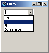 -\> 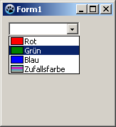 | |
| 132 | 132 | ||
| 133 | 133 | ### Preceded image | |
| 134 | 134 | ||
| 135 | 135 | In this example, we load a few images in a [[TImageList]] and draw them in front of the items in the combobox. It is a simple example which only generally show what you can do. I don't run explicitly details, such as checking, whether the corresponding image exists etc. in this example. This should be done by you depending on the need. | |
| 136 | 136 | ||
| 137 | 137 | - Create an application analogous example [[TComboBox|Fill ComboBox by code when you create the form]]. | |
| 138 | 138 | - Change from *ComboBox1* in the Object Inspector the property *Style* to *csOwnerDrawFixed*. | |
| 139 | 139 | - Add a [[TImageList]] from the component palette *Common controls* on your form. | |
| 140 | 140 | - The *Height* and *Width* of 16 pixels is preset in *ImageList1*. We allow this. To fit neatly the images into our combo box, we make the property *ItemHeight* from *ComboBox1* to *18* in the Object Inspector. | |
| 141 | 141 | - Add four images in the ImageList: | |
| 142 | 142 | - Doubleclick *ImageList1* or leftclick *ImageList1* and select *ImageList Editor...*. | |
| 143 | 143 | - Click on *Add* and select an image (see \<Lazarus directory\>/images/... there are various images or icons in 16x16px size). | |
| 144 | 144 | - Have you added four images, confirm your work with \[OK\]. | |
| 145 | 145 | - Create in the Object Inspector the event handler for the event *OnDrawItem*, by clicking on the button \[...\]. | |
| 146 | 146 | - Add the following code to the handler: | |
| 147 | 147 | ||
| 148 | 148 | ``` pascal | |
| 149 | 149 | procedure TForm1.ComboBox1DrawItem(Control: TWinControl; Index: Integer; | |
| 150 | 150 | ARect: TRect; State: TOwnerDrawState); | |
| 151 | 151 | begin | |
| 152 | 152 | ComboBox1.Canvas.FillRect(ARect); //first paint normal background | |
| 153 | 153 | ComboBox1.Canvas.TextRect(ARect, 20, ARect.Top, ComboBox1.Items[Index]); //paint item text | |
| 154 | 154 | ImageList1.Draw(ComboBox1.Canvas, ARect.Left + 1, ARect.Top + 1, Index); //draw image according to index on canvas | |
| 155 | 155 | end; | |
| 156 | 156 | ``` | |
| 157 | 157 | ||
| 158 | 158 | - Your example might look like: | |
| 159 | 159 | ||
| 160 | 160 |  -\> 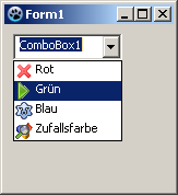 | |
| 161 | 161 | ||
| 162 | 162 | ## Styles | |
| 163 | 163 | ||
| 164 | 164 | ### csSimple | |
| 165 | 165 | ||
| 166 | 166 | **csSimple** represents itself a simple edit box with a list box underneath. The list box is only shown, if there's enough height allocated. By default the height is set to shown the edit box only. | |
| 167 | 167 | ||
| 168 | 168 | There's no dropdown icon to show the list box. Items can be changed by using keyboard (arrow keys), or by clicking an an item, if the control is high enough to show the items list. | |
| 169 | 169 | ||
| 170 | 170 | **csSimple** style is Windows specific. Non-widows widgetset most likely don't implement and fall back to **csDropDown**. | |
| 171 | 171 | ||
| 172 | 172 | Here's an example of (non-autosized) csSimple ComboBox on two different widgetset. (as of Lazarus 2.0.8): | |
| 173 | 173 | ||
| 174 | - | ||
| 174 | + | 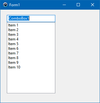 | |
| 175 | + | ||
| 176 | + | Win32 | |
| 177 | + | ||
| 178 | + | 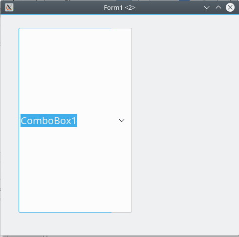 | |
| 179 | + | ||
| 180 | + | Gtk2 | |
| 175 | 181 | ||
| 176 | 182 | # Proposed Features | |
| 177 | 183 | ||
| 178 | 184 | ## ReadOnly | |
| 179 | 185 | ||
| 180 | 186 | ReadOnly property has been deprecated since 2017. It has been removed as of today. | |
| 181 | 187 | ||
| 182 | 188 | However, it's possible to reinstate ReadOnly property as a mirror of TEdit readonly. | |
| 183 | 189 | ||
| 184 | 190 | The complexity of ComboBox is that it bears features of both ListBox and Edit (but it's not a descendant of either). While ComboBox does provides the means to change the selection (just like TEdit), it might be helpful also to make the edit box readonly. (Note, that this is different to csDropDownList. ccDropDownList typically implements a dropdown as a button). | |
| 185 | 191 | ||
| 186 | 192 | How, ReadOnly property is expected to work: | |
| 187 | 193 | ||
| 188 | 194 | - it's available for any ComboBox style | |
| 189 | 195 | - it's does not influence or is not influenced by any ComboBox style selected or changed (unlike the previous implementation of ReadOnly) | |
| 190 | 196 | - if set to true, the edit box (if supported by the comboBox style on the widgetset) becomes ReadOnly (in terms of TEdit). The content cannot be changed by any text input actions (such as editing, pasting, or dragging the text around). | |
| 191 | 197 | ||
| 192 | 198 | :* the combobox value CAN be changed by selecting a different item from the dropdown, by either using a mouse (or respective key combinations, i.e. up or down arrows) | |
| 193 | 199 | ||
| 194 | 200 | ## TextHint | |
| 195 | 201 | ||
| 196 | 202 | As ComboBox bears traits of TEdit, it's should be possible to set TextHint for comboBox, if the value is empty. | |
| 197 | 203 | ||
| 198 | 204 | Introduce TextHint property that should act similar to TEdit | |
| 199 | 205 | ||
| 200 | 206 | - if text value of combobox is empty, the TextHint should be presented (in the colors and font style, that's applicable to the current widgetset theme) | |
| 201 | 207 | ||
| 202 | 208 | # See also | |
| 203 | 209 | ||
| 204 | 210 | - [[doc:lcl/stdctrls/tcombobox.html|TComboBox]] | |
| 205 | 211 | - [[TEdit]] | |
| 206 | 212 | - [[TListBox]] | |
| 207 | 213 | - [[TDBComboBox]] | |
| 208 | 214 | - [[TDBLookupComboBox]] | |
| 209 | 215 | ||
| 210 | 216 | --- | |
| 211 | 217 | *From the Free Pascal wiki, page "TComboBox", as it stood on 2022-09-13 after a change by Paskal, out of the wiki's dump of 2024-05-26. Copyright stays with the author who wrote it, according to the old wiki's [[Licensing]] page. If you have concerns about this material, [message the admin](/wiki-contact).* |