

TBitBtn/es: what changed
Revision 1 to 2. Removed lines have a minus sign; added lines have a plus sign.
| Old | New | Line | |
|---|---|---|---|
| 1 | 1 | **TBitBtn**  es un componente que crea un botón con una imagen (opcional) sobre él. Un TBitBtn es un descendiente de [[TWinControl]] y está disponible sobre la pestaña [[Additional tab/es]] de la [[Lazarus Tutorial/es|Paleta de componentes]]. | |
| 2 | 2 | ||
| 3 | - | ||
| 4 | - | ||
| 5 | - | ||
| 6 | - | ||
| 3 | + | 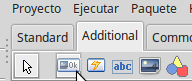 | |
| 7 | 4 | ||
| 8 | 5 | TBitBtn tiene una propiedad *Kind* que permite seleccionar tipos de botones predefinidos como los clásicos *bkok*, *bkcancel* y otros más, con la imagen y texto correspondiente. Por default el tipo (kind) del botón es *bkCustom* lo cual permite seleccionar una imagen (desde la propiedad *Glyph*) y el texto desde la propiedad *Caption*, obteniendo un modal-result *mrOk*. | |
| 9 | 6 | ||
| 10 | 7 | Desde la propiedad *Layout* se define si la imagen se situará a la izquierda, derecha, arriba o dejajo del texto. | |
| 11 | 8 | ||
| 12 | - | ||
| 13 | - | ||
| 14 | - | ||
| 15 | - | ||
| 9 | + | 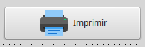 | |
| 16 | 10 | ||
| 17 | 11 | ## Ver también | |
| 18 | 12 | ||
| 19 | 13 | - [[doc:lcl/buttons/tbitbtn.html|TBitBtn doc]] | |
| 20 | 14 | - [[TButton/es|TButton]] | |
| 21 | 15 | - [[TSpeedButton]] | |
| 22 | 16 | - [[TColorButton]] | |
| 23 | 17 | ||
| 24 | 18 | --- | |
| 25 | 19 | *From the Free Pascal wiki, page "TBitBtn/es", as it stood on 2018-02-25 after a change by Useroflazarus, out of the wiki's dump of 2024-05-26. Copyright stays with the author who wrote it, according to the old wiki's [[Licensing]] page. If you have concerns about this material, [message the admin](/wiki-contact).* |