

TAChart Tutorial: BarSeries/ru: what changed
Revision 1 to 2. Removed lines have a minus sign; added lines have a plus sign.
| Old | New | Line | |
|---|---|---|---|
| 1 | 1 | ## Введение | |
| 2 | 2 | ||
| 3 | 3 | 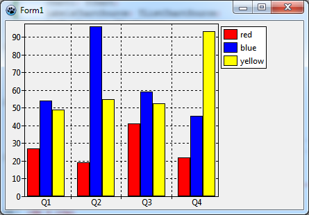 | |
| 4 | 4 | ||
| 5 | 5 | Библиотека `TAChart` различные диаграммы в Lazarus. Но в отличии от других типов рядов, гистограммы (столбчатые диаграммы) кажутся более сложными, главным образом потому, что существует широкий спектр возможностей: | |
| 6 | 6 | ||
| 7 | 7 | - смежные столбцы | |
| 8 | 8 | - сложенные столбцы | |
| 9 | 9 | - сложенные столбцы, приведенных к 100% | |
| 10 | 10 | - вертикальные столбцы | |
| 11 | 11 | - горизонтальные столбцы | |
| 12 | 12 | ||
| 13 | 13 | В этом руководстве мы хотим показать вам принципы того, как создать диаграмму с несколькими рядами столбцов, расположенными смежно. [[TAChart Tutorial: Stacked BarSeries|follow-up tutorial]] научит вас, как сложить столбцы друг над другом. | |
| 14 | 14 | ||
| 15 | 15 | Помимо гистограмм в этом руководстве будет представлен [[TAChart documentation|TRandomChartSource]], который является стандартным инструментом для разработки диаграммы без необходимости компиляции приложения. | |
| 16 | 16 | ||
| 17 | 17 | Вам понадобятся некоторые базовые знания в Pascal и в Lazarus. Взгляните на [[TAChart Tutorial: Getting started]], чтобы изучить некоторые базовые навыки работы с `TAChart`, если эта библиотека новая для Вас. Мы также рекомендуем [[TAChart documentation]]. | |
| 18 | 18 | ||
| 19 | 19 | ## Подготовка | |
| 20 | 20 | ||
| 21 | 21 | ### Настройка диаграммы | |
| 22 | 22 | ||
| 23 | 23 | Создайте новый проект, сохраните его. | |
| 24 | 24 | ||
| 25 | 25 | Добавьте компонент `TChart` из палитры компонентов Lazarus на `Form1`, смасштабируйте его, чтобы заполнить заданную область формы. | |
| 26 | 26 | ||
| 27 | 27 | ### Данные для вывода | |
| 28 | 28 | ||
| 29 | 29 | Прежде чем продолжить, давайте подумаем о том, какие данные мы хотим вывести. Возможно, вы могли бы использовать баланс своих чековых и сберегательных счетов, или бизнес-отчеты крупных компаний, найденные где-нибудь в Интернете, или что-то совершенно другое... | |
| 30 | 30 | ||
| 31 | 31 | Давайте на этот раз пойдем другим путем: почему бы нам не построить график только случайных данных? Конечно, они ничего не значат, но они просты и очень удобны для того, чтобы потренироваться с компонентом. В частности, `TAChart` содержит компонент [[TAChart documentation|TRandomChartSource]] который предоставляет случайные данные, подключающиеся к диаграммам прямо во время разработки. Это означает, что вы можете следовать этому руководству без необходимости написания хотя бы одной строчки кода и без необходимости компилировать демонстрационное приложение. Позже, когда работа над макетом будет завершена, вы можете удалить источники случайных диаграмм и заменить их источниками диаграмм, содержащими наши данные. | |
| 32 | 32 | ||
| 33 | 33 | Как вы вскоре увидите, на графике будет три ряда, каждый из которых, к примеру, с четырьмя столбцами. Для каждой серии вам понадобится `RandomChartSource`. Чтобы добавить `RandomChartSource` вгляните на палитру компонентов "Диаграммы" - это третий значок на палитре, подсвеченный красным на скриншоте ниже: | |
| 34 | 34 | ||
| 35 | 35 |  | |
| 36 | 36 | ||
| 37 | 37 | Добавьте в форму три источника случайных диаграмм - по одному на серию. Переименуйте в `RedChartSource`, `BlueChartSource` и `YellowChartSource` таким образом, что они будут связаны с красным "red", синим "blue" и желтым "yellow" сериями диаграмм, которые сразу будут созданы (Вы всегда должны использовать "говорящие" названия для переменных.) | |
| 38 | 38 | ||
| 39 | 39 | Прежде чем сделать это, нам нужно настроить источники случайных диаграмм, потому что по умолчанию они не предоставлят никаких данных. Мы хотим, чтобы в каждой серии было по четыре диаграммы. Поэтому установите свойство `PointsNumber` в значение 4. Чтобы метки осей синхронизировались со столбцами, ось `x` должна находиться в диапазоне от 1 до 4 ( или от 0 до 3, или от 0 до 39, как Вам угодно - мы обсудим метки осей более подробно позже): `XMin = 1, XMax = 4`. И, наконец, мы также должны указать диапазон осей `y`, можно выбрать `YMin = 0` и `YMax = 100`. | |
| 40 | 40 | ||
| 41 | 41 | ## Ряды столбцов | |
| 42 | 42 | ||
| 43 | 43 | ### Добавление рядов | |
| 44 | 44 | ||
| 45 | 45 | Теперь, когда все приготовления закончены, мы можем добавить ряд столбцов на диаграмму. Дважды щелкните по диаграмме, чтобы открыть редактор рядов (series). Нажмите "Добавить" и выберите "Ряд столбцов" из списка. Повторите дважды. В конце концов, у нас есть три ряда столбцов на графике. Мы не видим их на диаграмме, так как они еще не связаны с нашими данными. Однако в дереве объектов Инспектора объектов ряды отображаются как дочерние элементы узла диаграммы. | |
| 46 | 46 | ||
| 47 | 47 | Щелкните на первом ряду в дереве объектов и - в Инспекторе объектов - перейдите к свойству `Source` и выберите `RedChartSource` из списка. Теперь ряды становятся видимыми на диаграмме. Для того, чтобы сделать его красным "red" перейдите к его свойству `SeriesColor` и выберите цвет `clRed`. Переименуйте ряд в "RedBarSeries", и измените заголовок (title) на "красный". Последнее предназначено для легенды, которую мы включаем, устанавливая `Legend.Visible` в `true`. | |
| 48 | 48 | ||
| 49 | 49 | Повторите все это с двумя другими рядами аналогично. | |
| 50 | 50 | ||
| 51 | 51 | 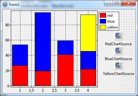 | |
| 52 | 52 | ||
| 53 | 53 | Теперь на графике отображается ряд столбцов (гистограмма). Однако столбики расположены на одном и том же значении оси `X`, желтые столбики частично закрыты другими столбиками. Давайте исправим это. | |
| 54 | 54 | ||
| 55 | 55 | ### Side-by-side arrangement of bars | |
| 56 | 56 | ||
| 57 | 57 | In oder to arrange the bars of each group (i.e. bars corresponding to the same `x` value) side-by-side, we have to shift them horizontally. `TBarSeries` offers two properties for this purpose: | |
| 58 | 58 | ||
| 59 | 59 | - `BarWidthPercent` | |
| 60 | 60 | - `BarOffsetPercent` | |
| 61 | 61 | ||
| 62 | 62 | Both numbers are expressed as a percentage of the distance to the next bar group. (In some charts, the bars are not equidistant and therefore get varying bar widths. To achieve a constant bar thickness in such a case, set the property `BarWidthStyle` to `bwPercentMin`.) | |
| 63 | 63 | ||
| 64 | 64 | The basic idea is that the space between the bar groups (100%) is divided by the bars and some empty space to the next group. If we want to leave a gap of - say - one bar width between the groups, we have to divide 100% by 4 (3 bars plus gap), i.e. each bar can occupy a width of 25%. | |
| 65 | 65 | ||
| 66 | 66 | So, let's set the `BarWidthPercent` to 25% and see what happens. Oh - not quite what we wanted: The bars did get narrower, but they are still overlapping. Of course, this happens because we did not change the `BarOffsetPercent` parameter. | |
| 67 | 67 | ||
| 68 | 68 | Currently, `BarOffsetPercent` is zero which means that the center of each bar is exactly at the position of the axis tick mark. We have to shift the red bars to the left and the yellow bars to the right such that they touch the blue bars which remain in the center. The shift difference is one bar width, i.e. 25%. For moving the red bars to the left their `BarOffsetPercent` has to be negative. | |
| 69 | 69 | ||
| 70 | 70 | In summary, we use the following values: | |
| 71 | 71 | ||
| 72 | 72 | - `RedBarSeries: BarOffsetPercent = -25, BarWidthPercent = 25` | |
| 73 | 73 | - `BlueBarSeries: BarOffsetPercent = 0, BarWidthPercent = 25` | |
| 74 | 74 | - `YellowBarSeries: BarOffsetPercent = 25, BarWidthPercent = 25` | |
| 75 | 75 | ||
| 76 | 76 | 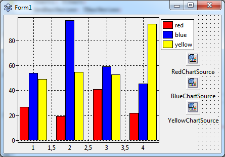 | |
| 77 | 77 | ||
| 78 | 78 | ## Axis | |
| 79 | 79 | ||
| 80 | 80 | ### Using text labels | |
| 81 | 81 | ||
| 82 | 82 | The next issue to be addressed is the `x` axis. Usually bar charts are considered to display categories of some data sets which often requires text labels underneath each bar group. But so far, we only have numerical labels, and the intermediate labels at half integers are particularly annoying. | |
| 83 | 83 | ||
| 84 | 84 | The best way to get this right is to use an additional ChartSource for assigning the strings to the axis values, it is a `TListChartSource` this time to be found as the second icon in the chart component palette (immediately to the left of the `TRandomChartSource`.) Add it to the form and rename is as `LabelsChartSource`. | |
| 85 | 85 | ||
| 86 | 86 | The ListChartSource has a built-in data editor which allows to enter data at design-time. Select the `LabelsChartSource` and go to the property `DataPoints`. Click on "..." at the right to open the data points editor, and enter the following data: | |
| 87 | 87 | ||
| 88 | 88 | 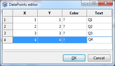 | |
| 89 | 89 | ||
| 90 | 90 | In the "X" column we enter the values of the `x` coordinates of each bar group. We could omit the "Y" column, but as we'll see later that it is conventient to have the same data in this column as well because labels are retained after rotation of the bars to an horizontal arrangement. In the column "Text" we specify the texts that will appear for each bar group along the axis as axis marks. Let us assume that our data represent some seasonal values and use the abbreviations "Q1", "Q2", "Q3", and "Q4" for "quarter 1" etc. Column "Color" can be left empty. | |
| 91 | 91 | ||
| 92 | 92 | In order to activate these labels we have to assign this ChartSource to the `Source` property of the `Marks` of the bottom axis, and we have to set the property `Style` of the `Marks` to `smsLabel`. | |
| 93 | 93 | ||
| 94 | 94 | Voila - here's what we get: | |
| 95 | 95 | ||
| 96 | 96 | 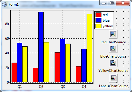 | |
| 97 | 97 | ||
| 98 | 98 | ### Showing grid lines & ticks between groups | |
| 99 | 99 | ||
| 100 | 100 | A minor issue can be improved: the chart would be clearer if the axis tick marks and grid lines were not at the center of the bar groups, but right between them. | |
| 101 | 101 | ||
| 102 | 102 | At first, we turn off the grid of the bottom axis: `BottomAxis.Grid.Visible = false`. To remove the ticks, we can set the `TickLength` and the `TickInnerLength` to `0`. | |
| 103 | 103 | ||
| 104 | 104 | But how to add grid lines between the chart groups? This can be done by creating a "minor" axis to the bottom axis. This is another set of ticks and gridlines in addition to the "major" axis. Go to the bottom axis and click on `Minors` to open the corresponding editor. Click "Add" and the select the `0 - M` in the list. Back in the normal Object Inspector, activate `Visible`, increase the `TickLength` to 4, and finally, set `Intervals.Count` to `1` - we only want one minor tick between the major ticks. Check the `Grid` settings - `Visible` should be `true`. | |
| 105 | 105 | ||
| 106 | 106 | This leads to the final result. Final? Not quite! There is an annoying little gap underneath the bars. This originates from the chart's `Margins` property which leaves some distance between the series and the axes. Just set `Chart.Margins.Bottom` to `0` to remove the gap. | |
| 107 | 107 | ||
| 108 | 108 | 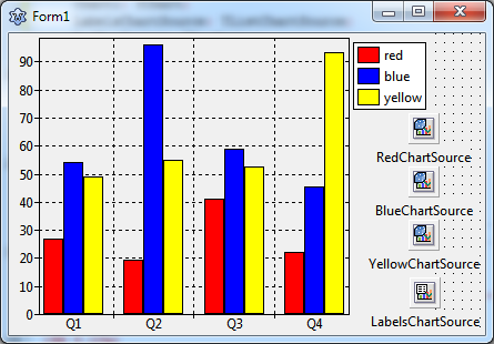 | |
| 109 | 109 | ||
| 110 | 110 | ## Horizontal bar series | |
| 111 | 111 | ||
| 112 | 112 | Before closing this lesson we'd like to quickly modify this project and create a plot with horizontal bars. This kind of diagram is often preferred when the axis labels consist of lengthy texts, and the chart is in a landscape orientation. | |
| 113 | 113 | ||
| 114 | 114 | `TAChart` does not offer a dedicated "`THorizontalBarSeries`", but the standard `TBarSeries` can easily be modified to obtain horizontal bars. Like any other descendant of `TChartSeries` it has properties `AxisIndexX` and `AxisIndexY` to indicate which axis is responsible for `x` and `y` coordinates. Just set `AxisIndexX` to the index of the `LeftAxis` (usually `0`) and `AxisIndexY` to that of the `BottomAxis` in order to rotate the bar direction. | |
| 115 | 115 | ||
| 116 | 116 | And, of course, the `LabelsChartSource` has to be linked to the `Marks.Source` of the `LeftAxis` this time. And the minor axis has to be handled accordingly. | |
| 117 | 117 | ||
| 118 | 118 | Essentially, that's all that's needed to create a chart with horizontal bars. | |
| 119 | 119 | ||
| 120 | 120 | 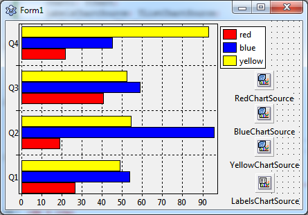 | |
| 121 | 121 | ||
| 122 | 122 | ## Summary | |
| 123 | 123 | ||
| 124 | 124 | Steps to create a side-by-side bar chart: | |
| 125 | 125 | ||
| 126 | 126 | - Every bar requires a separate BarSeries. | |
| 127 | 127 | - Use the BarSeries' properties `BarWidthPercent` and `BarOffsetPercent` to arrange the bars side-by-side with or without overlapping. The percentages refer to the distance between the center of the bar groups. | |
| 128 | 128 | - For horizontal bar series, set the series' `AxisIndexX` to the index of the chart's `LeftAxis` (usually `0`) and `AxisIndexY` to the index of the `BottomAxis` (usually `1`). | |
| 129 | 129 | ||
| 130 | 130 | ## Source code | |
| 131 | 131 | ||
| 132 | 132 | The source code of this tutorial is available in the folder `components/tachart/tutorials/bar_series` of your TAChart installation of newer Lazarus versions. | |
| 133 | 133 | ||
| 134 | 134 | ### Project file | |
| 135 | 135 | ||
| 136 | 136 | ``` pascal | |
| 137 | 137 | program project1; | |
| 138 | 138 | ||
| 139 | 139 | {$mode objfpc}{$H+} | |
| 140 | 140 | ||
| 141 | 141 | uses | |
| 142 | 142 | {$IFDEF UNIX}{$IFDEF UseCThreads} | |
| 143 | 143 | cthreads, | |
| 144 | 144 | {$ENDIF}{$ENDIF} | |
| 145 | 145 | Interfaces, // this includes the LCL widgetset | |
| 146 | 146 | Forms, tachartlazaruspkg, Unit1 | |
| 147 | 147 | { you can add units after this }; | |
| 148 | 148 | ||
| 149 | 149 | {$R *.res} | |
| 150 | 150 | ||
| 151 | 151 | begin | |
| 152 | 152 | RequireDerivedFormResource := True; | |
| 153 | 153 | Application.Initialize; | |
| 154 | 154 | Application.CreateForm(TForm1, Form1); | |
| 155 | 155 | Application.Run; | |
| 156 | 156 | end. | |
| 157 | 157 | ``` | |
| 158 | 158 | ||
| 159 | 159 | ### Unit1.pas | |
| 160 | 160 | ||
| 161 | 161 | ``` pascal | |
| 162 | 162 | unit Unit1; | |
| 163 | 163 | ||
| 164 | 164 | {$mode objfpc}{$H+} | |
| 165 | 165 | ||
| 166 | 166 | interface | |
| 167 | 167 | ||
| 168 | 168 | uses | |
| 169 | 169 | Classes, SysUtils, FileUtil, Forms, Controls, Graphics, Dialogs, TAGraph, | |
| 170 | 170 | TASeries, TASources; | |
| 171 | 171 | ||
| 172 | 172 | type | |
| 173 | 173 | ||
| 174 | 174 | { TForm1 } | |
| 175 | 175 | ||
| 176 | 176 | TForm1 = class(TForm) | |
| 177 | 177 | Chart1: TChart; | |
| 178 | 178 | LabelsChartSource: TListChartSource; | |
| 179 | 179 | RedBarSeries: TBarSeries; | |
| 180 | 180 | BlueBarSeries: TBarSeries; | |
| 181 | 181 | YellowBarSeries: TBarSeries; | |
| 182 | 182 | RedChartSource: TRandomChartSource; | |
| 183 | 183 | BlueChartSource: TRandomChartSource; | |
| 184 | 184 | YellowChartSource: TRandomChartSource; | |
| 185 | 185 | private | |
| 186 | 186 | { private declarations } | |
| 187 | 187 | public | |
| 188 | 188 | { public declarations } | |
| 189 | 189 | end; | |
| 190 | 190 | ||
| 191 | 191 | var | |
| 192 | 192 | Form1: TForm1; | |
| 193 | 193 | ||
| 194 | 194 | implementation | |
| 195 | 195 | ||
| 196 | 196 | {$R *.lfm} | |
| 197 | 197 | ||
| 198 | 198 | end. | |
| 199 | 199 | ``` | |
| 200 | 200 | ||
| 201 | 201 | ### Unit1.lfm (vertical bars) | |
| 202 | 202 | ||
| 203 | - | ||
| 203 | + | ``` lfm | |
| 204 | 204 | object Form1: TForm1 | |
| 205 | 205 | Left = 381 | |
| 206 | 206 | Height = 272 | |
| 207 | 207 | Top = 444 | |
| 208 | 208 | Width = 429 | |
| 209 | 209 | Caption = 'Form1' | |
| 210 | 210 | ClientHeight = 272 | |
| 211 | 211 | ClientWidth = 429 | |
| 212 | 212 | LCLVersion = '1.3' | |
| 213 | 213 | object Chart1: TChart | |
| 214 | 214 | Left = 0 | |
| 215 | 215 | Height = 272 | |
| 216 | 216 | Top = 0 | |
| 217 | 217 | Width = 384 | |
| 218 | 218 | AxisList = < | |
| 219 | 219 | item | |
| 220 | 220 | Minors = <> | |
| 221 | 221 | Title.LabelFont.Orientation = 900 | |
| 222 | 222 | end | |
| 223 | 223 | item | |
| 224 | 224 | Grid.Visible = False | |
| 225 | 225 | TickLength = 0 | |
| 226 | 226 | Alignment = calBottom | |
| 227 | 227 | Marks.Format = '%2:s' | |
| 228 | 228 | Marks.Source = LabelsChartSource | |
| 229 | 229 | Marks.Style = smsLabel | |
| 230 | 230 | Minors = < | |
| 231 | 231 | item | |
| 232 | 232 | Intervals.Count = 1 | |
| 233 | 233 | Intervals.MinLength = 5 | |
| 234 | 234 | Intervals.Options = [aipUseCount, aipUseMinLength] | |
| 235 | 235 | TickLength = 4 | |
| 236 | 236 | end> | |
| 237 | 237 | end> | |
| 238 | 238 | Foot.Brush.Color = clBtnFace | |
| 239 | 239 | Foot.Font.Color = clBlue | |
| 240 | 240 | Legend.Visible = True | |
| 241 | 241 | Margins.Bottom = 0 | |
| 242 | 242 | Title.Brush.Color = clBtnFace | |
| 243 | 243 | Title.Font.Color = clBlue | |
| 244 | 244 | Title.Text.Strings = ( | |
| 245 | 245 | 'TAChart' | |
| 246 | 246 | ) | |
| 247 | 247 | ParentColor = False | |
| 248 | 248 | object RedBarSeries: TBarSeries | |
| 249 | 249 | Title = 'red' | |
| 250 | 250 | BarBrush.Color = clRed | |
| 251 | 251 | BarOffsetPercent = -25 | |
| 252 | 252 | BarWidthPercent = 25 | |
| 253 | 253 | Source = RedChartSource | |
| 254 | 254 | end | |
| 255 | 255 | object BlueBarSeries: TBarSeries | |
| 256 | 256 | Title = 'blue' | |
| 257 | 257 | BarBrush.Color = clBlue | |
| 258 | 258 | BarWidthPercent = 25 | |
| 259 | 259 | Source = BlueChartSource | |
| 260 | 260 | end | |
| 261 | 261 | object YellowBarSeries: TBarSeries | |
| 262 | 262 | Title = 'yellow' | |
| 263 | 263 | BarBrush.Color = clYellow | |
| 264 | 264 | BarOffsetPercent = 25 | |
| 265 | 265 | BarWidthPercent = 25 | |
| 266 | 266 | Source = YellowChartSource | |
| 267 | 267 | end | |
| 268 | 268 | end | |
| 269 | 269 | object RedChartSource: TRandomChartSource | |
| 270 | 270 | PointsNumber = 4 | |
| 271 | 271 | RandSeed = 1 | |
| 272 | 272 | XMax = 4 | |
| 273 | 273 | XMin = 1 | |
| 274 | 274 | YMax = 100 | |
| 275 | 275 | YMin = 0 | |
| 276 | 276 | left = 360 | |
| 277 | 277 | top = 72 | |
| 278 | 278 | end | |
| 279 | 279 | object BlueChartSource: TRandomChartSource | |
| 280 | 280 | PointsNumber = 4 | |
| 281 | 281 | RandSeed = 2 | |
| 282 | 282 | XMax = 4 | |
| 283 | 283 | XMin = 1 | |
| 284 | 284 | YMax = 100 | |
| 285 | 285 | YMin = 0 | |
| 286 | 286 | left = 360 | |
| 287 | 287 | top = 120 | |
| 288 | 288 | end | |
| 289 | 289 | object YellowChartSource: TRandomChartSource | |
| 290 | 290 | PointsNumber = 4 | |
| 291 | 291 | RandSeed = 3 | |
| 292 | 292 | XMax = 4 | |
| 293 | 293 | XMin = 1 | |
| 294 | 294 | YMax = 100 | |
| 295 | 295 | YMin = 0 | |
| 296 | 296 | left = 360 | |
| 297 | 297 | top = 168 | |
| 298 | 298 | end | |
| 299 | 299 | object LabelsChartSource: TListChartSource | |
| 300 | 300 | DataPoints.Strings = ( | |
| 301 | 301 | '1|1|?|Q1' | |
| 302 | 302 | '2|2|?|Q2' | |
| 303 | 303 | '3|3|?|Q3' | |
| 304 | 304 | '4|4|?|Q4' | |
| 305 | 305 | ) | |
| 306 | 306 | left = 361 | |
| 307 | 307 | top = 220 | |
| 308 | 308 | end | |
| 309 | 309 | end | |
| 310 | 310 | ``` | |
| 311 | 311 | ||
| 312 | 312 | ### Unit1.lfm (horizontal bars) | |
| 313 | 313 | ||
| 314 | - | ||
| 314 | + | ``` lfm | |
| 315 | 315 | object Form1: TForm1 | |
| 316 | 316 | Left = 381 | |
| 317 | 317 | Height = 272 | |
| 318 | 318 | Top = 444 | |
| 319 | 319 | Width = 429 | |
| 320 | 320 | Caption = 'Form1' | |
| 321 | 321 | ClientHeight = 272 | |
| 322 | 322 | ClientWidth = 429 | |
| 323 | 323 | LCLVersion = '1.3' | |
| 324 | 324 | object Chart1: TChart | |
| 325 | 325 | Left = 0 | |
| 326 | 326 | Height = 272 | |
| 327 | 327 | Top = 0 | |
| 328 | 328 | Width = 384 | |
| 329 | 329 | AxisList = < | |
| 330 | 330 | item | |
| 331 | 331 | Grid.Visible = False | |
| 332 | 332 | TickLength = 0 | |
| 333 | 333 | Marks.Format = '%2:s' | |
| 334 | 334 | Marks.Source = LabelsChartSource | |
| 335 | 335 | Marks.Style = smsLabel | |
| 336 | 336 | Minors = < | |
| 337 | 337 | item | |
| 338 | 338 | Intervals.Count = 1 | |
| 339 | 339 | Intervals.MinLength = 5 | |
| 340 | 340 | Intervals.Options = [aipUseCount, aipUseMinLength] | |
| 341 | 341 | TickLength = 4 | |
| 342 | 342 | end> | |
| 343 | 343 | Title.LabelFont.Orientation = 900 | |
| 344 | 344 | end | |
| 345 | 345 | item | |
| 346 | 346 | Alignment = calBottom | |
| 347 | 347 | Minors = <> | |
| 348 | 348 | end> | |
| 349 | 349 | Foot.Brush.Color = clBtnFace | |
| 350 | 350 | Foot.Font.Color = clBlue | |
| 351 | 351 | Legend.Visible = True | |
| 352 | 352 | Margins.Bottom = 0 | |
| 353 | 353 | Title.Brush.Color = clBtnFace | |
| 354 | 354 | Title.Font.Color = clBlue | |
| 355 | 355 | Title.Text.Strings = ( | |
| 356 | 356 | 'TAChart' | |
| 357 | 357 | ) | |
| 358 | 358 | ParentColor = False | |
| 359 | 359 | object RedBarSeries: TBarSeries | |
| 360 | 360 | Title = 'red' | |
| 361 | 361 | AxisIndexX = 0 | |
| 362 | 362 | AxisIndexY = 1 | |
| 363 | 363 | BarBrush.Color = clRed | |
| 364 | 364 | BarOffsetPercent = -25 | |
| 365 | 365 | BarWidthPercent = 25 | |
| 366 | 366 | Source = RedChartSource | |
| 367 | 367 | end | |
| 368 | 368 | object BlueBarSeries: TBarSeries | |
| 369 | 369 | Title = 'blue' | |
| 370 | 370 | AxisIndexX = 0 | |
| 371 | 371 | AxisIndexY = 1 | |
| 372 | 372 | BarBrush.Color = clBlue | |
| 373 | 373 | BarWidthPercent = 25 | |
| 374 | 374 | Source = BlueChartSource | |
| 375 | 375 | end | |
| 376 | 376 | object YellowBarSeries: TBarSeries | |
| 377 | 377 | Title = 'yellow' | |
| 378 | 378 | AxisIndexX = 0 | |
| 379 | 379 | AxisIndexY = 1 | |
| 380 | 380 | BarBrush.Color = clYellow | |
| 381 | 381 | BarOffsetPercent = 25 | |
| 382 | 382 | BarWidthPercent = 25 | |
| 383 | 383 | Source = YellowChartSource | |
| 384 | 384 | end | |
| 385 | 385 | end | |
| 386 | 386 | object RedChartSource: TRandomChartSource | |
| 387 | 387 | PointsNumber = 4 | |
| 388 | 388 | RandSeed = 1 | |
| 389 | 389 | XMax = 4 | |
| 390 | 390 | XMin = 1 | |
| 391 | 391 | YMax = 100 | |
| 392 | 392 | YMin = 0 | |
| 393 | 393 | left = 360 | |
| 394 | 394 | top = 72 | |
| 395 | 395 | end | |
| 396 | 396 | object BlueChartSource: TRandomChartSource | |
| 397 | 397 | PointsNumber = 4 | |
| 398 | 398 | RandSeed = 2 | |
| 399 | 399 | XMax = 4 | |
| 400 | 400 | XMin = 1 | |
| 401 | 401 | YMax = 100 | |
| 402 | 402 | YMin = 0 | |
| 403 | 403 | left = 360 | |
| 404 | 404 | top = 120 | |
| 405 | 405 | end | |
| 406 | 406 | object YellowChartSource: TRandomChartSource | |
| 407 | 407 | PointsNumber = 4 | |
| 408 | 408 | RandSeed = 3 | |
| 409 | 409 | XMax = 4 | |
| 410 | 410 | XMin = 1 | |
| 411 | 411 | YMax = 100 | |
| 412 | 412 | YMin = 0 | |
| 413 | 413 | left = 360 | |
| 414 | 414 | top = 168 | |
| 415 | 415 | end | |
| 416 | 416 | object LabelsChartSource: TListChartSource | |
| 417 | 417 | DataPoints.Strings = ( | |
| 418 | 418 | '1|1|?|Q1' | |
| 419 | 419 | '2|2|?|Q2' | |
| 420 | 420 | '3|3|?|Q3' | |
| 421 | 421 | '4|4|?|Q4' | |
| 422 | 422 | ) | |
| 423 | 423 | left = 361 | |
| 424 | 424 | top = 220 | |
| 425 | 425 | end | |
| 426 | 426 | end | |
| 427 | 427 | ``` | |
| 428 | 428 | ||
| 429 | 429 | --- | |
| 430 | 430 | *From the Free Pascal wiki, page "TAChart Tutorial: BarSeries/ru", as it stood on 2021-09-26 after a change by Almuhandis, out of the wiki's dump of 2024-05-26. Copyright stays with the author who wrote it, according to the old wiki's [[Licensing]] page. If you have concerns about this material, [message the admin](/wiki-contact).* |