

Eye-Candy Controls/es: what changed
Revision 1 to 2. Removed lines have a minus sign; added lines have a plus sign.
| Old | New | Line | |
|---|---|---|---|
| 1 | 1 | **Eye Candy Controls** (abreviadamente ECControls o EC-Controls) son un conjunto de controles visuales escritos para Lazarus. Su diseño está basado en Temas, por lo tanto su aspecto es muy nativo en todo momento, no hay problema en cuanto al widgetset que utilices. | |
| 2 | 2 | ||
| 3 | 3 | Cada release se anuncia en el foro de Lazarus en la sección Third Party Announcements. | |
| 4 | 4 | ||
| 5 | 5 | Siempre se anexan ficheros `README.txt` (listado de incidencias conocidas)y `CHANGELOG.txt` (listado de todos los cambios realizados desde la versión previa). | |
| 6 | 6 | ||
| 7 | 7 | Licencia | |
| 8 | 8 | ||
| 9 | 9 | GNU Lesser General Public License 2.0 with linking exception (a.k.a. Modified LGPL). Each file of EC-Controls contains license header. Also, files `COPYING.modifiedLGPL.txt` and `COPYING.LGPL.txt` are bundled to each archive. | |
| 10 | 10 | ||
| 11 | 11 | Autor | |
| 12 | 12 | ||
| 13 | 13 | Todos los componentes han sido escritos por Blaazen. La notificación de Copyright y nombre real se mencionan en la cabecera de cada unidad. Puedes contactar con el autor en el foro de Lazarus (nickname: Blaazen) en cualquier hilo sobre EC-Controls (email author). Si te validas en el foro entonces puedes obtener la dirección de correo del autor y enviarle un mensaje privado. | |
| 14 | 14 | ||
| 15 | 15 | Descarga | |
| 16 | 16 | ||
| 17 | 17 | - Latest release: 0.9.20 a 31 de Julio de 2017 (sin demos); TECGrid es *Release candidate*; UltraShare está fuera de servicio. | |
| 18 | 18 | - Release previa: 0.9.6 a 24 de Mayo de 2016 (incluye demos) | |
| 19 | 19 | - SourceForge: <https://sourceforge.net/projects/eccontrols/> | |
| 20 | 20 | - UltraShare: <http://ultrashare.net/hosting/fl/8c275ee97f> (direct link to 0.9.6 released on 24-th May 2016; including demos) | |
| 21 | 21 | - UltraShare: <http://ultrashare.net/hosting/fl/a8838060fb> (direct link to 0.9.4.16 released on 9-th April 2016; without demos) | |
| 22 | 22 | - UltraShare: <http://ultrashare.net/hosting/fl/f523032cb4> (direct link to 0.9.4.14 released on 6-th April 2016; without demos) | |
| 23 | 23 | ||
| 24 | 24 | UltraShare es una alternativa debido a que SourceForge está bloqueada en algunos paises. Las nuevas releases siempre se anuncian en la sección Third Party del foro de Lazarus. | |
| 25 | 25 | ||
| 26 | 26 | Instalación en Lazarus | |
| 27 | 27 | ||
| 28 | 28 | Abrir Menú `Paquete => Abri Fichero de Paquete (*.lpk) ...` y seleccionar el fichero `eccontrols.lpk`. Click `Compilar` (esperar mientras) y a continuación `Usar >> Instalar`. Lazarus preguntará "¿Deseas reconstruir Lazarus ahora?". Hacer Click `Yes` para instalar el paquete. | |
| 29 | 29 | ||
| 30 | 30 | Traducción | |
| 31 | 31 | Esto es inicialmente una traducción de la página redactada por Blazen. Según vaya teniendo tiempo iré traduciendo el resto, y optimizando el significado. No he tenido ocasión de probar estos componentes lo cual ayudaría a mejorar este contenido. Posíblemente una vez que cuadre con el contenido original en inglés y haya realizado pruebas con los componentes y visto las demos, entonces redacte mi propio contenido (Agosto 2017). | |
| 32 | 32 | ||
| 33 | 33 | ## Componentes | |
| 34 | 34 | ||
| 35 | 35 | EC-Controls se instalan en la solapa EC-C dentro de la paleta de componentes de Lazarus. | |
| 36 | 36 | ||
| 37 | - | ||
| 38 | - | ||
| 39 | - | ||
| 40 | - | ||
| 37 | + |  | |
| 41 | 38 | ||
| 42 | 39 | Los componentes que aparecen aquí se listan en el orden de aparición en la paleta de componentes. Todos los pantallazos se han tomado desde KDE4 o Plasma5 (Lazarus+Qt). | |
| 43 | 40 | ||
| 44 | 41 | ### Visual | |
| 45 | 42 | ||
| 46 | 43 | #### TECBevel | |
| 47 | 44 | ||
| 48 | 45 | An alternative to [[TBevel]]. | |
| 49 | 46 | ||
| 50 | - | ||
| 51 | - | ||
| 52 | - | ||
| 53 | - | ||
| 47 | + | 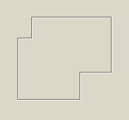 | |
| 54 | 48 | ||
| 55 | 49 | [[TECBevel]] puede dibujar formas no rectangulares y lineas no directas. | |
| 56 | 50 | ||
| 57 | 51 | #### TECLink | |
| 58 | 52 | ||
| 59 | 53 | [[TECLink]] provee un weblink. Los mismos enlaces que son bien conocidos por los visores web (navegadores web). | |
| 60 | 54 | ||
| 61 | - | ||
| 62 | - | ||
| 63 | - | ||
| 64 | - | ||
| 55 | + |  | |
| 65 | 56 | ||
| 66 | 57 | Es una etiqueta que cambia su aspecto cuando se recorre por el cursor del ratón (por defecto permanece subrayado y azul). | |
| 67 | 58 | ||
| 68 | 59 | Puede abrir una URL con el navegador/aplicación de correo por defecto, fichero asociado a una aplicación o simplemente lanzar el evento OnClick. | |
| 69 | 60 | ||
| 70 | 61 | #### TECImageMenu | |
| 71 | 62 | ||
| 72 | 63 | Un menú vertical con imágenes. Un componente similar a este se utiliza frecuentemente en aplicaciones KDE4 y Outlook97. | |
| 73 | 64 | ||
| 74 | - | ||
| 75 | - | ||
| 76 | - | ||
| 77 | - | ||
| 65 | + | 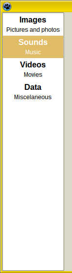 | |
| 78 | 66 | ||
| 79 | 67 | [[TECImageMenu]] Puede Obener el foco y activado mediante la tecla Tab (cuando `TabStop = True`, lo cual es por defecto). Se puede controlar mediante ratón, teclado o incluso por código. | |
| 80 | 68 | ||
| 81 | 69 | Ratón | |
| 82 | 70 | ||
| 83 | 71 | - Simplemente haz click con el pulsador izquierdo en el elemento del menú. | |
| 84 | 72 | - El click del pulsador de enmedio del ratón selecciona un elemento pero no hace click. | |
| 85 | 73 | - La rueda del ratón mueve la selección y no hace click. | |
| 86 | 74 | ||
| 87 | 75 | Teclado | |
| 88 | 76 | ||
| 89 | 77 | - Space nad Enter: click on the selected item. | |
| 90 | 78 | - Arrow Up, Arrow Down, Page Up, Page Down, Home and End: moves the selection but does not click. | |
| 91 | 79 | - Acceleration key (Alt + Key) selects and clicks the relevant item (menu doesn't need to be focused).. | |
| 92 | 80 | ||
| 93 | 81 | #### TECSpinBtns | |
| 94 | 82 | ||
| 95 | 83 | Una alternativa avanzada a [[TUpDown]]. | |
| 96 | 84 | ||
| 97 | - | ||
| 98 | - | ||
| 99 | - | ||
| 100 | - | ||
| 85 | + | 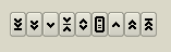 | |
| 101 | 86 | ||
| 102 | 87 | [[TECSpinBtns]] está basado en variables de precisión doble. | |
| 103 | 88 | ||
| 104 | 89 | TECSpinBtns no puede obtener el foco. Se puede controlar mediante ratón o por código. | |
| 105 | 90 | ||
| 106 | 91 | Mouse | |
| 107 | 92 | ||
| 108 | 93 | TECSpinBtns consiste en 9 pequeños pulsadores. | |
| 109 | 94 | ||
| 110 | 95 | - Left-click on BtnMin, BtnBigDec, BtnDec, BtnMiddle, BtnMenu, BtnInc, BtnBigInc and BtnMax sets the Value to Min, decreases Value by PageSize, decreases Value by Increment, sets Value to Middle, triggers OnMenuClick event, incrementa Value por Increment, incrementa Value por PageSize y establece Value a Max respectivamente. | |
| 111 | 96 | - Middle-click sets Value to Middle or triggers OnMenuClick - depends on MenuControl property. Other mouse buttons can be used for dragging too, depends on DragControl property. Dragging mainly depends on properties: DragOrientation, MouseIncrementX, MouseIncrementY, MouseStepPixelsX, MouseStepPixelsY and Reversed. | |
| 112 | 97 | ||
| 113 | 98 | Codigo | |
| 114 | 99 | ||
| 115 | 100 | Simplemente mediante la asignación de cualqier valor de punto flotante al valor de la propiedad: | |
| 116 | 101 | ||
| 117 | 102 | `Value := 10.5;` | |
| 118 | 103 | ||
| 119 | 104 | Si el valor se encuentra fuera de rango (menor que Min o mayor que Max) entonces Value valdrá Min o Max respectivamente. | |
| 120 | 105 | ||
| 121 | 106 | Precendencia de dibujado: | |
| 122 | 107 | ||
| 123 | 108 | 1. La mas alta frecedencia la tiene el evento OnDrawGlyph. | |
| 124 | 109 | 2. La segunda la tiene Caption. Debería ser corta (uno o dos caracteres). | |
| 125 | 110 | 3. La tercera es image desde Images. Images deben ser asignadas e ImageIndex debe ser mayor o igual que cero y lesser que Images.Count. | |
| 126 | 111 | 4. Cuando no se asigna OnDrawGlyph, Caption es una cadena vacía y ImageIndex vale -1 then built-in glyph is used. Tiene 5 conjuntos de estilos que pueden seleccionarse mediante la propiedad GlyphStyle.. | |
| 127 | 112 | ||
| 128 | 113 | #### TECSpinEdit | |
| 129 | 114 | ||
| 130 | 115 | Una alternativa avanzada a TSpinEdit y TFloatSpinEdit. Es un [[TEdit]] unido junto con TECSpinBtns. | |
| 131 | 116 | ||
| 132 | - | ||
| 133 | - | ||
| 134 | - | ||
| 135 | - | ||
| 117 | + | 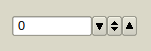 | |
| 136 | 118 | ||
| 137 | 119 | [[TECSpinEdit]] puede tomar el foco y puede alcanzarse con la tecla Tab (cuando `TabStop = True`, lo cual es por defecto). Se puede controlar mediante ratón, teclado o por código. | |
| 138 | 120 | ||
| 139 | 121 | ||
| 140 | 122 | Ratón | |
| 141 | 123 | ||
| 142 | 124 | Ver [[TECSpinBtns]]. | |
| 143 | 125 | ||
| 144 | 126 | Teclado | |
| 145 | 127 | ||
| 146 | 128 | (line-edit must be focused) | |
| 147 | 129 | ||
| 148 | 130 | Se puede teclear el valor de Text dentro de la linea de edición directamente. Si el valor entroducido es menor que TECSpinBtnsPlus.MinInEdit o mayor TECSpinBtnsPlus.MaxInEdit entonces el volor se cambiará para que encaje en esos límites. El cambio de Value se realiza en el evento OnEditingDone. | |
| 149 | 131 | ||
| 150 | 132 | - Arrow Up/Down do click on BtnInc/BtnDec*. | |
| 151 | 133 | - PgUp/PgDn do click on BtnBigInc/BtnBigDec*. | |
| 152 | 134 | - Ctrl + Home/End do click on BtnMax/BtnMin*. | |
| 153 | 135 | - Ctrl + Space do click BtnMiddle. | |
| 154 | 136 | - Ctrl + Enter do click on BtnMenu. | |
| 155 | 137 | ||
| 156 | 138 | *) valid for Reversed = False. For Reversed = True works oppositely. | |
| 157 | 139 | ||
| 158 | 140 | Code | |
| 159 | 141 | ||
| 160 | 142 | Simply by assigning any floating-point value to property Value: | |
| 161 | 143 | ||
| 162 | 144 | `Value := 10.5;` | |
| 163 | 145 | ||
| 164 | 146 | If the value is out of range (lesser than Min or greater than Max) then Value will be Min or Max. | |
| 165 | 147 | ||
| 166 | 148 | #### TECSwitch | |
| 167 | 149 | ||
| 168 | 150 | Una alternativa a TCheckBox. Existe una alternativa similar en GTk3. | |
| 169 | 151 | ||
| 170 | - | ||
| 171 | - | ||
| 172 | - | ||
| 173 | - | ||
| 152 | + | 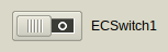 | |
| 174 | 153 | ||
| 175 | 154 | [[TECSwitch]] can have focus and can be reached by Tab key (when `TabStop = True`, which is default). Can be controlled by mouse, by keyboard or by code. | |
| 176 | 155 | ||
| 177 | 156 | Ratón | |
| 178 | 157 | ||
| 179 | 158 | - Left-click on switch area (out of knob) will change the State*. | |
| 180 | 159 | - Left-click on the knob and holding the left-mouse button down will capture mouse and knob can be moved even if the mouse-cursor leaves the area of the switch. | |
| 181 | 160 | ||
| 182 | 161 | Teclado | |
| 183 | 162 | ||
| 184 | 163 | - Espacio e Intro cambian su estado* (solamente cuando tiene el foco). | |
| 185 | 164 | - Acceleration key (Alt + Key) changes the State* (no necesita ser enfocado). | |
| 186 | 165 | ||
| 187 | 166 | Código | |
| 188 | 167 | ||
| 189 | 168 | Simply by assigning any State* or Checked property: | |
| 190 | 169 | ||
| 191 | 170 | `Checked := True; //False`\ | |
| 192 | 171 | `State := cbChecked; //cbGrayed, cbUnchecked` | |
| 193 | 172 | ||
| 194 | 173 | *) Property State is always changed from checked to unchecked, from grayed to unchecked or from unchecked to checked. | |
| 195 | 174 | ||
| 196 | 175 | #### TECSpeedBtn | |
| 197 | 176 | ||
| 198 | 177 | Un pulsador con algunas características avanzadas y glyps embebidos. Una alternativa a TSpeedButton y TToggleBox. | |
| 199 | 178 | ||
| 200 | - | ||
| 201 | - | ||
| 202 | - | ||
| 203 | - | ||
| 179 | + |  | |
| 204 | 180 | ||
| 205 | 181 | [[TECSpeedBtn]] no puede obtener el foco. | |
| 206 | 182 | ||
| 207 | 183 | Características y diferencias de [[TSpeedButton]]: | |
| 208 | 184 | ||
| 209 | 185 | - TSpeedButton tiene la propiedad Glyph: TBitmap. TECSpeedBtn tiene las propiedades ImageIndex: Integer e Images: [[TImageList]] instead. | |
| 210 | 186 | - TECSpeedBtn tiene la propiedad Delay ytimer embebido. Therefore it can work as a delay-button (Delay\>0) or toggle-box (Delay\<0). | |
| 211 | 187 | - TECSpeedBtn tiene más de 80 glyph embebidos (pintados vía [[TCanvas]] helper). Glyphs pueden ser varios para los estados checked yunchecked. | |
| 212 | 188 | - Simmilarmente a TSpeedButton, TECSpeedBtn tienen las propiedades GroupIndex, Checked y AllowAllUp de manera que los pulsadores se pueden agrupar a radio-group. | |
| 213 | 189 | - TECSpeedBtn cannot obtain focus but can be pressed by acceleration key (Alt+ \[underlined key\]). | |
| 214 | 190 | - TECSpeedBtn can be linked with [[TAction]] too. | |
| 215 | 191 | ||
| 216 | 192 | Precedencia de dibujado: | |
| 217 | 193 | ||
| 218 | 194 | 1. La mayor precedencia la tiene el evento OnDrawGlyph. | |
| 219 | 195 | 2. La segunda la tiene Caption e image de Images. Las images deben ser asignadas y al menos on of ImageIndex e ImageIndexChecked debe ser mayor o igual que cero y menor que Images.Count. | |
| 220 | 196 | 3. Cuando OnDrawGlyph no se ha asignado y ambos ImageIndex e ImageIndexChecked son -1 entonces se utiliza el glyph embebido (propiedades GlyphDesign y GlyphDesignChecked). Cuando ImageIndex is valid Image e ImageIndexChecked is -1 or only GlyphDesign is some glyph and GlyphDesignChecked is egdNone then ImageIndex o GlyphDesign is used for checked state too (y vice versa). | |
| 221 | 197 | ||
| 222 | 198 | #### TECEditBtn | |
| 223 | 199 | ||
| 224 | 200 | An alternative to [[TEditButton]]. It is [[TEdit]] joined together with [[TECSpeedBtn]]. | |
| 225 | 201 | ||
| 226 | - | ||
| 227 | - | ||
| 228 | - | ||
| 229 | - | ||
| 202 | + | 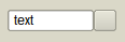 | |
| 230 | 203 | ||
| 231 | 204 | #### TECColorBtn | |
| 232 | 205 | ||
| 233 | 206 | Visual component for selecting color. Line edit displays color code in various formats and associated button triggers color dialog. | |
| 234 | 207 | ||
| 235 | - | ||
| 236 | - | ||
| 237 | - | ||
| 238 | - | ||
| 208 | + | 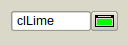 | |
| 239 | 209 | ||
| 240 | 210 | Color of the glyph on the button corresponds with the color in the line-edit. | |
| 241 | 211 | ||
| 242 | 212 | Property Text is not published. If Text is changed via code, EditingDone must be called to validate the change. | |
| 243 | 213 | ||
| 244 | 214 | #### TECComboBtn | |
| 245 | 215 | ||
| 246 | 216 | A combobox with associated button. It is [[TComboBox]] joined together with [[TECSpeedBtn]]. | |
| 247 | 217 | ||
| 248 | - | ||
| 249 | - | ||
| 250 | - | ||
| 251 | - | ||
| 218 | + | 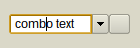 | |
| 252 | 219 | ||
| 253 | 220 | #### TECColorCombo | |
| 254 | 221 | ||
| 255 | 222 | Visual component for selecting color. Combobox contains colors in various formats and associated button triggers color dialog. | |
| 256 | 223 | ||
| 257 | - | ||
| 258 | - | ||
| 259 | - | ||
| 260 | - | ||
| 224 | + | 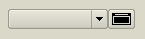 | |
| 261 | 225 | ||
| 262 | 226 | Color of the glyph on the button corresponds with the color selected in the combobox. | |
| 263 | 227 | ||
| 264 | 228 | Property Text is not published. If Text is changed via code, Validate must be called to validate the change. | |
| 265 | 229 | ||
| 266 | 230 | #### TECHeader | |
| 267 | 231 | ||
| 268 | 232 | An alternative to [[THeader]]. | |
| 269 | 233 | ||
| 270 | - | ||
| 271 | - | ||
| 272 | - | ||
| 273 | - | ||
| 234 | + |  | |
| 274 | 235 | ||
| 275 | 236 | Main feature is ability to have columns aligned to the left and to the right at a time. This components is designed for TECCheckListBox. | |
| 276 | 237 | ||
| 277 | 238 | #### TECCheckListBox | |
| 278 | 239 | ||
| 279 | 240 | An alternative to [[TCheckListBox]]. | |
| 280 | 241 | ||
| 281 | - | ||
| 282 | - | ||
| 283 | - | ||
| 284 | - | ||
| 242 | + | 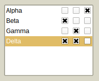 | |
| 285 | 243 | ||
| 286 | 244 | Can have multiple checkable columns. | |
| 287 | 245 | ||
| 288 | 246 | Currently, property Sorted is not supported. | |
| 289 | 247 | ||
| 290 | 248 | #### TECSlider | |
| 291 | 249 | ||
| 292 | 250 | An advanced alternative to [[TTrackBar]]. | |
| 293 | 251 | ||
| 294 | - | ||
| 295 | - | ||
| 296 | - | ||
| 297 | - | ||
| 252 | + | 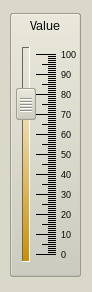 | |
| 298 | 253 | ||
| 299 | 254 | TECSlider can have focus and can be reached by Tab key (when `TabStop = True`, which is default). | |
| 300 | 255 | ||
| 301 | 256 | TECSlider is based on double precision variables. TECSlider can be controlled by mouse, by keyboard or by code. | |
| 302 | 257 | ||
| 303 | 258 | Ratón | |
| 304 | 259 | ||
| 305 | 260 | - Left-click on Slider area (out of Knob) will move the knob by PageSize (or less, if mouse cursor is nearer). | |
| 306 | 261 | - Double-click or Middle-click will move the knob immediately to the mouse cursor (or to the Min/Max, if click is done out of groove and scale area). | |
| 307 | 262 | - Left-click on the knob and holding the left-mouse button down will capture mouse and knob can be moved even if the mouse-cursor leaves the area of the slider. | |
| 308 | 263 | - Mouse wheel moves knob up/down regardless of the Reversed property. In case of horizontal slider rolling up/down moves knob to the left/right, again, regardless of the Reversed property. | |
| 309 | 264 | ||
| 310 | 265 | El incremento es: | |
| 311 | 266 | ||
| 312 | 267 | - Mouse wheel: Increment*Mouse.WheelScrollLines | |
| 313 | 268 | - Ctrl + mouse wheel: Incremento. | |
| 314 | 269 | ||
| 315 | 270 | Teclado | |
| 316 | 271 | ||
| 317 | 272 | - Space: mueve knob a la mitad de groove or to the ProgressMiddlePos en caso de que ProgressFromMiddle = True | |
| 318 | 273 | - 0-9: mueve el knob a position que es the integer multiplier of the PageSize (i.e. 0, 10, ..., 90 for PageSize = 10). | |
| 319 | 274 | - PgUp: decrementa Position por PageSize | |
| 320 | 275 | - PgUp: incrementa Position por PageSize | |
| 321 | 276 | - Home: mueve el Knob a Min | |
| 322 | 277 | - End: mueve el Knob a Max | |
| 323 | 278 | - +: increases Position by Increment | |
| 324 | 279 | - -: decreases Position by Increment | |
| 325 | 280 | - Ctrl + ArrowUp: decreases* Position by Increment | |
| 326 | 281 | - Ctrl + ArrowLeft: decreases* Position by Increment | |
| 327 | 282 | - Ctrl + ArrowDown: increases* Position by Increment | |
| 328 | 283 | - Ctrl + ArrowRight: increases* Position by Increment | |
| 329 | 284 | ||
| 330 | 285 | *) valid for `Reversed = False`. When `Reversed = True` works oppositely. | |
| 331 | 286 | ||
| 332 | 287 | Código | |
| 333 | 288 | ||
| 334 | 289 | Simplemente mediante la asignación de un valor de punto flotante a la propiedad Position: | |
| 335 | 290 | ||
| 336 | 291 | `Position := 10.5; ` | |
| 337 | 292 | ||
| 338 | 293 | Si el valor se encuentra fuera de rango (menor que Min o mayor que Max) entonces Position valdrá Min o Max respectivamente. | |
| 339 | 294 | ||
| 340 | 295 | #### TECProgressBar | |
| 341 | 296 | ||
| 342 | 297 | An advanced alternative to [[TProgressBar]]. | |
| 343 | 298 | ||
| 344 | - | ||
| 345 | - | ||
| 346 | - | ||
| 347 | - | ||
| 299 | + |  | |
| 348 | 300 | ||
| 349 | 301 | TECProgressBar is based on double precision variables. TECProgressBar cannot have focus. It can be controlled by code only. | |
| 350 | 302 | ||
| 351 | 303 | #### TECPositionBar | |
| 352 | 304 | ||
| 353 | 305 | An alternative to [[TTrackBar]] or [[TScrollBar]]. Similar components are used in [[Blender]] (3D graphics software). | |
| 354 | 306 | ||
| 355 | - | ||
| 356 | - | ||
| 357 | - | ||
| 358 | - | ||
| 307 | + |  | |
| 359 | 308 | ||
| 360 | 309 | [[TECPositionBar]] cannot have focus and is based on double precision variables. TECPositionBar can be controlled by mouse or by code. | |
| 361 | 310 | ||
| 362 | 311 | Mouse | |
| 363 | 312 | ||
| 364 | 313 | - Left-click will set the position immediately to the mouse cursor (or to the Min/Max, if click is done out of groove and scale area). | |
| 365 | 314 | - Middle-click: moves knob to the middle of the groove or to the ProgressMiddlePos in case of ProgressFromMiddle = True | |
| 366 | 315 | - Left-click on the end of the progress on and holding the left-mouse button down will capture mouse and position can be moved even if the mouse cursor leaves the area of a position bar. | |
| 367 | 316 | - Dragging is affected by MouseDragPixels (alone left mouse button) and MouseDragPixelsFine (Ctrl + left mouse button). Deafult values are 1 and 10, i.e. progress will change by one pixel when mouse cursor moves by one pixel (or by 10 pixels in case of dragging with Ctrl key pressed). | |
| 368 | 317 | - Mouse wheel moves knob up/down regardless of the Reversed property. In case of horizontal slider rolling up/down moves knob to the left/right, again, regardless of the Reversed property. | |
| 369 | 318 | ||
| 370 | 319 | The increment is: | |
| 371 | 320 | ||
| 372 | 321 | - Mouse wheel: MouseDragPixels*Mouse.WheelScrollLines | |
| 373 | 322 | - Ctrl + mouse wheel: (MouseDragPixels/MouseDragPixelsFine)*Mouse.WheelScrollLines | |
| 374 | 323 | ||
| 375 | 324 | Code | |
| 376 | 325 | ||
| 377 | 326 | Simply by assigning any floating-point value to property Position: | |
| 378 | 327 | ||
| 379 | 328 | `Position := 10.5; ` | |
| 380 | 329 | ||
| 381 | 330 | If the value is out of range (lesser than Min or greater than Max) then Position will be Min or Max. | |
| 382 | 331 | ||
| 383 | 332 | #### TECSpinPosition | |
| 384 | 333 | ||
| 385 | 334 | An alternative to [[TTrackBar]] or [[TScrollBar]]. Similar components are used in Krita (2D graphics software). | |
| 386 | 335 | ||
| 387 | - | ||
| 388 | - | ||
| 389 | - | ||
| 390 | - | ||
| 336 | + |  | |
| 391 | 337 | ||
| 392 | 338 | #### TECRuler | |
| 393 | 339 | ||
| 394 | 340 | An advanced ruler. | |
| 395 | 341 | ||
| 396 | - | ||
| 397 | - | ||
| 398 | - | ||
| 399 | - | ||
| 342 | + | 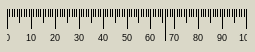 | |
| 400 | 343 | ||
| 401 | 344 | [[TECRuler]] cannot have focus. It just displays scale. Can have fixed or movable pointer optionally. | |
| 402 | 345 | ||
| 403 | 346 | #### TECRadioGroup | |
| 404 | 347 | ||
| 405 | 348 | An alternative to TRadioGroup. | |
| 406 | 349 | ||
| 407 | - | ||
| 408 | - | ||
| 409 | - | ||
| 410 | - | ||
| 350 | + | 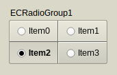 | |
| 411 | 351 | ||
| 412 | 352 | [[TECRadioGroup]] can have focus and can be reached by Tab key (when `TabStop = True`, which is not default). Can be controlled by mouse, by keyboard or by code. | |
| 413 | 353 | ||
| 414 | 354 | Mouse | |
| 415 | 355 | ||
| 416 | 356 | - Left-click on any item (out of knob) changes its Checked property to True (or to False if this item is already checked*). | |
| 417 | 357 | - Left-click on the TECRadioGroup out of items sets focus to component only. | |
| 418 | 358 | ||
| 419 | 359 | Keyboard | |
| 420 | 360 | ||
| 421 | 361 | - 0: deselects all* | |
| 422 | 362 | - 1-9: selects (or deselects*) item 1-9 | |
| 423 | 363 | - Acceleration key (Alt + Key) changes the Checked property to True or False* (radio group doesn't have to be focused). | |
| 424 | 364 | ||
| 425 | 365 | *) Depends whether egoAllowAllUp is in Options. | |
| 426 | 366 | ||
| 427 | 367 | Code | |
| 428 | 368 | ||
| 429 | 369 | Simply by assigning any ItemIndex or Items\[\].Checked property: | |
| 430 | 370 | ||
| 431 | 371 | `ItemIndex := 1; //selects the second item`\ | |
| 432 | 372 | `Items[1].Checked := False; //deselects the second item, regardless of the egoAllowAllUp in Options` | |
| 433 | 373 | ||
| 434 | 374 | #### TECCheckGroup | |
| 435 | 375 | ||
| 436 | 376 | An alternative to TCheckGroup. | |
| 437 | 377 | ||
| 438 | - | ||
| 439 | - | ||
| 440 | - | ||
| 441 | - | ||
| 378 | + | 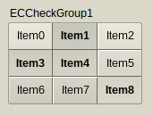 | |
| 442 | 379 | ||
| 443 | 380 | TECCheckGroup can have focus and can be reached by Tab key (when `TabStop = True`, which is not default). Can be controlled by mouse, by keyboard or by code. | |
| 444 | 381 | ||
| 445 | 382 | Mouse | |
| 446 | 383 | ||
| 447 | 384 | - Left-click on any item (out of knob) changes its Checked property to True (or to False if this item is already checked*). | |
| 448 | 385 | - Left-click on the TECCheckGroup out of items sets focus to component only. | |
| 449 | 386 | ||
| 450 | 387 | Keyboard | |
| 451 | 388 | ||
| 452 | 389 | - 0: deselects all* | |
| 453 | 390 | - 1-9: selects (or deselects*) item 1-9 | |
| 454 | 391 | - Acceleration key (Alt + Key) changes the Checked property to True/False* (check group doesn't have to be focused). | |
| 455 | 392 | ||
| 456 | 393 | *) Depends whether egoAllowAllUp is in Options. | |
| 457 | 394 | ||
| 458 | 395 | Code | |
| 459 | 396 | ||
| 460 | 397 | Simply by assigning any Checked\[\] or Items\[\].Checked property: | |
| 461 | 398 | ||
| 462 | 399 | `Checked[1] := True; //selects the second item`\ | |
| 463 | 400 | `Items[1].Checked := False; //deselects the second item, regardless of the egoAllowAllUp in Options.` | |
| 464 | 401 | ||
| 465 | 402 | #### TECTabCtrl | |
| 466 | 403 | ||
| 467 | 404 | See: [[TECTabCtrl]] | |
| 468 | 405 | ||
| 469 | 406 | #### TECAccordion | |
| 470 | 407 | ||
| 471 | 408 | [[TECAccordion]] is a side menu, works similarly to [[TPageControl]]. | |
| 472 | 409 | ||
| 473 | - | ||
| 474 | - | ||
| 475 | - | ||
| 476 | - | ||
| 410 | + | 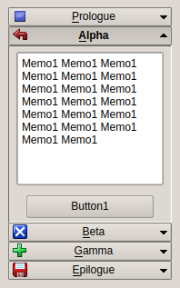 | |
| 477 | 411 | ||
| 478 | 412 | TECAccordion can have focus and can be reached by Tab key (when `TabStop = True`, which is not default). Can be controlled by mouse, by keyboard or by code. | |
| 479 | 413 | ||
| 480 | 414 | Mouse | |
| 481 | 415 | ||
| 482 | 416 | Left-click on any item opens/closes it. | |
| 483 | 417 | ||
| 484 | 418 | Keyboard | |
| 485 | 419 | ||
| 486 | 420 | Acceleration key (Alt + Key) changes the item (component doesn't have to be focused). | |
| 487 | 421 | ||
| 488 | 422 | Code | |
| 489 | 423 | ||
| 490 | 424 | Simply by setting ItemIndex property. | |
| 491 | 425 | ||
| 492 | 426 | #### TECTriangle | |
| 493 | 427 | ||
| 494 | 428 | A balance of three values. This is not a color picker! | |
| 495 | 429 | ||
| 496 | - | ||
| 497 | - | ||
| 498 | - | ||
| 499 | - | ||
| 430 | + | 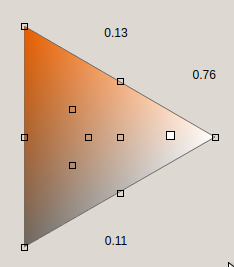 | |
| 500 | 431 | ||
| 501 | 432 | [[TECTriangle]] cannot have focus and cannot be reached by Tab key. Can be controlled by mouse only. | |
| 502 | 433 | ||
| 503 | 434 | Mouse | |
| 504 | 435 | ||
| 505 | 436 | - Left-click on triangle area. | |
| 506 | 437 | - Left-click and hold the pointer can drag. | |
| 507 | 438 | - Left-click on a mark sets more exact value, for example \[0,333..., 0.333..., 0.333...\]. | |
| 508 | 439 | - Mouse wheel can roll the pointer up and down. | |
| 509 | 440 | ||
| 510 | 441 | Code | |
| 511 | 442 | ||
| 512 | 443 | By calling overloaded SetValues method. Parameters can be 1) X and Y coordinates or 2) "Top" and "Bottom" values (the thirds value "Side" is calculated so the sum of the values is always equal to 1). | |
| 513 | 444 | ||
| 514 | 445 | #### TECGrid | |
| 515 | 446 | ||
| 516 | 447 | See: [[TECGrid]] | |
| 517 | 448 | ||
| 518 | 449 | #### TECConfCurve | |
| 519 | 450 | ||
| 520 | 451 | Component for Configuration. | |
| 521 | 452 | ||
| 522 | - | ||
| 523 | - | ||
| 524 | - | ||
| 525 | - | ||
| 453 | + | 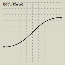 | |
| 526 | 454 | ||
| 527 | 455 | User can configure polyline or Bezier curve with multiple points. | |
| 528 | 456 | ||
| 529 | 457 | Can be aligned with vertical and/or horizontal ruler (TECRuler). | |
| 530 | 458 | ||
| 531 | 459 | See ECConfCurve-Demo. | |
| 532 | 460 | ||
| 533 | 461 | #### TECScheme | |
| 534 | 462 | ||
| 535 | 463 | An advanced component for configuration of general scheme. | |
| 536 | 464 | ||
| 537 | - | ||
| 538 | - | ||
| 539 | - | ||
| 540 | - | ||
| 465 | + | 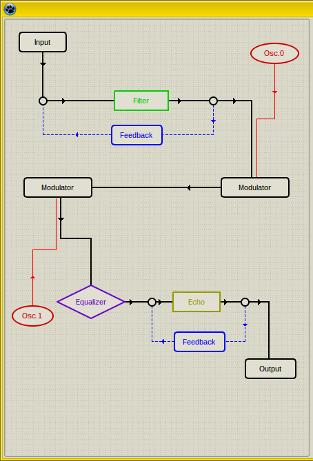 | |
| 541 | 466 | ||
| 542 | 467 | User can add multiple blocks and connect them. | |
| 543 | 468 | ||
| 544 | 469 | This component is highly configurable. See SchemeDesigner and ECSchemeDesc bundled with EC-Controls. | |
| 545 | 470 | ||
| 546 | 471 | ### Non-visual components | |
| 547 | 472 | ||
| 548 | 473 | #### TECSpinController | |
| 549 | 474 | ||
| 550 | 475 | Diseñado para controlar las propiedades de multiples TECSpinBtns y TECSpinEdit. | |
| 551 | 476 | ||
| 552 | - | ||
| 553 | - | ||
| 554 | - | ||
| 555 | - | ||
| 477 | + |  | |
| 556 | 478 | ||
| 557 | 479 | [[TECSpinBtns]] y [[TECSpinEdit]] tienen propiedades Controller. Cuando se asigna algún SpinController a esta propiedad entonces este controler puede cambiar las propiedades seleccionadas de todos los Controller asignados a TECSpinEdits y TECSpinBtns a la vez. Las propiedades ajustables son - por ejemplo - TimerDelay, TimerRepeat, anchos de pulsadores individuales, GlyphsStyle y otros. | |
| 558 | 480 | ||
| 559 | 481 | El proyecto puede tener múltiples SpinControllers. | |
| 560 | 482 | ||
| 561 | 483 | #### TECTimer | |
| 562 | 484 | ||
| 563 | 485 | Un temporizador avanzado. | |
| 564 | 486 | ||
| 565 | - | ||
| 566 | - | ||
| 567 | - | ||
| 568 | - | ||
| 487 | + |  | |
| 569 | 488 | ||
| 570 | 489 | La principal característica es que el primer intervalo(propiedad **Delay**) puede diferir de todos los siguientes intervaloss (property **Repeat**). | |
| 571 | 490 | ||
| 572 | 491 | ### Otras partes de EC-Controls | |
| 573 | 492 | ||
| 574 | 493 | #### Class TECScale | |
| 575 | 494 | ||
| 576 | 495 | Una escala. No es un componente pero se puede dibujar en cualquier canvas. | |
| 577 | 496 | ||
| 578 | 497 | Esta clase se utiliza en TECRuler, TECSlider, TECProgressBar, TECPositionBar y TECSpinPosition. | |
| 579 | 498 | ||
| 580 | 499 | Ver la demo ECScale-Demo. | |
| 581 | 500 | ||
| 582 | 501 | #### Unit ECTypes | |
| 583 | 502 | ||
| 584 | 503 | Tipos y clases base para los controles Eye Candy (EC-C). | |
| 585 | 504 | ||
| 586 | 505 | If you use EC-Controls in your project you may need to add this unit to your **uses** section. | |
| 587 | 506 | ||
| 588 | 507 | This unit contains many declarations, color-conversion routines and base classes, for example TBaseScrollControl. | |
| 589 | 508 | ||
| 590 | 509 | #### TBaseScrollControl | |
| 591 | 510 | ||
| 592 | 511 | Es la clase base para los componentes de desplazamiento (TECScheme es su descendiente). | |
| 593 | 512 | ||
| 594 | 513 | Puedes derivar tus propios componentes de desplazamiento a partir de TBaseScrollControl. | |
| 595 | 514 | ||
| 596 | 515 | Credito: Esta clase está basada en [TScrollingControl](https://github.com/theo222/lazarus-thumbviewer/blob/master/scrollingcontrol.pas) por Theo. | |
| 597 | 516 | ||
| 598 | 517 | ## Demos | |
| 599 | 518 | ||
| 600 | 519 | EC-Controls viene con varias demos. Si alguna de las siguientes demos no se encuentra en archivo puede significar que no hay cambios y la demo no ha sido incluida. En tal caso utiliza la demo de la versión previa. | |
| 601 | 520 | ||
| 602 | 521 | #### ECC-Demo | |
| 603 | 522 | ||
| 604 | 523 | Esta demo muestra todos los controles EC en varias configuraciones. | |
| 605 | 524 | ||
| 606 | 525 | #### ECScale-Demo | |
| 607 | 526 | ||
| 608 | 527 | Esta demo muestra como utilizar [[TECScale]] en tu propio componente visual.al component. | |
| 609 | 528 | ||
| 610 | 529 | #### ECConfCurve-Demo | |
| 611 | 530 | ||
| 612 | 531 | Esta demo muestra las capacidades de [[TECConfCurve]]. | |
| 613 | 532 | ||
| 614 | 533 | #### ECSchemeDesc | |
| 615 | 534 | ||
| 616 | 535 | Esta demo muestra como se pueden crear componentes descendientes de [[TCustomECScheme]]. | |
| 617 | 536 | ||
| 618 | 537 | #### SchemeDesigner | |
| 619 | 538 | ||
| 620 | 539 | SchemeDesigner es más que una demo. Muestra como crear el configurador TECScheme en tu aplicación pero además puede utilizarse par crear tus propias configuraciones y almacenarlas en formato *.xml. | |
| 621 | 540 | ||
| 622 | 541 | --- | |
| 623 | 542 | *From the Free Pascal wiki, page "Eye-Candy Controls/es", as it stood on 2020-07-29 after a change by FTurtle, out of the wiki's dump of 2024-05-26. Copyright stays with the author who wrote it, according to the old wiki's [[Licensing]] page. If you have concerns about this material, [message the admin](/wiki-contact).* |