

ExCtrls: what changed
Revision 1 to 2. Removed lines have a minus sign; added lines have a plus sign.
| Old | New | Line | |
|---|---|---|---|
| 1 | 1 | ## About | |
| 2 | 2 | ||
| 3 | 3 | *ExCtrls* is a collection of controls which try to overcome limitations posed by the widgetset. Moreover, some missing controls are added. | |
| 4 | 4 | ||
| 5 | 5 | ### Authors | |
| 6 | 6 | ||
| 7 | 7 | The package is written by Werner Pamler, but re-uses a lot of code of the LCL components written by the Lazarus team. The `TColumnComboBoxEx` was contributed by Howard Page-Clark. | |
| 8 | 8 | ||
| 9 | 9 | ### License | |
| 10 | 10 | ||
| 11 | 11 | Modified LGPL (with linking exception, like Lazarus LCL) | |
| 12 | 12 | ||
| 13 | 13 | ### Download and Installation | |
| 14 | 14 | ||
| 15 | 15 | #### Development version | |
| 16 | 16 | ||
| 17 | 17 | Use an svn client to download the current trunk version from <svn://svn.code.sf.net/p/lazarus-ccr/svn/components/exctrls>. Alternatively download the zipped snapshot from <https://sourceforge.net/p/lazarus-ccr/svn/HEAD/tree/components/exctrls/> and unzip it to some folder. | |
| 18 | 18 | ||
| 19 | 19 | #### Release version | |
| 20 | 20 | ||
| 21 | 21 | There is no release version, yet. | |
| 22 | 22 | ||
| 23 | 23 | #### Installation | |
| 24 | 24 | ||
| 25 | 25 | - In Lazarus, go to "Package" \> "Open Package File .lpk". | |
| 26 | 26 | - Navigate to the folder with the ExCtrls sources and select the runtime package **exctrlspkg.lpk**. Click "Compile". | |
| 27 | 27 | - Then select the designtime package **extrlspkg_dsgn.lpk** and click "Use" \> "Install". This will rebuild the IDE (it may take some time). When the process is finished the IDE will restart, and you'll find the components on the palette **ExCtrls**. | |
| 28 | 28 | ||
| 29 | 29 | ## Usage | |
| 30 | 30 | ||
| 31 | 31 | ### Sample code | |
| 32 | 32 | ||
| 33 | 33 | The application of each component is demonstrated by a project in the folder *examples* coming along with the component code. | |
| 34 | 34 | ||
| 35 | 35 | ### TRadioButtonEx, TCheckBoxEx, TRadioGroupEx and TCheckGroupEx | |
| 36 | 36 | ||
| 37 | 37 | These components re-implement the standard TRadioButton, TCheckBox, TRadioGroup and TCheckGroup, but inherit from TCustomControl and thus are not drawn by the widgetset but by the ThemeServices. As a consequence there are less widgetset related restrictions although the components look and behave like their original LCL counter-parts. | |
| 38 | 38 | ||
| 39 | 39 | **New features:** | |
| 40 | 40 | ||
| 41 | 41 | - **Wordwrapped captions**: If the new property `WordWrap` is set to `true`, long captions are word-wrapped to fit into the width of the control. Note that when `AutoSize` is active before `WordWrap` is activated the caption is not wrapped initially and all the text is placed into a single line. Turn `AutoSize` off and reduce the width of the control. Once the text is wrapped `AutoSize` may be switche on again to adjust the height. | |
| 42 | 42 | - **Vertical layout**: `ButtonLayout` and `TextLayout` control the vertical positioning of checkbox/radiobutton and caption, respectively. Default is `tlCenter`, i.e. the corresponding element is centered vertically within the bounds of the control; other values are `tlTop` and `tlBottom`. Normally `ButtonLayout` and `TextLayout` are changed in pairs. | |
| 43 | 43 | - **User provided check images**: The checkboxes and radiobuttons are normally drawn by the ThemeServices, but it is possible to provide dedicated bitmaps which can be used instead. The bitmaps must be stored in a `TImageList` attached to property `Images`. The corresponding image index must be assigned in a handler of the event `OnGetImageIndex` which has appropriate parameters to distinguishe between mouse-over, pressed, enabled/disabled and checked/unchecked states. | |
| 44 | 44 | - **Custom caption colors and font settings**: The font of the caption can be changed when the property `ThemedCaption` is switched to `false`. In case of `TRadioGroupEx` the font of individual items can only be changed at runtime by accessing the `RadioGroup1.Buttons[Andex]` property pointing to the `TRadioButtonEx` at the given index in the groupbox. The same is possible also with the `TCheckGroupEx`. | |
| 45 | 45 | ||
| 46 | - | ||
| 47 | - | ||
| 48 | - | ||
| 49 | - | ||
| 46 | + | 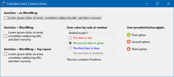 | |
| 50 | 47 | ||
| 51 | 48 | ###  TCurrSpinEditEx | |
| 52 | 49 | ||
| 53 | 50 | The default *LazControls* palette contains already extended spin edit controls for integers and floating point numbers (`TSpinEditEx` and `TFloatSpinEditEx`, respectively). The missing edit for currency values is implemented in package *ExCtrls*. | |
| 54 | 51 | ||
| 55 | 52 | **New and modified properties** | |
| 56 | 53 | ||
| 57 | 54 | - `Value`: The data type of the control is `currency`. | |
| 58 | 55 | - `CurrencyString`: The currency name, for example '\$' or '€', is added to the numeric value in the edit box. The default value is taken from the `DefaultFormatSettings` provided by the `SysUtils` unit. | |
| 59 | 56 | - `CurrencyFormat`: Defines the order of (positive) numeric value and currency name in the edit field: | |
| 60 | 57 | - `secfCurrVal`: currency string first, no space (e.g. '\$1') | |
| 61 | 58 | - `secfValCurr`: value first, no space (e.g. '1\$') | |
| 62 | 59 | - `secfCurrSpaceVal`: currency string first, space to value (e.g. '\$ 1'); | |
| 63 | 60 | - `secfValSpaceCurr`: value first, space to currency string (e.g. '1 \$'); | |
| 64 | 61 | - `NegCurrencyFormat`: Like `CurrencyFormat`, but now for negative values: | |
| 65 | 62 | - `sencfParCurrValPar`: currency string first, no space, the entire string is put in parenthesis (e.g. '(\$1)') | |
| 66 | 63 | - `sencfMinusCurrVal`: currency string first with leading '-' character, no space (e.g. '-1\$') | |
| 67 | 64 | - `sencfCurrMinusVal`: currency string first, no space, '-' at value (e.g. '\$-1') | |
| 68 | 65 | - `sencfCurrValMinus`: currency string first, value with appended '-' (eg. '\$1-') | |
| 69 | 66 | - etc... Other allowed values are `sencfParValCurrPar` ('1\$'), `sencfMinusValCurr` ('-1\$'), `sencfValMinusCurr` ('1-\$'), `sencfValCurrMinus` ('1\$-'), `sencfMinusValSpaceCurr` ('-1 \$'), `sencfMinusCurrSpaceVal` ('-\$ 1'), `sencfValSpaceCurrMinus` ('1 \$-'), `sencfCurrSpaceValMinus` ('\$ 1-'), `sencfCurrSpaceMinusVal` ('\$ -1'), `sencfValMinusSpaceCurr` ('1- \$'), `sencfParCurrSpaceValPar` ('(\$ 1)'), `sencfParValSpaceCurrPar` ('(1 \$)') | |
| 70 | 67 | - `DecimalSeparator`: Character used to separate decimals from the integer part. Defaults to the value defined by the `DefaultFormatSettings`. | |
| 71 | 68 | - `ThousandSeparator`:If not empty (i.e. not \#0) the integer part of the Value is formatted with a thousand separator for better readability. Note that the control does not allow DecimalSeparator and ThousandSeparator to be equal. | |
| 72 | 69 | ||
| 73 | - | ||
| 74 | - | ||
| 75 | - | ||
| 76 | - | ||
| 70 | + | 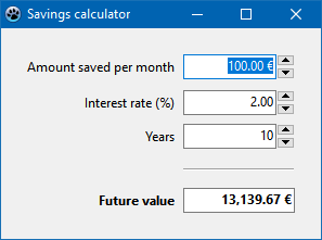 | |
| 77 | 71 | ||
| 78 | 72 | ###  TFloatSISpinEditEx | |
| 79 | 73 | ||
| 80 | 74 | This is an extended version of `TFloatSpinEditEx` which accepts scientific multiplier suffixes, e.g. k for "kilo" or the factor 1000; the user can input the text `'1.23k'` and the `Value` of the component is 1230. | |
| 81 | 75 | ||
| 82 | 76 | ###  TColumnComboBoxEx | |
| 83 | 77 | ||
| 84 | 78 | `TColumnComboBoxEx`, written by Howard Page-Clark, is a text-only combobox that displays its dropdown items list in single phrase columns, which are parsed according to the delimiter property. The column width in the dropdown is adjusted automatically to accomomodate the longest word/phrase in each column. The number of columns shown depends entirely on the number of delimiters found in each listed item, hence is an unpublished read-only property. | |
| 85 | 79 | ||
| 86 | - | ||
| 87 | - | ||
| 88 | - | ||
| 89 | - | ||
| 80 | + | 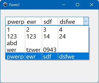 | |
| 90 | 81 | ||
| 91 | 82 | - `Delimiter`: the `char` value which separates the columns in each combobox item. The default is the comma. | |
| 92 | 83 | - `ShowColSeparators`: a `boolean` display property which activates the display of vertical dividing lines between the columns. Default: `false`. | |
| 93 | 84 | - `ColSeparatorColor` (`TColor`): defines the color of the vertical dividing lines between the columns. Default: `clSilver`. | |
| 94 | 85 | - `ColumnMargin` (`Integer`): allows for adjustment of all column widths by a fixed amount. | |
| 95 | 86 | ||
| 96 | 87 | ###  TCheckComboBoxEx | |
| 97 | 88 | ||
| 98 | 89 | `TCheckComboBoxEx` overcomes some annoyances of the `TCheckComboBox` which comes with the Lazarus IDE: | |
| 99 | 90 | ||
| 100 | 91 | - Incidentally checking an item by selecting an item is no longer possible | |
| 101 | 92 | - The item list stays in the dropped state until ENTER, ESC, ALT-UP or ALT-DOWN are pressed, or another control is selected. This way several items can be checked without having to drop down the list multiple times. The easiest way to do this is by the UP/DOWN arrow keys and pressing the SPACE bar for checking/unchecking items. | |
| 102 | 93 | - The main field of the control lists all checked items rather than only the selected item. | |
| 103 | 94 | ||
| 104 | 95 | Although the control inherits from `TEditButton` rather than from `TCustomComboBox`, many its **properties and events** are based on `TComboBox`; other properties were added to achieve the unique behaviour of the component: | |
| 105 | 96 | ||
| 106 | 97 | - `AllowGrayed` (boolean): if false (default), the items in the dropdown list can either be checked or not. If true, the items can also be switched to a third, "grayed" state. | |
| 107 | 98 | - `AutoDropDown` (boolean): if true, the list window drops down automatically when the control is focused. Otherwise the arrow icon at the right must be clicked, or the key ALT-DOWN must be pressed. | |
| 108 | 99 | - `Delimiter` (char): character separating the items in the list of checked items in the main control field. | |
| 109 | 100 | - `DropDownCount` (integer): maximum count of lines shown in the dropdown list | |
| 110 | 101 | - `EscCancels` (boolean): when true and the dropdown list is closed by pressing the ESC key the changes in the list are cancelled and all items have their checked states as when the list had dropped down initially. | |
| 111 | 102 | - `HintMode` (enumeration of `cbhmDefault`, `cbhmItems`): | |
| 112 | 103 | - `cbhmDefault`: the default hint is shown as specified by the `Hint` property | |
| 113 | 104 | - `cbhmItems`: the hint is composed of the checked items. | |
| 114 | 105 | - `Items` (`TStrings`): list of the items names shown in the dropdown window. | |
| 115 | 106 | - `ItemIndex` (integer): Index of the selected (= highlighted) item in the dropdown window | |
| 116 | 107 | - `Sorted` (boolean): the items in the dropdown window are sorted alphabetically, when `true`. | |
| 117 | 108 | - `Checked[AIndex]` (boolean): it `true` when the item at the given index is checked | |
| 118 | 109 | - `State[AIndex]` (boolean): depending on the checked state of the item at the given index the property can have three values: `cbUnchecked`, `cbChecked`, or `cbGrayed`. `AllowGrayed` must be `true` to use this option. | |
| 119 | 110 | - `Enabled[AIndex]` (boolean): when false, the checked state of the item at the given index cannot be changed by the user. | |
| 120 | 111 | - `OnDropDown`: this event fires when the dropdown windows is dropping down | |
| 121 | 112 | - `OnCloseUp`: this event is generated when the dropdown window closes | |
| 122 | 113 | - `OnItemChange`: when an item is checked, either by the user or by code, this event is triggered. | |
| 123 | 114 | - `OnItemClick`: this event is fired when the user clicks on a checkbox in the dropdown list or when he presses the SPACE bar. It is not fired when the item is checked by code. | |
| 124 | 115 | - `OnChange`: In addition to changes of inidividual items, this event fires when all items are changes (methods `Clear()`, `CheckAll`). | |
| 125 | 116 | ||
| 126 | 117 | The most important **methods**: | |
| 127 | 118 | ||
| 128 | 119 | - `function AddItem(AText: String; AChecked: Boolean = false; AEnabled: Boolean = true): Integer;` - Adds a new item to the combobox list and sets is Checked and Enabled states. | |
| 129 | 120 | - `procedure CheckAll(AState: TCheckBoxState; aAllowGrayed: Boolean = true; aAllowDisabled: Boolean = true);` - Sets all existing items to the given state. When `aAllowGrayed` is `false` the `cbGrayed` state is not applied. When `aAllowDisabled` is `false` then only enabled items are changed. | |
| 130 | 121 | - `procedure Clear` - removes all items from the dropdown list. | |
| 131 | 122 | - `procedure Toggle(AIndex: Integer)` - toggle the list item at the given index between checked and unchecked. | |
| 132 | 123 | ||
| 133 | - | ||
| 134 | - | ||
| 135 | - | ||
| 136 | - | ||
| 124 | + | 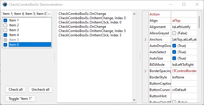 | |
| 137 | 125 | ||
| 138 | 126 | ###  TShapeEx | |
| 139 | 127 | ||
| 140 | 128 | `TShapeEx` is a `TShape` descendant with Header and Text properties. Both texts can consist of multiple lines and be left-/right-/top-/bottom-aligned/centered; margins can be specified. The unit is self-contained and can be used without the package. | |
| 141 | 129 | ||
| 142 | - | ||
| 143 | - | ||
| 144 | - | ||
| 145 | - | ||
| 130 | + | 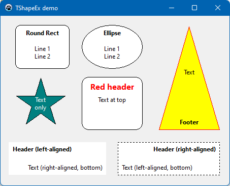 | |
| 146 | 131 | ||
| 147 | 132 | The `Shape` property inherited from the `TShape` ancestor defines the kind of shape to be drawn (`TShapeType = (stRectangle, stSquare, stRoundRect, stRoundSquare, stEllipse, stCircle, stSquaredDiamond, stDiamond, stTriangle, stTriangleLeft, stTriangleRight, stTriangleDown, stStar, stStarDown)`. | |
| 148 | 133 | ||
| 149 | 134 | The properties `Header` and `Text` describe two text elements which can be displayed inside the control. They are controlled by properties of type `TShapeText`: | |
| 150 | 135 | ||
| 151 | 136 | - `HorAlignment: TAlignment = (taLeftJustify, taRightJustify, taCenter)` - the horizontal alignment of the text: left/right aligned, or centered. | |
| 152 | 137 | - `HorMargin: Integer` - the distance to the left or right border of the client rectangle. Note that some shapes are not drawn to the border of the control; in this case the text may appear outside the shape. | |
| 153 | 138 | - `Lines: TStrings` - holds the text to be displayed. It can consist of multiple lines. | |
| 154 | 139 | - `VertAlignment: TVerticalAlignment = (taAlignTop, taAlignBottom, taVerticalCenter)` - the vertical alignment of the text: at the top, at the bottom, or in the center of the control | |
| 155 | 140 | - `VertMargin: Integer` - the distance to the top or bottom border of the client rectangle. Note that some shapes are not drawn to the border of the control; in this case the text may appear outside the shape. | |
| 156 | 141 | ||
| 157 | 142 | The fonts used for painting `Header` and `Text` are given by the `HeaderFont` and `Font` properties, respectively. | |
| 158 | 143 | ||
| 159 | 144 | ###  TProgressBarEx | |
| 160 | 145 | ||
| 161 | 146 | A completely rewritten progressbar component with many new additional properties providing more flexibility than the original `TProgressBar`: | |
| 162 | 147 | ||
| 163 | 148 | - `BackColor: TColor` - the background color of the control | |
| 164 | 149 | - `BorderColor: TColor` - the color of the control's border. Ignored when `BorderStyle` is different from `bsFlat`. | |
| 165 | 150 | - `BorderStyle: TProgressbarBorderStyle` - defines the way the control's border is painted (`bsNone, bsFlat, bsSunken, bsRaised, bsEtched`). | |
| 166 | 151 | - `BarColor: TColor` - the color of the progress bar | |
| 167 | 152 | - `GradientEndColor: TColor` - color of the bar gradient when `DrawStyle = pdsGradient` | |
| 168 | 153 | - `Caption: String` - custom text to be displayed in the center of the progress bar. The text is passed to the `Format()` function and thus can contain specifiers for the scrollbar's `Position` and/or percentage. `Position` must have an integer specifier (`'%d'`) while percentage requires a floating point specifier (`'%f'` or `'%g'`). Both parameters can be used in the same text; in this case `Position` is expected as first and percentage as second value in the parameter list, e.g. `ProgressBarEx.Caption := '%1:.0f%% complete at position %0:d'` | |
| 169 | 154 | - `DrawStyle: TProgressbarDrawStyle` - defines the way the bar is drawn: `pdsFlat, pdsGradient, pdsRounded, pdsShiny, pdsBevel`. | |
| 170 | 155 | - `MarqueeLength: Integer` - Length of the automatically moving bar piece when `Style` is `pbstMarquee` | |
| 171 | 156 | - `MarqueeSpeed: Integer` - Parameter of the speed of the moving marquee bar piece, `0..8`. | |
| 172 | 157 | - `Max: Integer` - Value corresponding to maximum bar length, default `100`. | |
| 173 | 158 | - `Min: Integer` - Value corresponding to minimum bar length, default `0`. | |
| 174 | 159 | - `Orientation: TProgressbarOrientation` - orientation and moving direction of the bar (`pbHorizontal, pbVertical, pbRightToLeft, pbTopDown`). | |
| 175 | 160 | - `Position: Integer` - Value to be displayed as bar length, default `0`. | |
| 176 | 161 | - `Style: TProgressbarStyle` - Operating type of the progressbar. Use `pbstNormal` when the `Min` and `Max` values of the progress are known, or `pbstMarquee` when they are not known. In the latter case, a short bar piece moves continuously across the control size. | |
| 177 | 162 | - `TextMode: TProgressBarTextMode` - defines how a numberical value for the progress should be displayed in the center of the progress bar. | |
| 178 | 163 | ||
| 179 | - | ||
| 180 | - | ||
| 181 | - | ||
| 182 | - | ||
| 164 | + | 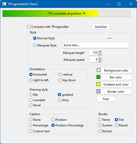 | |
| 183 | 165 | ||
| 184 | 166 | ### Unit *ExImgList* | |
| 185 | 167 | ||
| 186 | 168 | This unit contains functions to modify existing image lists: | |
| 187 | 169 | ||
| 188 | 170 | - `function CreateDisabledImagelist(AImageList: TCustomImageList; AOwner: TComponent): TCustomImageList`: creates a new image list with copies of the images contained in `AImageList`. The copied images are converted to grayscale. Correct handling of the alpha-channel leads to improved quality compared to the built-in grayscale conversion of the standard `TImageList` (Note the spurious pixels at the border of some icons in the second disabled toolbar of the *ImgListEx demo project* -- see screenshot). The primary intention is to assign the result of this function to the `DisabledImages` property of a `TToolbar`. | |
| 189 | 171 | - `function SetImageListColor(AImageList: TCustomImageList; ANewColor: TColor): TCustomImageList`: Replaces all pixels with non-zero alpha channel in the images of an existing `ImageList` by the specified new color. It is intended to be applied to modern outline icons consisting of only a single color. This way the user has the possibility to present the icons in a different color. | |
| 190 | 172 | - `function CreateRecoloredImagelist(AImageList: TCustomImagelist; ANewColor: TColor; AOwner: TComponent): TCustomImageList`: creates a new image list with copies of the images contained in `AImageList` and then applies the function `SetImageListColor` described above. | |
| 191 | 173 | ||
| 192 | 174 | The unit is self-contained and can be used without the package. | |
| 193 | 175 | ||
| 194 | - | ||
| 195 | - | ||
| 196 | - | ||
| 197 | - | ||
| 176 | + | 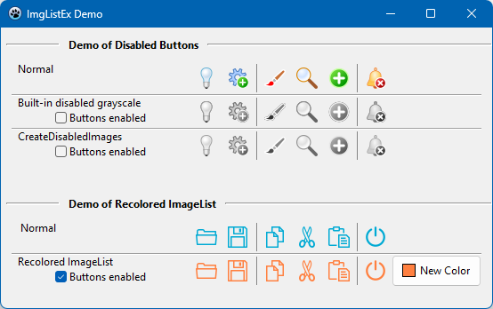 | |
| 198 | 177 | ||
| 199 | 178 | --- | |
| 200 | 179 | *From the Free Pascal wiki, page "ExCtrls", as it stood on 2024-04-26 after a change by Wp, out of the wiki's dump of 2024-05-26. Copyright stays with the author who wrote it, according to the old wiki's [[Licensing]] page. If you have concerns about this material, [message the admin](/wiki-contact).* |