

ColorPalette: what changed
Revision 0 to 1. Removed lines have a minus sign; added lines have a plus sign.
Title: ColorPalette
| Old | New | Line | |
|---|---|---|---|
| 1 | + | ## About | |
| 2 | + | ||
| 3 | + | 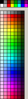 ColorPalette is a cross-platform color palette grid with ability to select a color from a palette. The OnMouseColorPick event is fired when the user clicks onto a color. | |
| 4 | + | ||
| 5 | + | ### Authors | |
| 6 | + | ||
| 7 | + | Tom Gregorovic and Werner Pamler | |
| 8 | + | ||
| 9 | + | ### License | |
| 10 | + | ||
| 11 | + | Modified LGPL | |
| 12 | + | ||
| 13 | + | ## Usage | |
| 14 | + | ||
| 15 | + | ### Color selection | |
| 16 | + | ||
| 17 | + | When a color is selected by clicking with the mouse onto a color box an event `OnColorPick` is generated; the event gets the rgb value of the *picked color* as a parameter. Another parameter passes the *ShiftState* active during the click; usually this identifies the mouse button pressed. If the property `ShowSelection` is turned on then the picked color is highlighted. | |
| 18 | + | ||
| 19 | + | The time flow when exactly the color is selected is determined by the property `PickMode`: | |
| 20 | + | ||
| 21 | + | - `pmImmediate`: The color is selected, and the event is generated, when the mouse button goes down. | |
| 22 | + | - `pmContinuous`: The color is selected, and the event is generated, while the mouse moves and when the mouse button goes up. | |
| 23 | + | - `pmDefault`: The color is selected when the mouse button goes down, and the event is generated when the mouse button goes up. Both events must occur at the same location. This mode is a left-over from a previous version of the component and should not be used any more. | |
| 24 | + | ||
| 25 | + | ### Palettes | |
| 26 | + | ||
| 27 | + | #### Built-in palettes | |
| 28 | + | ||
| 29 | + | The components supports a series of **built-in palettes** as determined by the `PaletteKind` property: | |
| 30 | + | ||
| 31 | + | - `pkStandardPalette`: the 16 standard color defined by the `graphics` unit | |
| 32 | + | - `pkExtendedPalette`: the same, but extended by the 4 extra colors `clMoneyGreen, clSkyBlue, clCream, clMedGray` | |
| 33 | + | - `pkSystemPalette`: the 25 system colors defined by the `graphics` unit | |
| 34 | + | - `pkStandardAndSystemPalette`: the standard colors plus the system colors | |
| 35 | + | - `pkExtendedAndSystemPalette`: the extended colors plus the system colors | |
| 36 | + | - `pkGradientPalette`: "all" colors nicely arranged; use `GradientSteps` to define the horizontal resolution. | |
| 37 | + | - `pkWebSafePalette`: a set of web-safe colors as defined by a [wikipedia article](https://en.wikipedia.org/wiki/Web_colors#Color_table). | |
| 38 | + | - `pkWebSafePalette2`: another set of web-safe colors. | |
| 39 | + | ||
| 40 | + | #### Custom palettes and palette files | |
| 41 | + | ||
| 42 | + | In addition, a **custom palette** can be loaded from a file by calling the `LoadPalette` method. The palette files are simple text files according to this example (see also *Default.pal* in the component folder): | |
| 43 | + | ||
| 44 | + | Custom palette example: | |
| 45 | + | ||
| 46 | + | $COLS 8 | |
| 47 | + | # sets count of palette grid columns | |
| 48 | + | ||
| 49 | + | 0,0,0 | |
| 50 | + | # inserts color r,g,b colorname | |
| 51 | + | # colorname is optional. | |
| 52 | + | 255,255,255 White | |
| 53 | + | ||
| 54 | + | $NONE | |
| 55 | + | # inserts empty palette grid cell | |
| 56 | + | ||
| 57 | + | $BLENDWB 128,128,128 3 | |
| 58 | + | # creates color gradient white -> color -> black with specified steps | |
| 59 | + | # The specified steps are applied to the transitions between "white" and "color" | |
| 60 | + | # and between "color" and "black", i.e., in total, there are <tt>2*steps+1</tt> color boxes. | |
| 61 | + | ||
| 62 | + | A set of **keywords** is defined to identify the palette file entries: | |
| 63 | + | ||
| 64 | + | - `r,g,b colorname`: Defines the next entry of the color palette by means of its red-green-blue components (0..255). The `colorname` is optional. | |
| 65 | + | - `$NONE`: Is a place-holder for an empty color button. Useful for layout optimization. If the property `UseSpacers` is false then the button can be picked as color `clNone`. | |
| 66 | + | - `$BLENDBW r,g,b n`: creates a series of palette entries corresponding to a gradient from white to the specified color and to black. Each one of the two gradient consists of `n` steps, i.e. in total, `2*n+1` palette entries are created. | |
| 67 | + | - `$COLS value`: defines the number of columns used to display the palette. | |
| 68 | + | - `$BTNDIST value`: specifies the pixel distance between the color palette button tiles (`value` is an `integer`) | |
| 69 | + | - `$BTNWIDTH value`: specifies the pixel width of each color palette button (`value` is an `integer`) | |
| 70 | + | - `$BTNHEIGHT value`: specifies the pixcel height of each color palette button (`value` is an `integer`) | |
| 71 | + | - `$BTNBORDER r,g,b`: specifies the color of the border of a palette button in terms of r, g, b values (`0..255`) | |
| 72 | + | - `$FLIPPED value`: specifies whether the palette is flipped (`value = TRUE`) or not (`value = FALSE`) | |
| 73 | + | - `$SELKIND value`: specifies how the selected palette button is highlighted. `value` can be `NONE`, `THIN`, `THICK`, `THIN-INV`, `THICK-INV`. | |
| 74 | + | - `$SELCOLOR r,g,b`: specifies the color with which the selected button is highlighted if `$SELKIND` is `THIN` or `THICK`. The color is given by its red, green and blue components (`0..255`). | |
| 75 | + | - `#`: defines a comment - all characters in the same line following the `#` are ignored. | |
| 76 | + | ||
| 77 | + | ### Methods and properties for color access | |
| 78 | + | ||
| 79 | + | There are several methods and properties to manipulate and query the entries of the used palette: | |
| 80 | + | ||
| 81 | + | - `AddColor(AColor: TColor; AColorName: String = '')`: adds a new entry to the palette. An optional color name can be provided. | |
| 82 | + | - `DeleteColor(AIndex: Integer)`: removes the entry with the specified index from the palette | |
| 83 | + | - `ClearColors`: removes all colors from the palette. | |
| 84 | + | - `LoadPalette(AFileName: String; AItems: TPaletteItems = [])`: load a palette from specified file. The optional parameter `AItems` allows to define which items stored in the palette are loaded: `TPaletteItems = set of [piColors, piColumnCount, piFlipped, piButtonBorder, piButtonSize, piButtonDistance, piSelKind, piSelColor]`. By default, `AItems` is `[piColors, piColumnCount]` which loads all colors and the column count. Use `piAll` as an abbreviation to load all items. | |
| 85 | + | - `SavePalette(AFileName: String)`: saves the currently used palette to a palette file which, in turn, can be re-loaded by means of the `LoadPalette` method. | |
| 86 | + | - Access individual colors by using the `Colors[Index]` property. | |
| 87 | + | - `ColorCount` returns the number of colors in the palette. | |
| 88 | + | - `PickedColor`: returns the currently selected color | |
| 89 | + | - `PickedIndex`: returns the index of the currently selected color (indexes are counted first along the rows). | |
| 90 | + | - `MouseColor`: returns the color of the button underneath the mouse cursor | |
| 91 | + | - `MouseIndex`: returns the index of the color underneath the mouse cursor (indexes are counted first along the rows). | |
| 92 | + | - `Colors[AIndex: Integer]`: allows to read and write a color at the specified palette index | |
| 93 | + | - `ColorNames[AIndex:Integer]`: allows to read and write the name of the color at the specified palette index. If an empty string is written to the ColorNames property then the colorname defined by the graphics unit is used. | |
| 94 | + | ||
| 95 | + | ### Other properties | |
| 96 | + | ||
| 97 | + | #### Layout | |
| 98 | + | ||
| 99 | + | - `ButtonHeight`: height of the color buttons (in pixels). Is used along with `ColumnCount` to define the height of the control. | |
| 100 | + | - `ButtonWidth`: width of the color buttons (in pixels). Is used along with `ColumnCount` to define the width of the control. | |
| 101 | + | - `ButtonDistance`: distance, in pixels, between the individual color buttons. | |
| 102 | + | - `ColumnCount`: Defines how many color buttons are drawn horizontally. | |
| 103 | + | ||
| 104 | + | #### Visual appearance | |
| 105 | + | ||
| 106 | + | - `ButtonBorderColor`: defines the borderline around a color button. Can be removed by selecting `clNone`. | |
| 107 | + | - `Color`: defines the background color of the component. Note that the background is not visible if \<ttButtondistance = 0</tt>. | |
| 108 | + | - `ShowSelection`: If true a thick border is drawn around the button of the selected color. | |
| 109 | + | - `UseSpacers`: If true `clNone` color entries serve as spacers to arrange groups of colors. If false `clNone` is shown as a crossed-out button meaning "transparent color". | |
| 110 | + | ||
| 111 | + | #### Hints | |
| 112 | + | ||
| 113 | + | - `ShowColorHint`: If true a hint popup window is displayed for the color button above which the mouse cursor hovers. The built-in hint text can be modified by means of the `OnGetHintText` event. | |
| 114 | + | - The `OnGetHintText` event allows to modify the built-in text used for creating the popup hint. | |
| 115 | + | ||
| 116 | + | ### Demo projects | |
| 117 | + | ||
| 118 | + | Two demo projects are contained in the folder *demo* of the component installation directory: | |
| 119 | + | ||
| 120 | + | - **GeneralDemo** shows application of all the features of TColorPalette. | |
| 121 | + | - **ToolbarDemo** adds a ColorPalette to a coolbar/toolar. | |
| 122 | + | ||
| 123 | + | ## Download and installation | |
| 124 | + | ||
| 125 | + | `svn checkout `[`https://svn.code.sf.net/p/lazarus-ccr/svn/components/colorpalette`](https://svn.code.sf.net/p/lazarus-ccr/svn/components/colorpalette) | |
| 126 | + | ||
| 127 | + | - Download from [Lazarus CCR at SourceForge](http://sourceforge.net/projects/lazarus-ccr/files/ColorPalette/) | |
| 128 | + | - Install the package `LazColorPalette` in the Lazarus IDE. The ColorPalette icon is added to the *Misc* component palette page. | |
| 129 | + | ||
| 130 | + | ## Change Log | |
| 131 | + | ||
| 132 | + | ### Version 0.2 | |
| 133 | + | ||
| 134 | + | - **New features** | |
| 135 | + | - "AddColor", "DeleteColor" etc. | |
| 136 | + | - Color names | |
| 137 | + | - Builtin palettes | |
| 138 | + | - Highlight selected color | |
| 139 | + | - Color button distance, border color | |
| 140 | + | - Color hint window | |
| 141 | + | - New keywords in palette file | |
| 142 | + | - **Tested** on Windows 2000/XP/7/10, and with gtk2 and qt under Linux (Mint 17). | |
| 143 | + | ||
| 144 | + | ### Version 0.1 | |
| 145 | + | ||
| 146 | + | - **Initial release** | |
| 147 | + | - **Tested** on Windows XP, and with gtk1 and gtk2 under Linux (Kubuntu 6.06). | |
| 148 | + | ||
| 149 | + | --- | |
| 150 | + | *From the Free Pascal wiki, page "ColorPalette", as it stood on 2016-06-21 after a change by Arent, out of the wiki's dump of 2024-05-26. Copyright stays with the author who wrote it, according to the old wiki's [[Licensing]] page. If you have concerns about this material, [message the admin](/wiki-contact).* | |
| 151 | + | Category: Components | |
| 152 | + | Category: Graphics | |
| 153 | + | Category: Lazarus-CCR |