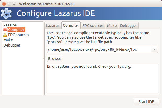
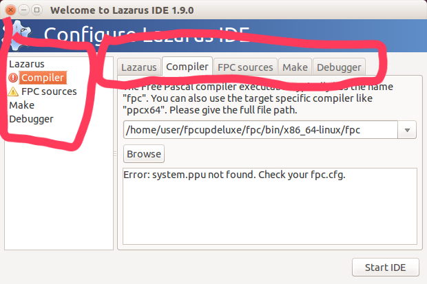
This dialog has one tabset -from PageControl, and another - from left Listbox/Listview. Confusing. Better leave one Listbox.
Picture.

Mailing lists / lazarus / 2017-04
18 messages · 6 people ·
Reply by email Subscribe to this list Your subscription
Read-only archive. Use j and k to move between messages.
This dialog has one tabset -from PageControl, and another - from left Listbox/Listview. Confusing. Better leave one Listbox.
Picture.
+1
Better leave left Listbox.
Sandro
-------------- next part --------------
An HTML attachment was scrubbed...
URL: <http://lists.lazarus-ide.org/pipermail/lazarus/attachments/20170423/b399d91e/attachment.html>
This dialog has one tabset -from PageControl, and another - from left Listbox/Listview.…
Alexey wroteThis dialog has one tabset -from PageControl, and another - from left Listbox/Listview. Confusing. Better leave one Listbox. Picture.
Can you explain in more detail what is wrong with the dialog ?
I look at this picture, and I see absolutely nothing wrong or confusing about it ?
Michael.
If I have understand correctly, it is better to have only one list. I prefer the left Listbox.
Sandro
On 23 Apr 2017 10:17, "Michael Van Canneyt via Lazarus" <
-------------- next part --------------
An HTML attachment was scrubbed...
URL: <http://lists.lazarus-ide.org/pipermail/lazarus/attachments/20170423/a1b55d77/attachment-0001.html> -------------- next part --------------
A non-text attachment was scrubbed...
Name: 2017-04-23 10.25.10.png
Type: image/png
Size: 63876 bytes
Desc: not available
URL: <http://lists.lazarus-ide.org/pipermail/lazarus/attachments/20170423/a1b55d77/attachment-0001.png>
This dialog has one tabset -from PageControl, and another - from left Listbox/Listview.…
Alexey wroteThis dialog has one tabset -from PageControl, and another - from left Listbox/Listview. Confusing. Better leave one Listbox.
I kind-of see what you mean - duplicated information. The idea was probably to have the "error state" available for all settings involved. Obviously that can be resolved too. Simply remove the listbox and then place error state icons in the tabs where applicable. So you will still get an overview of what settings are wrong.
Regards,
Graeme
On 23 Apr 2017 10:30, "Graeme Geldenhuys
-1
IMHO left ListBox is better because error states are visible even if tab is not selected. I would convert right tabs to frames or something similar.
Sandro
-------------- next part --------------
An HTML attachment was scrubbed...
URL: <http://lists.lazarus-ide.org/pipermail/lazarus/attachments/20170423/6a34e06d/attachment.html>
If I have understand correctly, it is better to have only one list. I prefer the left…
Sandro Cumerlato wroteIf I have understand correctly, it is better to have only one list. I prefer the left Listbox.
Ah...
Why is it better ? I quite like the fact that there are 2 possibilities ?
Seems very much like a matter of taste to me.
Michael.
On 23 Apr 2017 10:30, "Graeme Geldenhuys -1 IMHO left ListBox is better because error…
You can achieve the same with a status icon on the tabs.
*If* something needs to be removed, I would remove the listbox. It only takes up a lot of space, and it's mostly empty.
Michael.
Good idea! +1000
Sandro
On 23 Apr 2017 10:49, "Michael Van Canneyt via Lazarus" <
wrote:
You can achieve the same with a status icon on the tabs.
*If* something needs to be removed, I would remove the listbox. It only takes up a lot of space, and it's mostly empty.
Michael.
-------------- next part --------------
An HTML attachment was scrubbed...
URL: <http://lists.lazarus-ide.org/pipermail/lazarus/attachments/20170423/112d07cc/attachment-0001.html>
On 23 Apr 2017 10:30, "Graeme Geldenhuys -1 IMHO left ListBox is better because error…
Sandro Cumerlato wroteIMHO left ListBox is better because error states are visible even if tab is not selected.
That is why I said to place status icons in the tabs itself next to the text "Compiler", "FPC Sources" etc. It will accomplish the same thing.
But then there is the matter of LCL inconsistency.... Does all LCL widgetsets support icons in the tabs?
Regards,
Graeme
I kind-of see what you mean - duplicated information. The idea was probably to have the…
With Michael explanation it looks like the best solution.
Sorry for my misunderstanding.
Sandro
On 23 Apr 2017 10:30, "Graeme Geldenhuys via Lazarus" <
-------------- next part --------------
An HTML attachment was scrubbed...
URL: <http://lists.lazarus-ide.org/pipermail/lazarus/attachments/20170423/be4508cf/attachment.html>
You can achieve the same with a status icon on the tabs. *If* something needs to be…
Michael Van Canneyt wrote*If* something needs to be removed, I would remove the listbox. It only takes up a lot of space, and it's mostly empty.
+1
It is takes up a lot of space with not much or no , Graeme
With Michael explanation it looks like the best solution. Sorry for my misunderstanding.…
Sandro Cumerlato wroteWith Michael explanation it looks like the best solution. Sorry for my misunderstanding.
? No need to apologize.
All is clear in the end, that's what matters :)
Michael.
You can achieve the same with a status icon on the tabs. *If* something needs to be…
[...] *If* something needs to be removed, I would remove the listbox. It only takes up a lot of space, and it's mostly empty.
The idea was to add more checks/issues and some common choices, like language and docked/undocked. Then the tabs will soon run out of space.
Mattias
I like your use of "soon" :-)
Given that the dialog has not changed substantially in many years, I think we can safely remove the listbox, still assuming that something must be removed :)
Michael.
It would be more "safe" to remove the tabs, as AFAIK not all widgetsets support tab icons, other languages have wider captions and eventually more items will be added.
Mattias
I don't think the dialog needs to be changed to begin with, but if general opinion is that it needs changing,
I don't have strong opinions on how it is changed, so "go ahead..."
Michael.
Il 23/04/2017 12:14, Michael Van Canneyt via Lazarus ha scritto:
I don't think the dialog needs to be changed to begin with,
+1
We have a summary on the left, and details on the right.
If you just need to check what has to be fixed you look to the list box, while if you want to verify the proper Lazarus path, the selection of the right compiler, the right sources etc. you use the right side tabs.