

An HTML attachment was scrubbed...
URL: <http://lists.lazarus.freepascal.org/pipermail/lazarus/attachments/20141014/726e9629/attachment-0001.html> -------------- next part --------------
A non-text attachment was scrubbed...
Name: LWaste.png
Type: image/png
Size: 32942 bytes
Desc: not available
URL: <http://lists.lazarus.freepascal.org/pipermail/lazarus/attachments/20141014/726e9629/attachment-0001.png>
Mailing lists / lazarus / 2014-10
Redundant text on project buttons
29 messages · 14 people · –
- MMichael Van Canneyt 6
- JJürgen Hestermann 5
- KKostas Michalopoulos 3
- GGraeme Geldenhuys 2
- JJuha Manninen 2
- RReinier Olislagers 2
- +8 more
Reply by email Subscribe to this list Your subscription
Read-only archive. Use j and k to move between messages.

These urgently need to be reduced to icons with no text
No, they don't. Icons cannot always indicate exactly what the purpose of a control is - having a text and preferably a hint helps.
IIRC, the project inspector has enough vertical space to allow for this...
However, if you feel strongly about it, please feel free to submit a patch in the bugtracker against current trunk.
Thank you,
Reinier
Reinier Olislagers wrote 10 lines
On 14/10/2014 11:20, wrote:
> These urgently need to be reduced to icons with no text
No, they don't. Icons cannot always indicate exactly what the purpose of
a control is - having a text and preferably a hint helps.
IIRC, the project inspector has enough vertical space to allow for this...
However, if you feel strongly about it, please feel free to submit a
patch in the bugtracker against current trunk.
They should simply follow the global setting for such things, no ?
Michael.
Michael Van Canneyt wrote 18 lines
On Tue, 14 Oct 2014, Reinier Olislagers wrote:
> On 14/10/2014 11:20, wrote:
>> These urgently need to be reduced to icons with no text
>
> No, they don't. Icons cannot always indicate exactly what the purpose of
> a control is - having a text and preferably a hint helps.
>
> IIRC, the project inspector has enough vertical space to allow for
> this...
>
> However, if you feel strongly about it, please feel free to submit a
> patch in the bugtracker against current trunk.
They should simply follow the global setting for such things, no ?
If there is such a global setting, yes.
Reinier Olislagers wrote 20 lines
On 14/10/2014 11:46, Michael Van Canneyt wrote:
>
>
> On Tue, 14 Oct 2014, Reinier Olislagers wrote:
>
>> On 14/10/2014 11:20, wrote:
>>> These urgently need to be reduced to icons with no text
>>
>> No, they don't. Icons cannot always indicate exactly what the purpose of
>> a control is - having a text and preferably a hint helps.
>>
>> IIRC, the project inspector has enough vertical space to allow for
>> this...
>>
>> However, if you feel strongly about it, please feel free to submit a
>> patch in the bugtracker against current trunk.
>
> They should simply follow the global setting for such things, no ?
>
If there is such a global setting, yes.
Tools | Options
then
Environment | Desktop
There such things can be specified more or less.
Michael.
An HTML attachment was scrubbed... URL: <http://lists.lazarus.freepascal.org/pipermail/laz…
Hello,
?
I don't think it urgently need to be removed.
On the other hand, Lazarus is not consistent. Some windows (Call Stack, Project Inspector) has icons with captions while others (Watch List, History) are icons only. If you will create patch to remove text, please check that all buttons has proper Hint. Usually they have but for example Call Stack doesn't. ?
Vojt?ch?
An HTML attachment was scrubbed... URL: <http://lists.lazarus.freepascal.org/pipermail/laz…
These urgently need to be reduced to icons with no text http://s30.postimg.org/5hxkrzfkx/LWaste.png

why? and why "urgently"??
my personal preference is text only or text with icon if text only is not available... i never have liked just plain icons with no indication of their action...
NOTE: No off-list assistance is given without prior approval.
Please *keep mailing list traffic on the list* unless
private contact is specifically requested and granted.
waldo kitty wrote 8 lines
On 10/14/2014 5:20 AM, wrote:
> These urgently need to be reduced to icons with no text
> http://s30.postimg.org/5hxkrzfkx/LWaste.png
why? and why "urgently"??
my personal preference is text only or text with icon if text only is not available... i never have liked just plain icons with no indication of their action...
+1
Icons are realy useless.
You cannot search for nor filter nor sort them.
They eat up space and performance without benefit. I think that they were introduced for the illiterates who can't read.
There is also a report about it :
http://bugs.freepascal.org/view.php?id=22278
Clearly there should be an option for Icon only / Text Only / Both. It should be respected by all IDE windows and not only Project Inspector.
Yes, I think '+' and '-' signs are more understandable than most other icons. In many situations I notice hovering my mouse cursor over speedbuttons just to see their hints because the icon itself is not informative enough.
Then it is better if there is text already without hovering.
Juha
+1 Icons are realy useless. You cannot search for nor filter nor sort them. They eat up…
J?rgen Hestermann wrote 17 lines
Am 2014-10-14 um 18:43 schrieb waldo kitty:
> On 10/14/2014 5:20 AM, wrote:
>> These urgently need to be reduced to icons with no text
>> http://s30.postimg.org/5hxkrzfkx/LWaste.png
>
> why? and why "urgently"??
>
> my personal preference is text only or text with icon if text only is not
> available... i never have liked just plain icons with no indication of
> their action...
>
+1
Icons are realy useless.
You cannot search for nor filter nor sort them.
They eat up space and performance without benefit.
There must be something wrong with your eyes then. Icons use less space than text.
You can count the number of buttons where the text is smaller (as in: less wide) than the icon, on 1 hand. At a first glance, for 'Add' the text is as wide as the icon. For all other buttons the text is wider than the icon.
So, no thank you. I prefer icons; you can get rid of the text for all I care.
Michael.
+1 Icons are realy useless. You cannot search for nor filter nor sort them. They eat up…
Icons are realy useless. You cannot search for nor filter nor sort them. They eat up space and performance without benefit. I think that they were introduced for the illiterates who can't read.
Icons have been introduced for "visual" people, who organize their desktop by landmarks and locations, not by searching.
When I met the first GUI on my Atari ST, I was familiar with it within a few minutes, and knew that this is the way I want to work with computers and programs. While I can remember patterns (arrangements, pictures, faces...) very well, I cannot remember names (of commands, people...), unless I use these names every day.
I admit that too many icons, with too few differences, are not really helpful, i.e. textual menus and lists have their place in my world, too. But the same applies to text (captions), which have to be different enough without wasting too much space. That's why I'd prefer icons without captions, but with hints, and kind of a (context) menu for an *entire* toolbar that can be popped up whenever needed. In the best case that popup should be searchable by keystrokes (incremental search), to please me and also people why prefer to work with text.
DoDi
There is also a report about it : http://bugs.freepascal.org/view.php?id=22278 Clearly…
2014-10-14 20:02 GMT+02:00 Juha Manninen :
Show quoted text 14 lines
There is also a report about it :
http://bugs.freepascal.org/view.php?id=22278
Clearly there should be an option for Icon only / Text Only / Both.
It should be respected by all IDE windows and not only Project Inspector.
Yes, I think '+' and '-' signs are more understandable than most other
icons.
In many situations I notice hovering my mouse cursor over speedbuttons
just to see their hints because the icon itself is not informative
enough.
Then it is better if there is text already without hovering.
Juha
Same for me
Frederic Da Vitoria
(davitof)
Membre de l'April - ? promouvoir et d?fendre le logiciel libre ? -
http://www.april.org
-------------- next part --------------
An HTML attachment was scrubbed...
URL: <http://lists.lazarus.freepascal.org/pipermail/lazarus/attachments/20141015/04a8dff7/attachment-0001.html>
There must be something wrong with your eyes then. Icons use less space than text. You…
Michael Van Canneyt wrote 27 lines
On Tue, 14 Oct 2014, J?rgen Hestermann wrote:
>
> Am 2014-10-14 um 18:43 schrieb waldo kitty:
>> On 10/14/2014 5:20 AM, wrote:
>>> These urgently need to be reduced to icons with no text
>>> http://s30.postimg.org/5hxkrzfkx/LWaste.png
>>
>> why? and why "urgently"??
>>
>> my personal preference is text only or text with icon if text only is not available... i never have liked just plain icons with no indication of their action...
>>
>
> +1
> Icons are realy useless.
> You cannot search for nor filter nor sort them.
> They eat up space and performance without benefit.
There must be something wrong with your eyes then.
Icons use less space than text.
You can count the number of buttons where the text is smaller (as in: less wide) than the icon, on 1 hand.
At a first glance, for 'Add' the text is as wide as the icon. For all other buttons the text is wider than the icon.
So, no thank you. I prefer icons; you can get rid of the text for all I care.
With your argumenation a single pixel (in varying colors) would be even better than text and icons. But of what use is it to use less space when no information is given? If you leave out the icon at all it would use the fewest space. This is what I always do: disable all button bars as much as possible and use menus or keyboard shortcuts.
Icons only use less space if they tell you nothing. I often see text even in icons because otherwise the icon would be without any meaning.
yesss indeed a good idea for saving even more space on Project Explorer window: Add files = green thingy
Remove files = red thingy
Options = grey thingy
Help = blue thingy
Hmm I just come up with another idea: alternatively we could remove all these buttons from panel and then make it a menu which would appear when clicking window title icon (where we currently have "Lazarus face" thing):
[*] Project Inspector - Project1
file 1
file 2
...
So when you click [*] you would see a menu with four items: Add file
Remove file
Options
Help
Of course nobody wold guess that this thingy opens an important menu, so we could make it look like this
[menu] Project Inspector - Project1
so it would be more obvious
15.10.2014, 13:40, "J?rgen Hestermann" :
Show quoted text 34 lines
Am 2014-10-14 um 20:13 schrieb Michael Van Canneyt:
> ?On Tue, 14 Oct 2014, J?rgen Hestermann wrote:
>> ?Am 2014-10-14 um 18:43 schrieb waldo kitty:
>>> ?On 10/14/2014 5:20 AM, wrote:
>>>> ?These urgently need to be reduced to icons with no text
>>>> ?http://s30.postimg.org/5hxkrzfkx/LWaste.png
>>> ?why? and why "urgently"??
>>>
>>> ?my personal preference is text only or text with icon if text only is not available... i never have liked just plain icons with no indication of their action...
>> ?+1
>> ?Icons are realy useless.
>> ?You cannot search for nor filter nor sort them.
>> ?They eat up space and performance without benefit.
> ?There must be something wrong with your eyes then.
> ?Icons use less space than text.
>
> ?You can count the number of buttons where the text is smaller (as in: less wide) than the icon, on 1 hand.
> ?At a first glance, for 'Add' the text is as wide as the icon. For all other buttons the text is wider than the icon.
>
> ?So, no thank you. I prefer icons; you can get rid of the text for all I care.
With your argumenation a single pixel (in varying colors) would be even better than text and icons.
But of what use is it to use less space when no information is given?
If you leave out the icon at all it would use the fewest space.
This is what I always do: disable all button bars as much as possible and use menus or keyboard shortcuts.
Icons only use less space if they tell you nothing.
I often see text even in icons because otherwise the icon would be without any meaning.
--
_______________________________________________
Lazarus mailing list
http://lists.lazarus.freepascal.org/mailman/listinfo/lazarus
With your argumenation a single pixel (in varying colors) would be even better than text…
J?rgen Hestermann wrote 35 lines
Am 2014-10-14 um 20:13 schrieb Michael Van Canneyt:
>
>
> On Tue, 14 Oct 2014, J?rgen Hestermann wrote:
>
>>
>> Am 2014-10-14 um 18:43 schrieb waldo kitty:
>>> On 10/14/2014 5:20 AM, wrote:
>>>> These urgently need to be reduced to icons with no text
>>>> http://s30.postimg.org/5hxkrzfkx/LWaste.png
>>>
>>> why? and why "urgently"??
>>>
>>> my personal preference is text only or text with icon if text only is not
>>> available... i never have liked just plain icons with no indication of
>>> their action...
>>>
>>
>> +1
>> Icons are realy useless.
>> You cannot search for nor filter nor sort them.
>> They eat up space and performance without benefit.
>
> There must be something wrong with your eyes then.
> Icons use less space than text.
>
> You can count the number of buttons where the text is smaller (as in: less
> wide) than the icon, on 1 hand.
> At a first glance, for 'Add' the text is as wide as the icon. For all other
> buttons the text is wider than the icon.
>
> So, no thank you. I prefer icons; you can get rid of the text for all I
> care.
What is clear to me is that opinions vary, so, if it is changed, the behaviour should be made a setting.
Michael.
yesss indeed a good idea for saving even more space on Project Explorer window: Add files…
Show quoted text 7 lines
yesss indeed a good idea for saving even more space on Project Explorer window:
Add files = green thingy
Remove files = red thingy
Options = grey thingy
Help = blue thingy
Hmm I just come up with another idea: alternatively we could remove all these buttons from panel and then make it a menu which would appear when clicking window title icon (where we currently have "Lazarus face" thing):
That does not work on non-windows. You have no access to the window title bar.
Michael.
As a "visual" person, i prefer icons over text. But those icons have to make sense and be clear, not randomly chosen just to put something that looks nice there. When i am in doubt, i rely on hints.
Also text below icons waste space IMO. You only need to learn once what a button does/means (even when the icon isn't that clear, it'll still stay the same), not every time you use the program.
But since not everyone thinks like that, i'd take the approach mentioned previously - make it an option.
On Wed, Oct 15, 2014 at 11:59 AM, Michael Van Canneyt <
Show quoted text 30 lines
wrote:
On Wed, 15 Oct 2014, wrote:
yesss indeed a good idea for saving even more space on Project Explorer
> window:
> Add files = green thingy
> Remove files = red thingy
> Options = grey thingy
> Help = blue thingy
>
> Hmm I just come up with another idea: alternatively we could remove all
> these buttons from panel and then make it a menu which would appear when
> clicking window title icon (where we currently have "Lazarus face" thing):
>
That does not work on non-windows. You have no access to the window title
bar.
Michael.
--
_______________________________________________
Lazarus mailing list
http://lists.lazarus.freepascal.org/mailman/listinfo/lazarus
-------------- next part --------------
An HTML attachment was scrubbed...
URL: <http://lists.lazarus.freepascal.org/pipermail/lazarus/attachments/20141015/c3faaf0a/attachment-0001.html>
Kostas Michalopoulos wroteAs a "visual" person, i prefer icons over text. But those icons have to make sense and be clear, not randomly chosen just to put something that looks nice there.
But IMO the majority of icons is meaningless.
Some even look very similar although they mean
complete different things.
Therefore I don't like them.
Also text below icons waste space IMO.
Yes, if the icon would be meaningful (as it should) then there should be no need for extra text.
You only need to learn once what a button does/means (even when the icon isn't that clear, it'll still stay the same), not every time you use the program.
I prefer to type a few characters to filter a (text) list to find what I want instead of wading through dozens of pictograms guessing what they could mean and then click on one. Especially, because I prefer the keyboard over the mouse anyway.
Visual searching for an icon is like playing memory (which I am not good in).
What is clear to me is that opinions vary, so, if it is changed, the behaviour should be…
Michael Van Canneyt wroteWhat is clear to me is that opinions vary, so, if it is changed, the behaviour should be made a setting.
At least under *nix systems where Gnome or KDE desktop environments are used, it should really pick such settings up from the system. I remember in my days of using Ubuntu 10.* I disabled icons in menus, and there was a similar setting for toolbar buttons (icons only, text only or both).
If Lazarus LCL doesn't adhere to such system settings a specific IDE setting is definitely a good idea. My workflow would be to have icons and text enabled in the start, and once I know what the icons mean, disable the text, thus saving on screen space.
Regards,
- Graeme -
fpGUI Toolkit - a cross-platform GUI toolkit using Free Pascal
http://fpgui.sourceforge.net/
But IMO the majority of icons is meaningless. Some even look very similar although they…
On Wed, Oct 15, 2014 at 6:34 PM, J?rgen Hestermann <
Show quoted text 7 lines
wrote:
But IMO the majority of icons is meaningless.
Some even look very similar although they mean
complete different things.
Therefore I don't like them.
I was talking about the general idea for icons. Lazarus' icons aren't the best though. The most immediate problem - IMO - is the use of color: which is none. Almost all icons have a blue color making it hard to distinguish them. Also the current icons do not have clean contrast in their outlines which makes their outline invisible. As a rule of thumb, it should be possible to locate an icon even when you squint.
IMO the older Lazarus icons were better for that, as shown here (notice the strong outline and color use):
http://wiki.lazarus.freepascal.org/images/e/eb/ReactOS.png
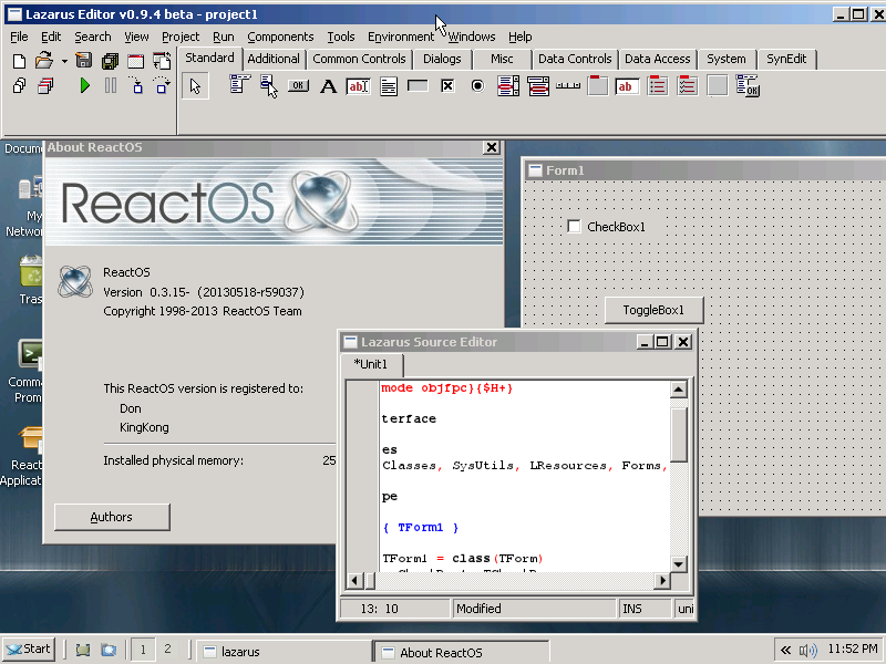
Also having icons that relate to the similar thing have similar colors help. For example in the image above all icons that relate to forms have a red/gray palette and all icons that relate to files have a white palette. Saving isn't consistent though - the diskettes could have the same colors (this dark yellowish one) but they dont. Also the folder could use a similar color (light yellow like mos folders).
Having the same palette for all icons isn't good. See the backlash that Visual Studio 2012 got for making everything gray initially and how they added more color after that because of it.
Also IMO some icons in Lazarus aren't good as pictures. For example the "New form" icon has controls in it - it should be empty (as it is right now gives the impress that it will show some settings, at least from a first look). The "Tab order" icon uses two arrows - this means nothing really when it comes to ordering - in this case it is about specifying a sequence, so something linear (like a vertical list of items) or something that shows the nature of the ordering (like a few tiny controls with numbers) would be better. The current icon is also the same (on what it shows) as the restart icon. Similarly the Anchor editor icon isn't really helpful - sure, you edit anchors, but the real purpose of the editor is to specify layout. A 3x3 grid or something like that with L/R/T/B letters could be better. Or some controls with the guidelines drawn. In other cases the images are inconsistent: beyond the restart vs tab order i mentioned above, the Object inspector and Project inspector icons are essentially the same (the gray circle in project is barely visible and i actually noticed it after looking the two icons for some time). In this case the Object inspector is the odd one out since it looks like the "box, pyramid, sphere" icon is used to mean "Project" in other icons. Another case is the "Jump Back" and "Jump Forward" buttons which use the binoculars even though they have nothing to do with search and are instead about navigation (the binoculars are otherwise used for searching stuff in other icons). -------------- next part --------------
An HTML attachment was scrubbed...
URL: <http://lists.lazarus.freepascal.org/pipermail/lazarus/attachments/20141016/106f0527/attachment.html>
Kostas Michalopoulos wrote 12 lines
On Wed, Oct 15, 2014 at 6:34 PM, J?rgen Hestermann
< <mailto:>> wrote:
But IMO the majority of icons is meaningless.
Some even look very similar although they mean
complete different things.
Therefore I don't like them.
I was talking about the general idea for icons. Lazarus' icons aren't
the best though. The most immediate problem - IMO - is the use of color:
which is none...
What a very constructive contribution to this discussion. Thanks.
What Lazarus has lacked (for the most part, so far) is a contributor who has your eye for good GUI analysis, design and consistency, combined with the graphic skills needed to implement elegant icons appropriately. My prayer is that this conversation which included a tirade against icons (and poor icons are indeed rather useless space-wasters) might result in someone(s) with the necessary skills and motivation offering improvements along the lines you suggest. Good application visual design is part of what a RAD IDE is meant to enhance, and it would be great if the IDE itself were an exemplary model of such excellence in GUI design which could stand the test of time in the way that most things Mac have justifiably become classics (without needing to slavishly follow every passing design fad).
Howard
I'm not that good actually, in my own programs
<http://i3.minus.com/ibuyWlnHJorkXY.png> sometimes i even ignore the color grouping part :-P (although i do try to use colors that stand out and contrasted outlines). Also my icons are very simplistic and in some cases they look more like game sprites than icons :-P.

Howard Page-Clark wrote 40 lines
On 16/10/2014 12:54, Kostas Michalopoulos wrote:
> On Wed, Oct 15, 2014 at 6:34 PM, J?rgen Hestermann
> < <mailto:>> wrote:
>
> But IMO the majority of icons is meaningless.
> Some even look very similar although they mean
> complete different things.
> Therefore I don't like them.
>
>
> I was talking about the general idea for icons. Lazarus' icons aren't
> the best though. The most immediate problem - IMO - is the use of color:
> which is none...
>
What a very constructive contribution to this discussion. Thanks.
What Lazarus has lacked (for the most part, so far) is a contributor who
has your eye for good GUI analysis, design and consistency, combined with
the graphic skills needed to implement elegant icons appropriately.
My prayer is that this conversation which included a tirade against icons
(and poor icons are indeed rather useless space-wasters) might result in
someone(s) with the necessary skills and motivation offering improvements
along the lines you suggest. Good application visual design is part of what
a RAD IDE is meant to enhance, and it would be great if the IDE itself were
an exemplary model of such excellence in GUI design which could stand the
test of time in the way that most things Mac have justifiably become
classics (without needing to slavishly follow every passing design fad).
Howard
--
_______________________________________________
Lazarus mailing list
http://lists.lazarus.freepascal.org/mailman/listinfo/lazarus
-------------- next part --------------
An HTML attachment was scrubbed...
URL: <http://lists.lazarus.freepascal.org/pipermail/lazarus/attachments/20141016/e036fb35/attachment.html>
On Wed, Oct 15, 2014 at 6:34 PM, J?rgen Hestermann < I was talking about the general idea…
Kostas Michalopoulos wrote 5 lines
The "Tab order" icon uses two arrows - this means nothing really when it
comes to ordering - in this case it is about specifying a sequence, so
something linear (like a vertical list of items) or something that shows the
nature of the ordering (like a few tiny controls with numbers) would be
better. The current icon is also the same (on what it shows) as the restart icon.
I am guilty for this one.
To get at least some icon there, I copied an existing icon and changed its colors.
I remember it was some package related icon.
Yes, a better icon would be appreciated. I promise to apply it.
Similarly the Anchor editor icon isn't really helpful - sure, you edit anchors, but the real purpose of the editor is to specify layout. A 3x3 grid or something like that with L/R/T/B letters could be better. Or some controls with the guidelines drawn.
IMO this is not completely bad.
"Anchor" borrows the concept and word from boats. The icon continues the same idea.
Besides, anchors are only one way to make layouts. It is not a synonym for layout.
Show quoted text 5 lines
the Object inspector and Project inspector icons are essentially the same
(the gray circle in project is barely visible and i actually noticed it after
looking the two icons for some time). In this case the Object inspector
is the odd one out since it looks like the "box, pyramid, sphere"
icon is used to mean "Project" in other icons.
And even worse, the icon in the View menu is different from the icon in the window.
The different IDE windows now have their own icons (in trunk) which is nice but maybe they should match the View menu icon.
Another case is the "Jump Back" and "Jump Forward" buttons which use the binoculars even though they have nothing to do with search and are instead about navigation (the binoculars are otherwise used for searching stuff in other icons).
This is fixed in trunk.
I noticed the same thing and Giuliano Colla kindly provided new icons. This is related to the EditorToolbar component by Graeme now being part of Lazarus bigide (installed by default).
It now has "Jump Back" and "Jump Forward" commands enabled by default.
Juha
P.S.
Anybody who looks for bugs or things to improve in Lazarus, please try Lazarus trunk.
It has many improvements and other goodies.
Juha Manninen wroteYes, a better icon would be appreciated. I promise to apply it.
What a waste of manpower!
Programming the UI already takes so much effort
that it should be restricted to useful things.
Just compare the two ways of selecting a graphical component in the IDE:
1.) Wading through the icons/buttons (which
are grouped in tabs with text(!) names. Why?).
2.) Right-clicking on the bar and selecting "View all". With "View-all" I have a sortable list which I can filter with a few keystrokes. What a comfortable function to find things! And there is no need to create new icons for each and every (new) component, just choose a (text) name. What can be better?
J?rgen Hestermann wrote 18 lines
Am 2014-10-17 um 01:20 schrieb Juha Manninen:
> Yes, a better icon would be appreciated. I promise to apply it.
What a waste of manpower!
Programming the UI already takes so much effort
that it should be restricted to useful things.
Just compare the two ways of selecting a graphical component in the IDE:
1.) Wading through the icons/buttons (which
are grouped in tabs with text(!) names. Why?).
2.) Right-clicking on the bar and selecting "View all".
With "View-all" I have a sortable list which I can filter
with a few keystrokes. What a comfortable function to find
things! And there is no need to create new icons for each
and every (new) component, just choose a (text) name.
What can be better?
I prefer the icons. I know exactly where they are. So that is better and faster for me.
Everybody is entitled to his opinion, but beware of forcing it on others. people can spend their time on whatever they like. If that is making icons, then this must be respected.
Michael.
Michael Van Canneyt wroteI prefer the icons. I know exactly where they are. So that is better and faster for me.
Yes. A well placed icon in a stable position can be a time saver.
As for those who claim to be faster with the keyboard, be cautious and read this funny thing:
http://www.asktog.com/TOI/toi06KeyboardVMouse1.html
Paulo Costa
What a waste of manpower! Programming the UI already takes so much effort that it should…
J?rgen Hestermann wrote2.) Right-clicking on the bar and selecting "View all".
Very useful, and which reminds me of a visual bug, which I just filed on Mantis.
http://mantis.freepascal.org/view.php?id=26881
Regards,
- Graeme -
fpGUI Toolkit - a cross-platform GUI toolkit using Free Pascal
http://fpgui.sourceforge.net/
Yes. A well placed icon in a stable position can be a time saver. As for those who claim…
Paulo Costa wrote 9 lines
On 17/10/2014 11:51, Michael Van Canneyt wrote:
> I prefer the icons. I know exactly where they are. So that is better and
> faster for me.
Yes. A well placed icon in a stable position can be a time saver.
As for those who claim to be faster with the keyboard, be cautious and read this funny thing:
http://www.asktog.com/TOI/toi06KeyboardVMouse1.html
This discussion was not about mouse vs. keyboard but text vs. icons. You can select text with the mouse too (i.e. from a sorted list). I don't see any advantage of icons over text.
I don't see the need to invest valuable working time into icon design if the same can be achieved with text (which also has the advantage of beeing sortable and filterable).
And regarding mouse vs. keyboard:
As mentioned many times it depends on many facts
whether you are faster (or maybe just more familiar) with one or the other. The mouse is a visual tool while keyboard is a mental tool.
If you know nothing the mouse could be
easier in the first place (although I saw people at their first computer contact moving the mouse to the edge of the desk and not knowing how to proceed because they could not move further as the desk end was reached. So you
need a little knowledge with the mouse too).
Also, if you type text (so you are on the keyboard anyway) it is much easier to just type a shortcut than reaching for the mouse to search for and click on an icon or button.
The next step of dummying down the user interface is using touch screens. But try to browse through a collection of hundreds of pictures with
A) Touch screen gestures
B) Mouse moving a slider
C) Keyboard keys
I would always prefer C) because it is the less strenuous and allows the most variation (cursor up/down, page up/down, Ctrl+Cursor up/down, etc.).
You will soon get a tennis elbow when trying A).
I'm not that good actually, in my own programs <http://i3.minus.com/ibuyWlnHJorkXY.png>…
Kostas Michalopoulos wrote 6 lines
I'm not that good actually, in my own programs
<http://i3.minus.com/ibuyWlnHJorkXY.png> sometimes i even ignore the
color grouping part :-P (although i do try to use colors that stand
out and contrasted outlines). Also my icons are very simplistic and in
some cases they look more like game sprites than icons :-P.
That is because you got the grouping wrong. You don't group based on application modules (forms, data, print, etc) you group on useability eg insert, add, append and everything that adds to the existing data/module/functionality green delete, remove, everything that has to do with remove red, everything that has to do with edit orange or something between green and red, blue is used for the info functionality, logo, about, hints and everything else that can be considered information. Something along those lines should be used for messages too although they are part of the info group in icon you can use sub groups (eg background color) to show the 3 basic groups of messages (info, error, unrecoverable error).
That leaves 3 basic categories with out colors searching, reporting and executing. I usually use yellow for reports, black and white for searching, executing on the other hand is so rarely used outside the developing tools industry that I do not have anything for it.
Oh I disagree about the borders/outline comment of yours, although it is crucial that every icon must be distinguishable (even when you squint as you said) there are far better methods to do that from a rigid pixelized outline.